The Brand Monograph
AidKit brand identity by Order
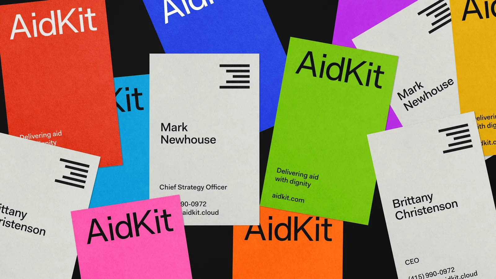
↗Order's identity for AidKit feels like infrastructure and like care at once, which is harder to pull off than it sounds. AidKit is a platform that lets governments, nonprofits, and funders send money to eligible households, and its track record, $385 million across 27 states, demands credibility without reducing recipients to numbers.
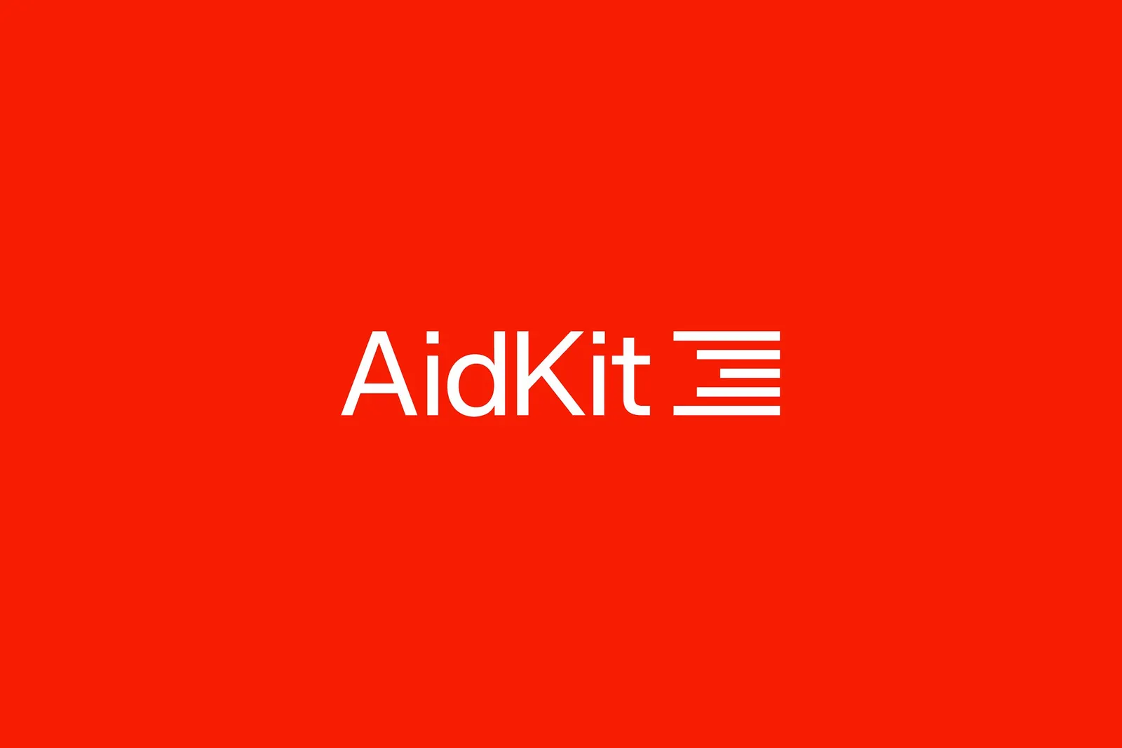
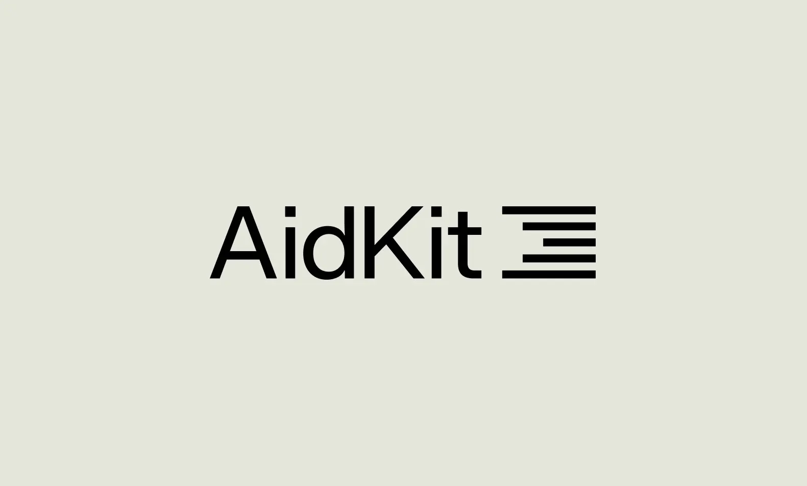
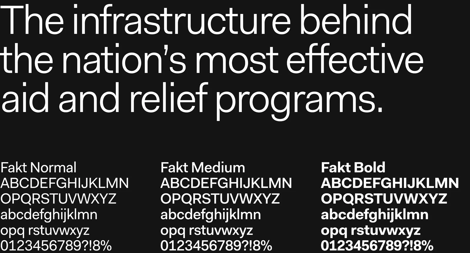
The studio started from movement. Its symbol turns the familiar cross into something that travels, and that gesture stretches into lines that tie photography to type throughout the system. Fakt, from Type by Thiemich, handles typography, and a palette of supporting colors nods to the different kinds of aid. With design by Garrett Corcoran and Joyce Ho, Order also built the launch website and an icon set that borrows the symbol's linework.
Why it works
The cross reads as help at a glance, which matters when applicants and agency staff need to trust a platform quickly. Giving it direction keeps it from feeling generic or clinical. Fakt is plain-spoken and readable, a sensible fit for forms, dashboards, and public-facing material. The linework is the smartest move: because the same gesture shapes the layouts, the icons, and the site, the brand and the product feel like one thing. A range of colors also keeps the tone away from the single-note solemnity common in this category.
Logo
Applications
Typography
Color




Images and video from order.design, by Order.