The Brand Monograph
Climate Imperative brand identity by Order
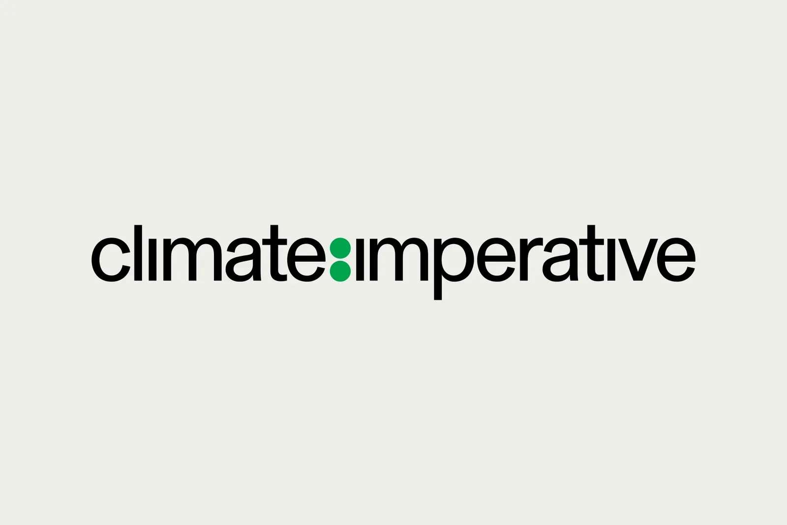
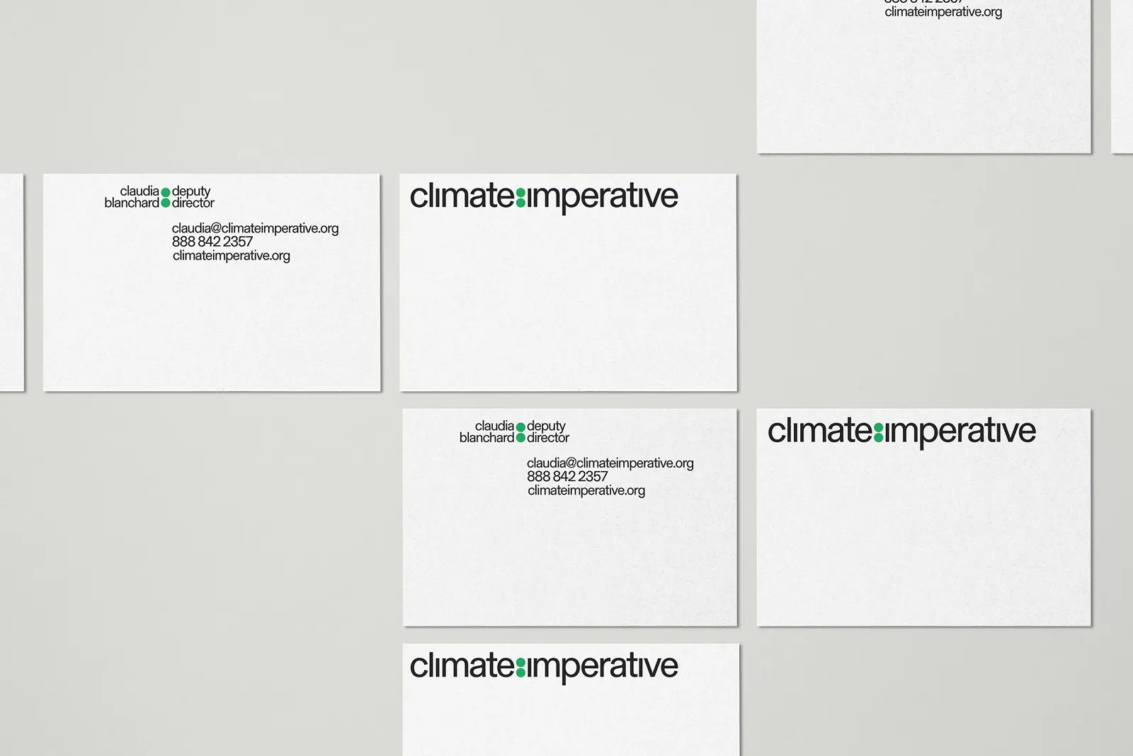
↗Order gave Climate Imperative an identity that turns a chemistry diagram into a branding tool. The organization supplies funding, technical support, and expertise to people making climate policy around the world. The studio, with designer Garrett Corcoran, found a visual language for that support in Lewis structures, the notation chemists use to show how electrons are arranged around atoms in a molecule.
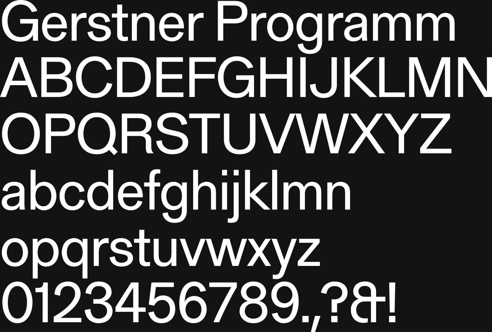
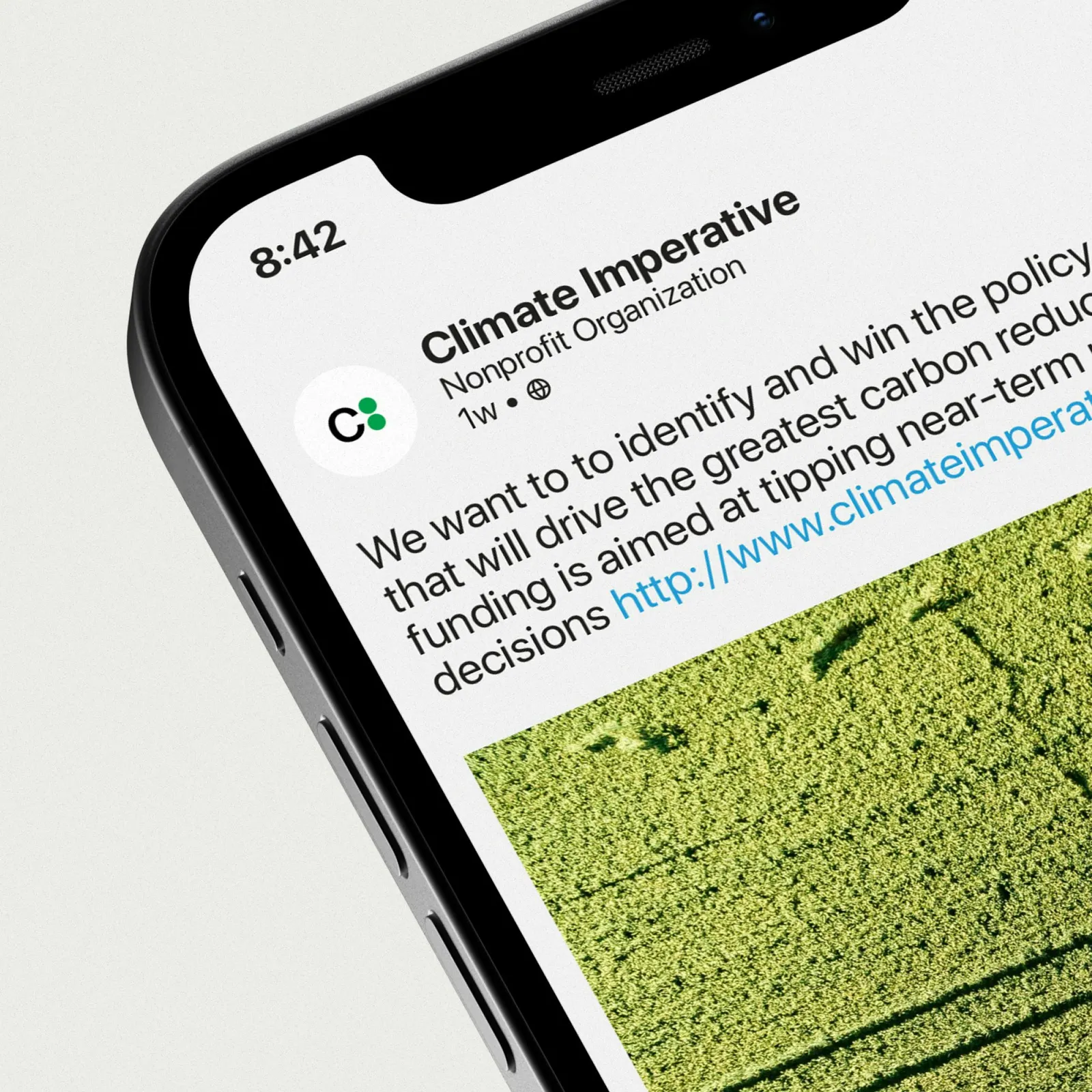
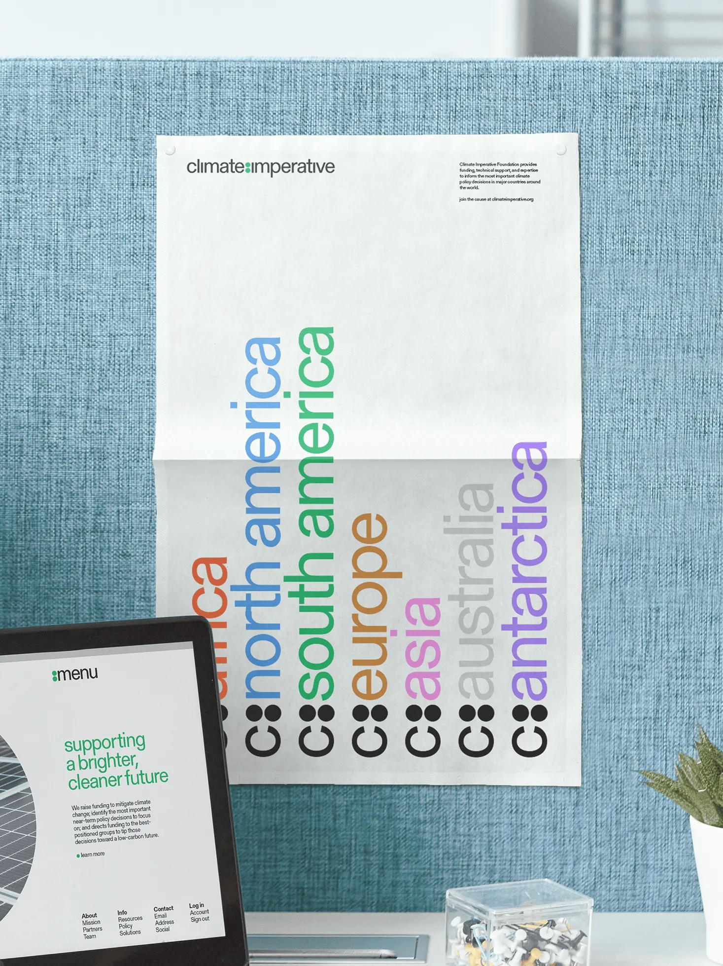
The logo can shrink to a single letter c, which lets the mark attach to partners, locations, and resources as the organization's reach grows. Typography comes from Forgotten Shapes: Gerstner Program, used in Regular and Bold for a plainspoken voice with enough contrast to organize information. An infographic palette sits alongside the core system, so data can be emphasized without leaving the brand's visual world.
Why it works
Climate work usually reaches for leaves, globes, and greens, so a molecular diagram sets this identity apart immediately. It also suits the audience. Policy makers respond to rigor, and the Lewis structure reads as science without feeling like a lecture. The single-letter symbol is the practical stroke: a mark built to bond with other content can carry partner and place names without clutter. Restrained type in two weights keeps the tone sober, leaving the diagrams and data to do the persuading.
Applications
Logo

Typography
Color


Images and video from order.design, by Order.