The Brand Monograph
REM Decaf brand identity by Order
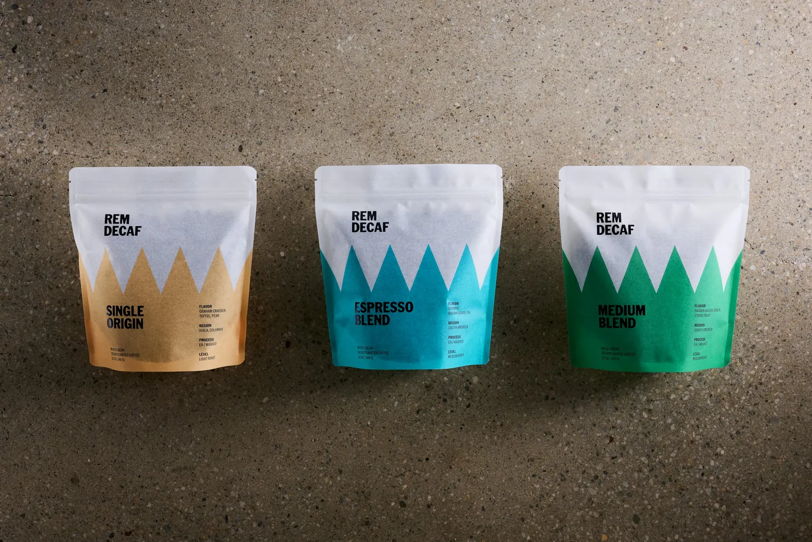
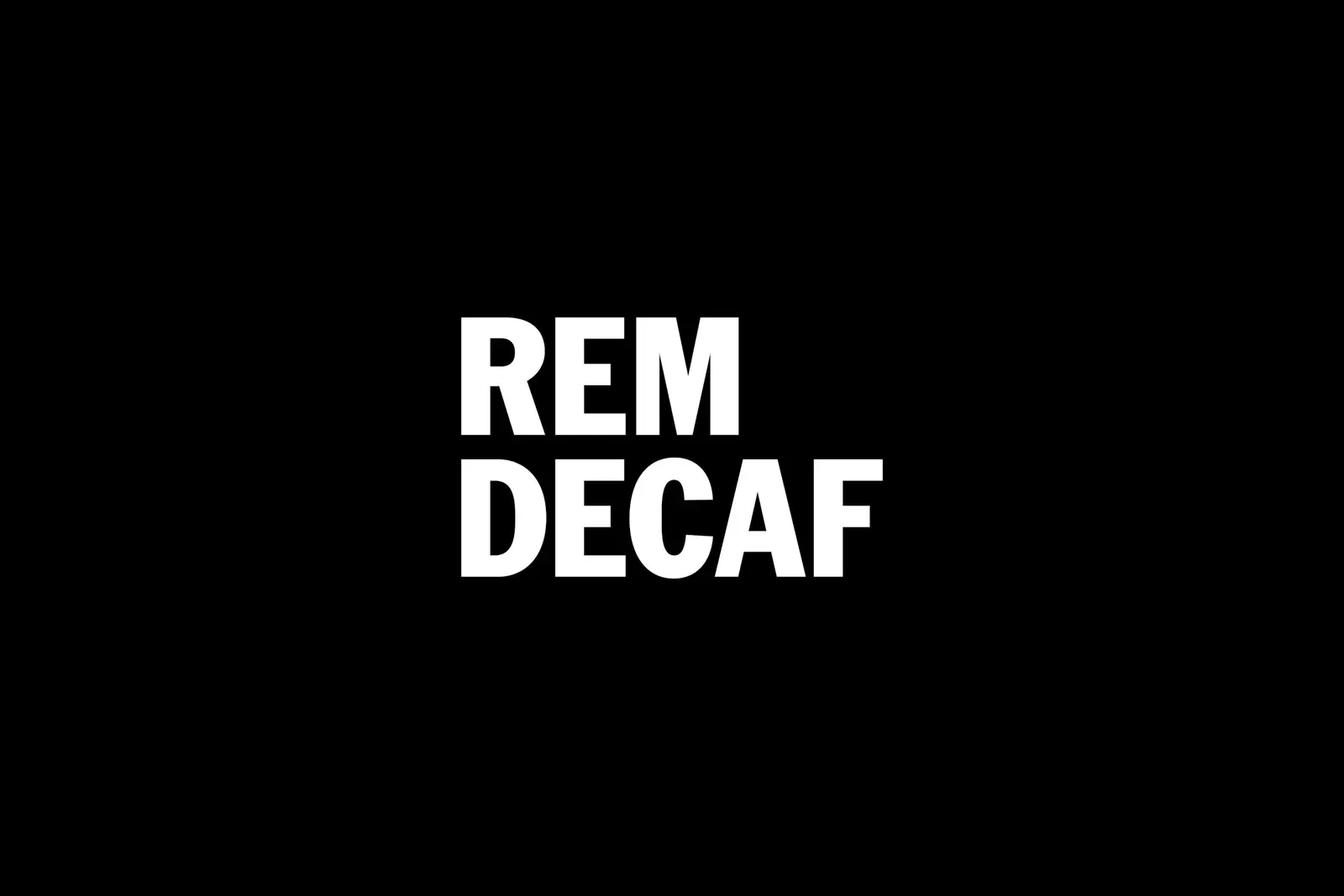
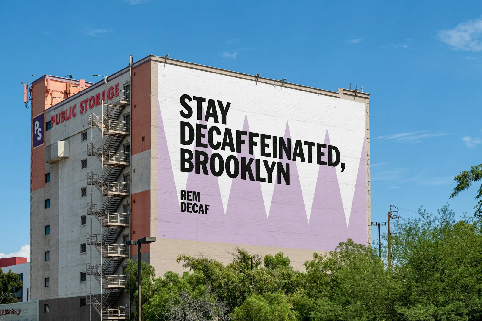
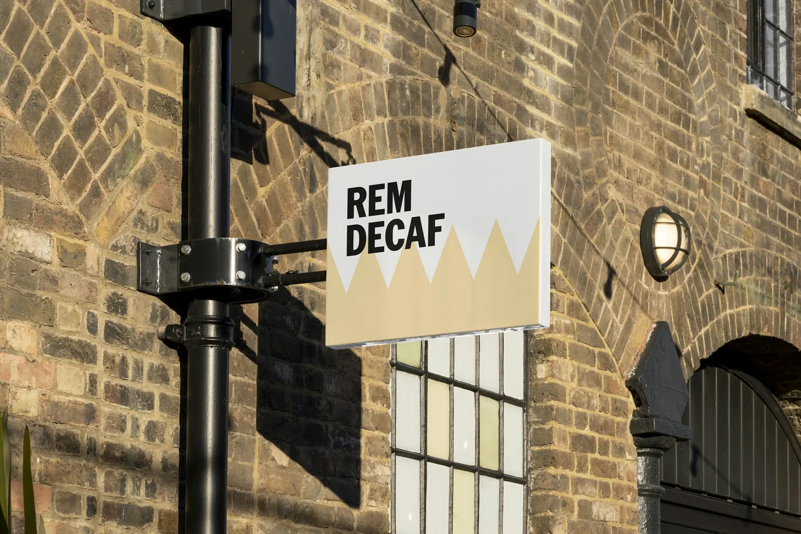
↗REM Decaf's identity is a rare case of a decaf brand building its personality on sleep instead of on what the coffee leaves out. Order took the brief for a new company, founded in 2025 by Kevin Curtin and Dave Goldberg, and tied the name directly to a graphic device drawn from the four spikes of a typical REM cycle.
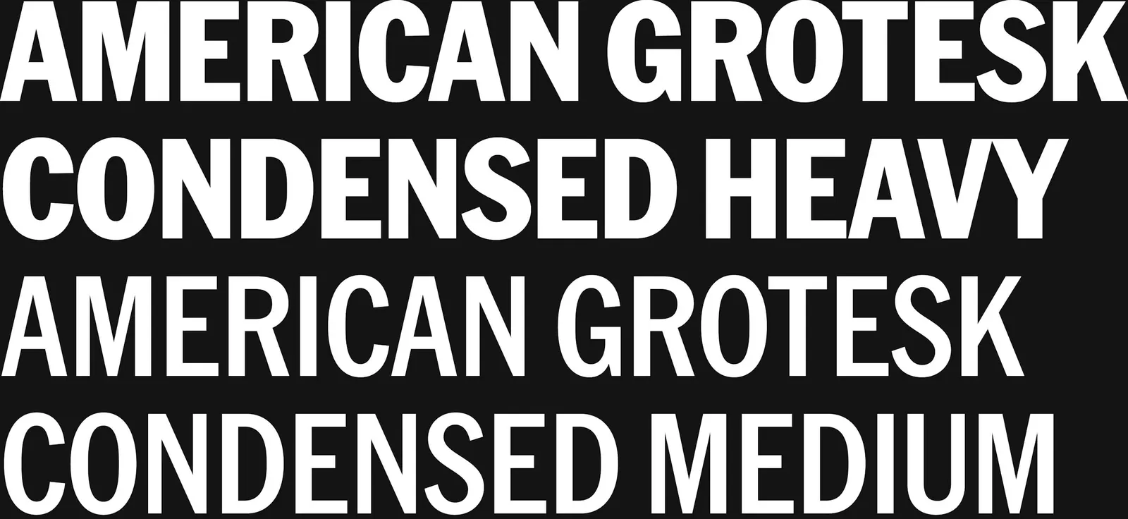
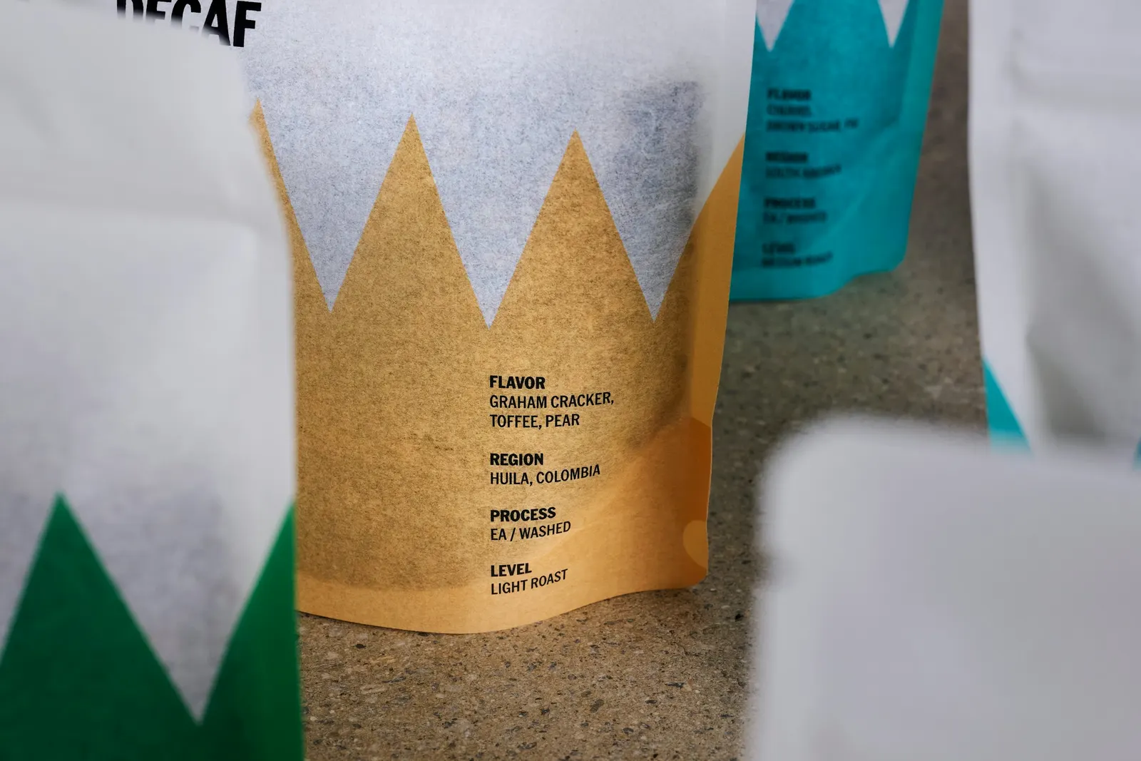
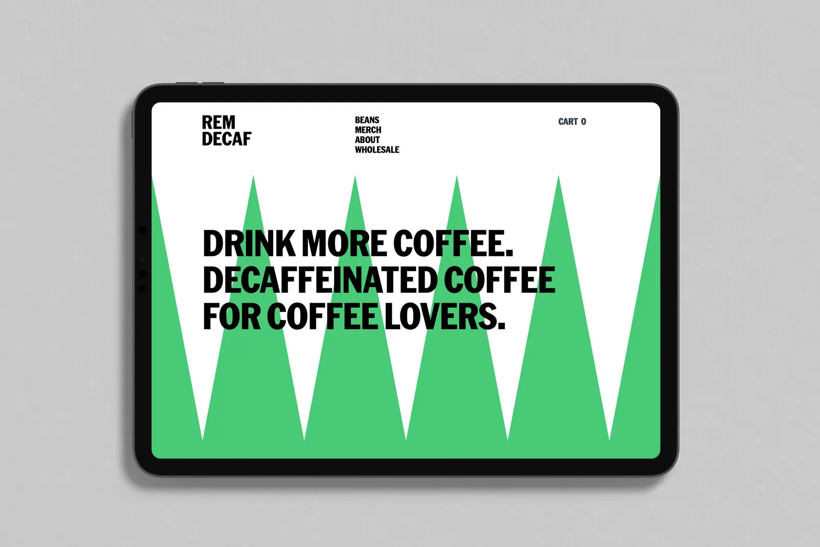
That device anchors a system that stays quiet around it. Klim's American Grotesk Condensed handles the typography, a plain, utilitarian choice for a product defined by subtraction. Each bean gets its own color within a wide palette, and the bags are rice paper, a material that echoes the decaffeination process. Working with Jesse Reed on design and Casey Steffens on photography, Order carried the system through merch, signage, marketing, and a website whose layouts keep to the REM device across screen sizes.
Why it works
The strength here is restraint with a reason behind it. Decaf can feel like a concession, and REM answers with one ownable shape that links the name to rest rather than to a coffee cliché. Because the type stays neutral, the device and color carry the personality, and color coding gives a growing range an easy way to be told apart on a shelf. A mark built from simple peaks also scales cleanly, which is why it holds together from bag to browser.
Applications
Typography
Logo
Color

Images and video from order.design, by Order.