The Brand Monograph
Toriba brand identity by Estudio Cru
↗Most organizations that talk about the future end up with an identity that looks finished. For Toriba, Estudio Cru designed one that stays deliberately unfinished, and that choice is what makes the project worth a look. Toriba brings artists, activists, educators, researchers, and other leaders into the same room to imagine new scenarios, so the brief was really about many voices rather than one.
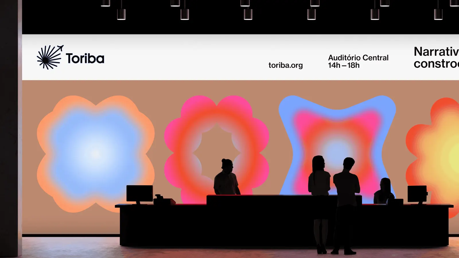
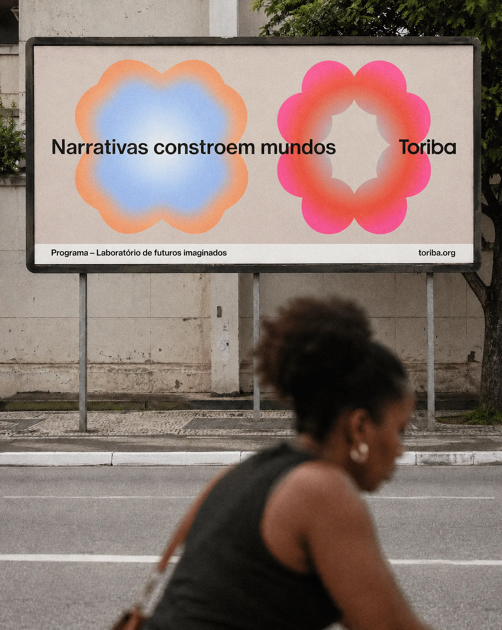
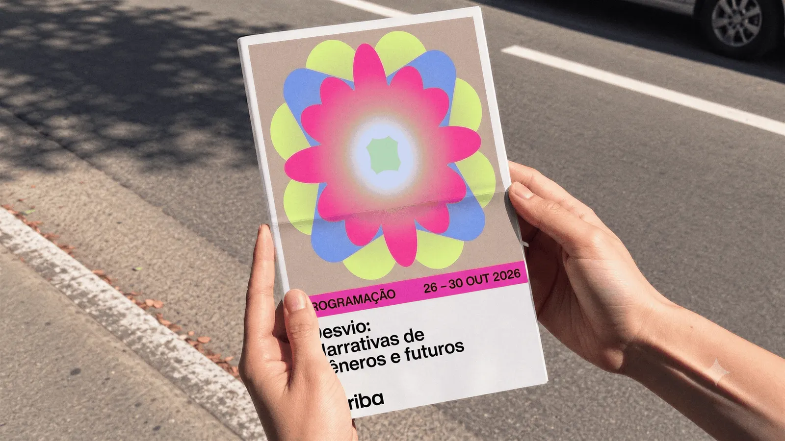
The studio built the identity around sound, color, material, and form, treating each as something generated through collaboration rather than applied afterward. The result can shift with every initiative and encounter while still reading as Toriba. Estudio Cru then extended that thinking into a website and a manifesto film, so the brand's point of view carries across screen and motion as well as the visual system.
Why it works
A static identity would have frozen an organization whose value is conversation. By drawing on sounds, colors, materials, and forms, Estudio Cru lets each initiative look like itself while still belonging to Toriba. That suits an audience of makers and thinkers, who tend to distrust a polished institutional look. The manifesto film also gives the system a clear voice to carry. In a category full of neutral, cautious branding, an identity that visibly evolves makes the argument for the organization before anyone reads a word.
Applications
Color
Logo
Images and video from estudiocru.com, by Estudio Cru.