The Brand Monograph
Domaine brand identity by Order
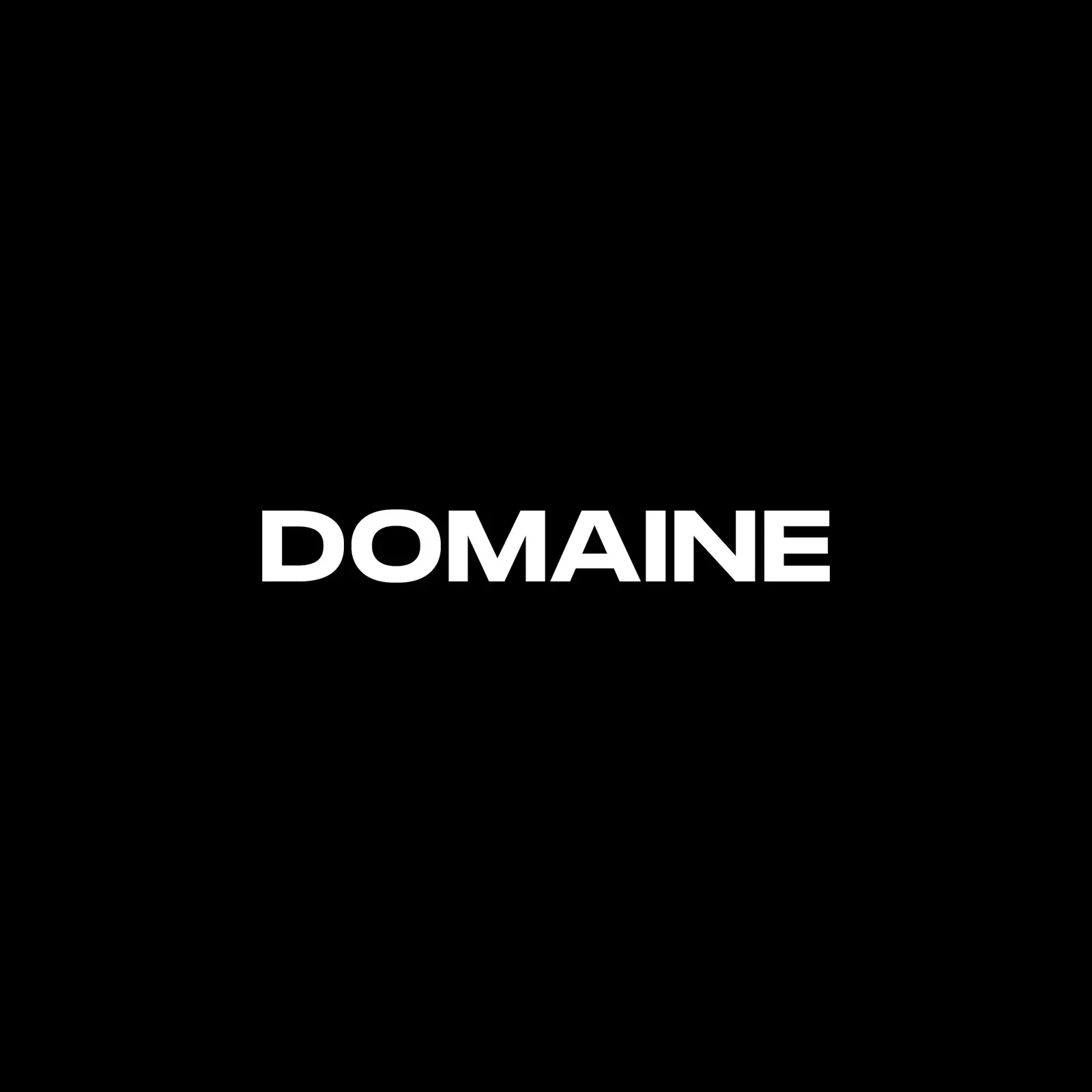
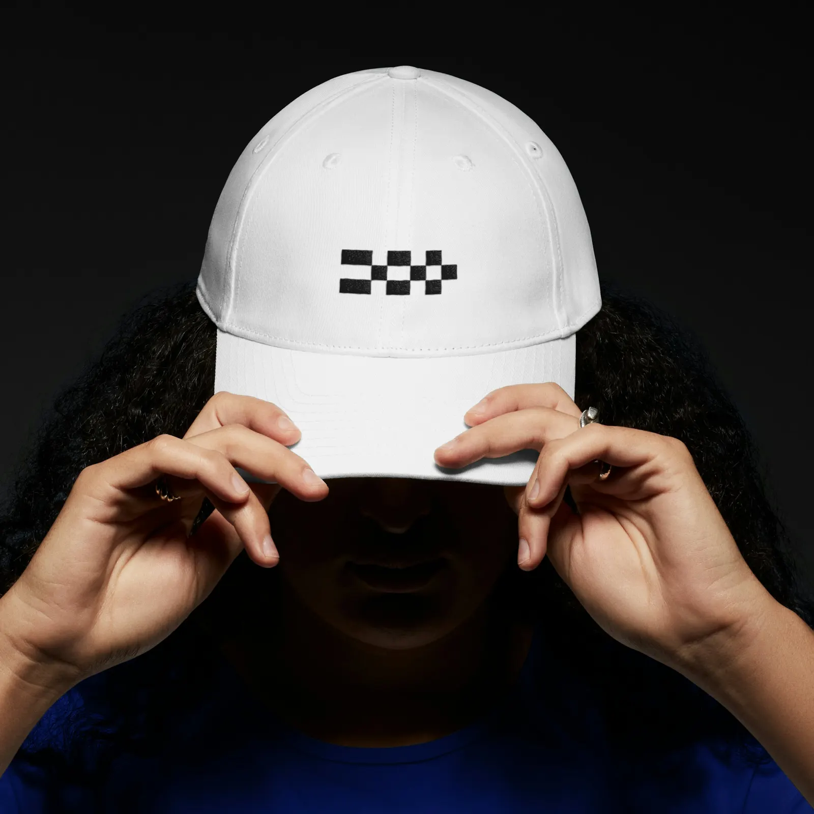
↗Order's identity for Domaine treats the grid as something to play with rather than obey. When Tomorrow and Half Helix merged into the world's largest Shopify design and development practice, the studio had to find a name both teams could own and a look that could sit comfortably next to other brands' work. Working with designers Emily Klaebe and Jesse Reed, and with Fern Diaz on strategy and copy, Order settled on Domaine, an altered spelling of "domain" that reads as boutique rather than big.
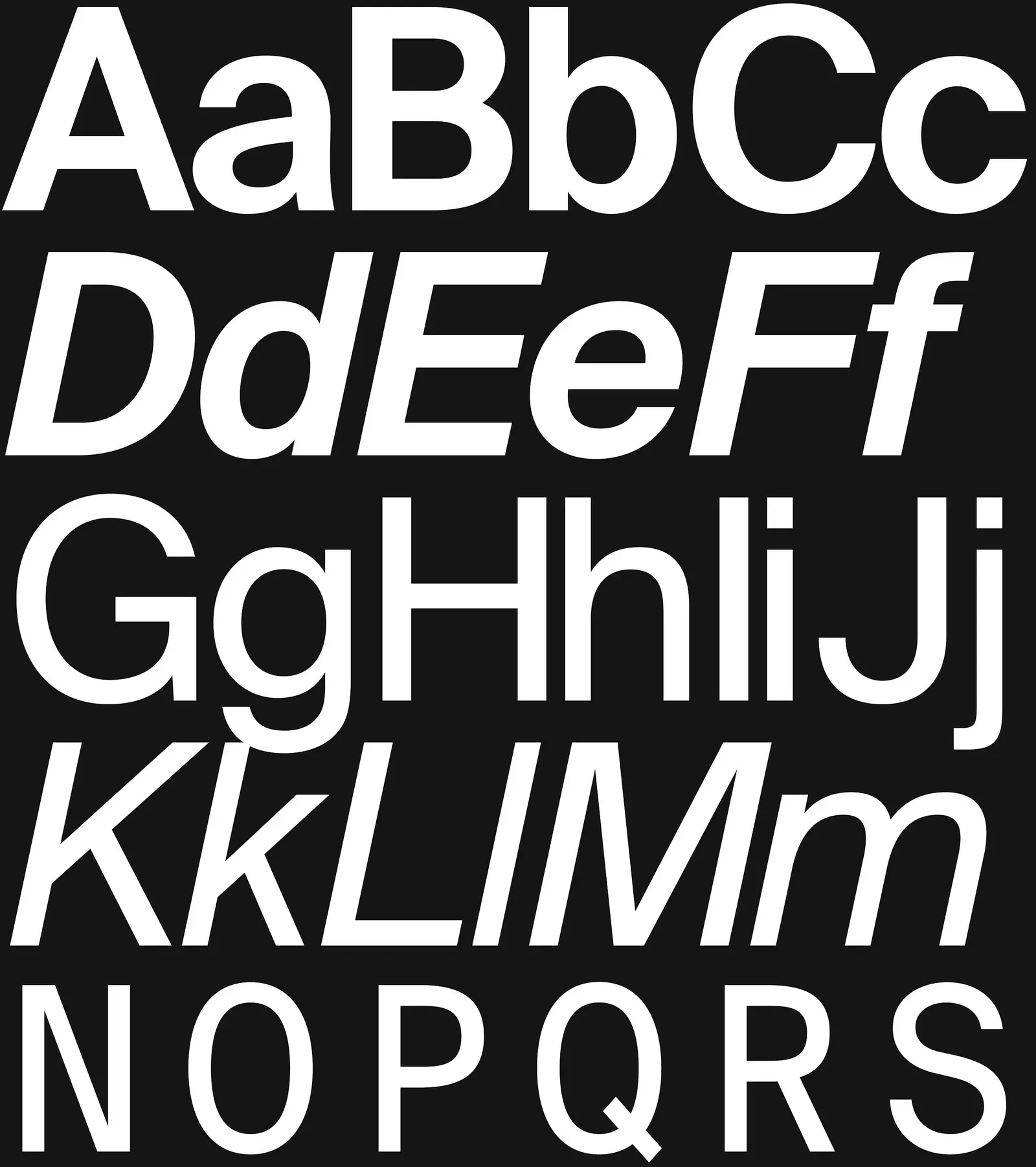
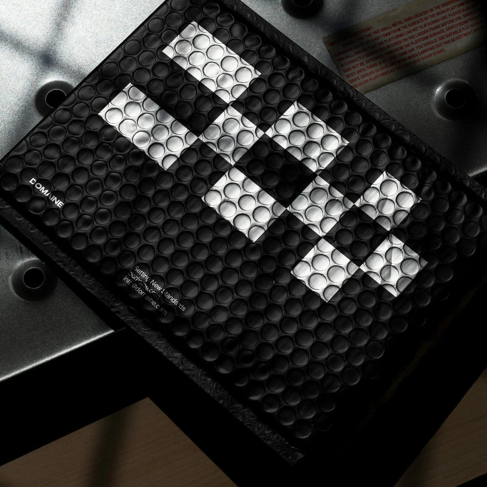
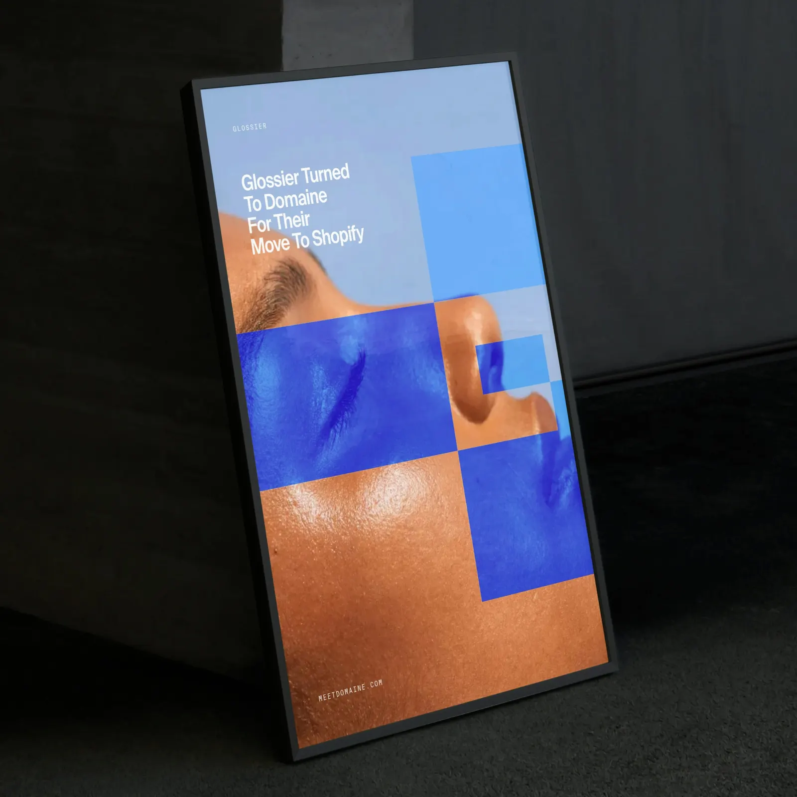
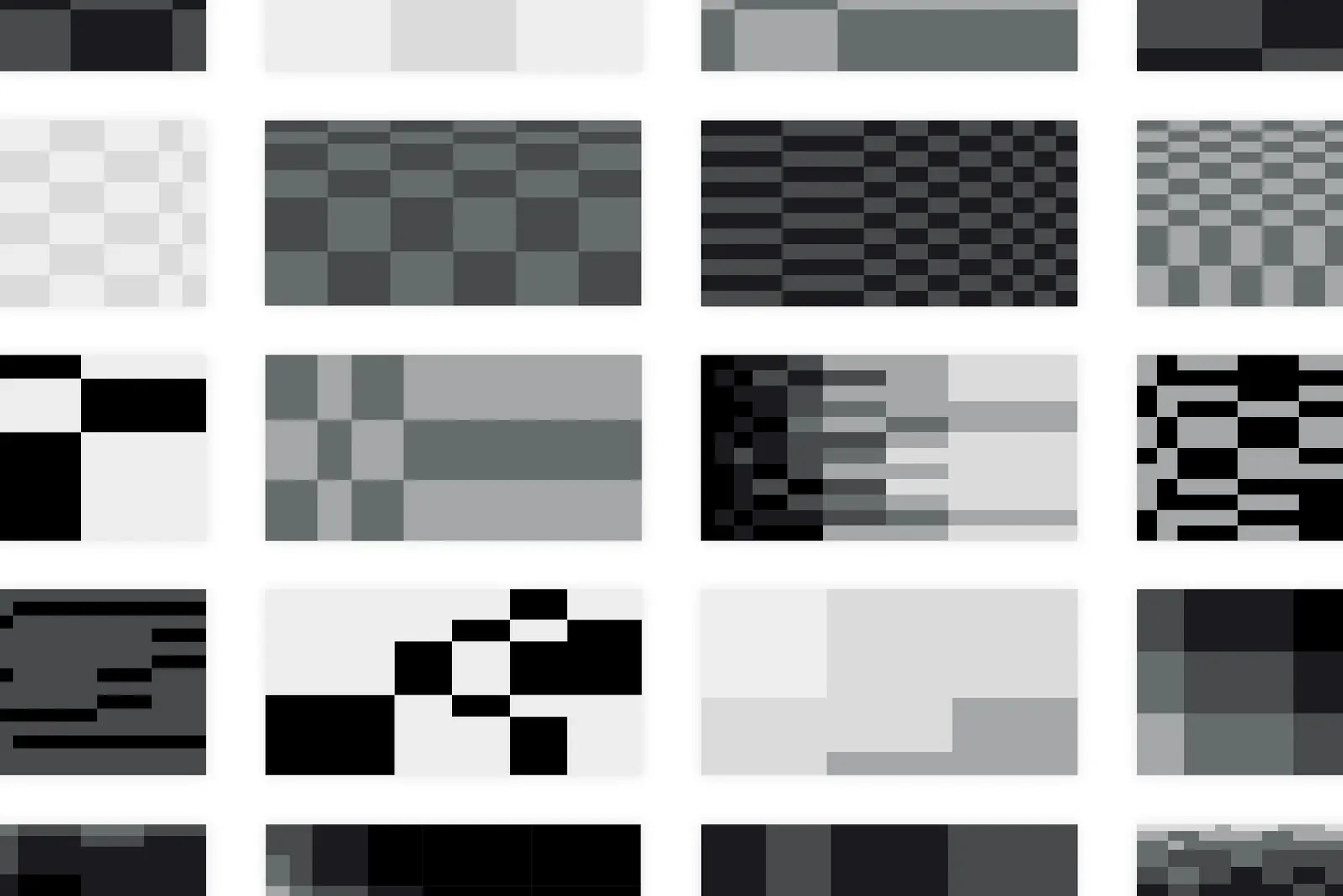
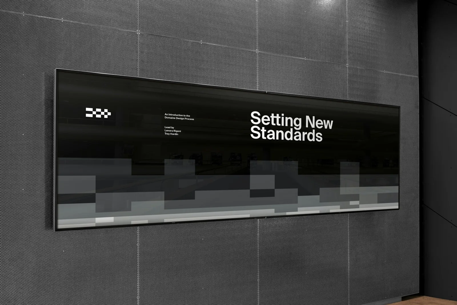
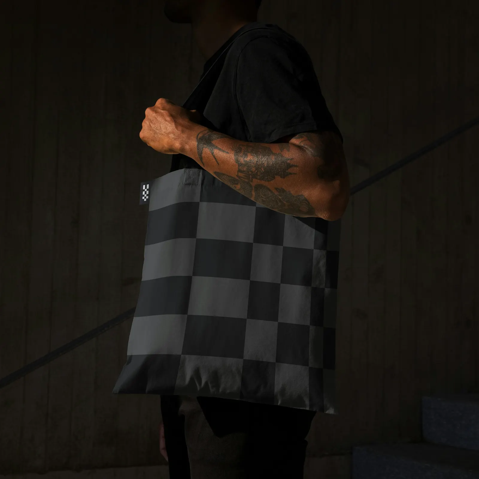
The symbol sets order against interruption, and that tension carries through the system. Suisse Int'l and Mono stay deliberately quiet, while a custom set of letters is built on a nine-square grid whose intensity can be raised in half steps. Color works on two tracks: a restrained greyscale with a few accents, and hues sampled from each client's imagery. Order also built flexible grid layouts for case studies and campaigns, launched them on Domaine's 2024 website, and documented everything in Standards.
Why it works
Domaine's clients are brands, and its best work is their work, so the identity acts as a frame instead of competing with it. Neutral typefaces and a grey base let a client's color take over, while sampling that color makes each case study feel like a pairing. The grid suits a firm that designs and builds, and the deliberate breaks suggest judgment rather than rule-following. The half-step scale gives the team a dial instead of a rulebook, so expression stays consistent.
Logo

Typography
Applications
Images and video from order.design, by Order.