The Brand Monograph
Skateyogi brand identity by Order
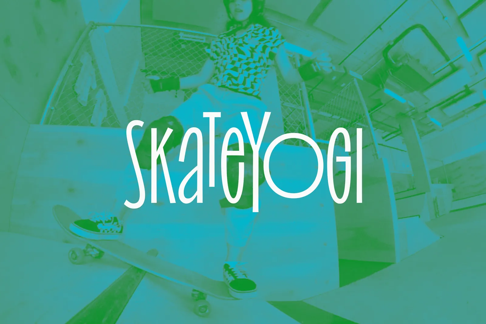
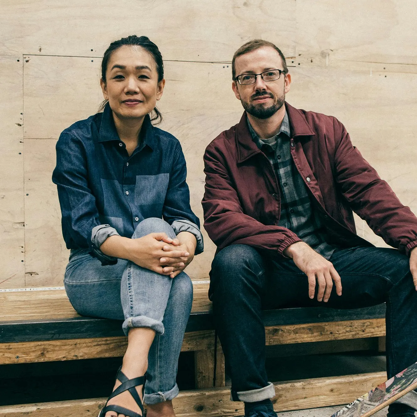
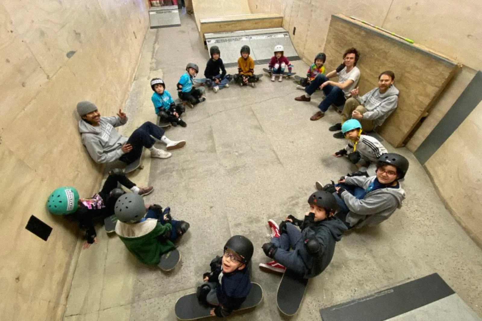
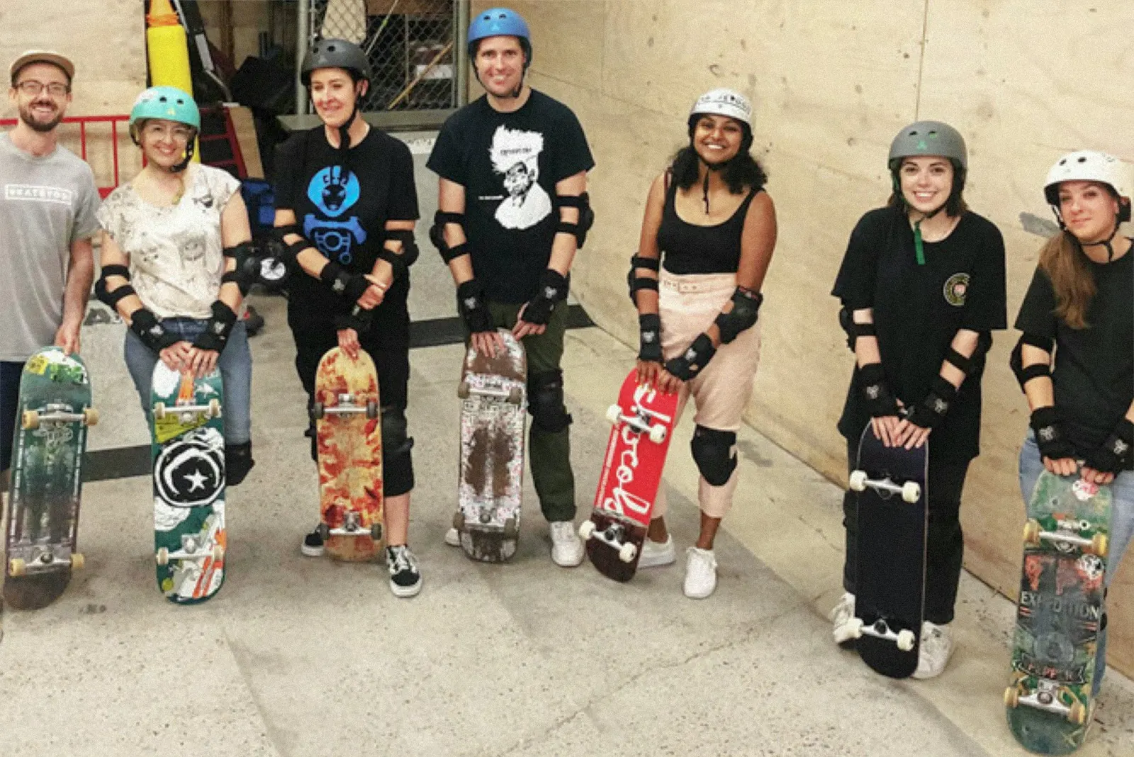
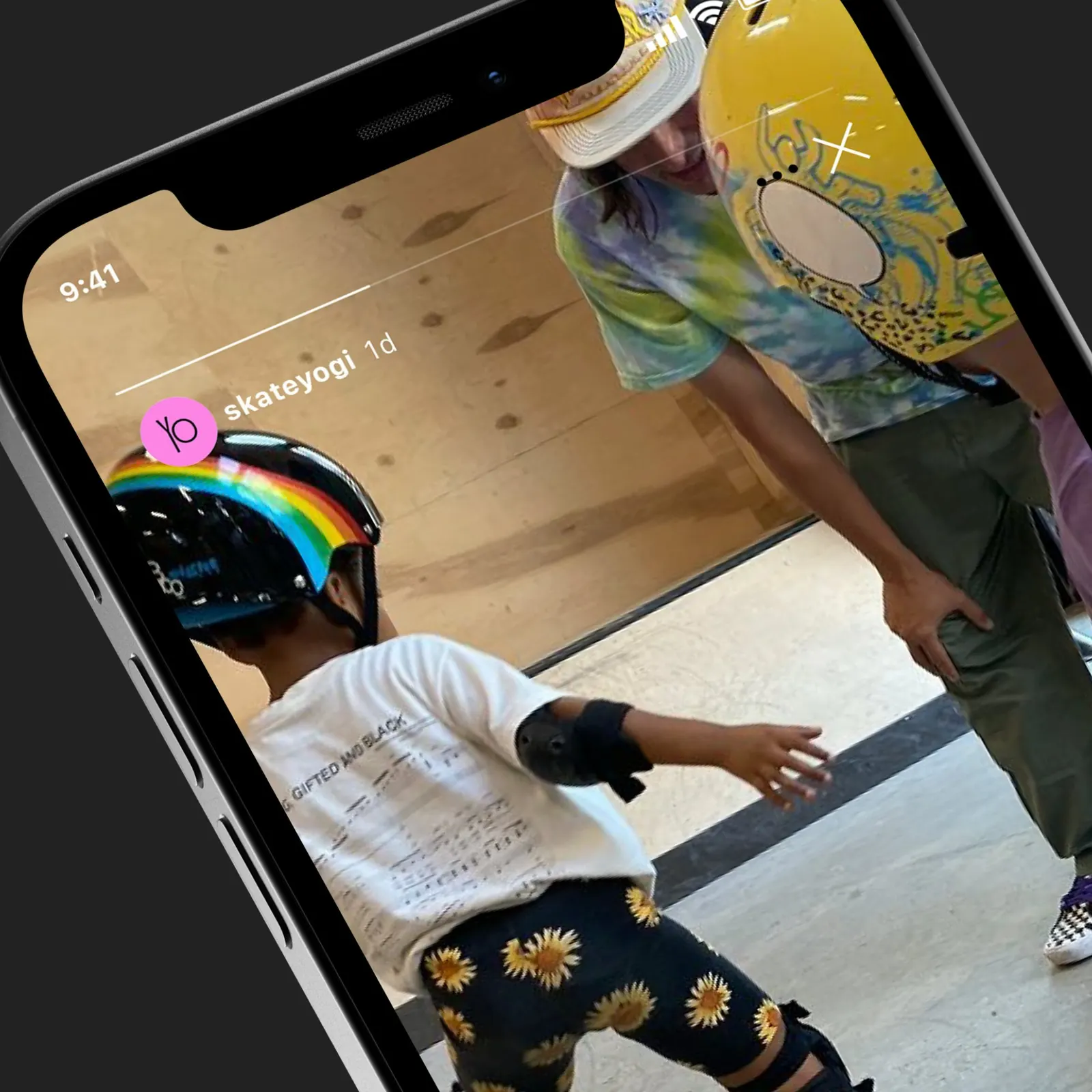
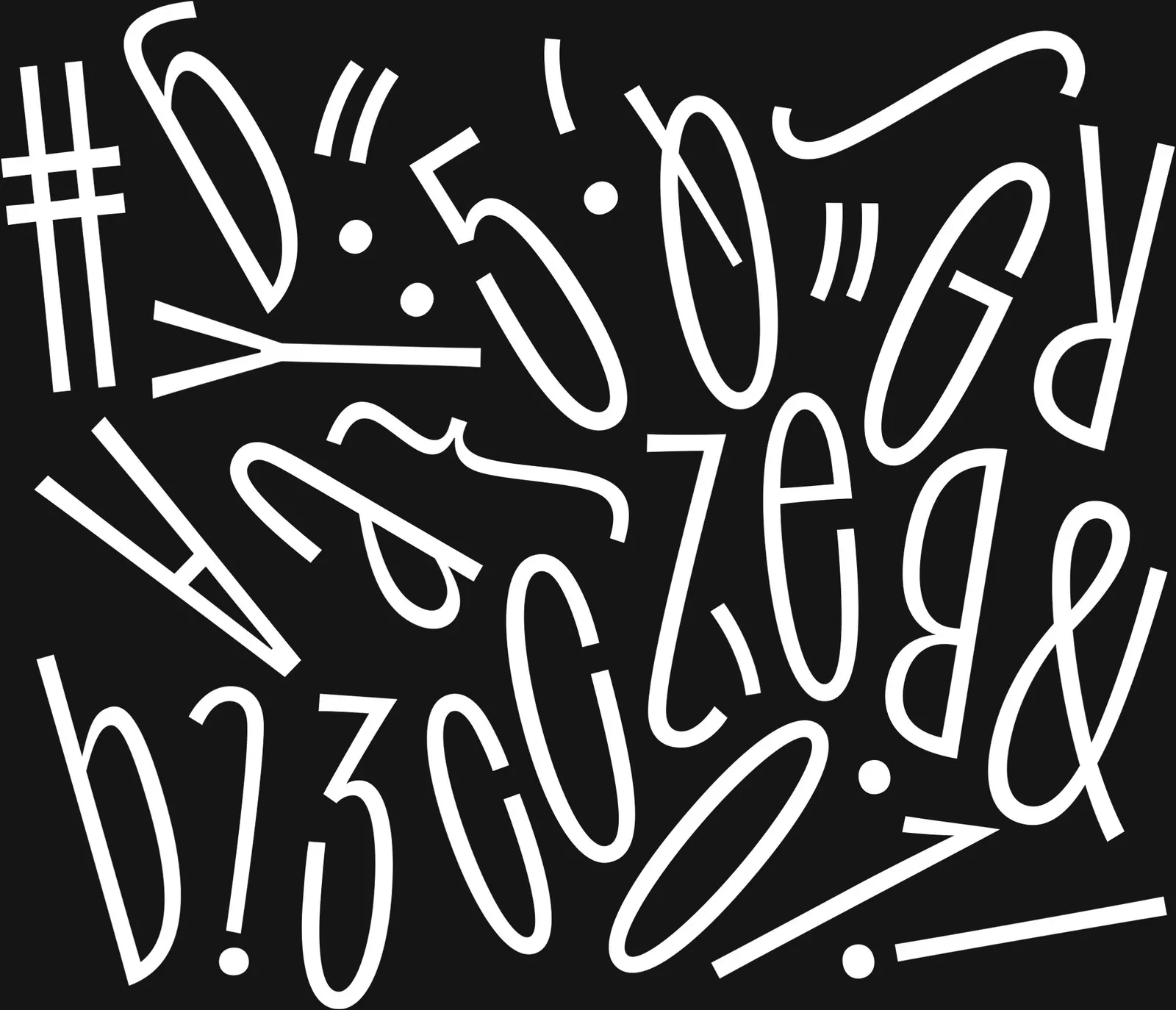
↗Skateyogi's identity lets letters behave like skaters: they stretch, lean, and shift as if caught mid-run. Order designed it for a Brooklyn skateboard school opening its second space in Williamsburg, and began with hands-on sessions to learn how the team sees skate culture. The school started in 2013 as skate lessons at a yoga studio and now serves all ages through classes, camps, and private instruction.
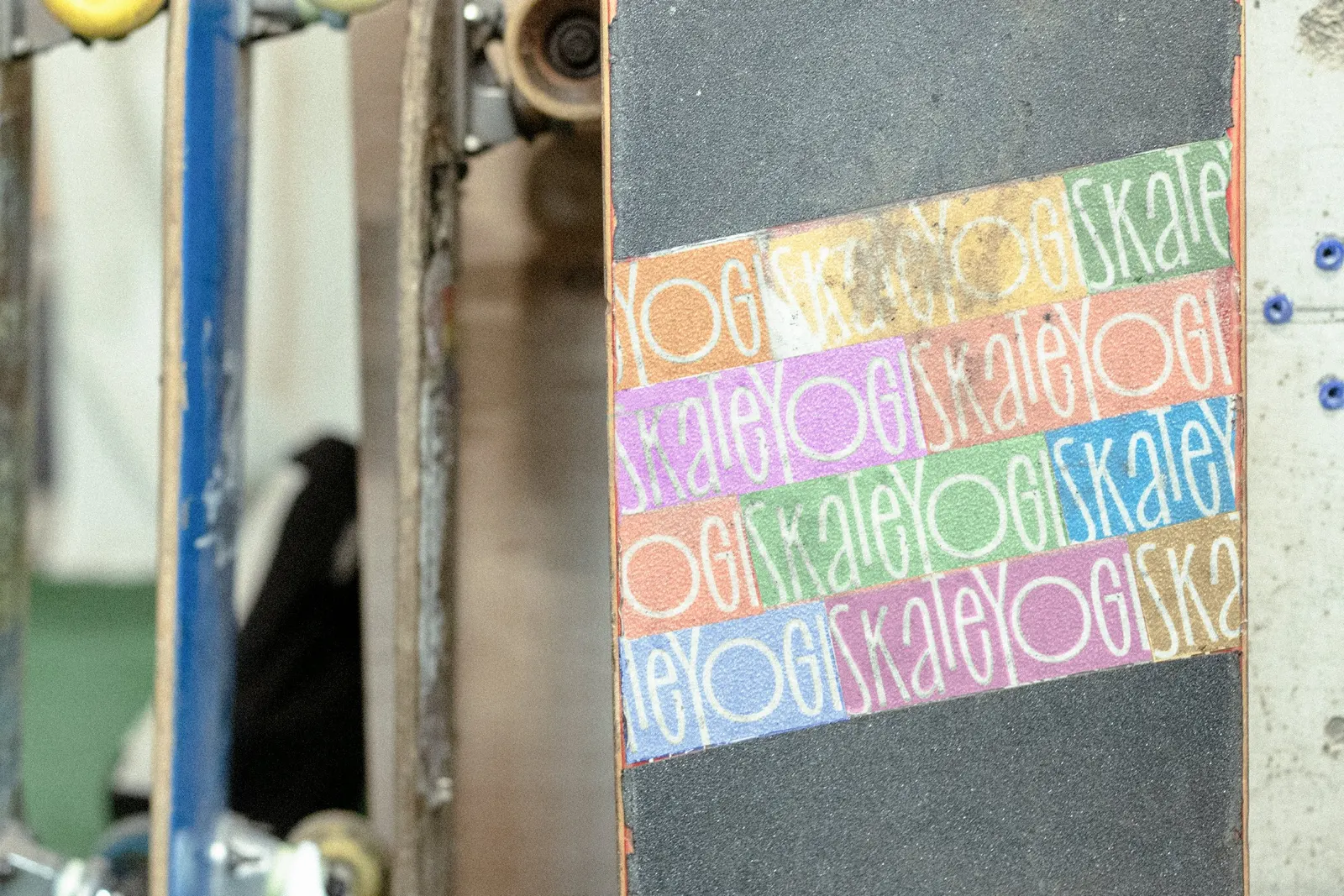
Typography carries the system. Oh No Type Co's variable face Irregardless provides the flexible, loud voice, while Good Type Foundry's Good Sans keeps practical details clear. Trick names and short phrases become display copy, and loose gestures layer over photography. The "Yo" inside the name works as a compact mark, and a multicolor palette runs through print and digital pieces. Garrett Corcoran designed it at Order.
Why it works
Skate brands often lean on grit and insider codes, which can intimidate beginners and parents. Here, a stretchy, slightly unruly typeface signals play, and falling and trying again becomes part of the look. Pairing it with a calm sans means a camp schedule stays readable, so the energy never costs clarity. "Yo" is a friendly greeting as well as a tidy avatar, and the wide range of colors suggests no single tribe owns the place.
Applications
Logo
Typography
Color

Images and video from order.design, by Order.