The Brand Monograph
Norika brand identity by Bold
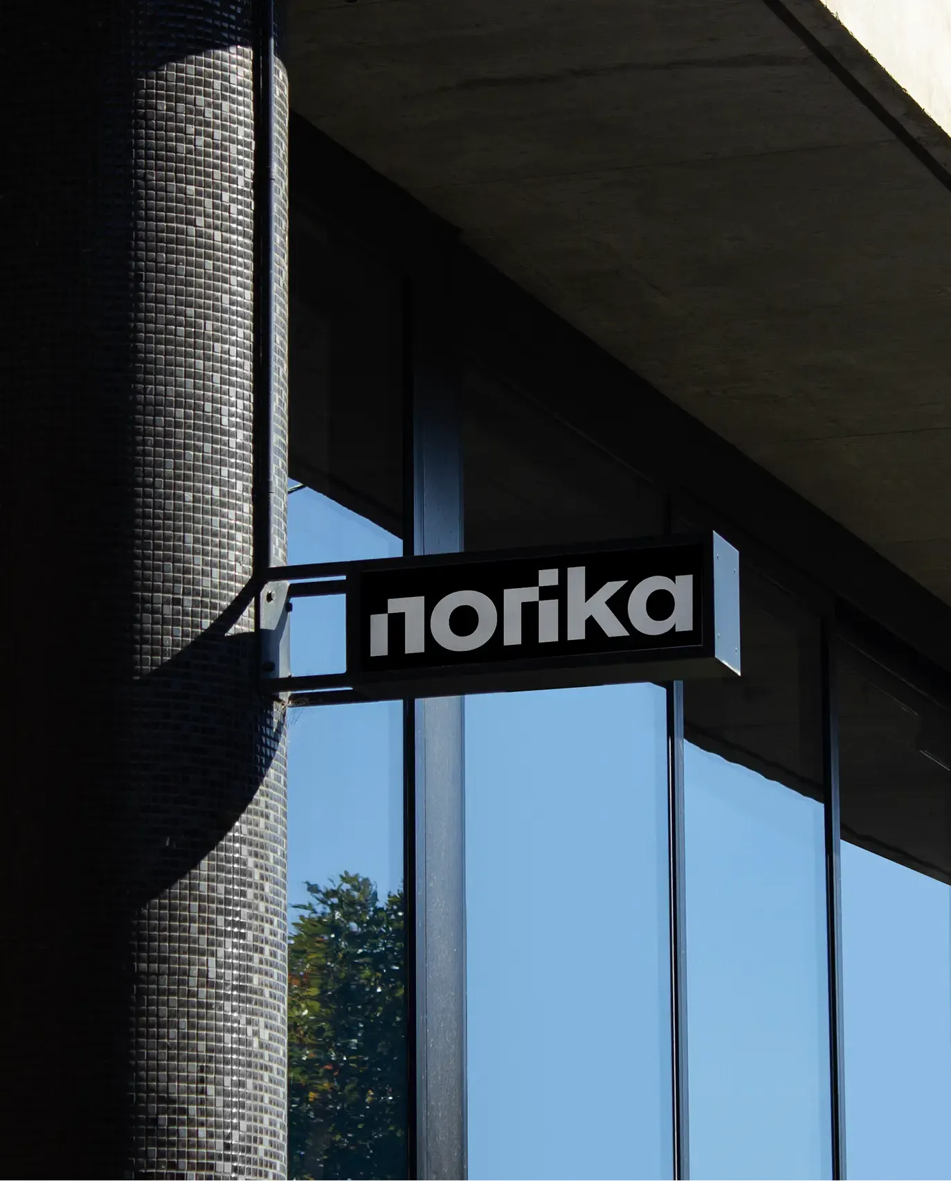
↗Recruiting brands tend to reach for the same handshakes, speech bubbles, and human silhouettes. Bold's identity for Norika steps away from all of it and looks like a technology company instead, which suits a business that invests in digital products and services for hiring.
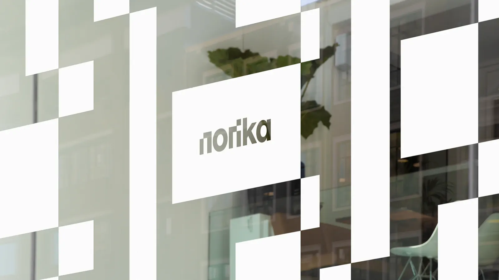
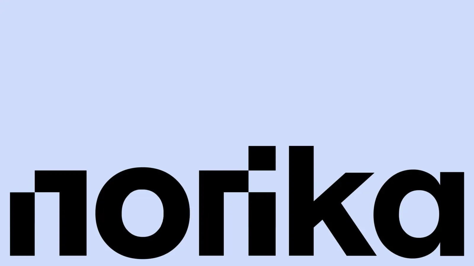
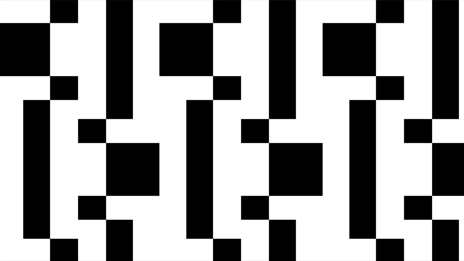
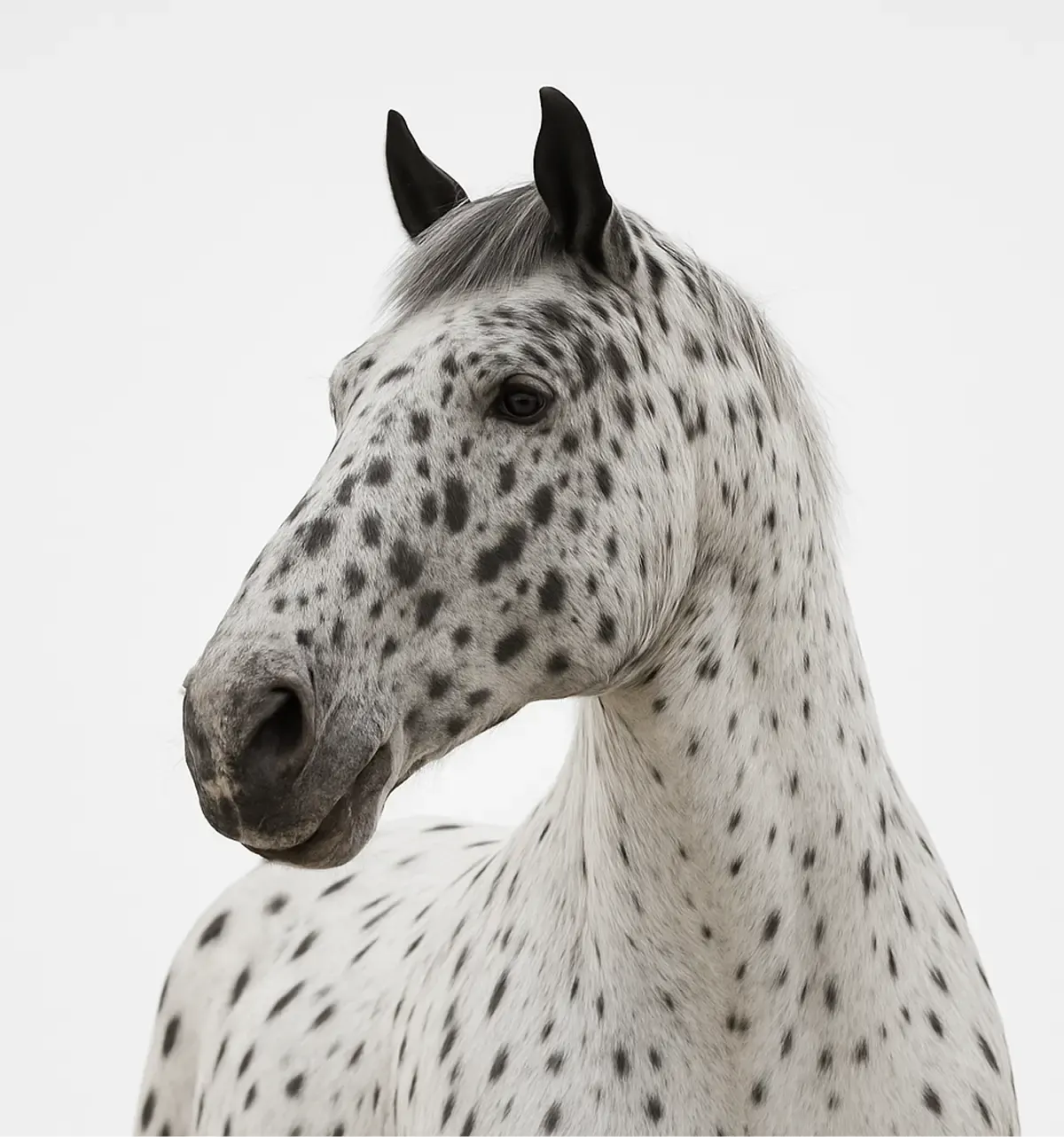
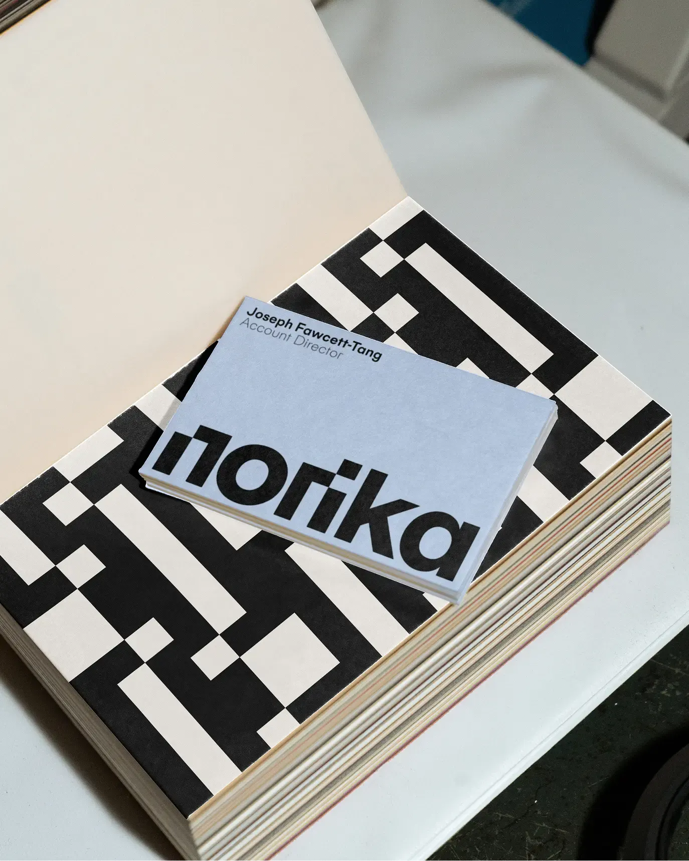
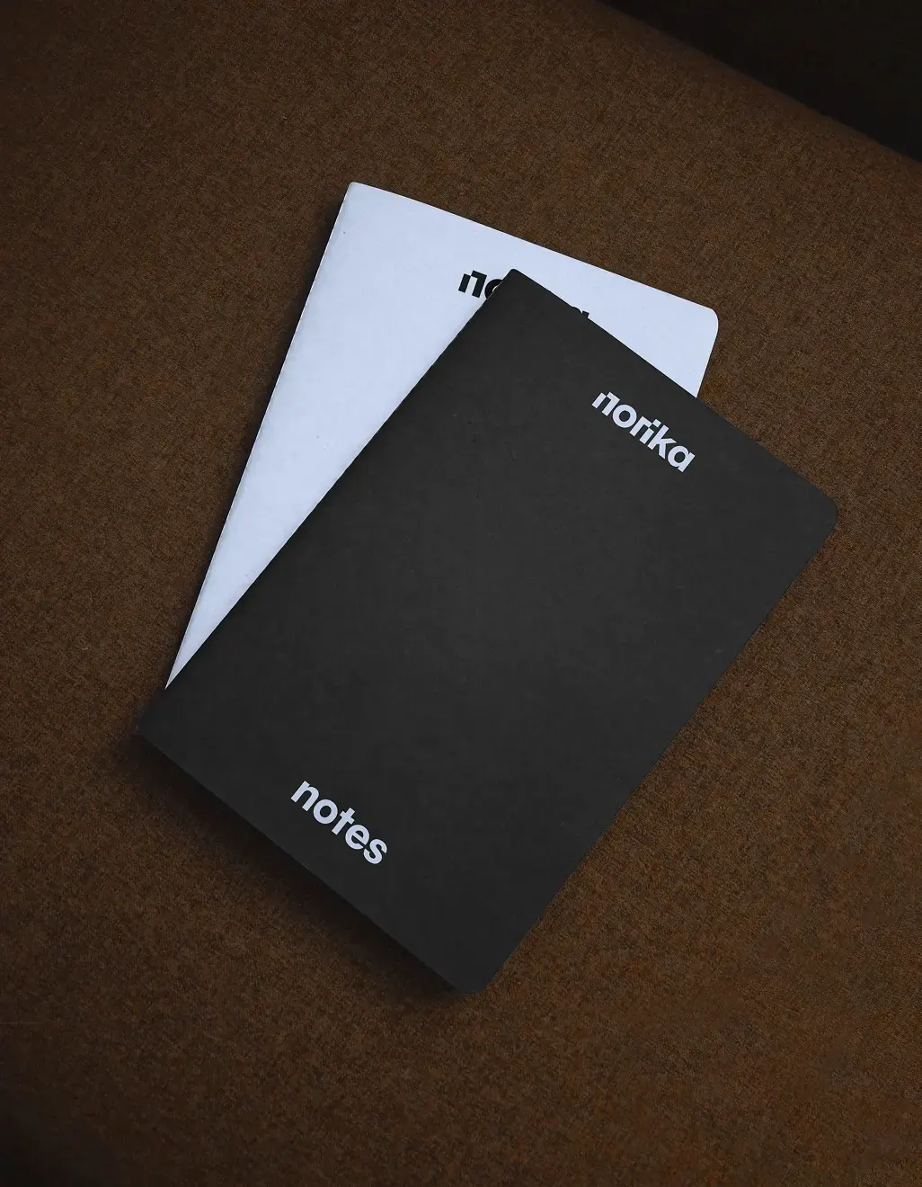
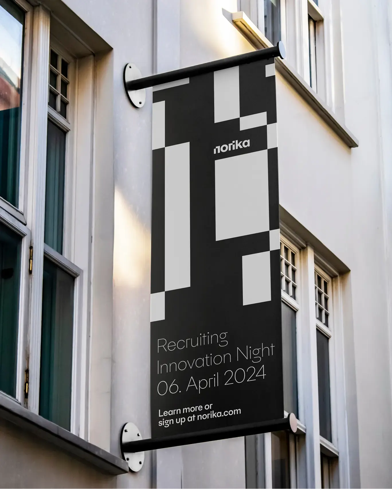
Norika is a European group that puts established recruiting companies under one roof and lets each keep its own brand. Bold's answer is a visual system built on a pattern that suggests things linking up and working together, designed to move from screens to printed and physical material. The name has a story too. It comes from the Noriker, an Austrian horse breed, and the studio bent the spelling into Norika so the word belongs to the company alone.
Why it works
A pattern is a smart tool for a group of brands. It can be shared across companies without flattening them, so each partner gets a common visual thread while its own identity stays intact. That matters when the audience includes founders deciding whether to join. The horse-derived name adds warmth to a category that usually talks in process and software terms, while the tech-forward look keeps it credible. Together they signal ambition without losing the human side of recruiting.
Applications
Logo
Images and video from boldscandinavia.com, by Bold.