The Brand Monograph
Nurture brand identity by Under After
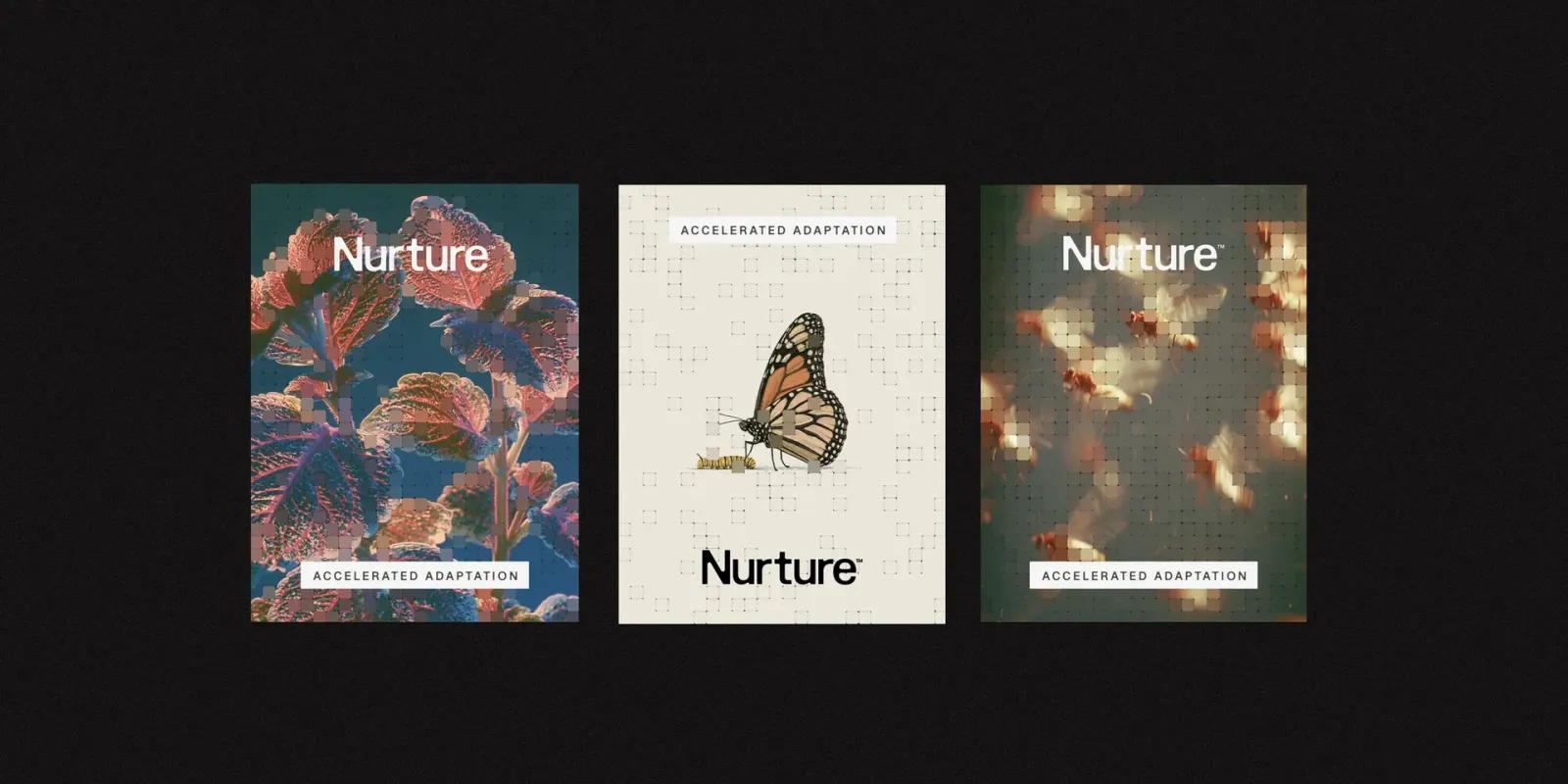
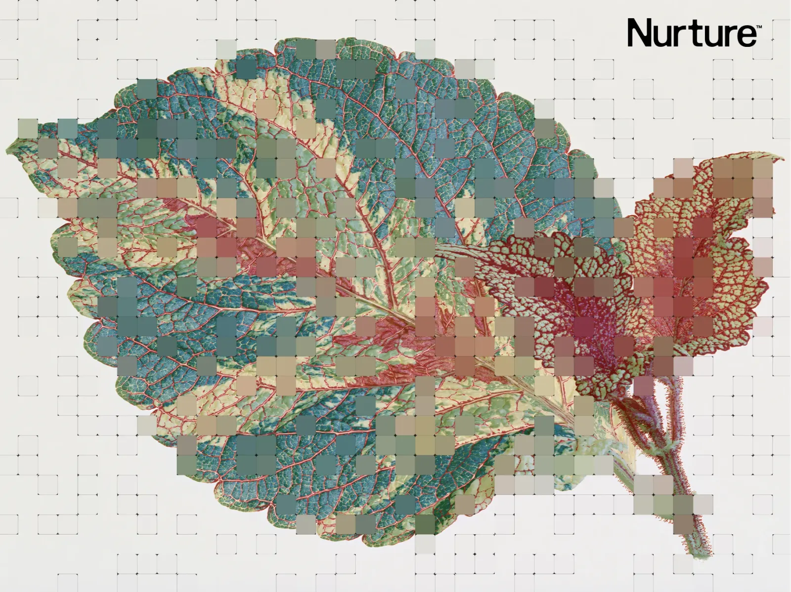
↗The most distinctive thing about Nurture's identity is that the imagery does the branding. Under After built a tool that divides a photograph into a grid and collapses scattered cells into the average color beneath them. Any organism, from any source, ends up looking like it belongs to the company. Rough hand-drawn spot illustrations sit alongside the procedural pictures.
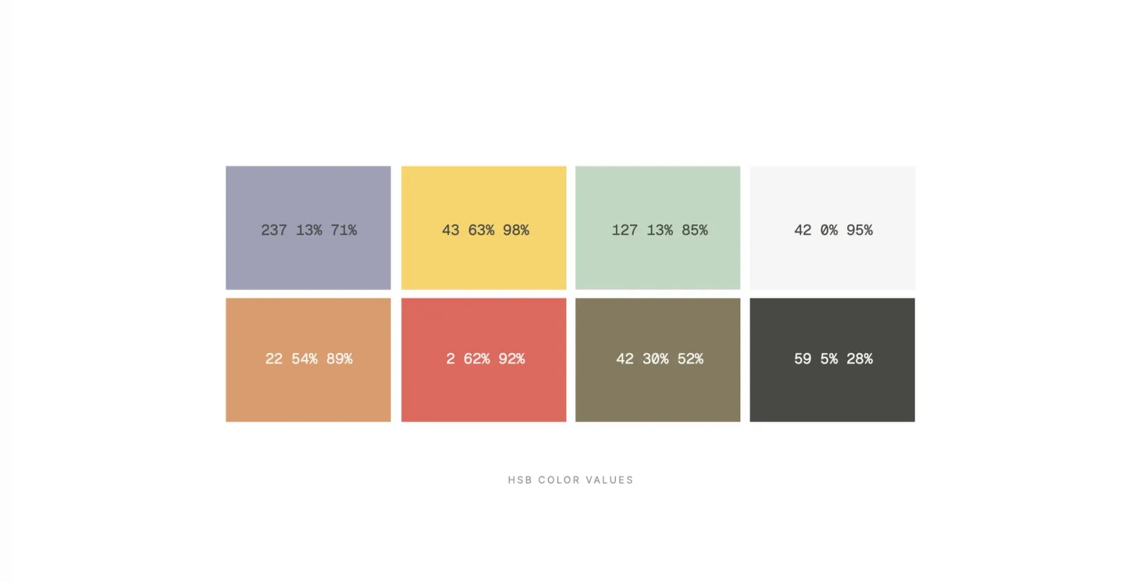
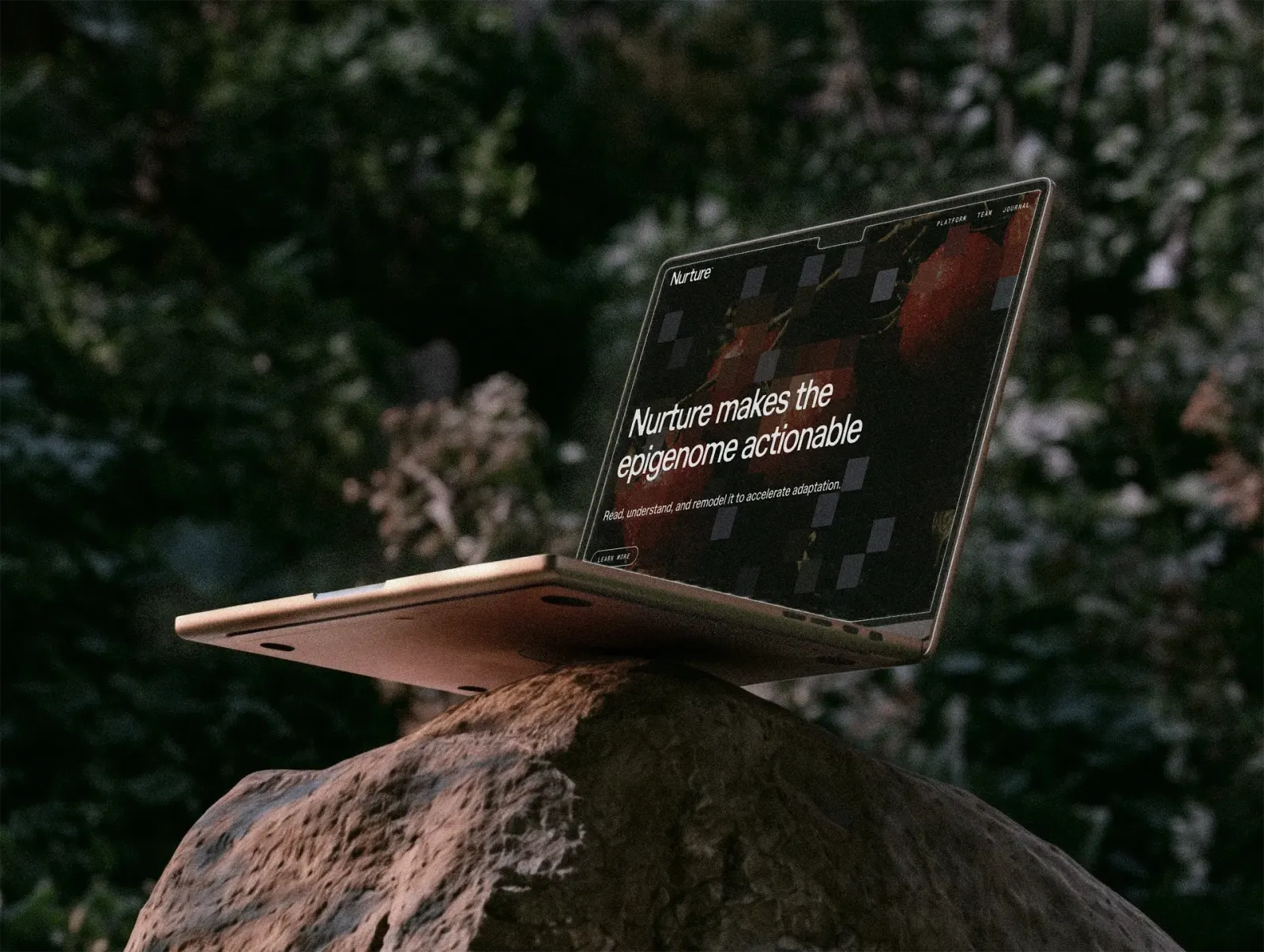
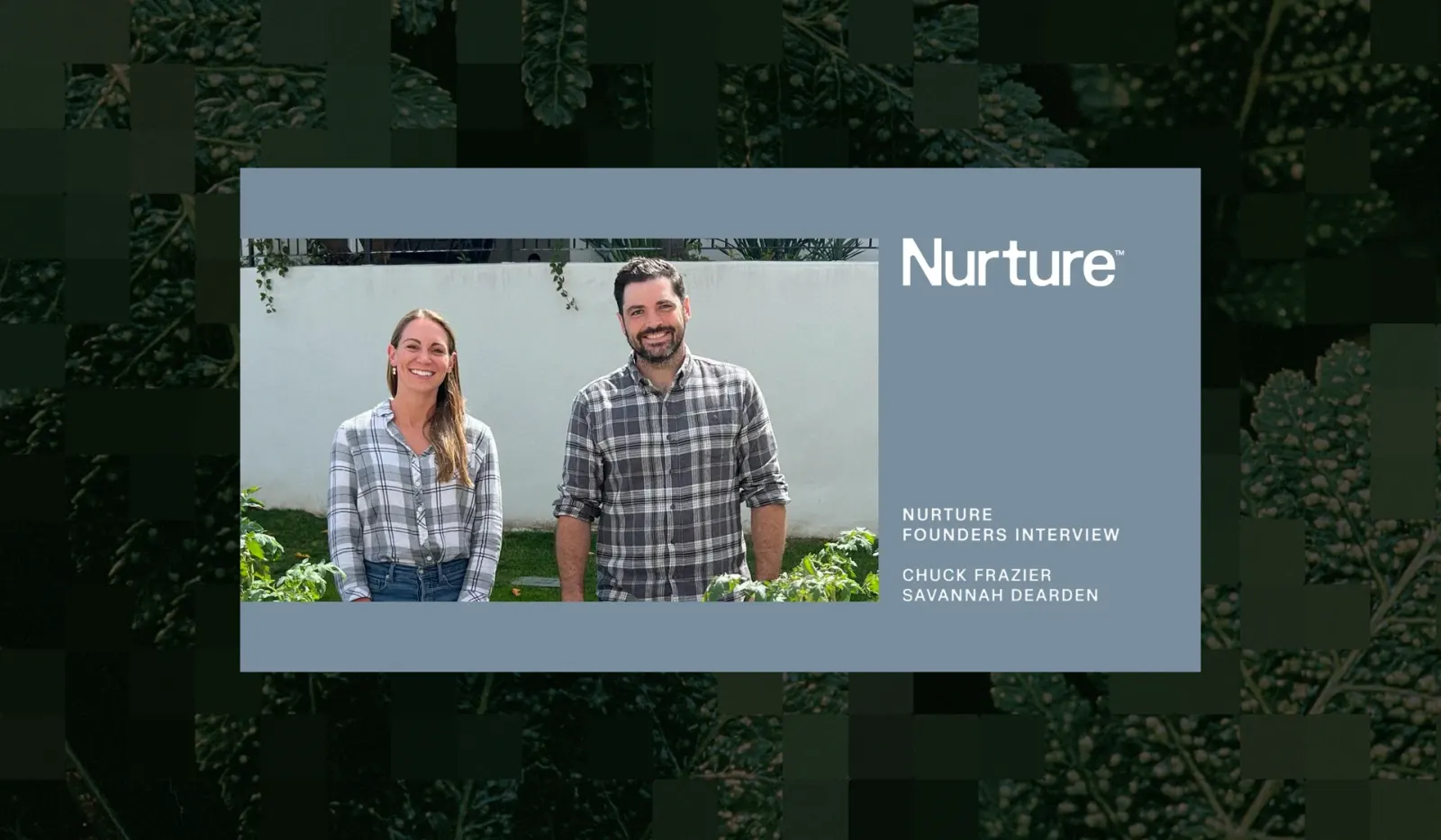
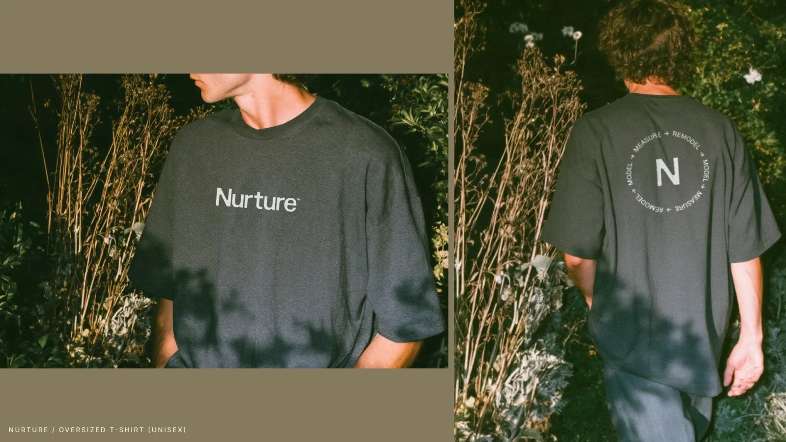
The brief was an identity for an epigenomics infrastructure company whose customers are biology companies and their scientists. Under After started with brand strategy and messaging alongside the founders, then moved into identity, imagery, and the Astro-built website, where cursor movement triggers the averaging and hover states reveal the platform's benefits. Nurture, the company brand, and Tellus, the platform, share one palette and Marund, a multi-axis neo-grotesque from 26A1 with a distinctive rounding system. A thirty-second trailer, posters, and apparel supported the launch.
Why it works
Coarse cells of averaged color read as measurement, which suits a company that reads the epigenome, and the studio gets there without leaning on helixes or glowing molecules. Because the system accepts any photograph, the brand can keep widening as the field does. Marund's rounded details soften the rigor of the grid, and the deliberately imperfect drawings give scientists a human presence. Together they feel credible without feeling clinical or like science fiction.
Applications
Logo
Color


Images and video from underafter.com, by Under After.