The Brand Monograph
NYC Literary Action Coalition brand identity by Order
↗Order gives the NYC Literary Action Coalition a symbol that reads at a glance: a pen and an exclamation point drawn as one shape. It's a small piece of visual wordplay, but it holds the coalition's whole purpose, writing as a call to act.
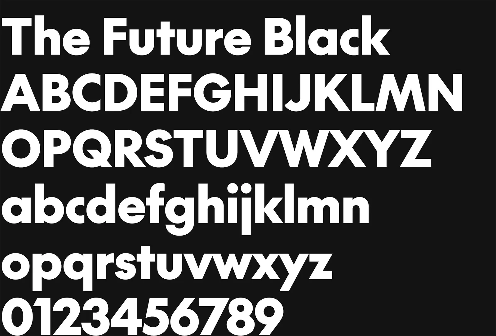
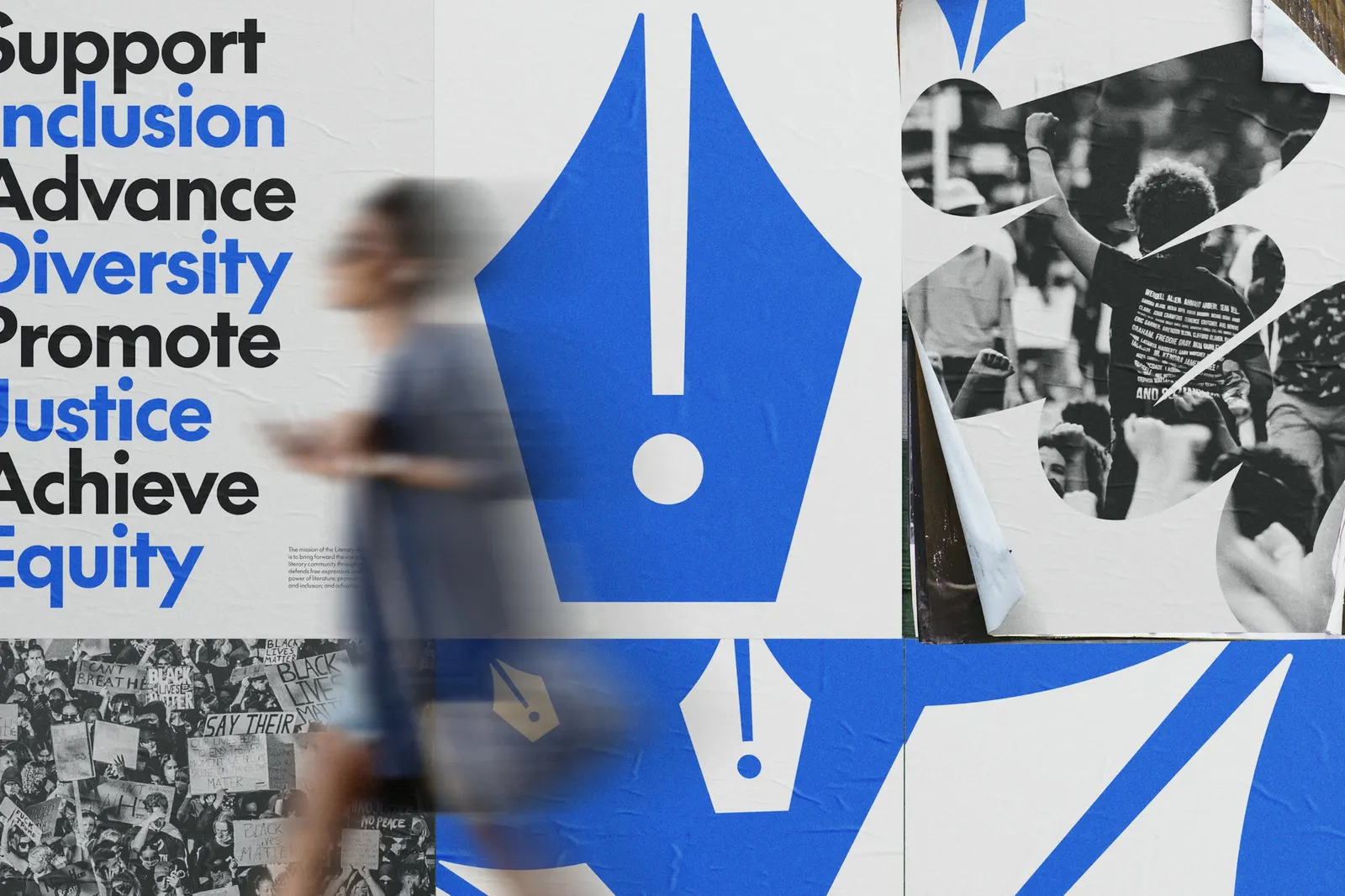
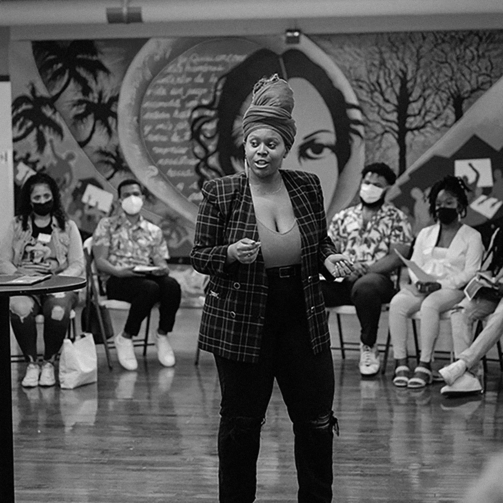
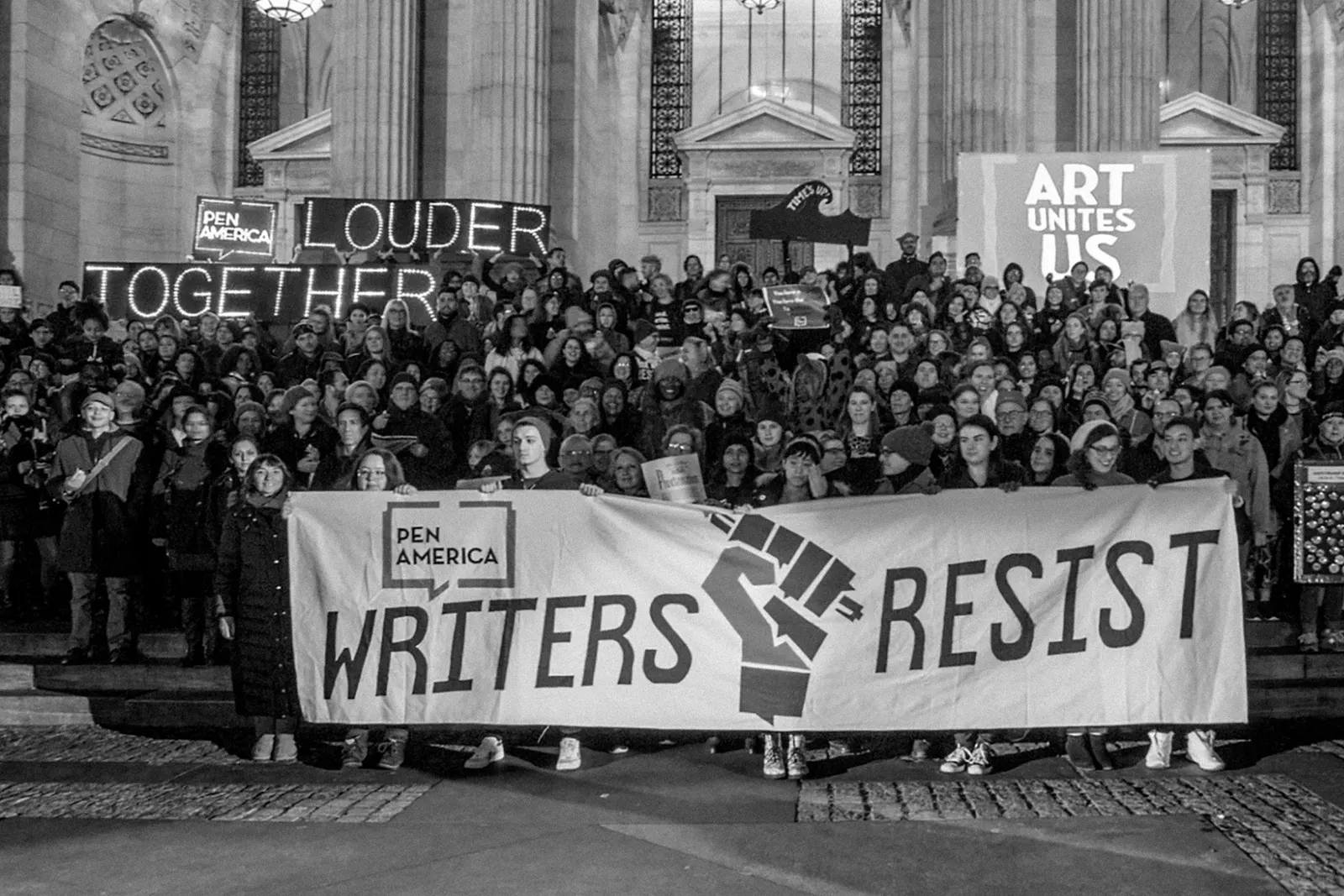
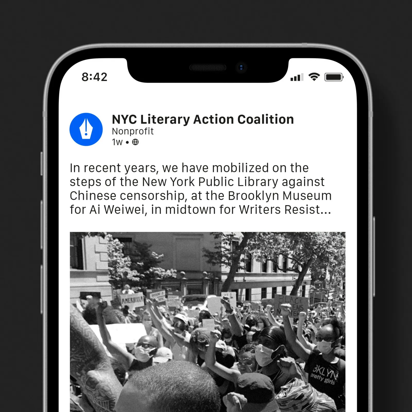
The coalition grew out of PEN America's network of more than 30 literary organizations, so the identity had to work for bookstores, publishers, campus groups, performance spaces, and individual writers alike. Working with designer Garrett Corcoran, Order paired the mark with The Future from Klim Type Foundry, a geometric typeface that picks up the symbol's clean construction. Layouts and iconography stay deliberately plain, and the system stretches from internal materials to public campaigns and event identities.
Why it works
The exclamation point is the right kind of loud. It signals urgency without leaning on familiar protest imagery, and the pen keeps it rooted in writing. Because the mark is a single geometric form, it can sit beside dozens of partner logos without competing with any of them. The Future adds to that neutrality. It feels modern and direct, a clear contrast to the bookish serifs many literary brands default to, which suits a group built around acting rather than reverence.
Logo

Typography
Color

Applications

Images and video from order.design, by Order.