The Brand Monograph
Parla brand identity by Pentagram
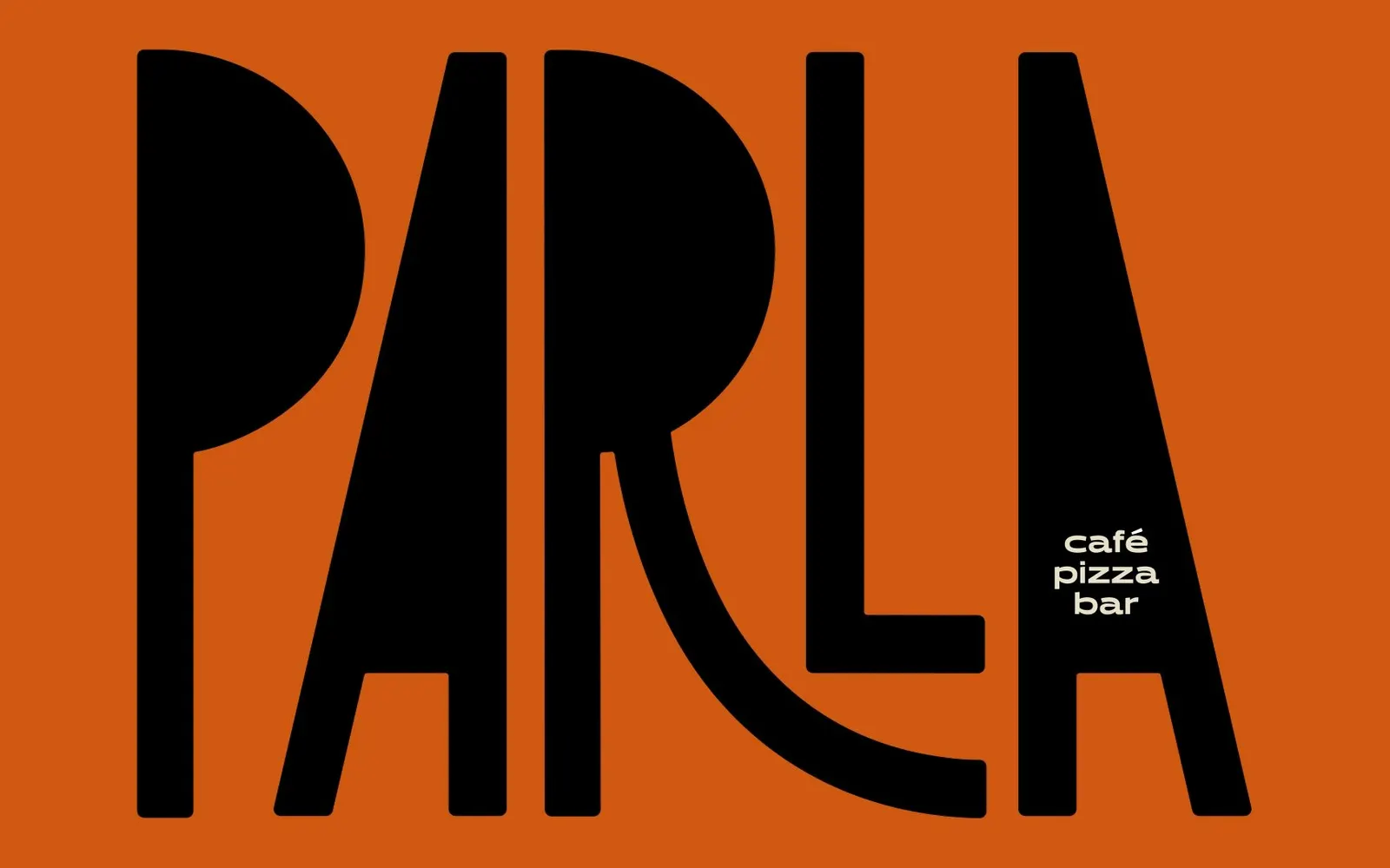
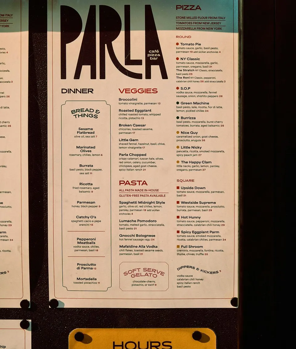
↗Pentagram's identity for Parla turns a name that means "speak" into something you can see. The wordmark's tightly packed letters tilt toward one another like neighbors at a shared table, and the rest of the system keeps up the chatter.
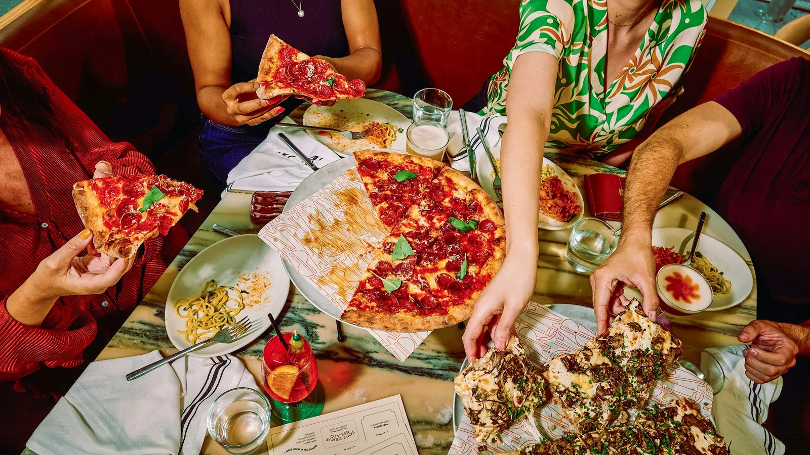
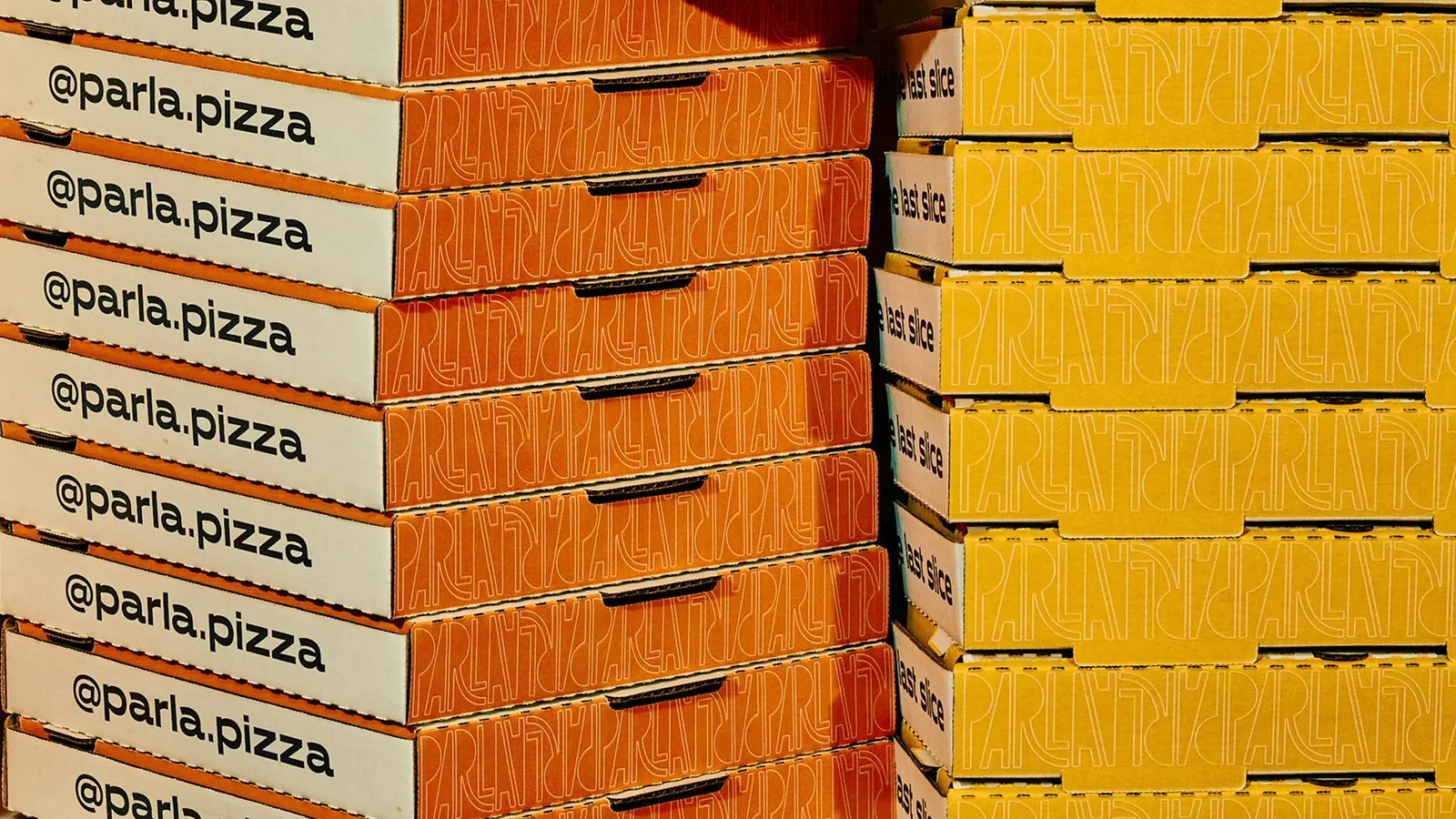
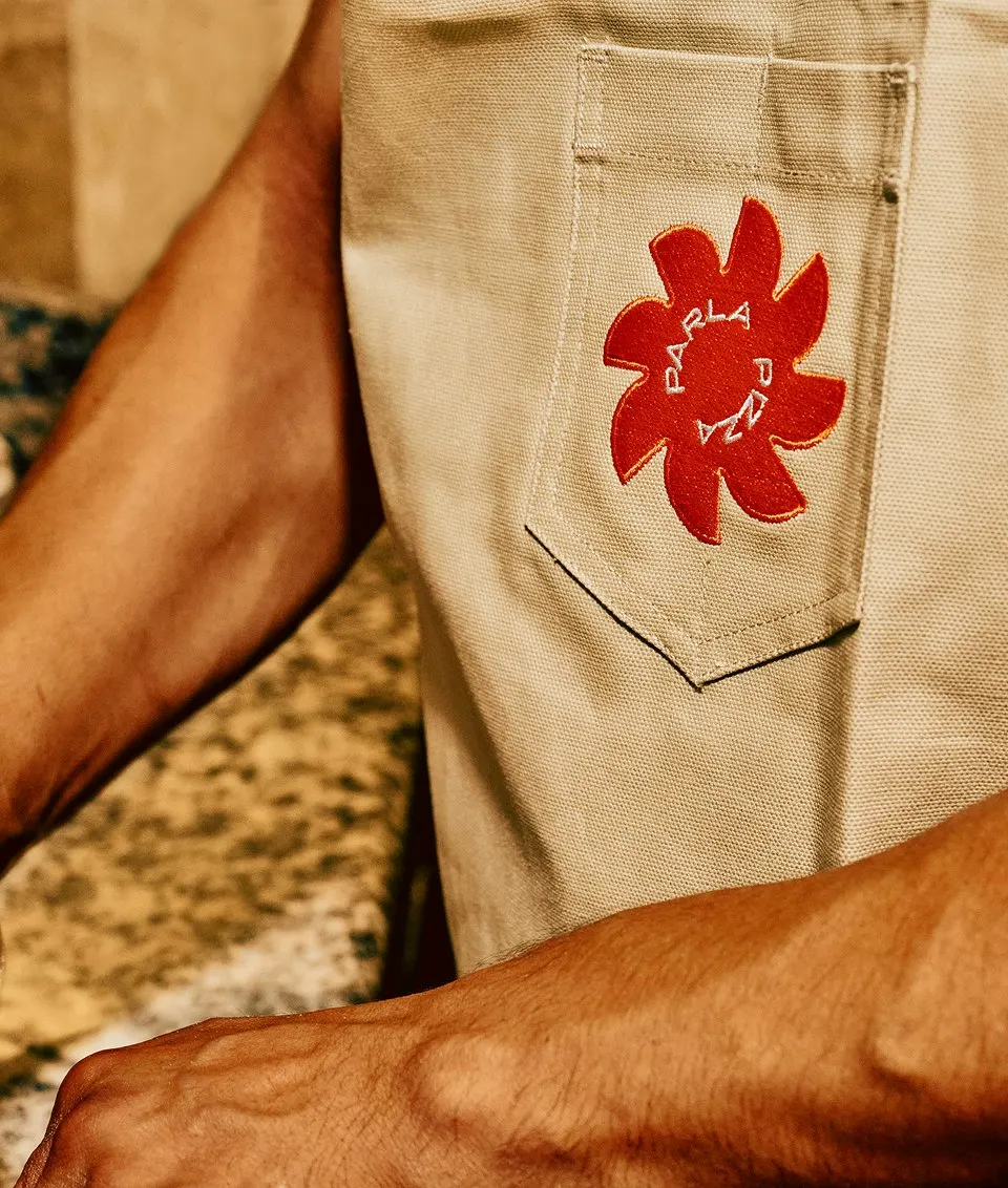
For Corner Table Restaurants, the group behind The Smith, Pentagram drew on 1960s and 70s Italian graphics. Emily Oberman, Greg Morrison, Mira Khandpur, Mira Steinzor, Renee Freiha, and Samantha Infante built a family of marks around the wordmark: two facing Ps, a sunburst, a spinning "pizza Parla" roundel, and wavy stripes that read as spaghetti. Halcyon and Area set the type, and circles and squares echo the pizzas on menu posters, box stickers, and coasters. Louise Palmberg photographed the work.
Why it works
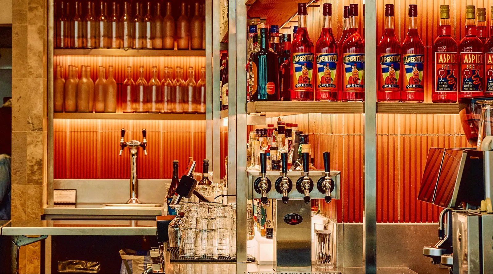
The wordmark carries the pitch on its own: leaning letters say "come talk," which is exactly what a neighborhood spot built around one big table wants to say. The retro Italian references could have slid into red-checked cliché, but clean geometric sans serifs keep them current. The system also earns its keep. Shapes map to real products, so stickers can sort pizzas by color at a glance, and tomato orange and squash yellow tables carry the brand onto a busy sidewalk, where it stands apart from the neighboring restaurants.
Logo
Typography
Applications
Images and video from pentagram.com, by Pentagram.