The Brand Monograph
RSPCA brand identity by JKR
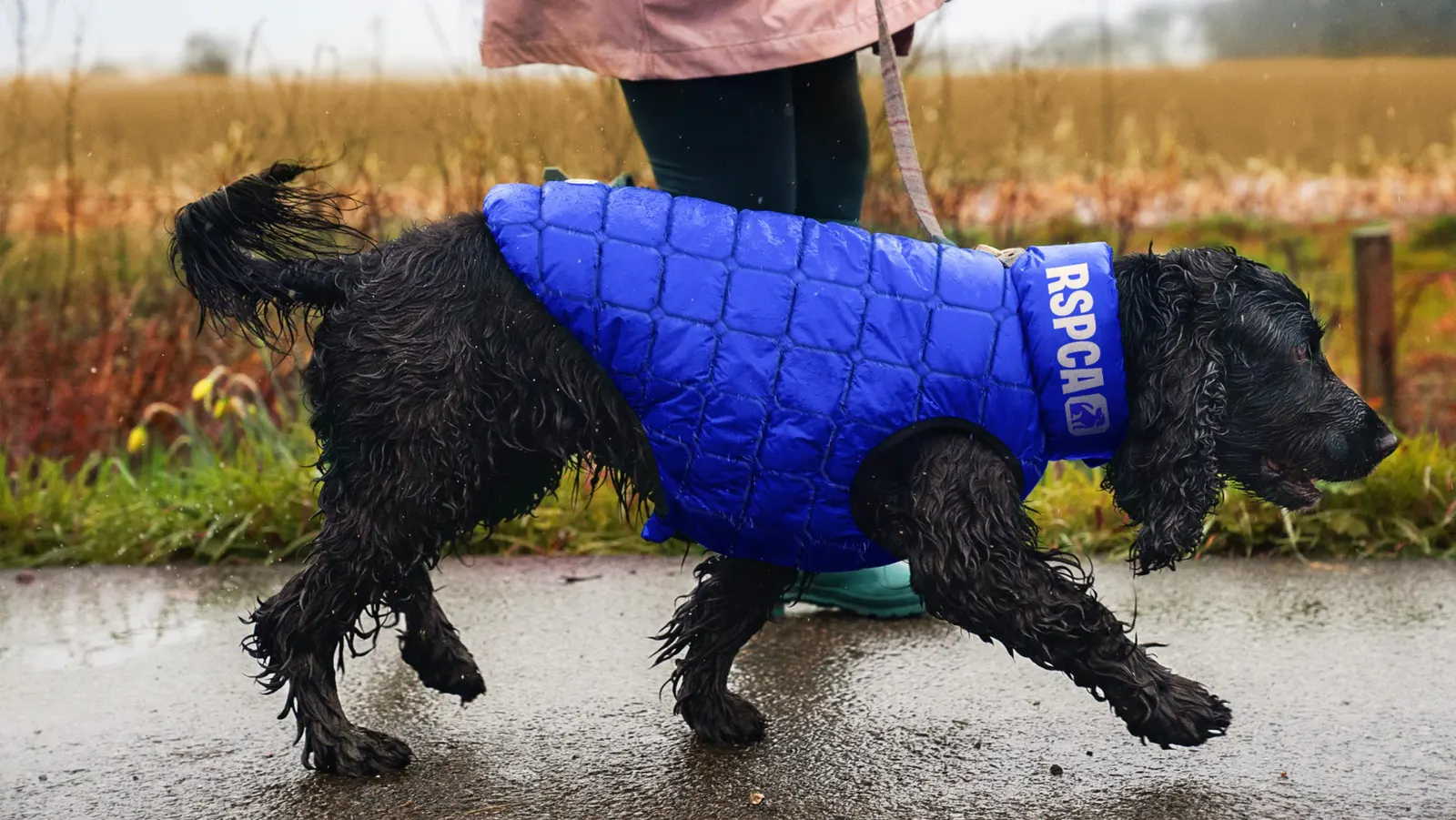
↗Few charity rebrands have to do as much as this one. JKR's work for the RSPCA stands out because it treats the brand as a story about a country, not just a rescue organization people think they already understand.
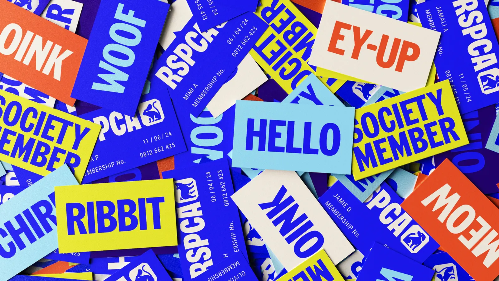
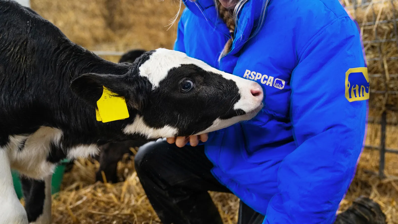
The brief was to explain everything the RSPCA does and why it matters, while setting a direction for the next 200 years. The studio answered with an idea that moves attention beyond cats and dogs to people, a wider range of animals, and the communities around them. The aim is an identity that reflects UK culture and gives people a reason to join in. Typography carries much of that ambition. JKR developed it with Studio DRAMA, giving the brand a voice with enough range to speak across all of it.
Why it works
The smartest move is choosing a collective idea over a sympathetic one. Animal welfare communications often lean on pets and emotional appeal, and JKR gives the RSPCA a position built on participation instead. That suits an audience far wider than pet owners. Bringing in Studio DRAMA for typography also shows where the identity does its heavy lifting. A distinctive typographic voice can stay recognizable across everything from campaigns to frontline communications, which a charity of this scale needs.
Applications
Logo
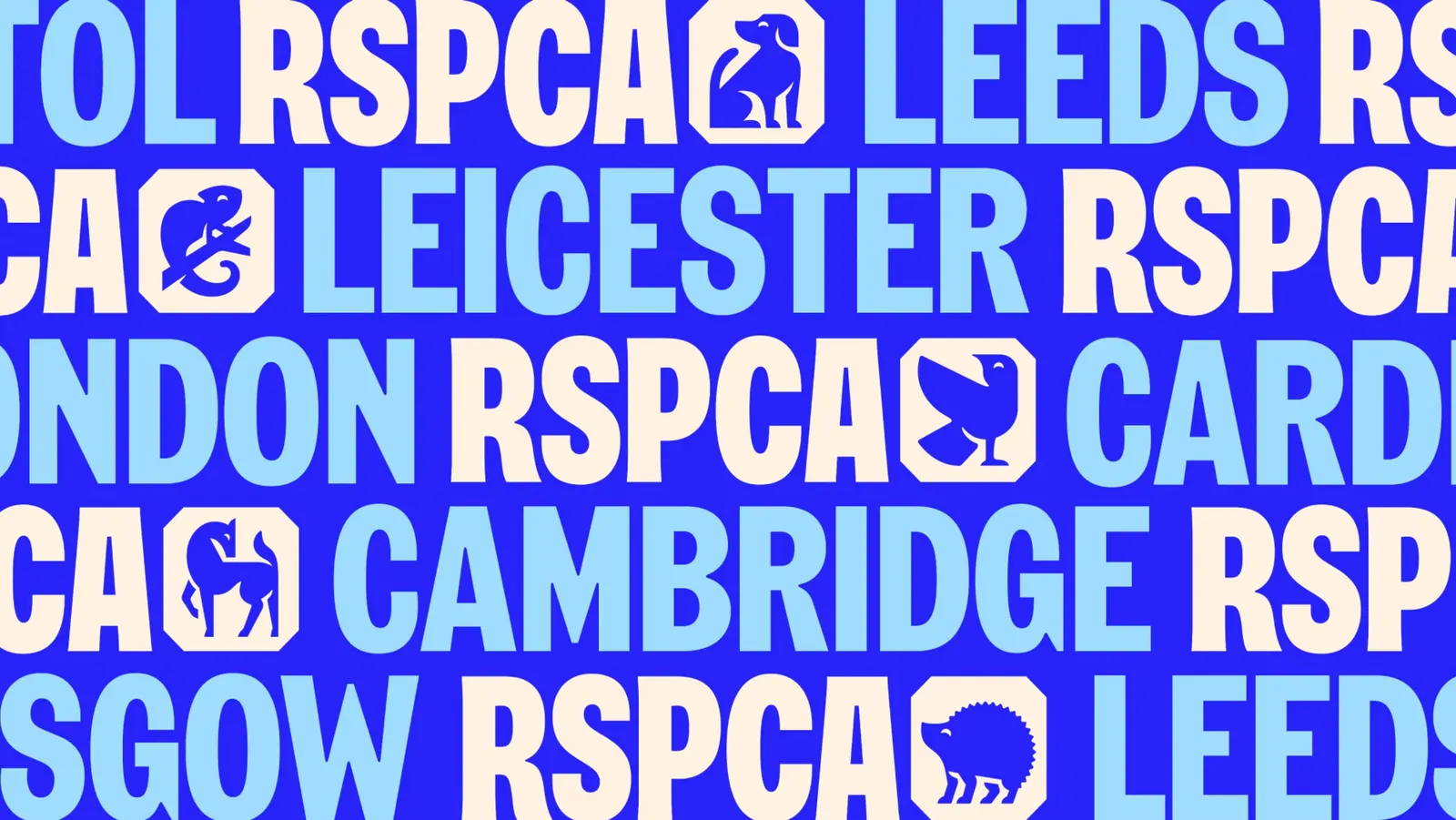

Typography
Images and video from jkrglobal.com, by JKR.