 The Brand Monograph
Shop brand identity by Porto Rocha
↗Shop is used by more than 20 million people a month, yet it was still read as a utility, something you open to check on a delivery. Porto Rocha's 2021 identity work gives the app the confidence of a place you'd actually browse. The studio kept the logo and Shop Purple and built outward from them instead of starting over.
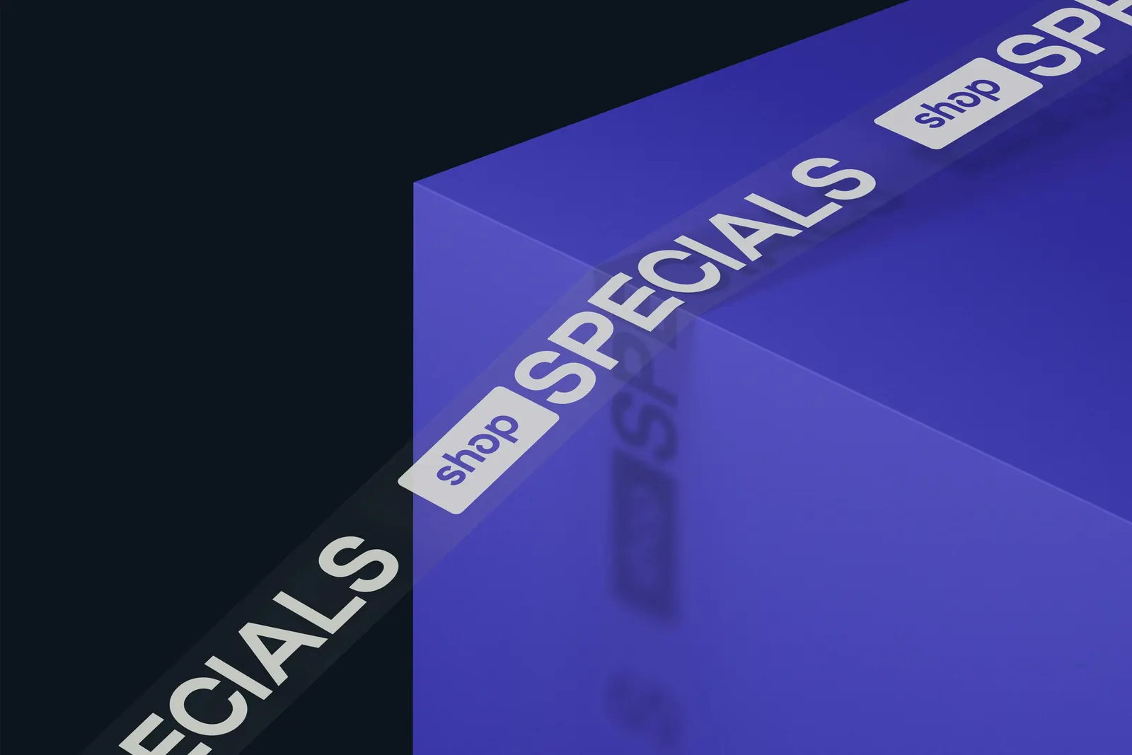
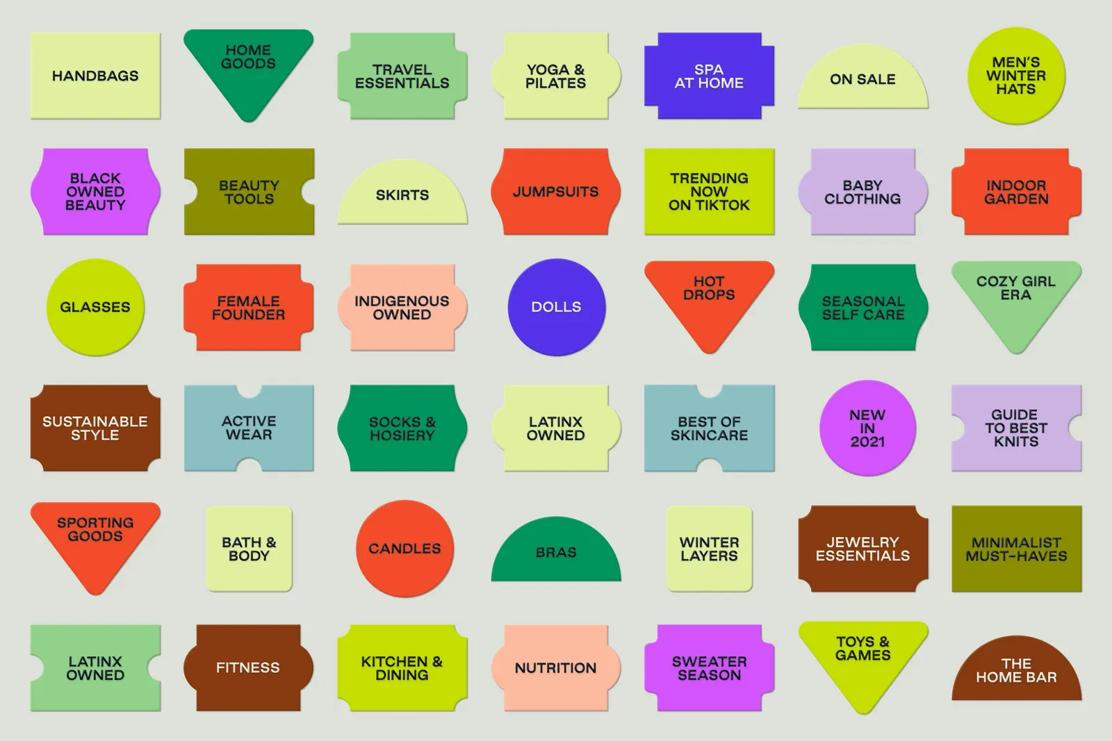
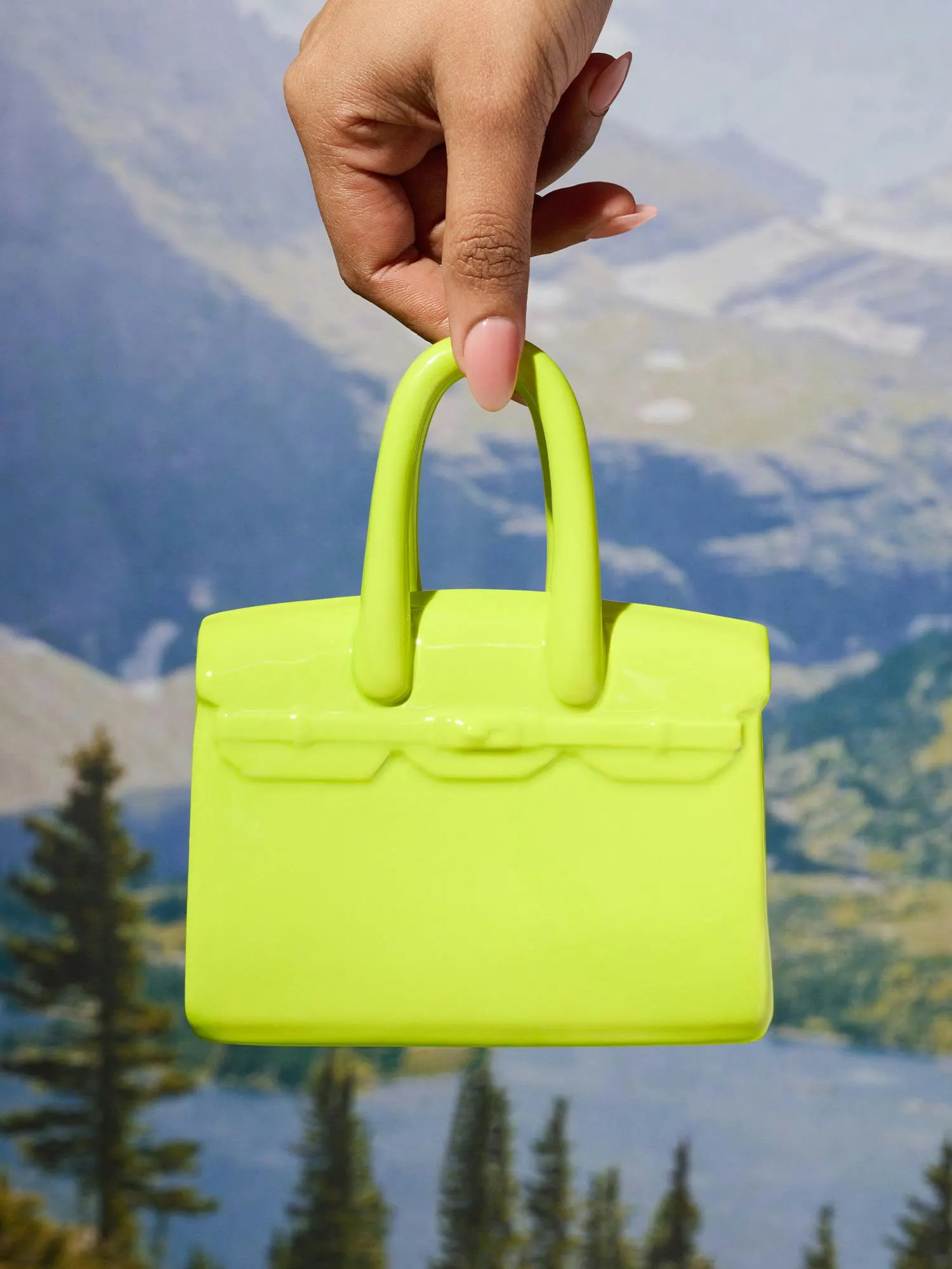
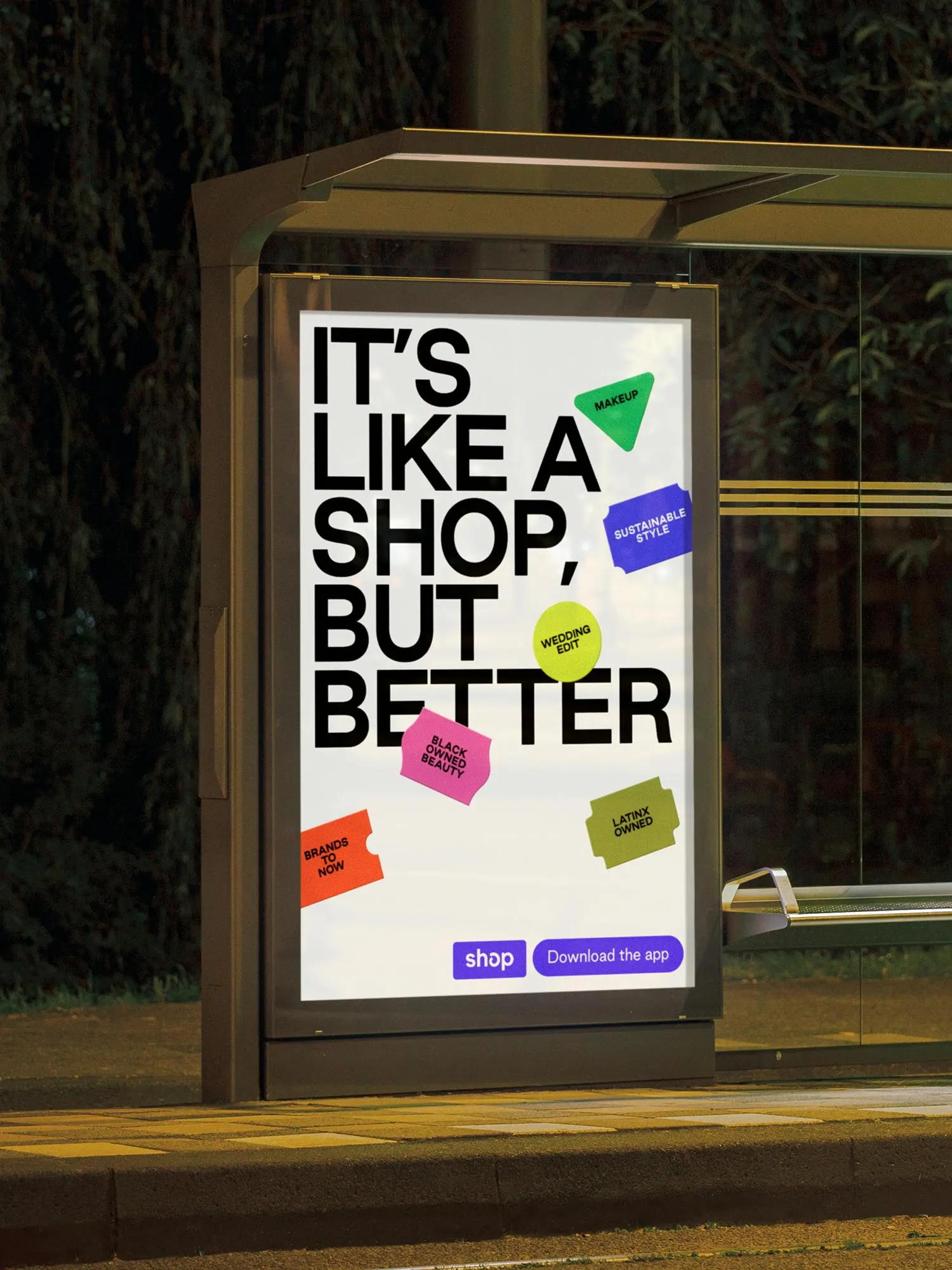
The craft shows in the details. The "o" in the wordmark was redrawn for better balance at any size. Good Sans, developed with Good Type Foundry, holds up in small product copy and in loud all-caps headlines. A wider palette, anchored by off-white and warm black, gives merchants and products room to lead. Price-tag-style stickers sit on top of imagery to carry secondary details. Photography with Mari Juliano puts buyers and merchants in frame and turns products into staged subjects or close-up studies. The design team included Felipe Rocha and Leo Porto, with motion by Thales Muniz and Young Woo.
Why it works
The smartest decision is what Porto Rocha left alone. Keeping the purple preserves recognition at the moment of checkout, while the off-white and warm black give merchant color and photography a calm backdrop. Shopping apps often look generic or shout, and this one does neither. The stickers do the most work. They borrow the familiar language of retail price tags, so they feel native to commerce, and they give Shop a signature gesture that never competes with the product. Good Sans gives the brand a voice of its own.
Logo
Typography
Applications
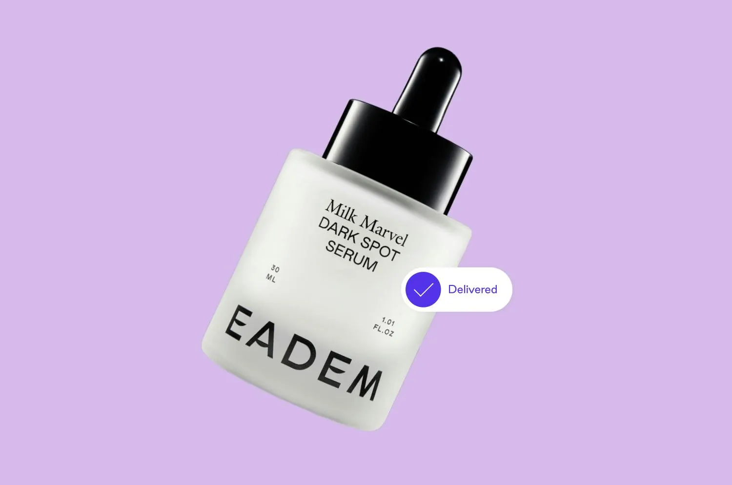

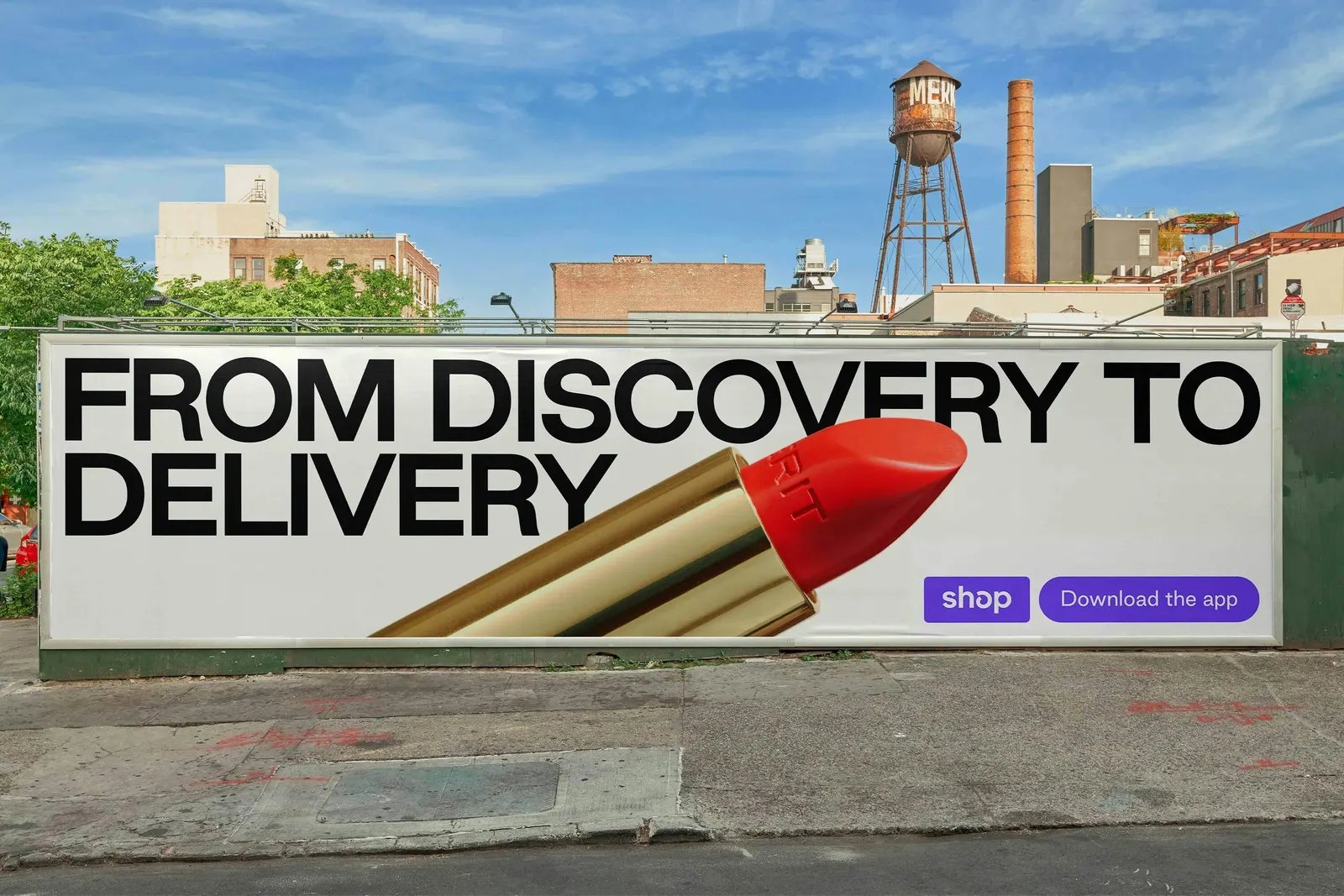
Images and video from portorocha.com, by Porto Rocha.

