The Brand Monograph
L.A. Material brand identity by Hoodzpah
↗Hoodzpah gave L.A. Material an identity with the same slightly unruly charm as the city it covers. The independent outlet was started by Pulitzer Prize-winning journalists, veteran editors, and voices from LA entertainment and culture, and it publishes a daily newsletter and a weekly podcast. The studio handled strategy, creative direction, the core identity system, and podcast art, working alongside the L.A. Material team.
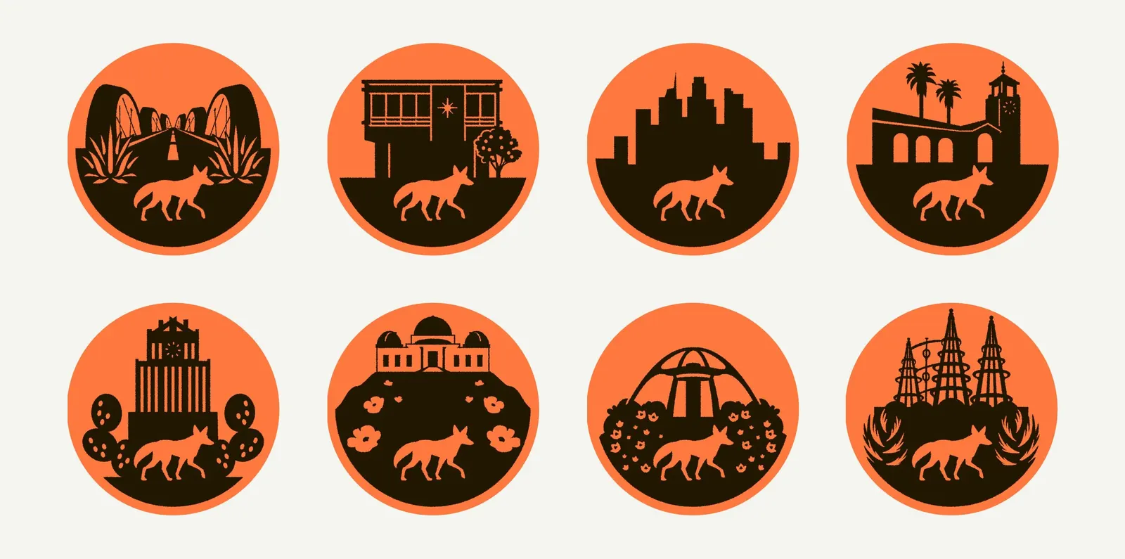
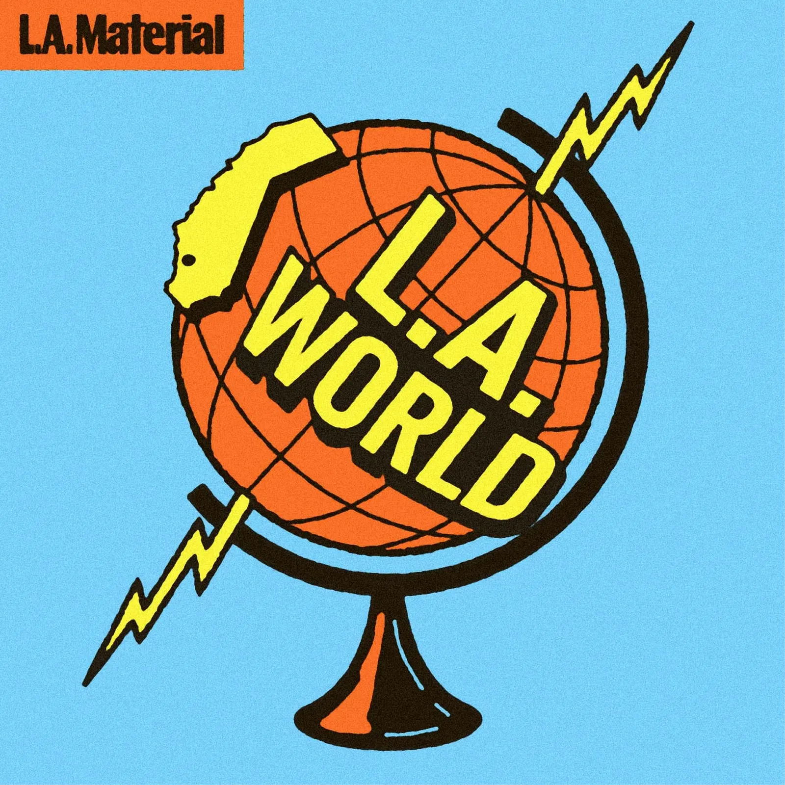
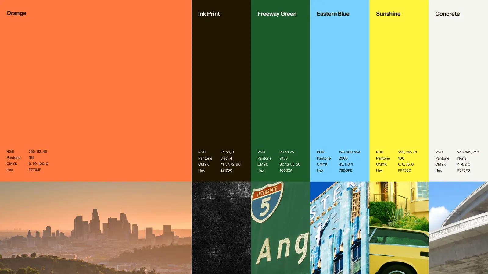
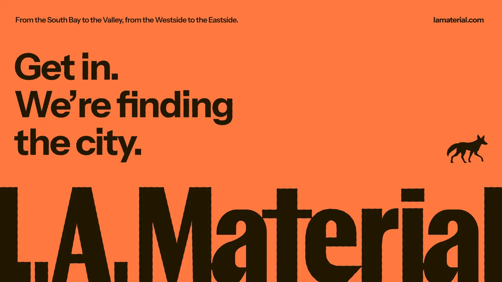
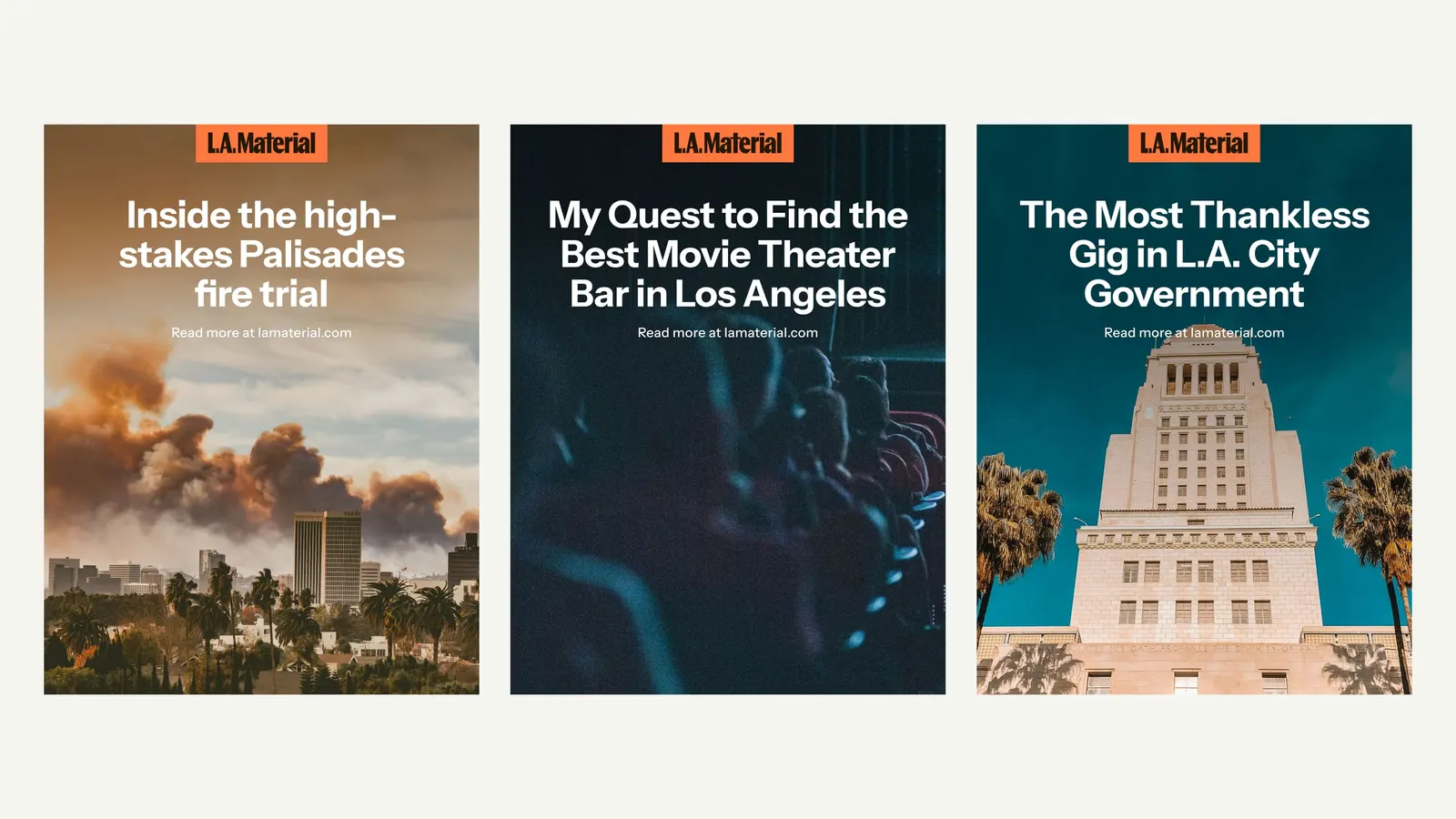
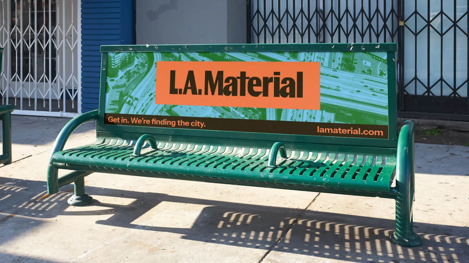
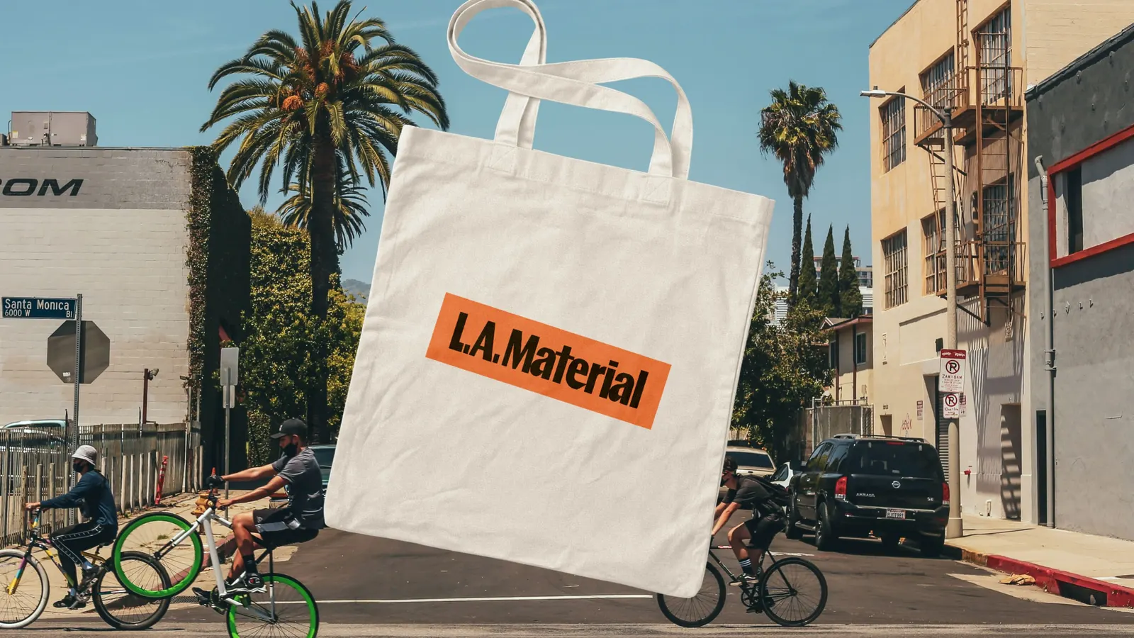
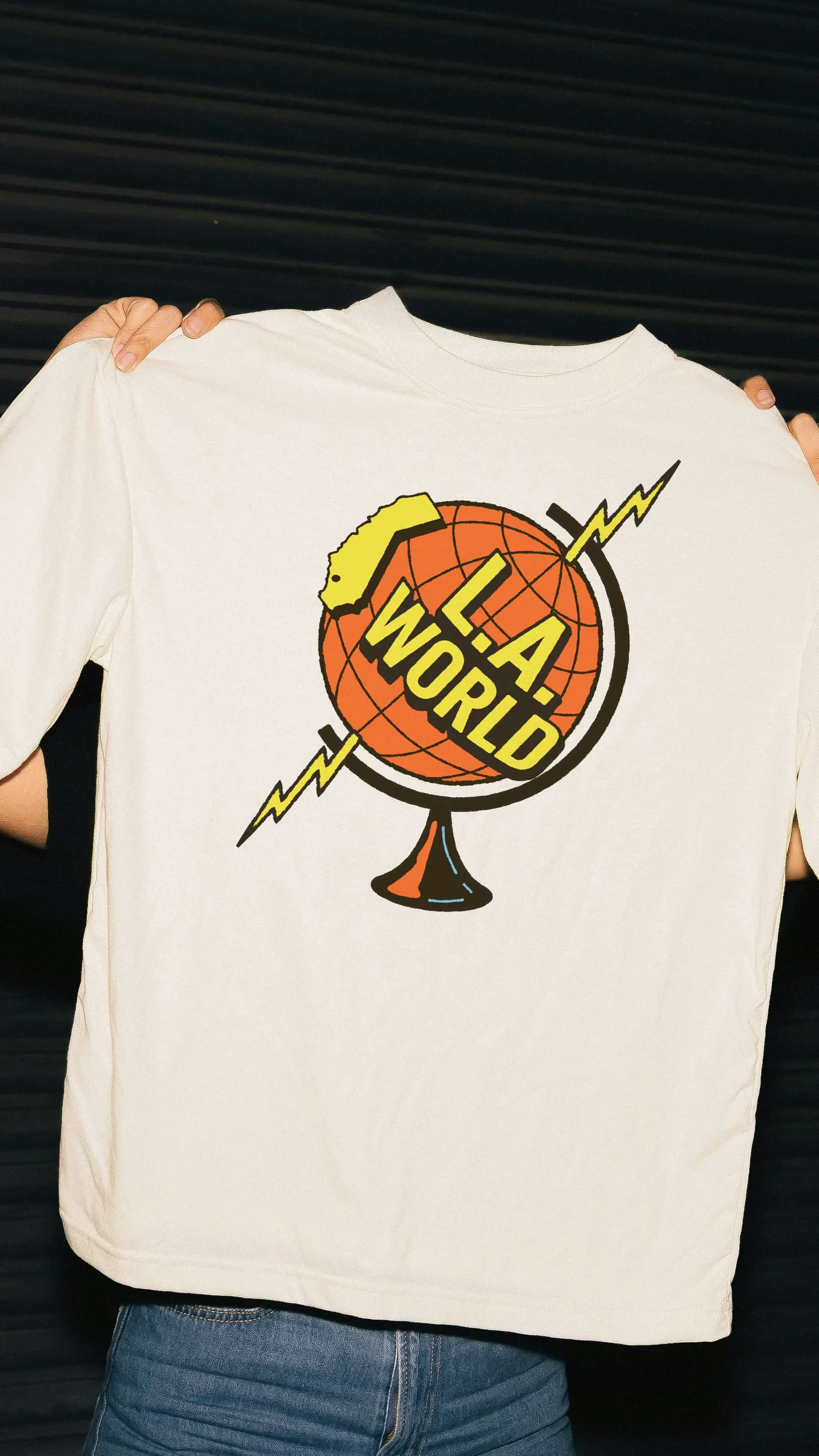
The centerpiece is a custom wordmark with chunky, slightly off-kilter letterforms, joined by a coyote mascot for avatars and small spaces. Because the publishing platform supports only Google Fonts, the studio paired Instrument Sans for headlines with Bitter for body copy. Blue, green, and orange replace the usual news-brand primaries, and a gradient map pushes that palette through photographs of the city. Location-specific coyote badges, a podcast cover, a bumper animation, and templates for quick-turn graphics complete the kit. Design came from Amy Hood, Jen Hood, Jose Sojo, and Zevy Blokh, with motion by Ethan Silva and Jose Sojo.
Why it works
Every piece of this identity has a clear job. The wordmark has enough personality to set the outlet apart from sober, traditional mastheads, and the coyote carries that personality into spaces where letters get too small to read. The palette steps out of a category crowded with red, blue, and yellow, while the gradient map ties very different photographs into one recognizable look. Pairing a sturdy sans with a slab serif turns a platform restriction into clear hierarchy, which suits readers skimming a daily newsletter.
Applications
Logo
Images and video from hoodzpahdesign.com, by Hoodzpah.