The Brand Monograph
Target: up&up brand identity by COLLINS
↗Private label usually means a compromise on the shelf, and COLLINS' work for Target's up&up pushes against that. The line has grown to $3 billion in sales and more than 2,000 products, and the studio gave it a look that feels considered rather than cheap.
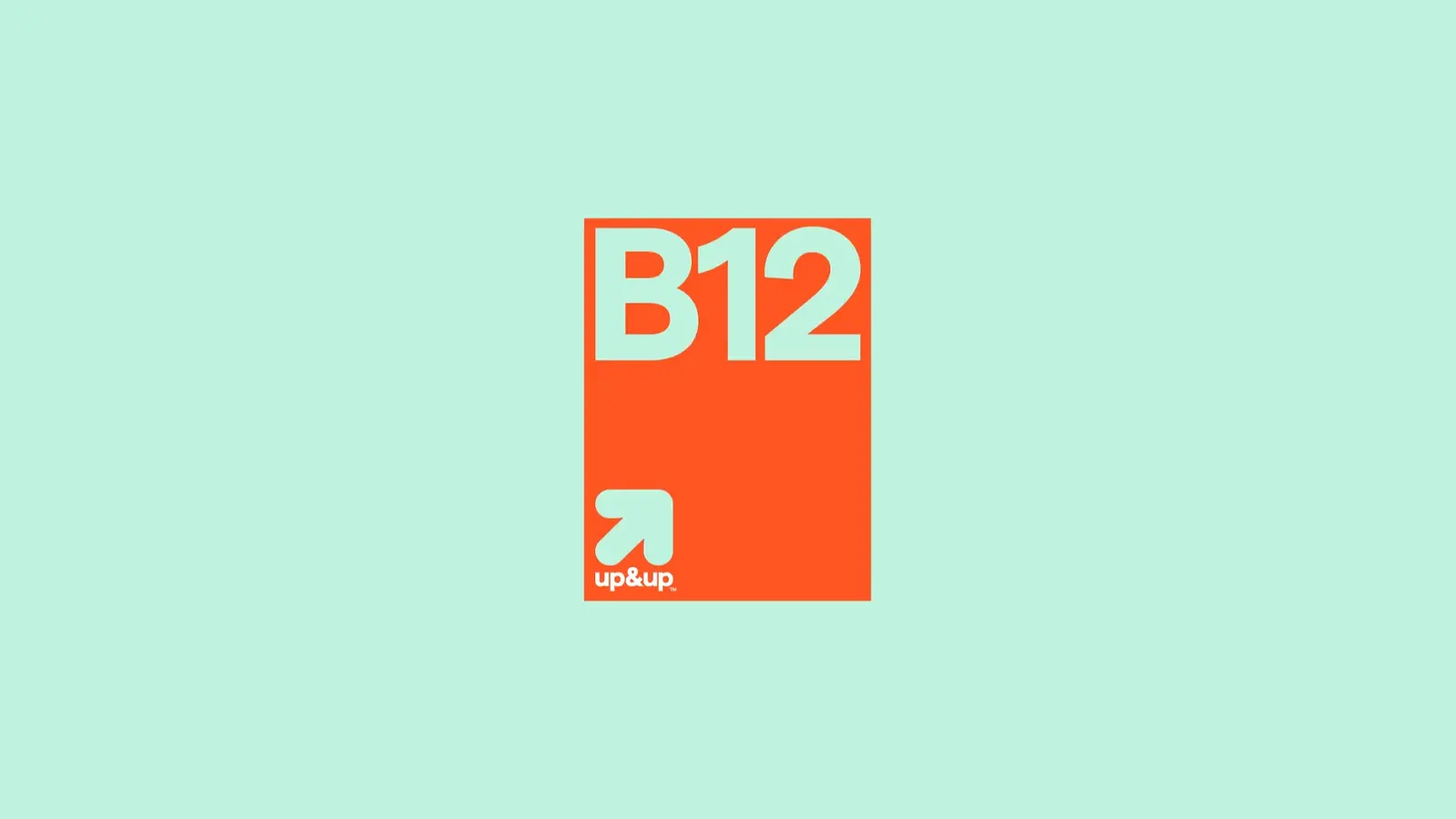
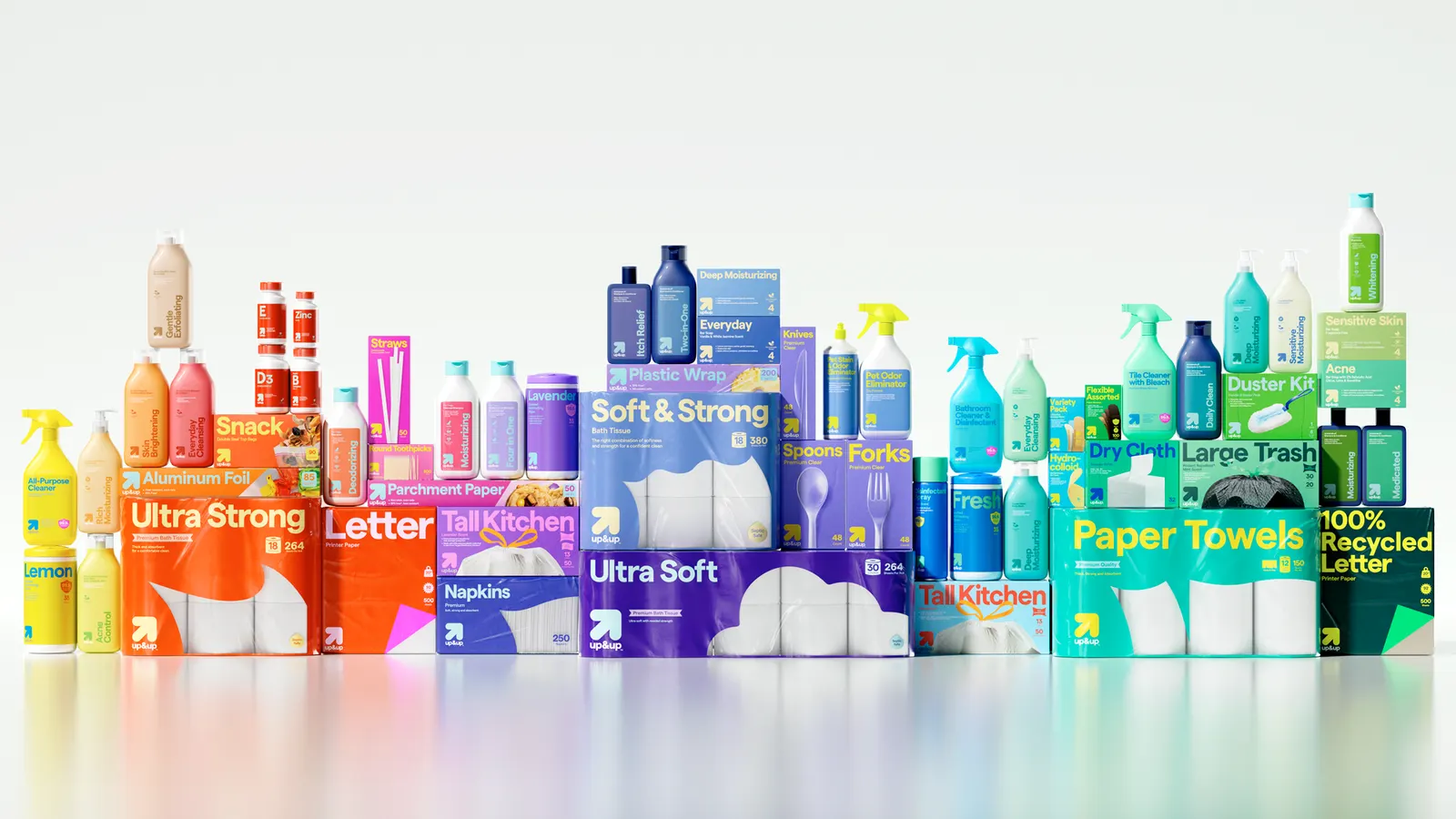
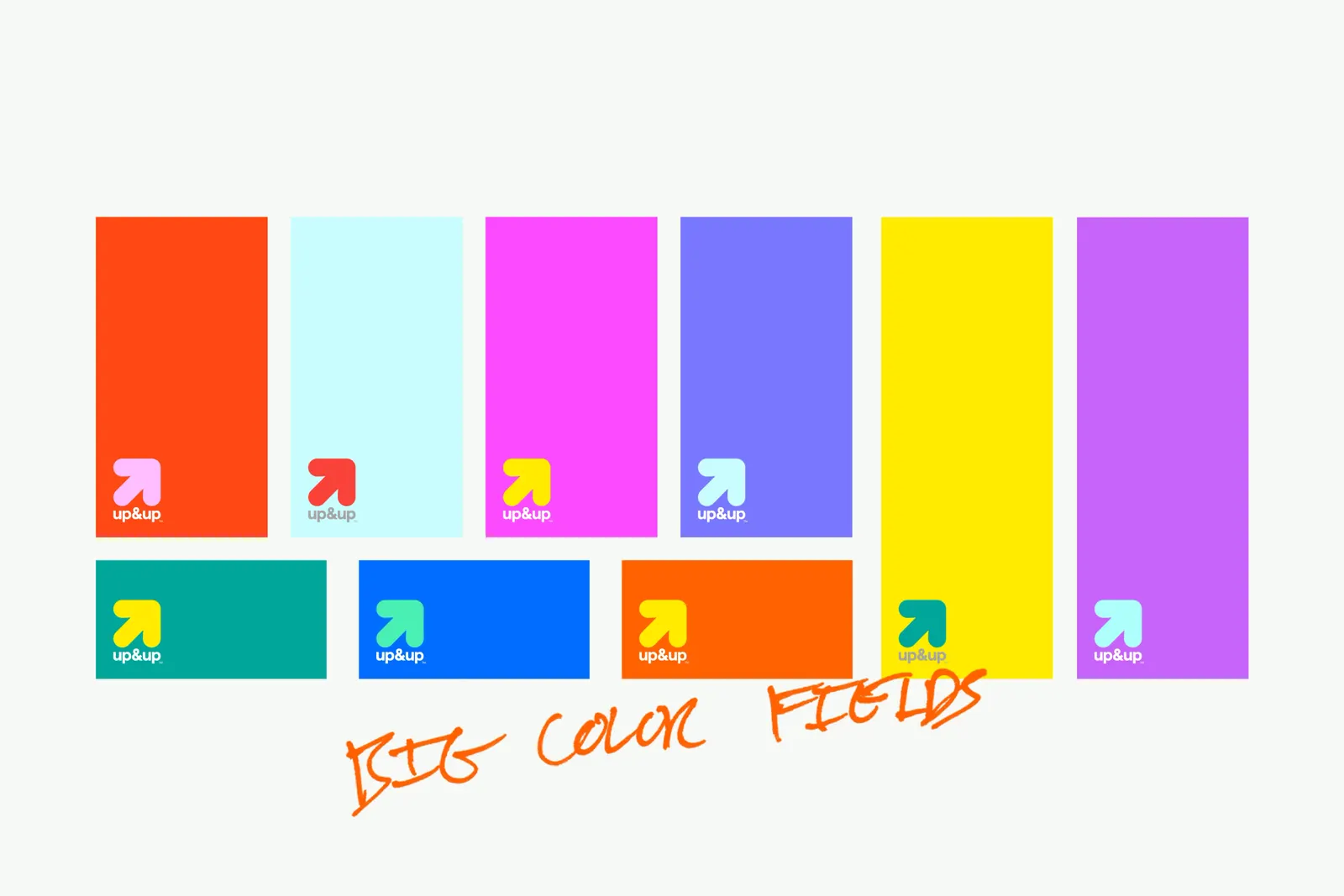
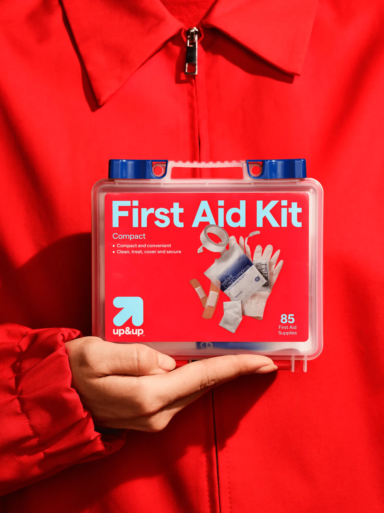
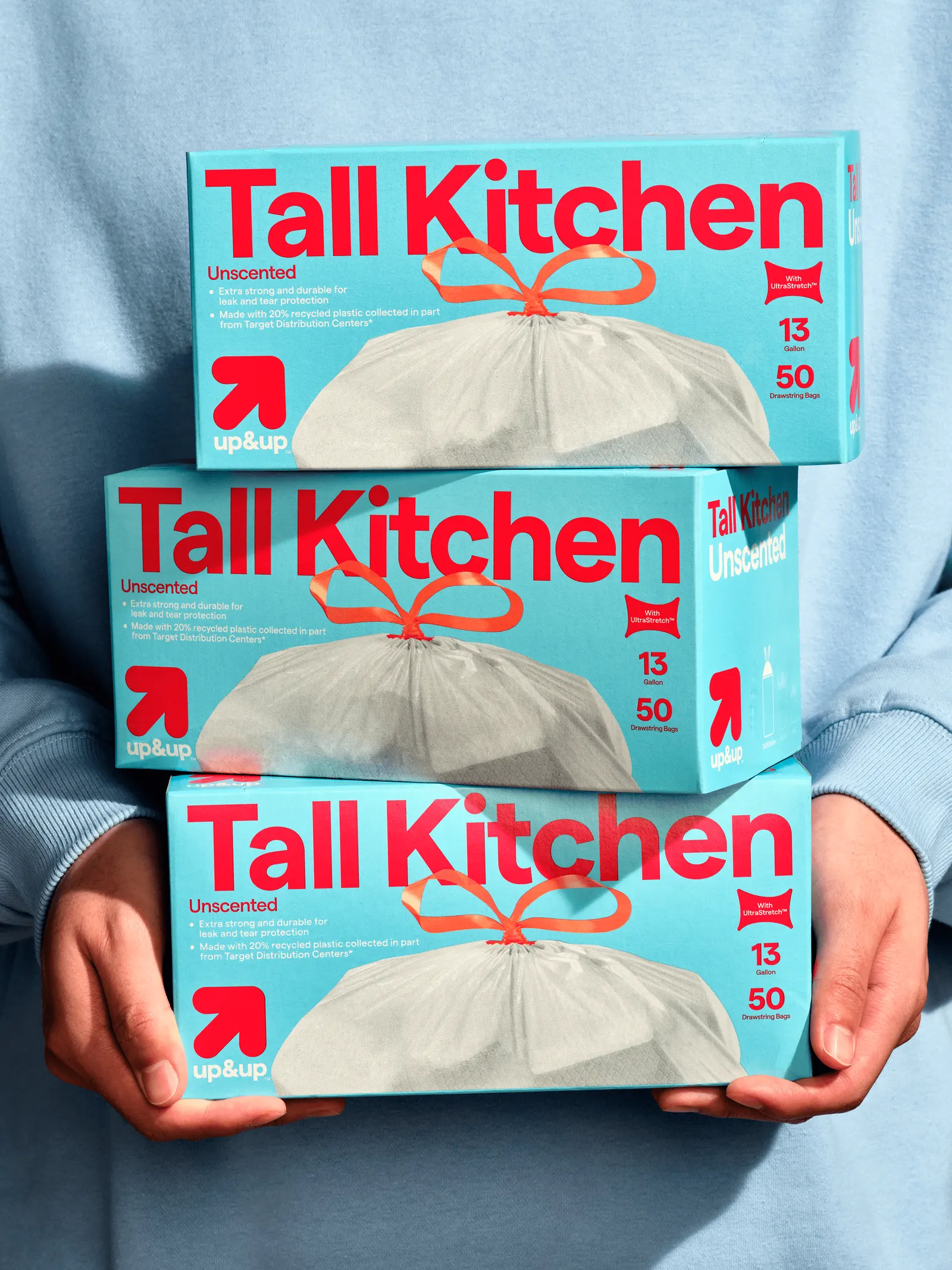
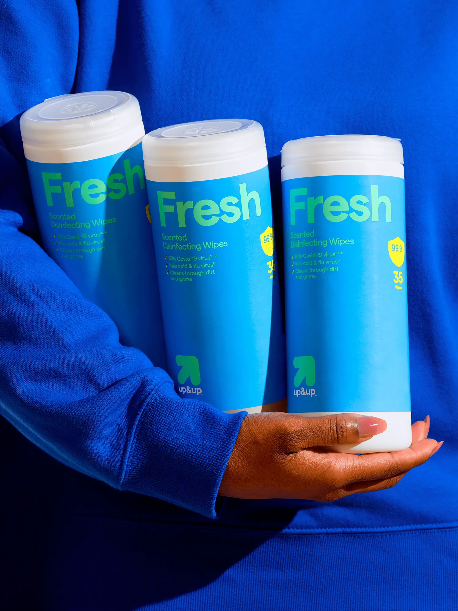
The brief arrived as Target reformulated about 40 percent of the range and moved into pet grooming, moving supplies, and oral care. COLLINS answered with a single system that flexes by category. Beauty leans polished, household goods stay plainspoken, and a new logotype holds the family together. Category palettes and bold color blocking help shoppers find their aisle, and occupational therapists weighed in on how items like lotion bottles and cleaners are held and used. Pedro Veneziano led design and 3D, with Mari Juliano on photography. The packaging also uses less plastic and more paper where possible.
Why it works
A brand that sits in dozens of aisles has to be read from a distance, and color blocking does that job well: shoppers recognize the category before they read a word. The studio also accepts that people judge value differently in each aisle, so a lotion can look refined while a cleaner stays direct, and the shared logotype keeps both recognizably up&up. The ergonomic work matters too. When a bottle is easier to hold, the savings are felt in the hand, not just at the register.
Logo
Applications
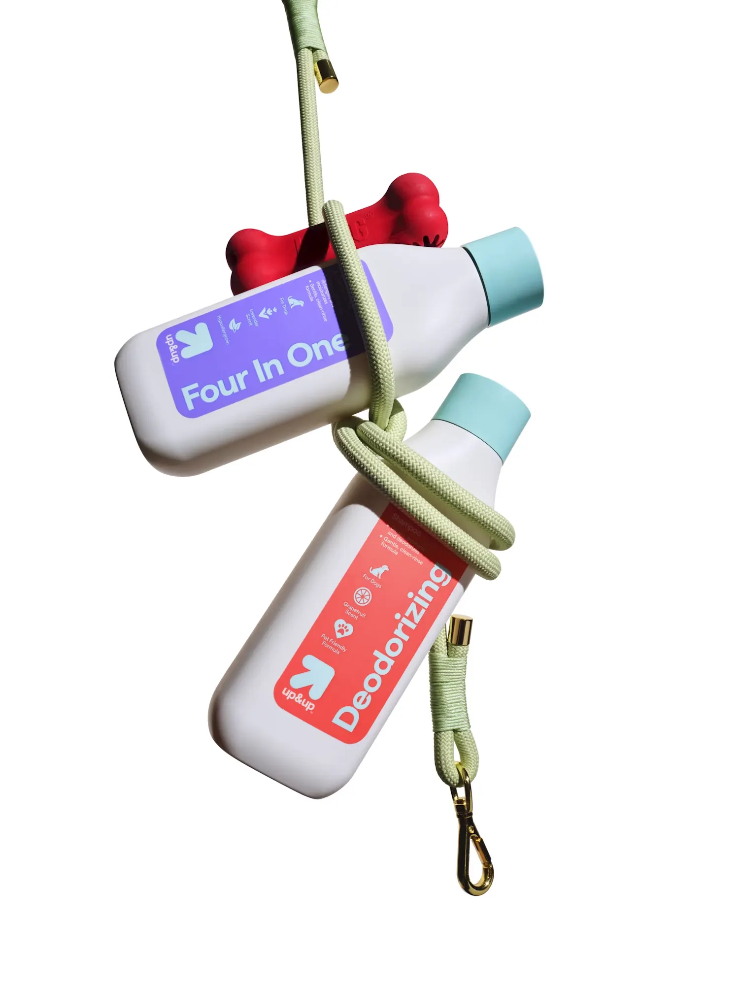
Images and video from wearecollins.com, by COLLINS.