The Brand Monograph
The Original Mavericks brand identity by Noë & Associates
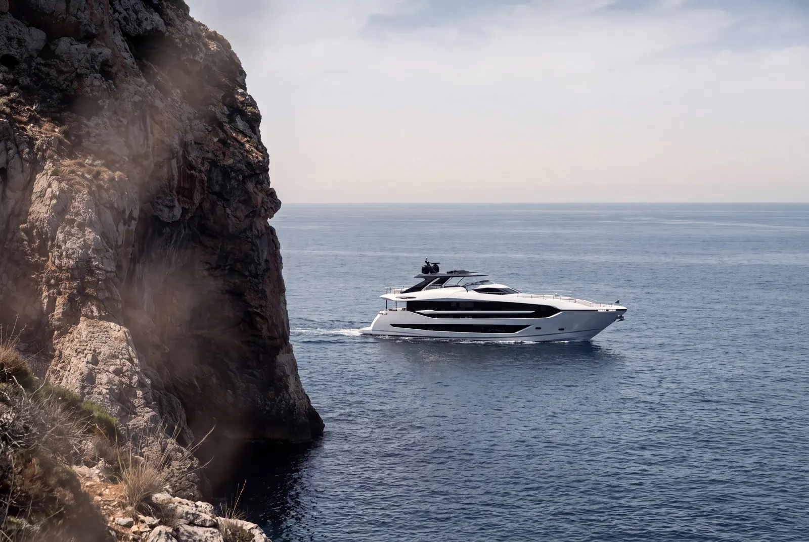
↗Most luxury motor yacht brands have drifted toward quiet, polished understatement. Sunseeker went the other way, and Noë & Associates made that choice look deliberate rather than loud for its own sake. New ownership and fresh investment opened the door to a reset, and the studio was asked to reposition a brand with nearly sixty years behind it. The work spans boat shows, advertising, merchandise, and digital, and it had to keep what made the company matter.
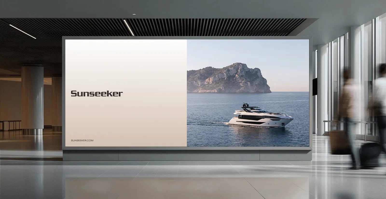
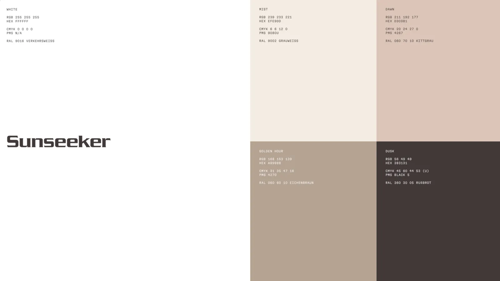
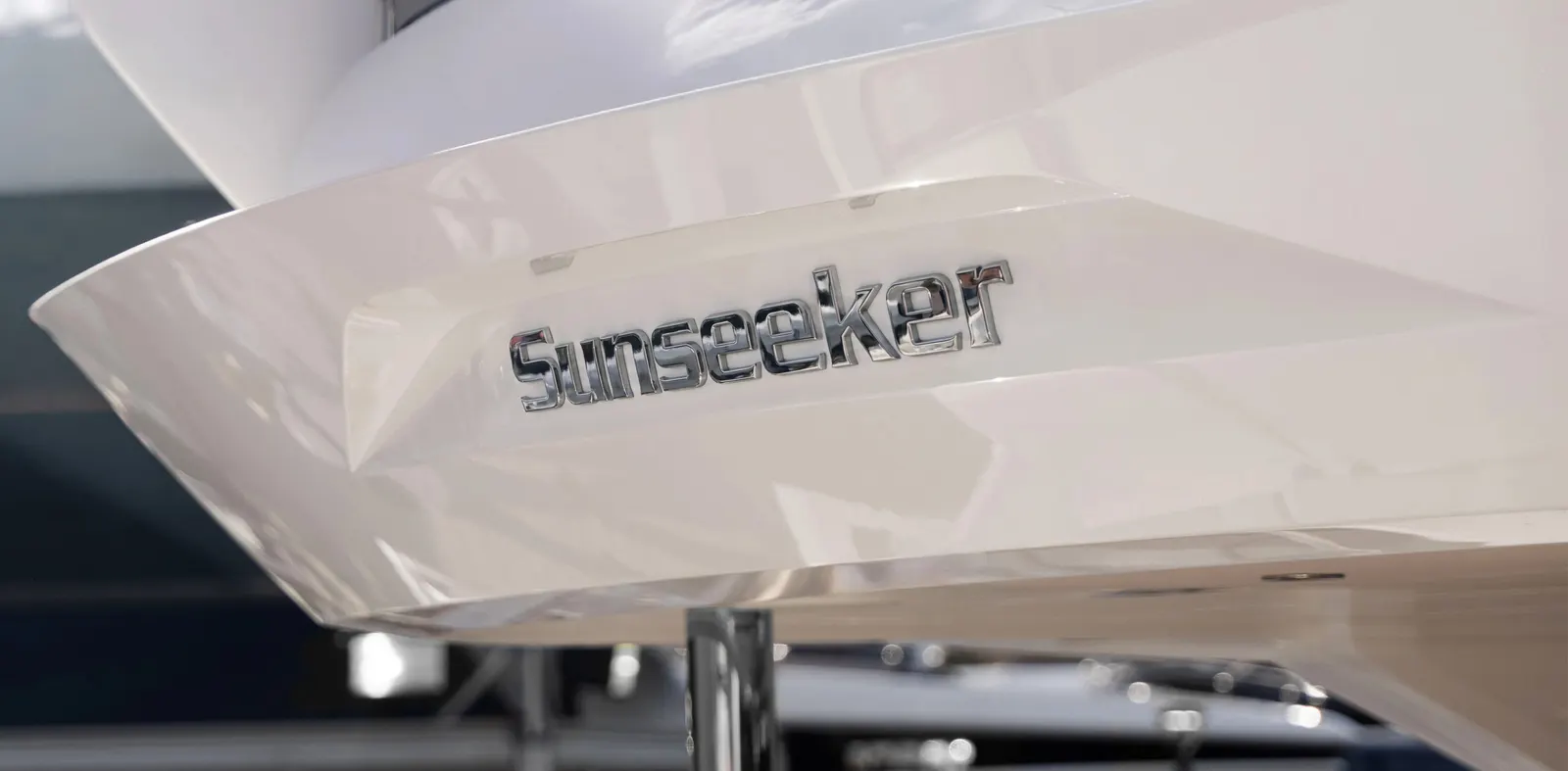
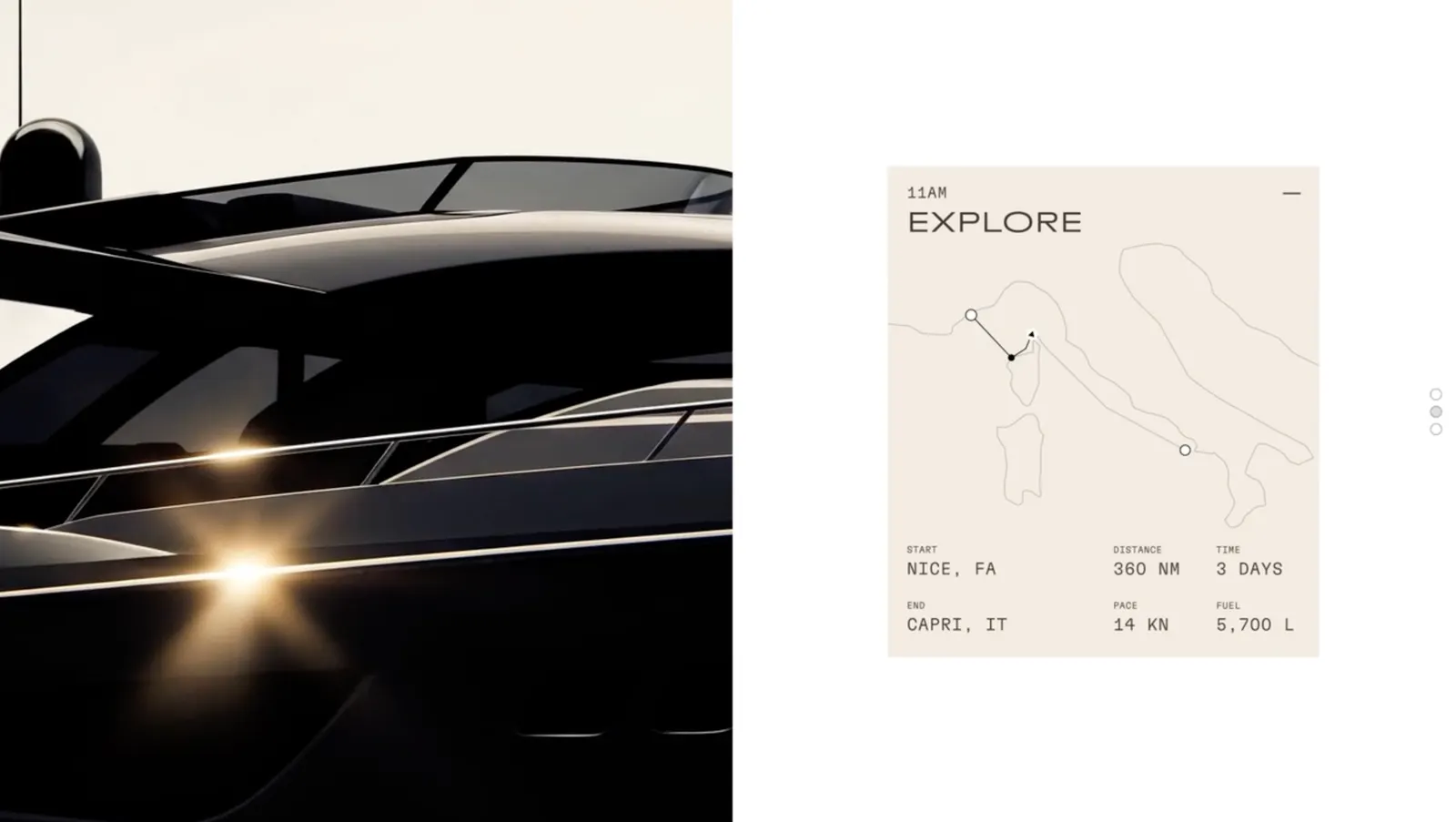
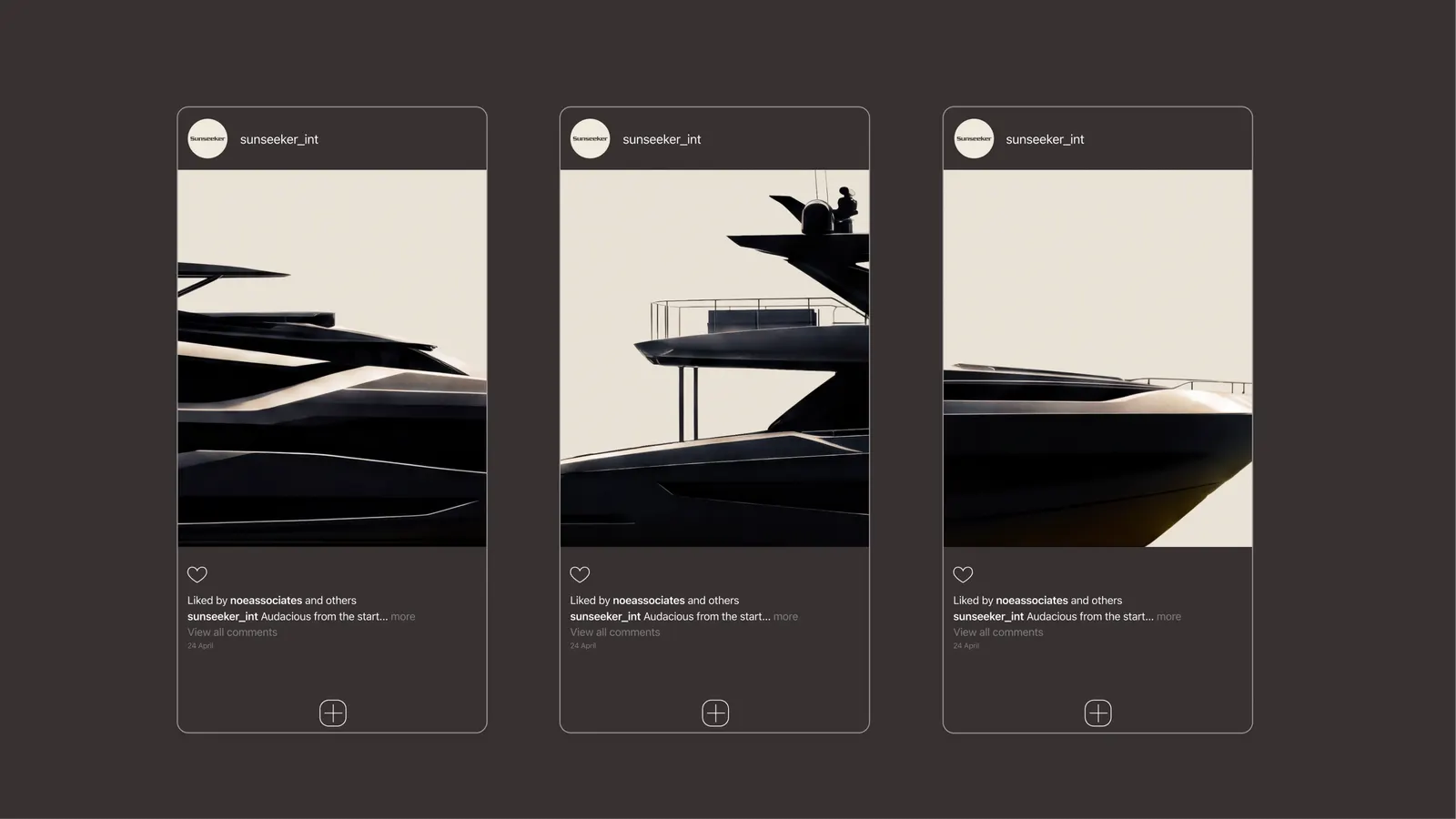
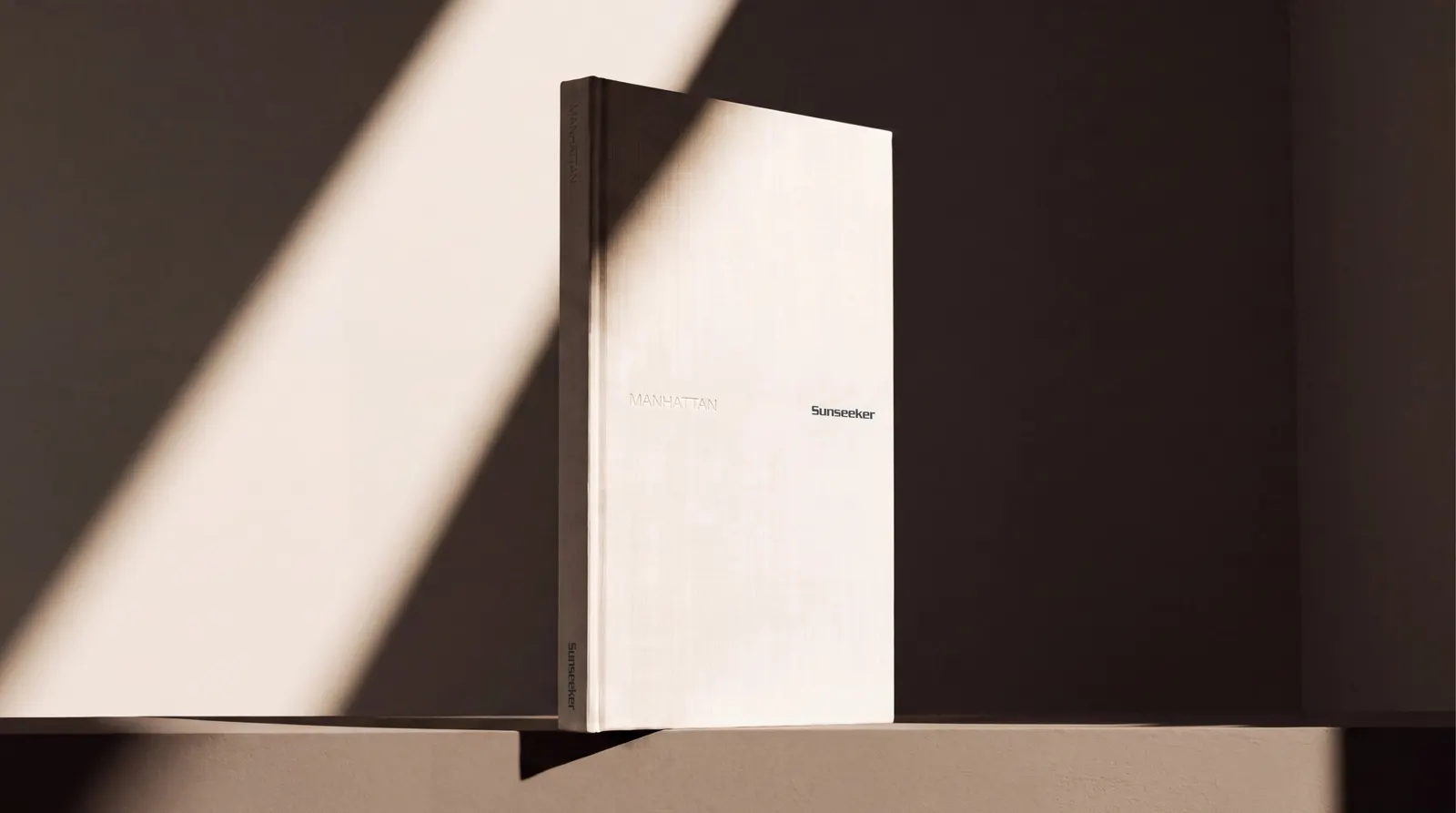
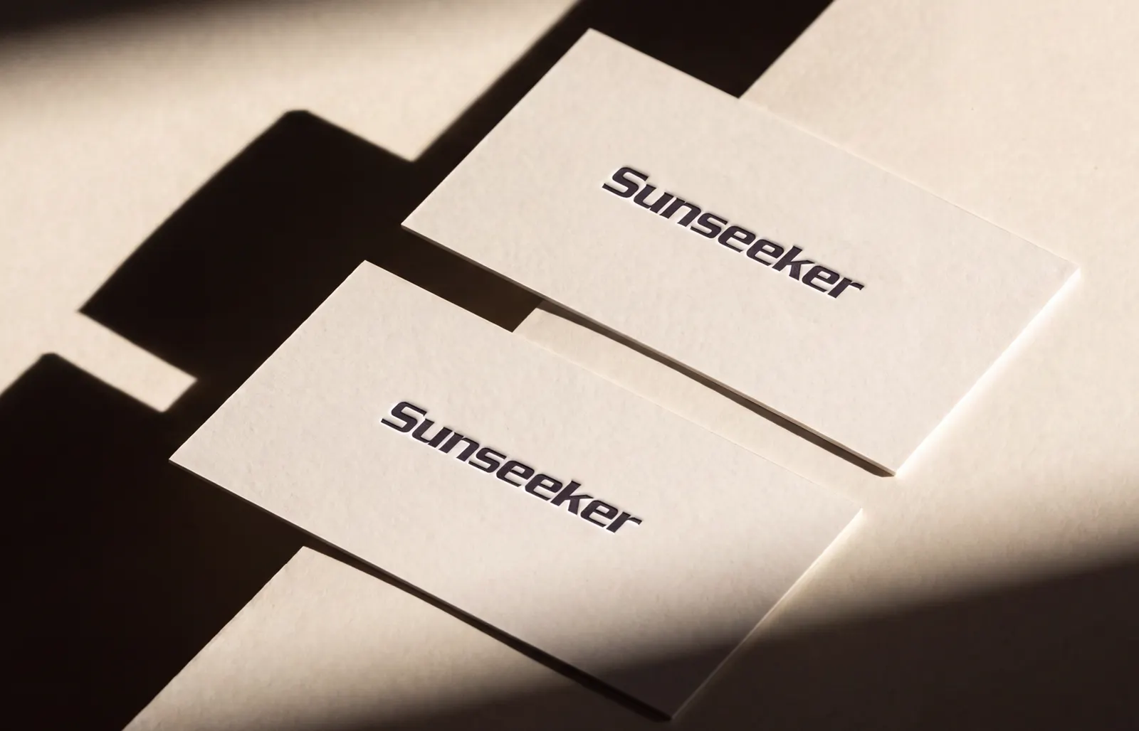
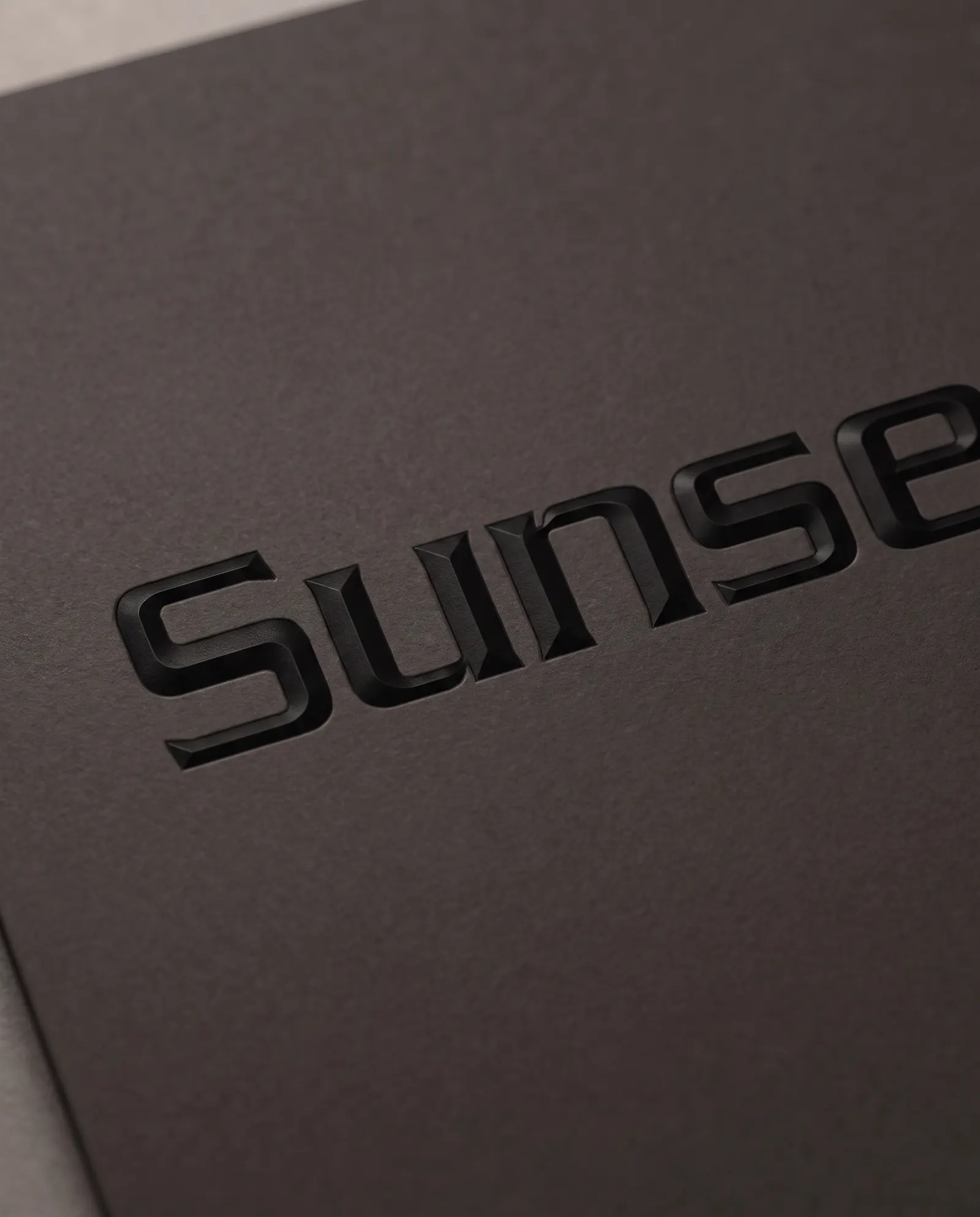
The idea is a single line, The Original Mavericks, which treats Sunseeker's rebellious streak as its biggest asset. The identity keeps the wordmark, palette, and confident silhouette, tuned to fit the new strategy. At its center is a typographic system whose letterforms borrow the geometry of the yachts. Working with Sunseeker's team, the studio extended it to the website and social channels, and to billboards, user manuals, yacht livery, and brochures.
Why it works
The smartest move is restraint in the right place. By keeping the wordmark, palette, and silhouette, the studio protects recognition that took decades to build, so existing owners see continuity while the new typography does the provocative work. Because the letterforms come from the yachts' own geometry, the brand's voice looks like the product, which is hard for a competitor to fake. In a category that has settled on hushed sophistication, that confidence gives Sunseeker a clear and ownable register for buyers deciding where they belong.
Applications
Logo
Images and video from noeassociates.com, by Noë & Associates.