The Brand Monograph
The Train Factory brand identity by Hasan & Partners
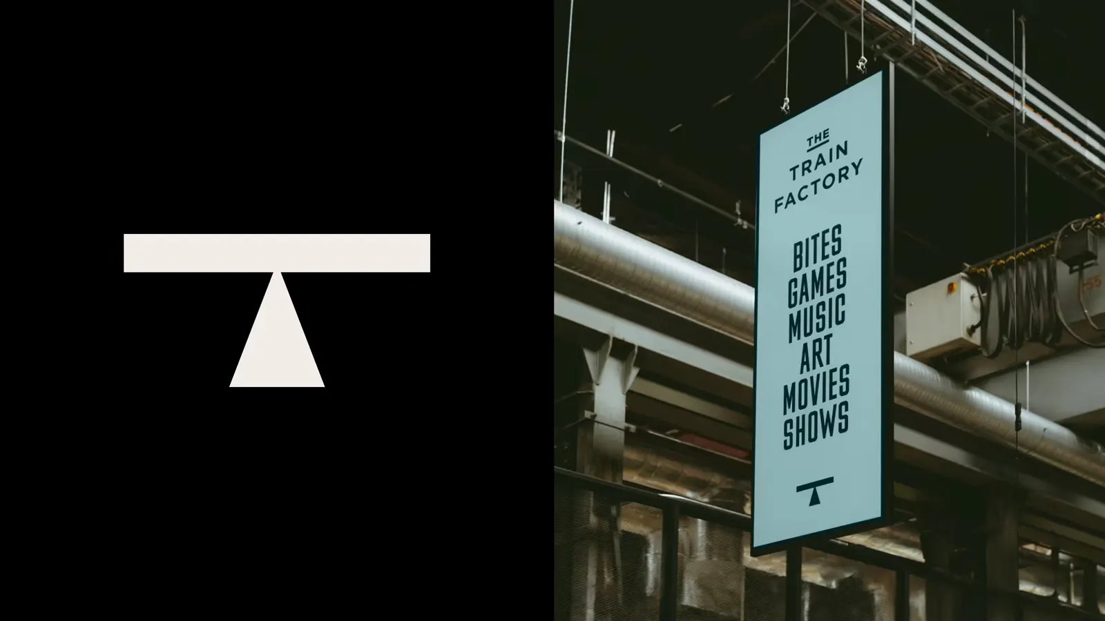
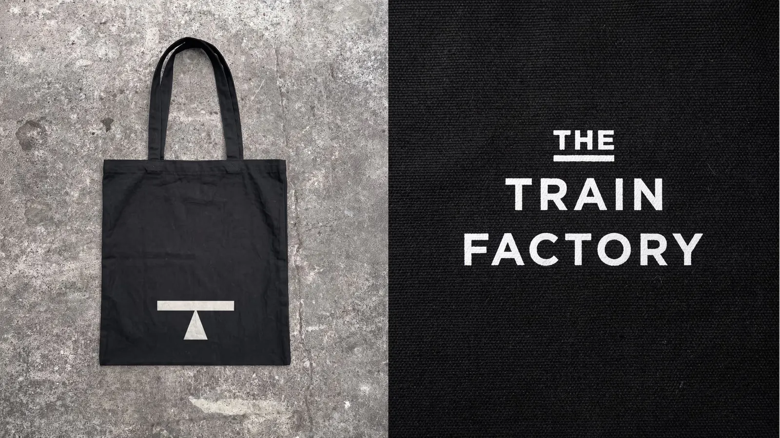
↗Hasan & Partners found The Train Factory's logo painted on the side of a rail car. The studio spotted the small pictogram that shows where a car can be lifted for maintenance and redrew it as a "T" for this new Helsinki destination. It is a rare brand mark that is both a found object and a legible initial.
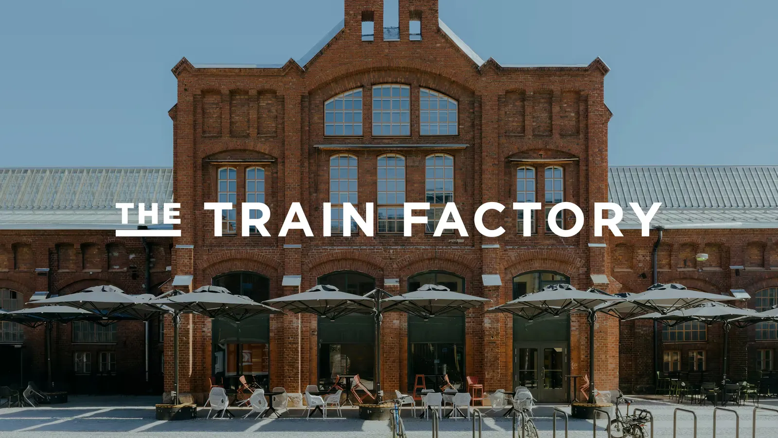
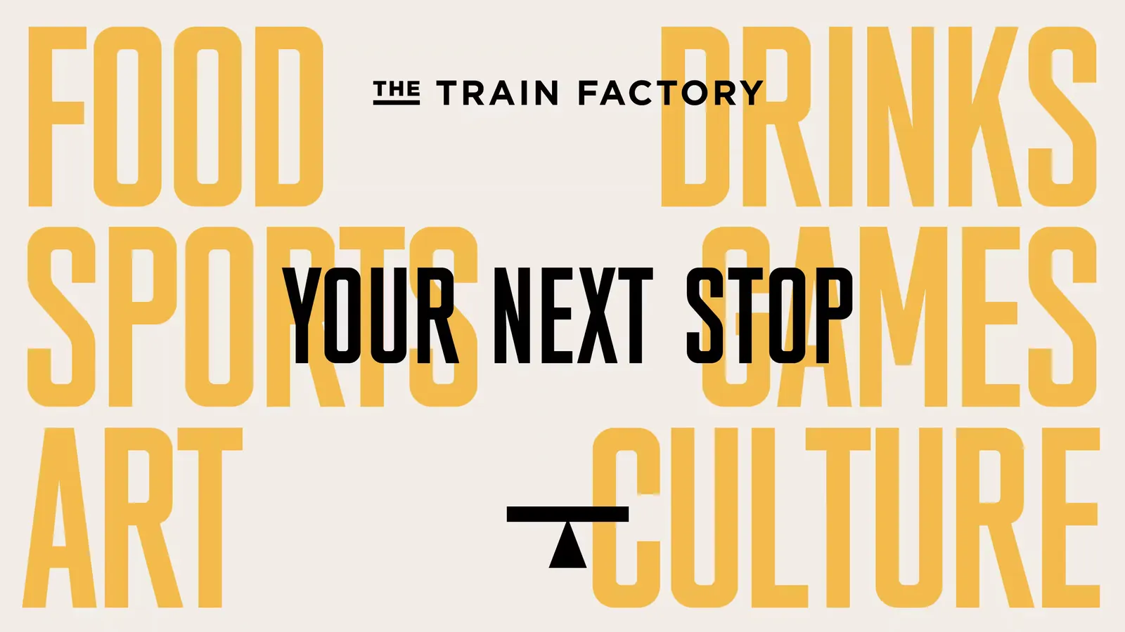
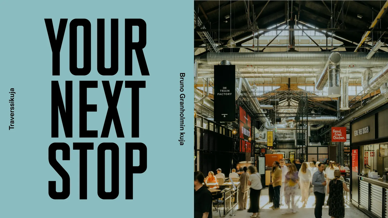
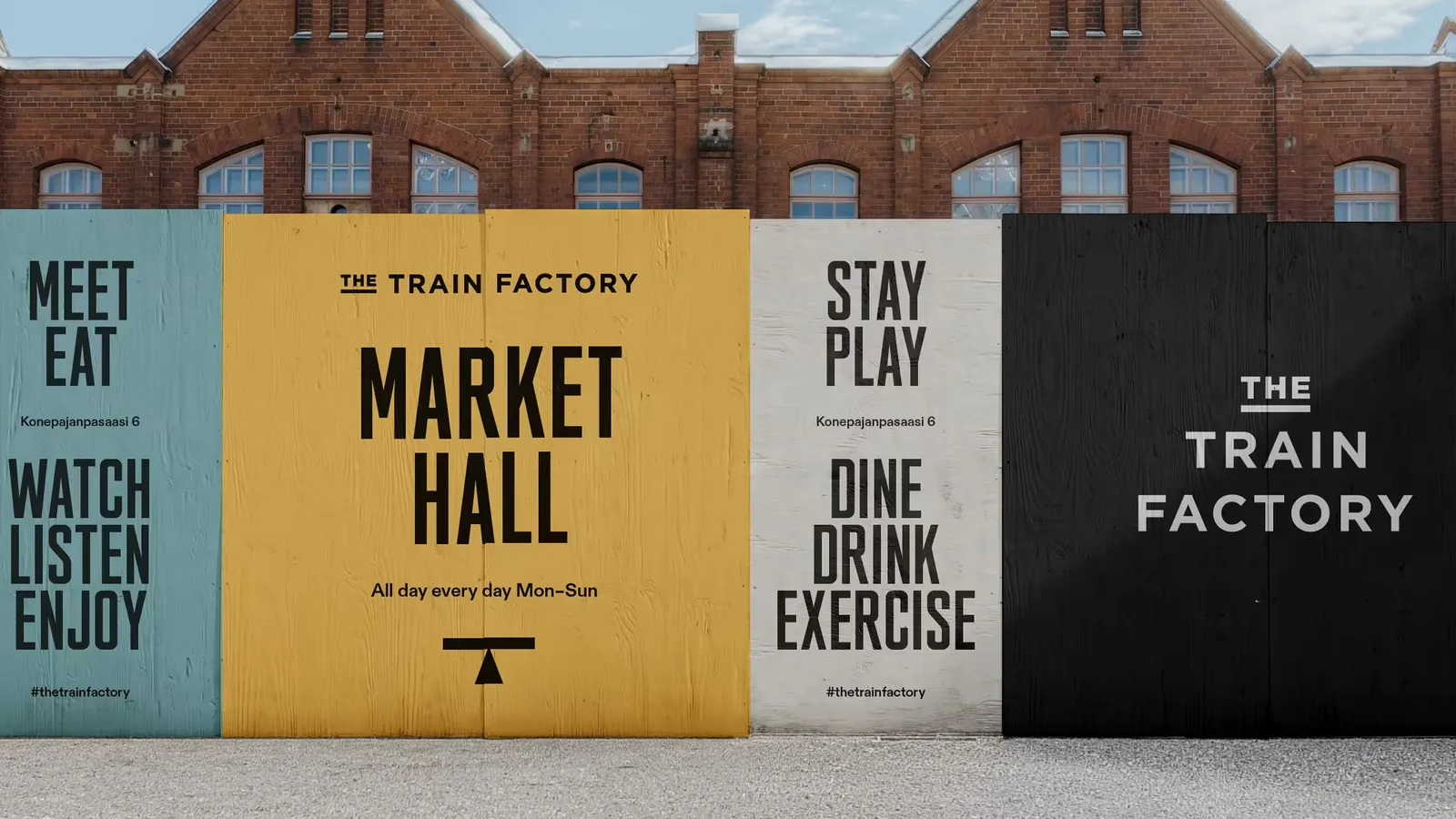
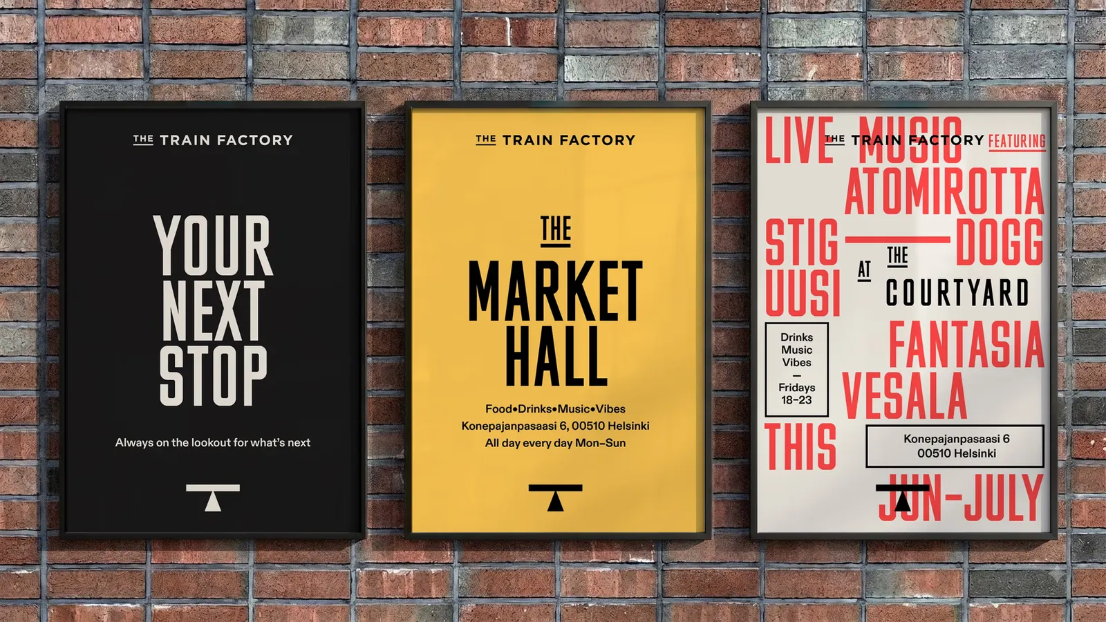
The brief came from a Vallila site where most Finnish locomotives were once built, now home to dining, drinks, sports, theater, and gallery spaces. Hasan & Partners drew the logotype and signage from Finnish train car numbering and paired it with a heavy industrial headline style. The palette comes straight from the building: brick red from the facade, plus yellow and grey-blue from old factory markings and the cranes. Henri Vogt's photography shows the system at home in the space, and the identity has been covered by Creative Review, Creative Boom, and Brand New.
Why it works
A venue that hosts diners, athletes, and theatergoers needs an anchor that doesn't favor any one of them, and a single-letter mark does that while scaling easily to signage. Because the mark, type, and colors all come from objects in the building, the identity feels discovered rather than applied. That sets it apart from the generic industrial look common to converted venues. The numbering-derived lettering also gives wayfinding a sturdy, familiar logic, and the worn, borrowed colors keep everything at home beside the brick.
Applications
Logo

Images and video from hasanpartners.fi, by Hasan & Partners.