The Brand Monograph
Walmart brand identity by JKR
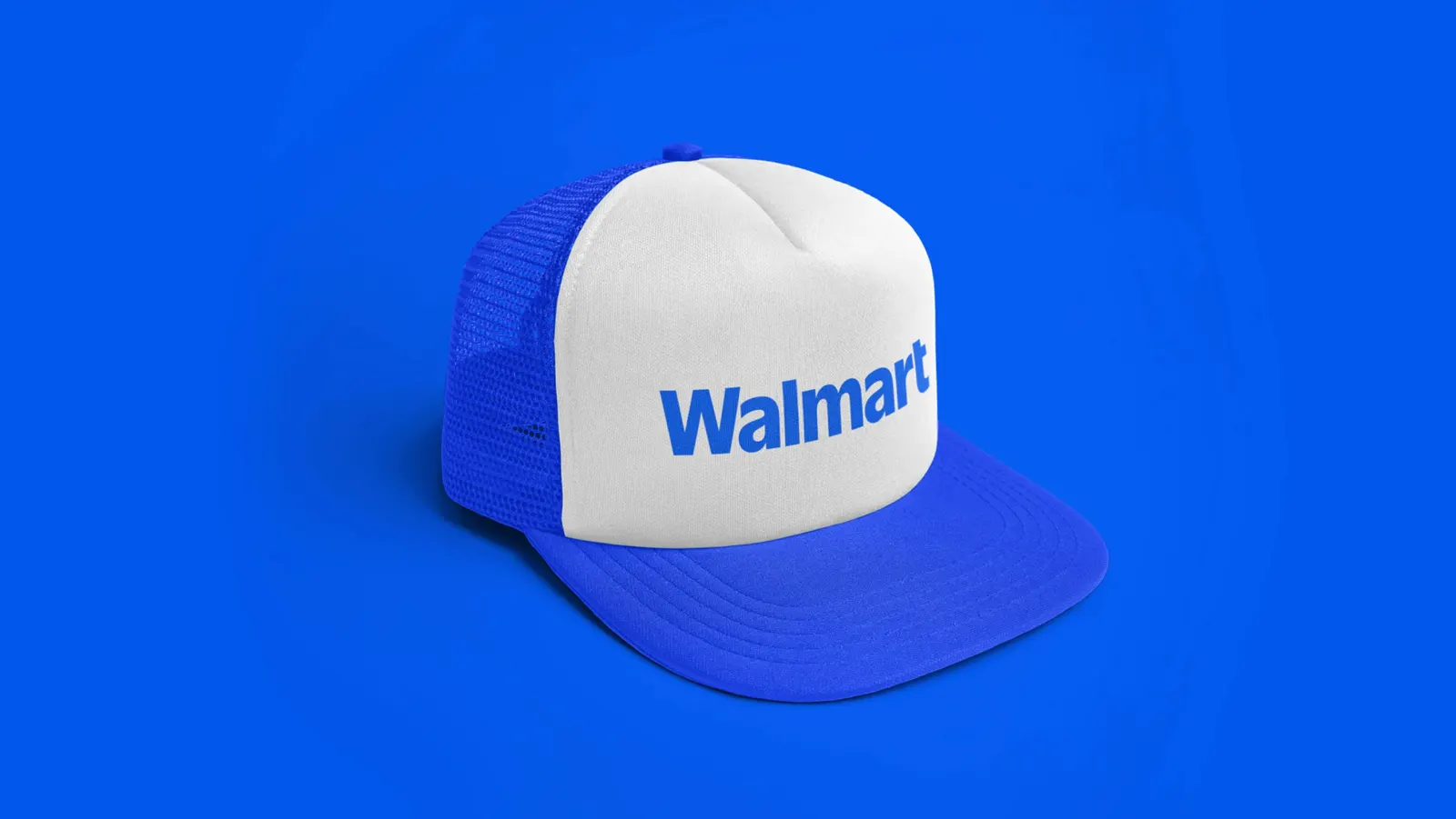
↗The most memorable detail in JKR's Walmart identity is where the new wordmark comes from: the lettering on a trucker hat that Sam Walton wore. It's a small, personal source for one of the biggest companies in the world, and it gives the brand a voice that feels rooted rather than manufactured.
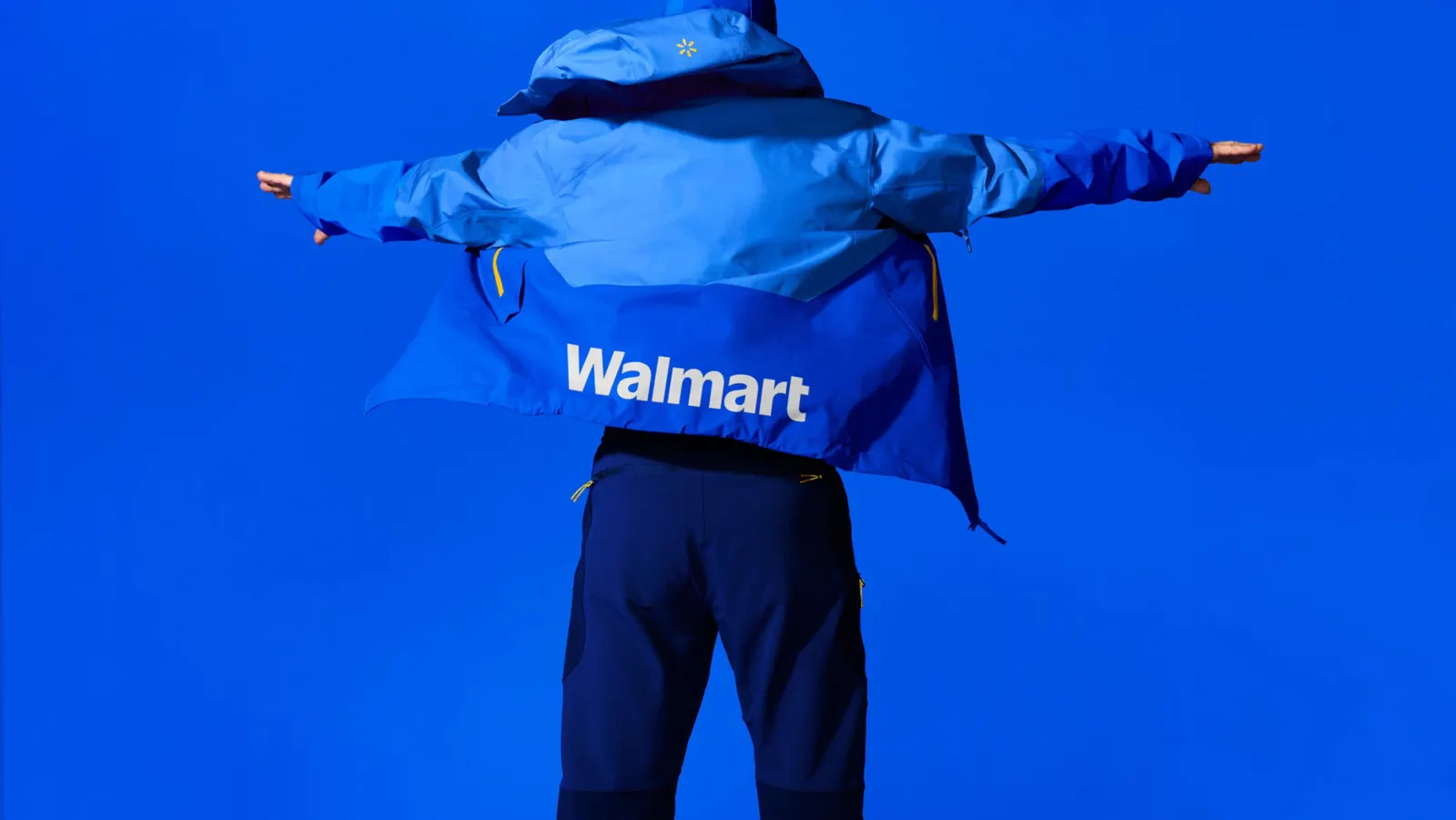
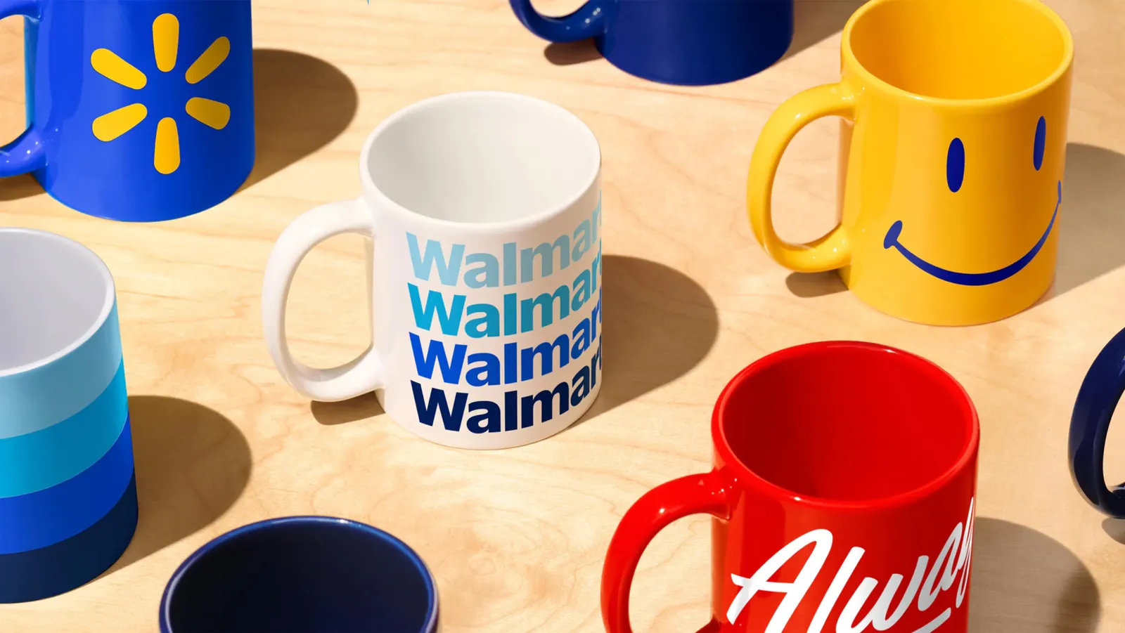
The challenge was making a retailer that now spans stores, digital, and health services read as one brand. JKR worked with the Walmart Creative Studio to update the Spark symbol so it feels more dynamic, then paired it with the hat-derived wordmark. Christian Schwartz and Commercial Type collaborated on the typography, which has to carry that heritage onto screens as comfortably as onto storefronts. The result is a digital-first system that keeps what shoppers already recognize.
Why it works
Walmart's Spark is already one of the most recognized symbols in retail, so evolving it rather than replacing it was the right call. It keeps years of familiarity working for a customer base this broad. The wordmark does the differentiating. Many big retailers settle on a neutral sans serif, but lettering with a real origin gives Walmart something specific, hard to imitate, and easy to tell a story around. Together, the two signal change without breaking trust, which is exactly what a brand at this scale needs.
Logo
Applications
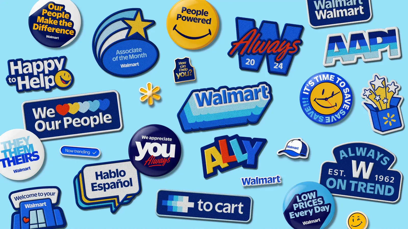

Images and video from jkrglobal.com, by JKR.