The Brand Monograph
St Paul’s Cathedral brand identity by Pentagram
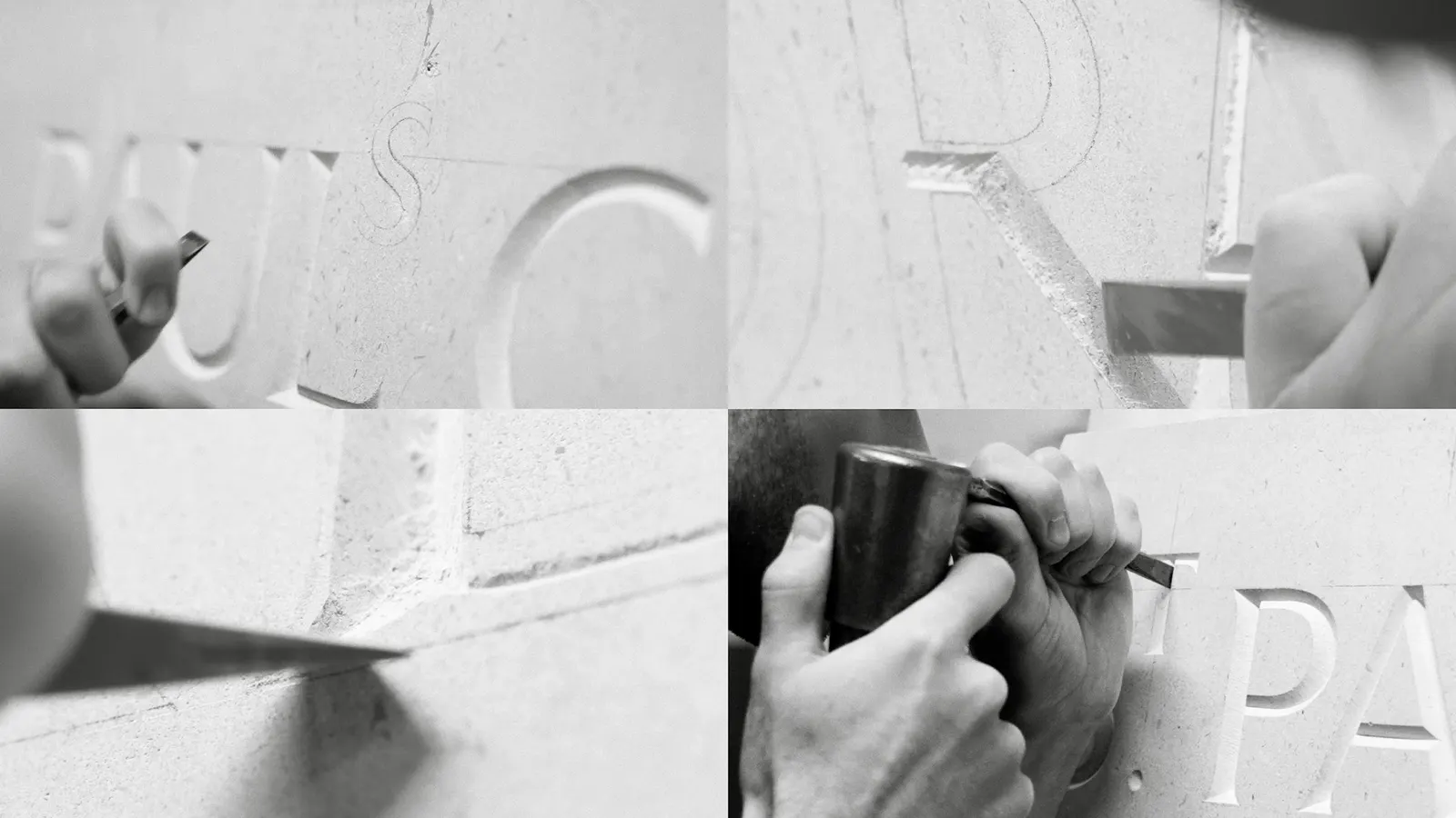
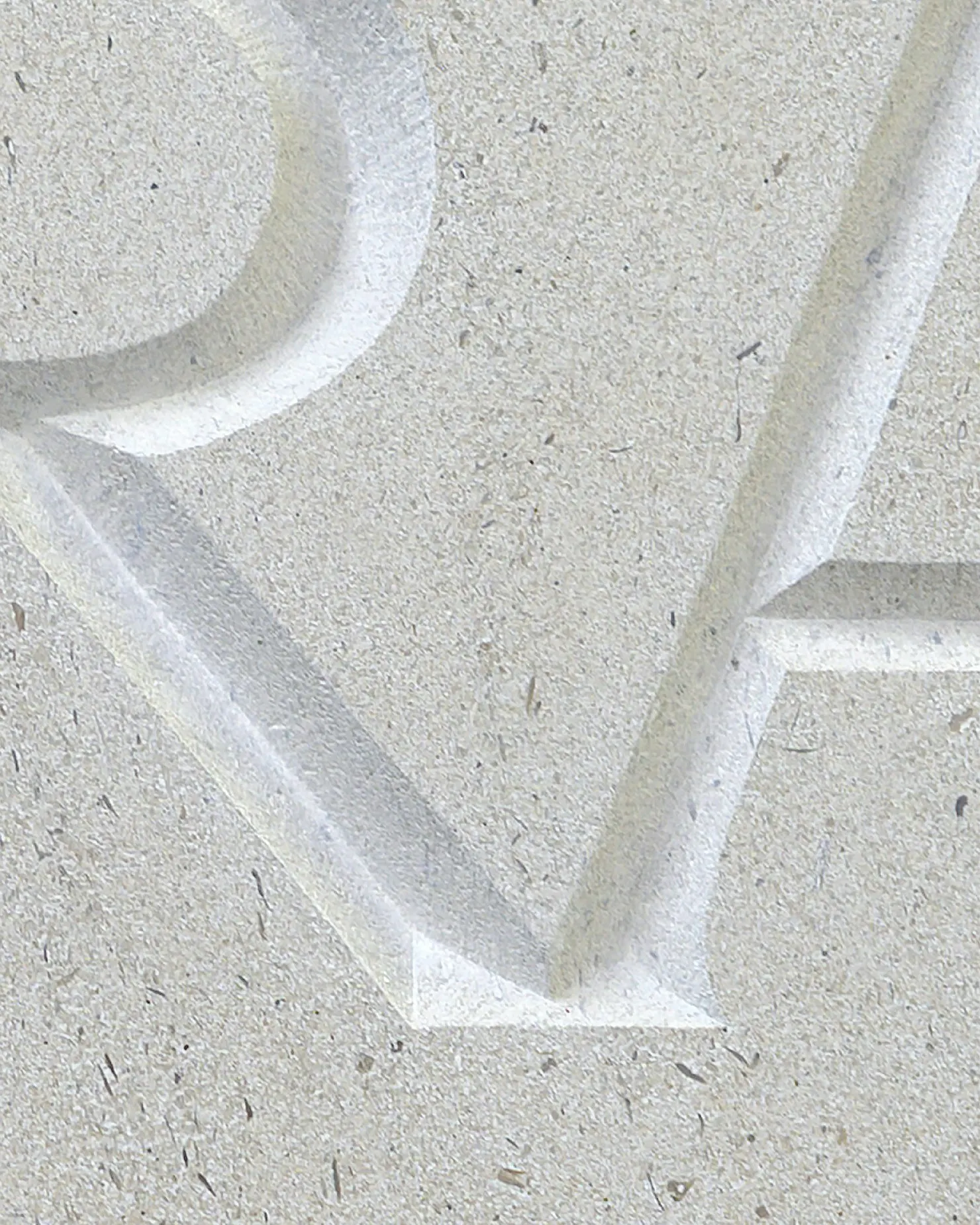
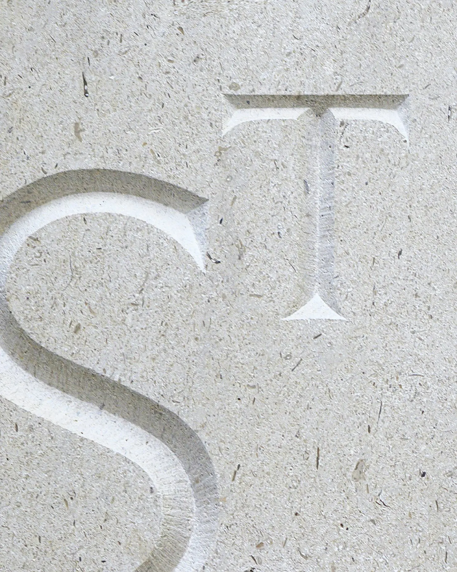
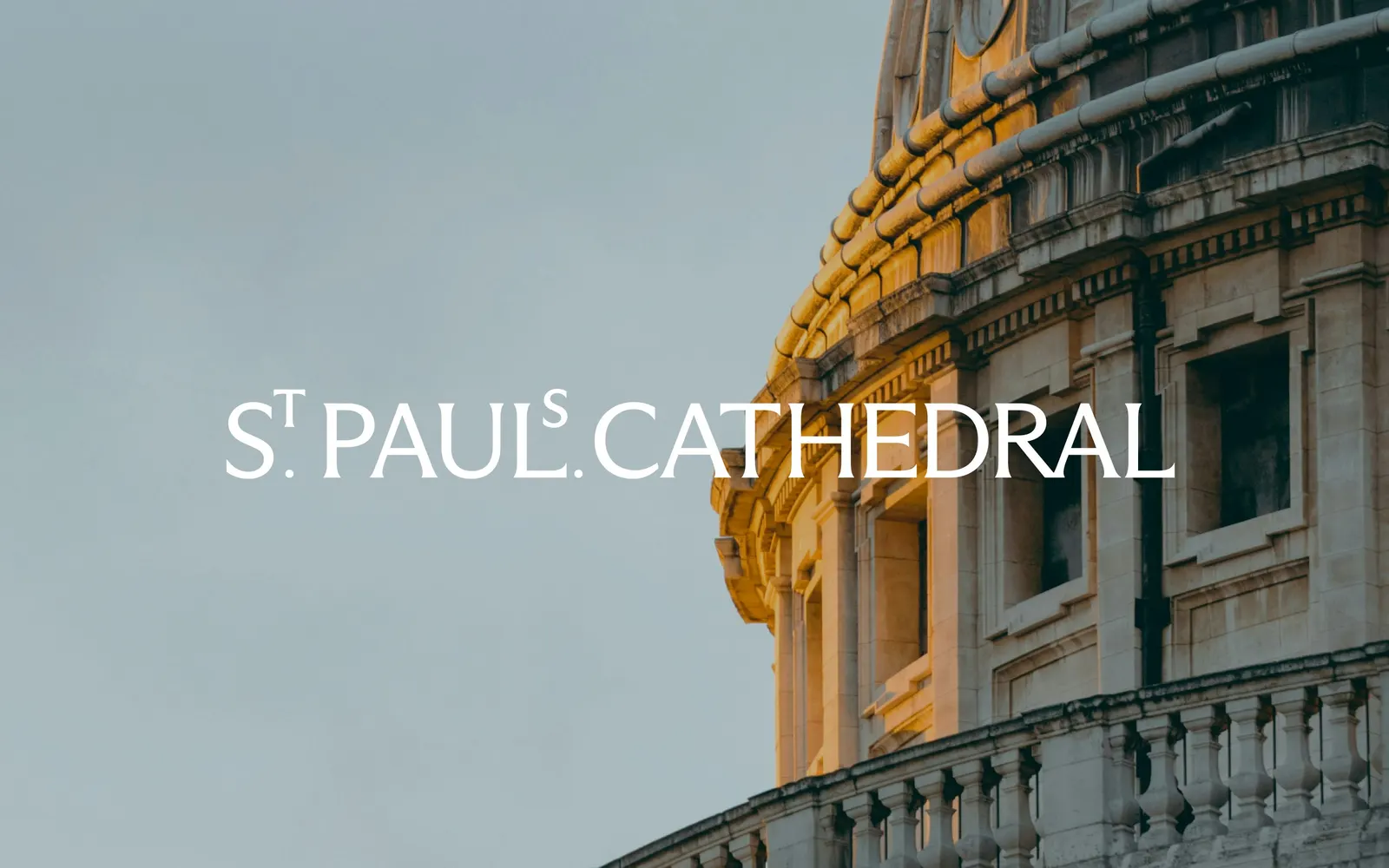
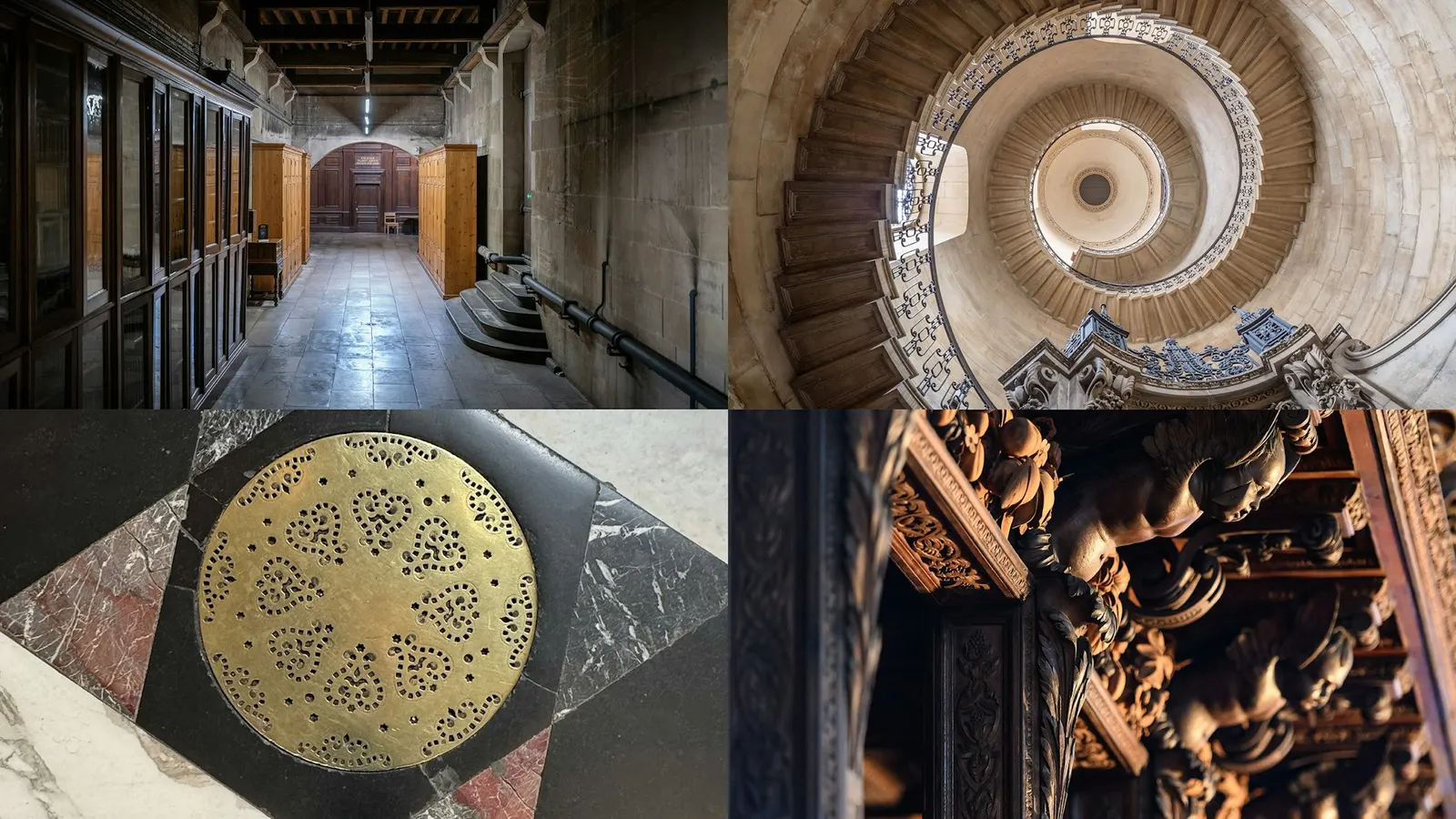
↗Pentagram's identity for St Paul's Cathedral starts from the building's own lettering rather than the dome everyone already knows. Domenic Lippa, Edie Lippa, and Ry Coleman studied carvings and engravings throughout the cathedral and the Crypt, then worked with its stonemasons to test how a wordmark could exist as a physical object. The client is both a working church and a major visitor attraction, and it wanted to signal that it is open to everyone.
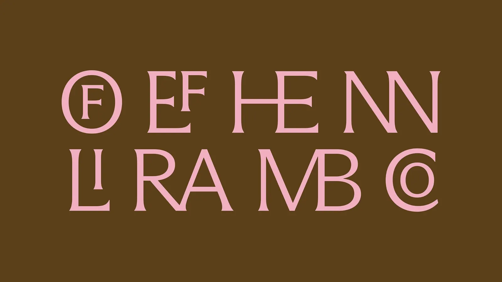
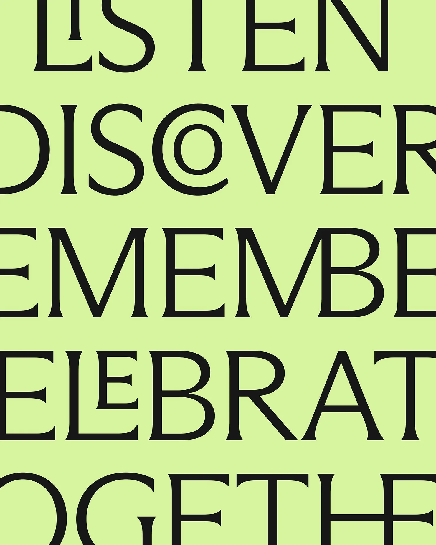
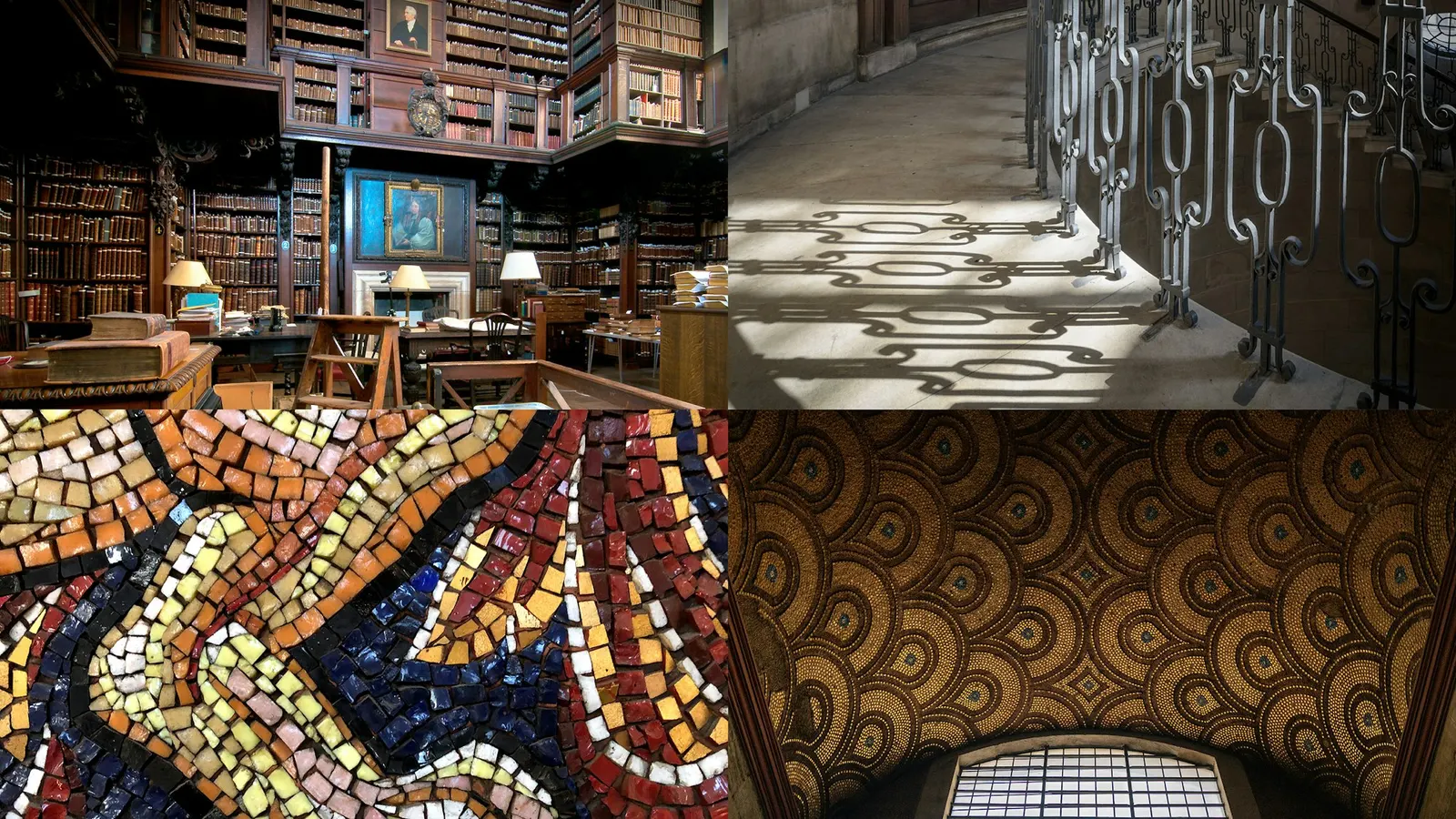
Bert Preece and Adam Kaveney of Simple Revolution shaped the strategy and verbal identity. In the wordmark, a raised S and T borrow a detail from a book in the Cathedral's Library, and a monogram built from its letters acts as shorthand. Arizona Flare, with bespoke ligatures, leads the typography, supported by Raleway for body copy and subheads. The palette comes from the stone floors and walls and the brighter ceiling mosaics, while photography moves between architecture and quiet human moments.
Why it works
The dome could have carried this identity on its own, but the studio built it on type instead, which gives St Paul's something more ownable than a skyline. The raised S and T add a small irregularity that rewards a second look, and it sets the wordmark apart from the neutral sans serifs many cultural institutions default to. Arizona Flare feels carved but warm, so it reads as welcoming rather than formal. Because the colors come from the building itself, they feel earned, not applied.
Logo
Typography
Applications
Images and video from pentagram.com, by Pentagram.