The Brand Monograph
Yahoo brand identity by JKR
↗Few brands carry as much web history as Yahoo, and fewer manage to make that history feel like an asset. JKR's refresh treats three decades of heritage as raw material rather than baggage, and the result is louder, warmer, and more confident than a typical legacy-brand update.
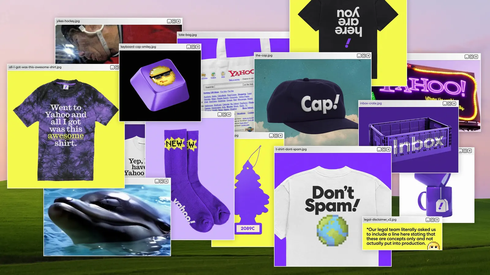
The brief was to modernize the look and feel of a service that still reaches around 90% of the US internet population every month. Rather than start over, the studio went back to how Yahoo has always sounded and behaved, then built a brand experience system to sit across its newly updated products and features. Color is pushed hard, and illustration from Marco Palmeiro and Till Lauer adds character and a human touch to the system.
Why it works
Yahoo's greatest asset is familiarity, and this work protects it. By building on the purple people already associate with the brand and amplifying it with bolder color, JKR keeps Yahoo recognizable at a glance while shedding the dated feel. Commissioned illustration gives a category of similar-looking search tools and portals a personality that stock imagery rarely can. And because the work is a system rather than a single new mark, it can flex across many products while staying coherent for a huge, varied audience.
Logo
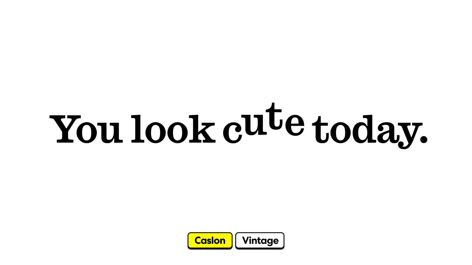
Typography
Applications
Images and video from jkrglobal.com, by JKR.