The Brand Monograph
Philharmonia
by Pentagram
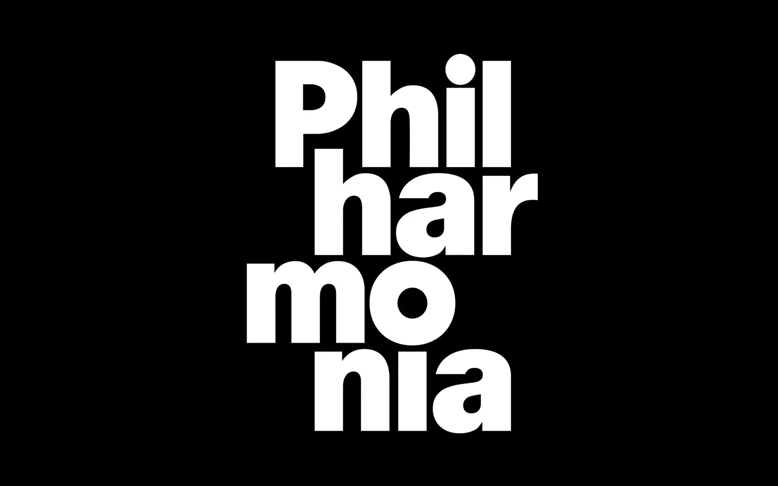
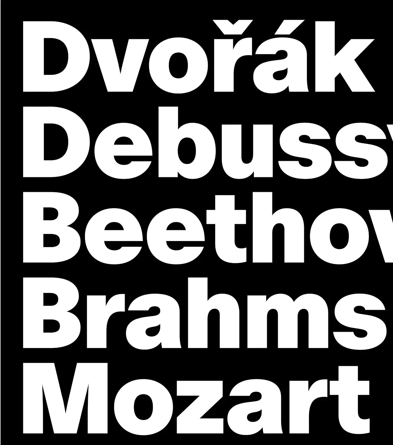
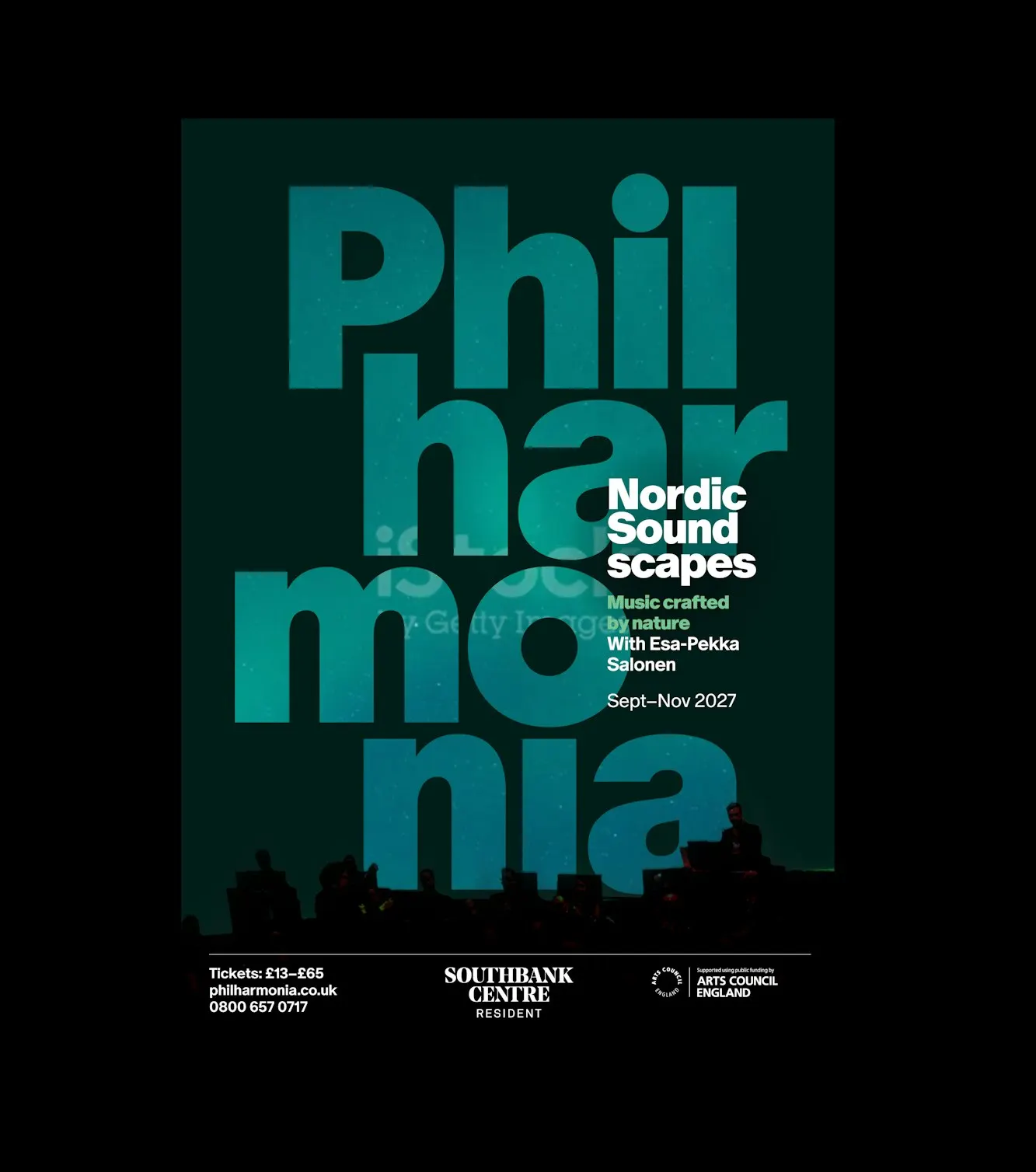
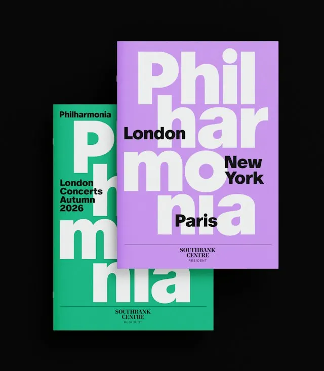
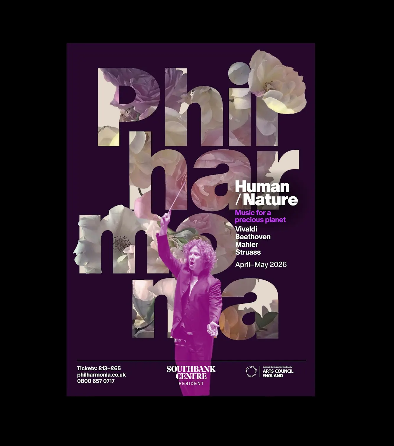
What makes this identity stand out is a logo that doesn't hold still. For the Philharmonia's 80th anniversary season, Pentagram built a stacked logo that can take on a different mood each season, rather than settling into one fixed form.
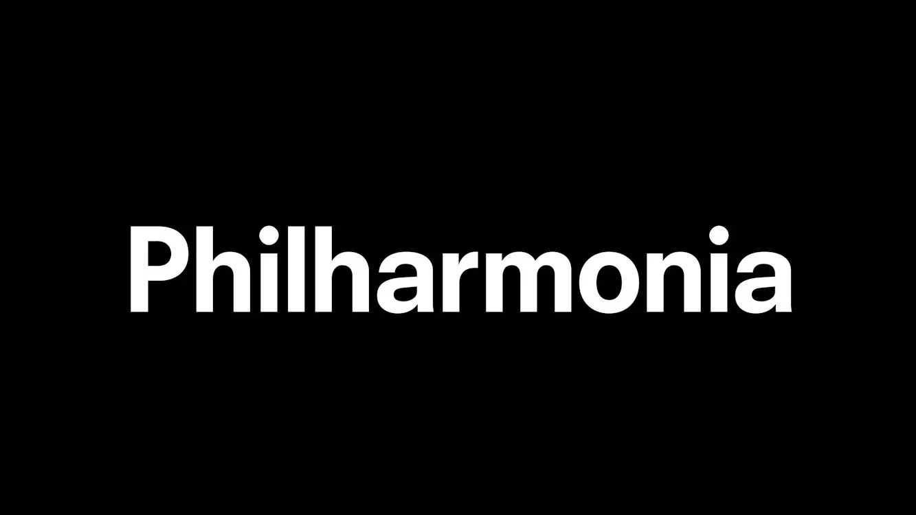
The orchestra, a longtime Pentagram client, wanted to mark the milestone in a way that reflected its curiosity as well as its heritage. It commissions new music, works with artists in other disciplines, and cares as much about reaching new audiences as about performing. Working closely with members of the orchestra, the studio started with the logo. The stacked version takes its cue from the rhythm of saying "Philharmonia" aloud. It's set in Dinamo's ABC Oracle Black, with a few characters subtly redrawn, and it sits alongside the traditional wordmark.
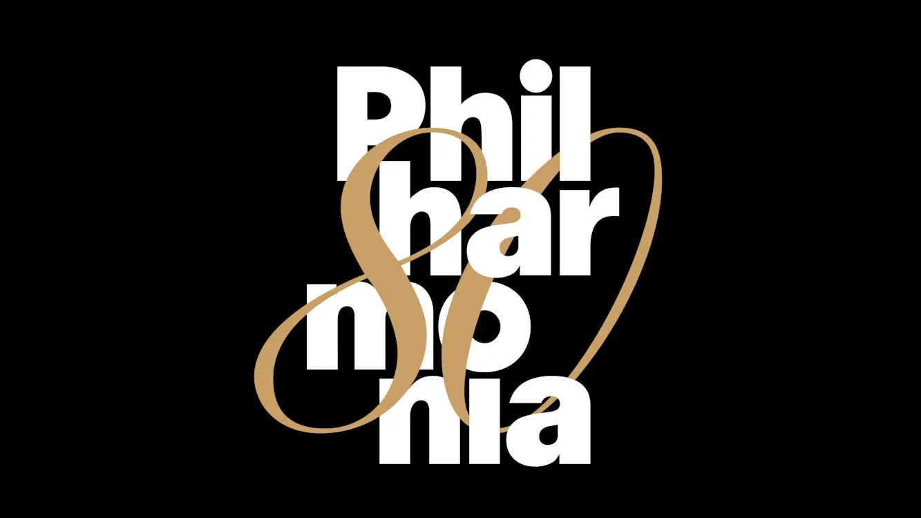
That logo anchors a looser visual language, with photography, instrument illustrations, and type layered over it, and it plays a central role in the redesigned concert programmes. The red is new too: a warmer shade that nods to the orchestra's recording history, and it runs from music stands and tote bags to the lorry that carries the equipment between concerts. For the anniversary, Pentagram added a fluid gold "80" over the white logo on black. The result is a system with room to change, built by a team that included Edward Roberts, Harry Pearce, Hyo Lee, Romilly Winter, and Tiffany Fenner.
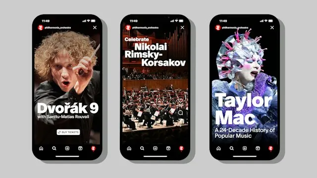
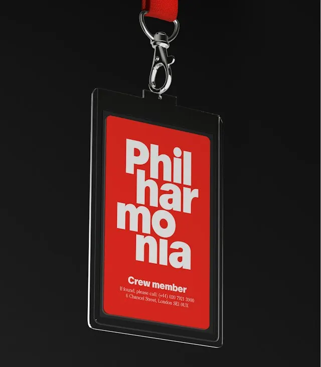

Images and video from pentagram.com, by Pentagram.