The Brand Monograph
33east brand identity by UNKNW
↗UNKNW's work for 33east takes a category known for guarded, transactional tone and gives a Cyprus-based fund a brand that feels like a table you're invited to sit at. The brief was to put 33east on the global startup map. The studio began with long interviews with the partners, found one idea that kept recurring, people coming together, and built everything from it.
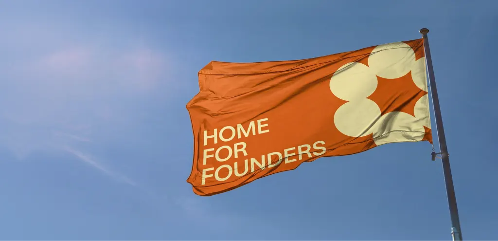
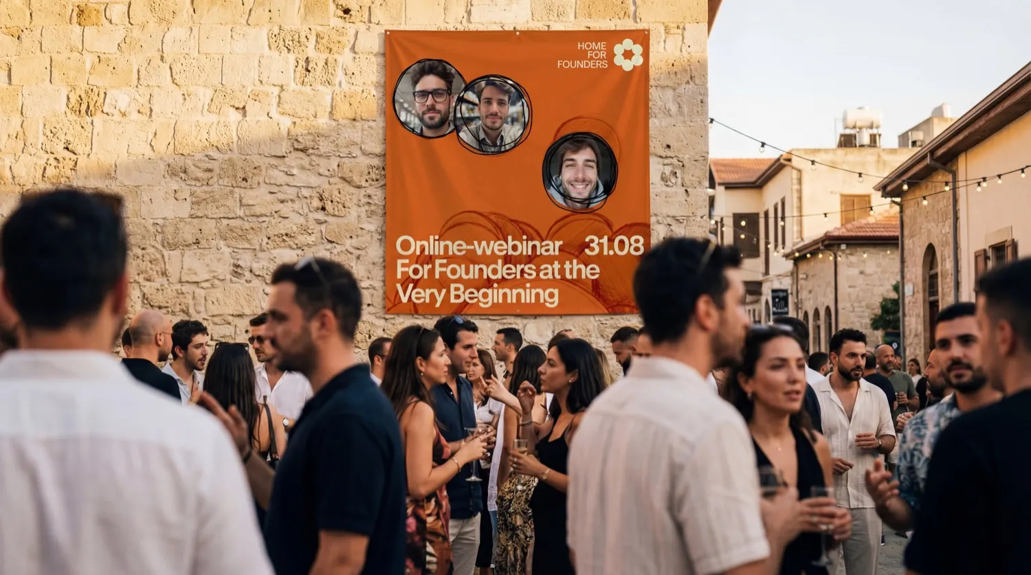
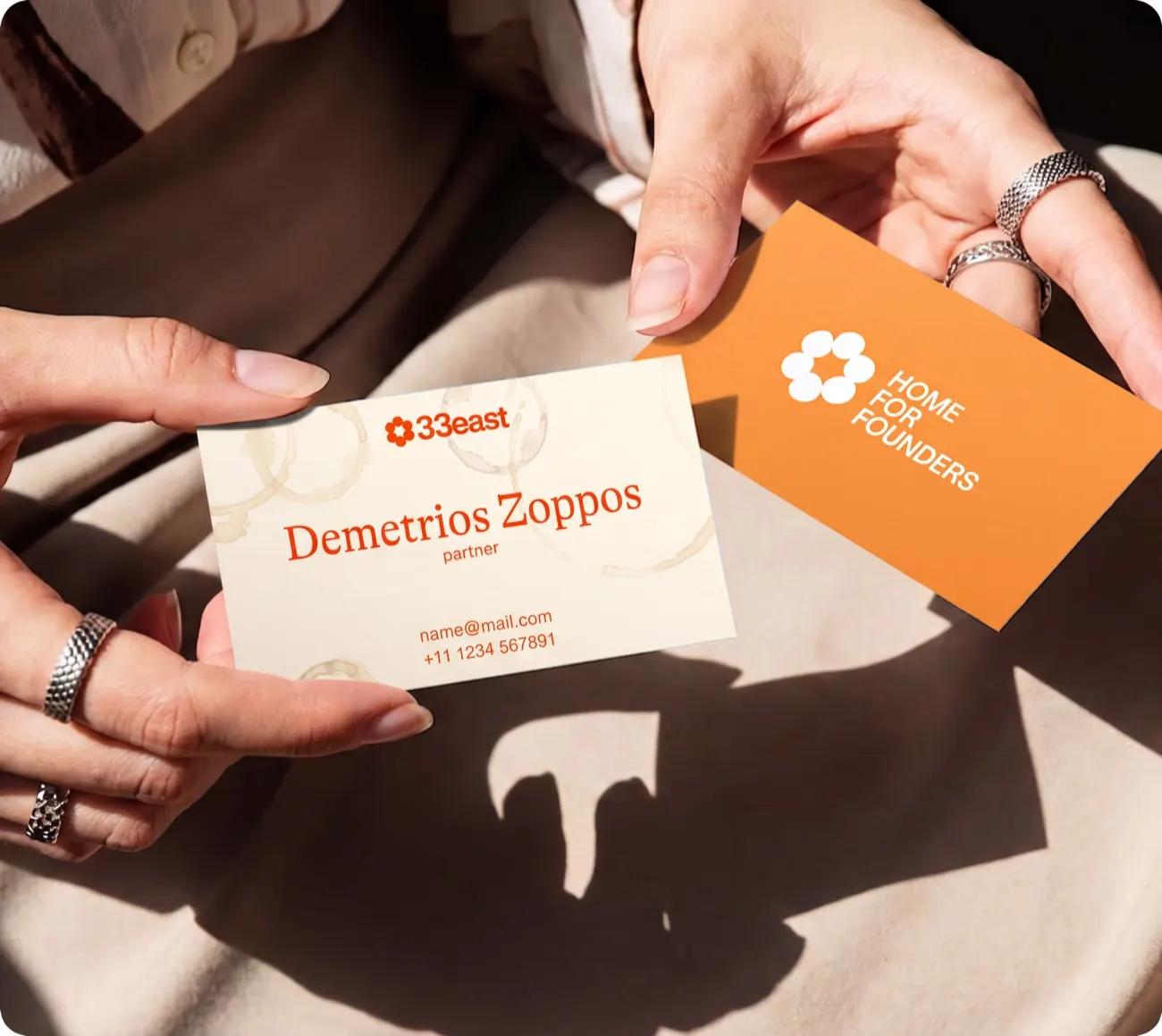
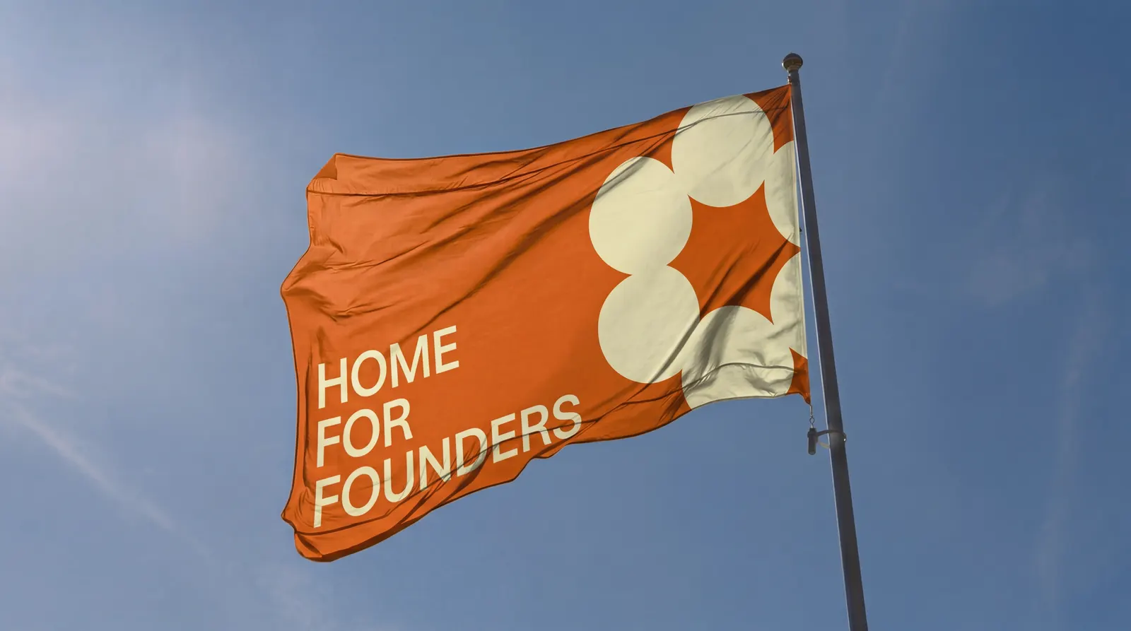
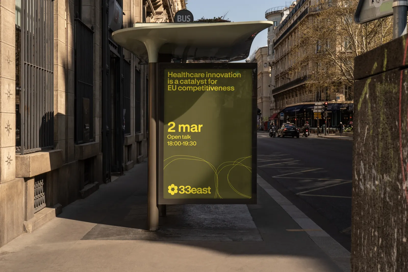
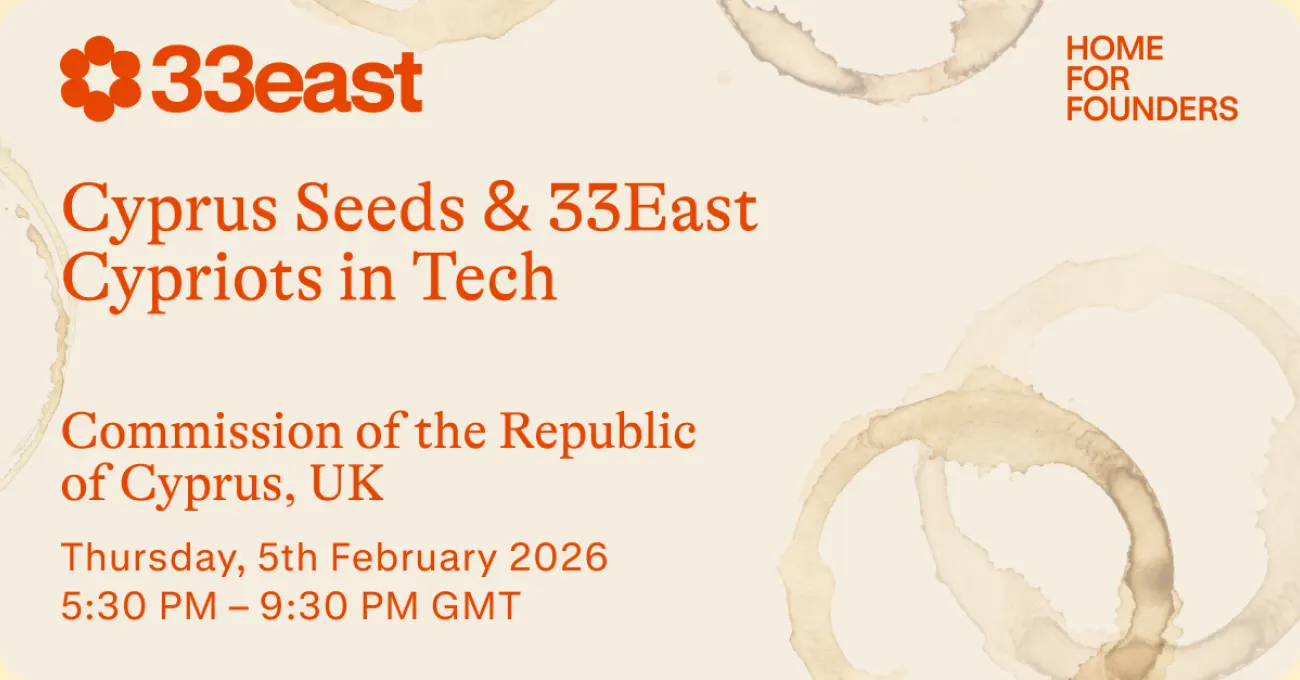
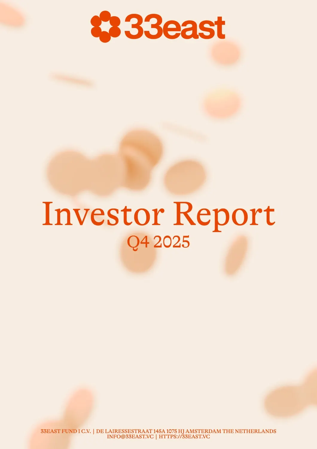
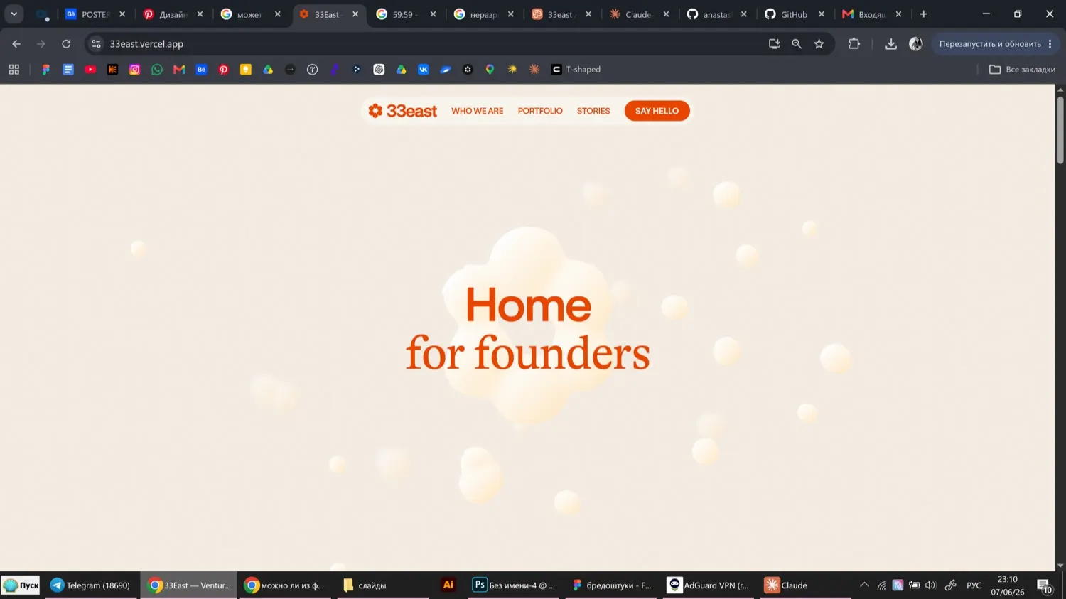
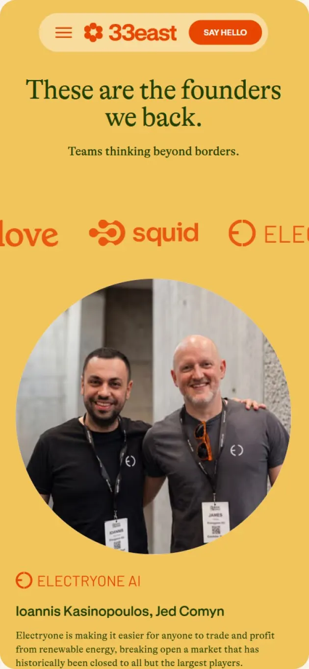
That idea shapes soft, rounded forms that pull inward, small touches like coffee-cup rings, and a system set in GT Alpina and GT Standart with a warm palette. Presentation templates put founders' work and results ahead of logos. On the website, orbiting and connecting graphics carry the motion, portraits lead each page, and a separate guidelines page teaches how to judge whether new work truly fits the metaphor.
Why it works
The strongest decision is restraint about the brand itself. By pushing the logo back and putting founders forward, 33east shows its priorities instead of announcing them, which matters to an audience that has heard plenty of funds promise support. The pairing of a serif and a clean sans keeps the tone warm without losing clarity, and the palette sets the fund apart from the cooler, more clinical look common in finance. The guidelines page makes the metaphor testable, so it can stay consistent as the fund grows.
Applications
Logo

Images and video from unknw.com, by UNKNW.