The Brand Monograph
Palisades Parks Conservancy brand identity by Order
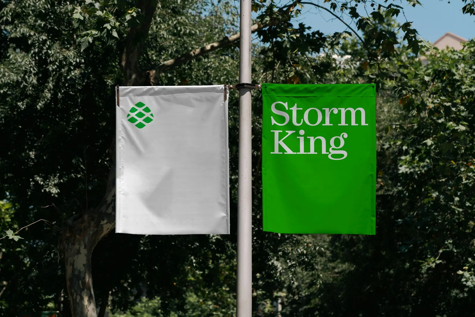
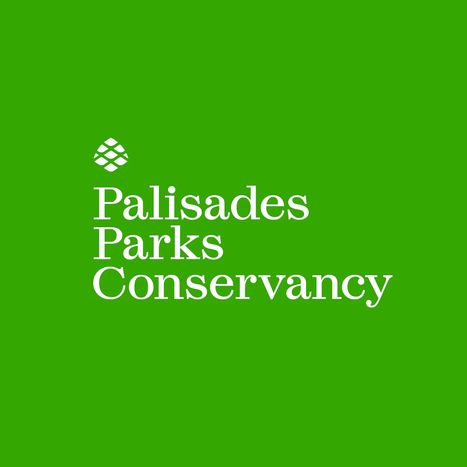
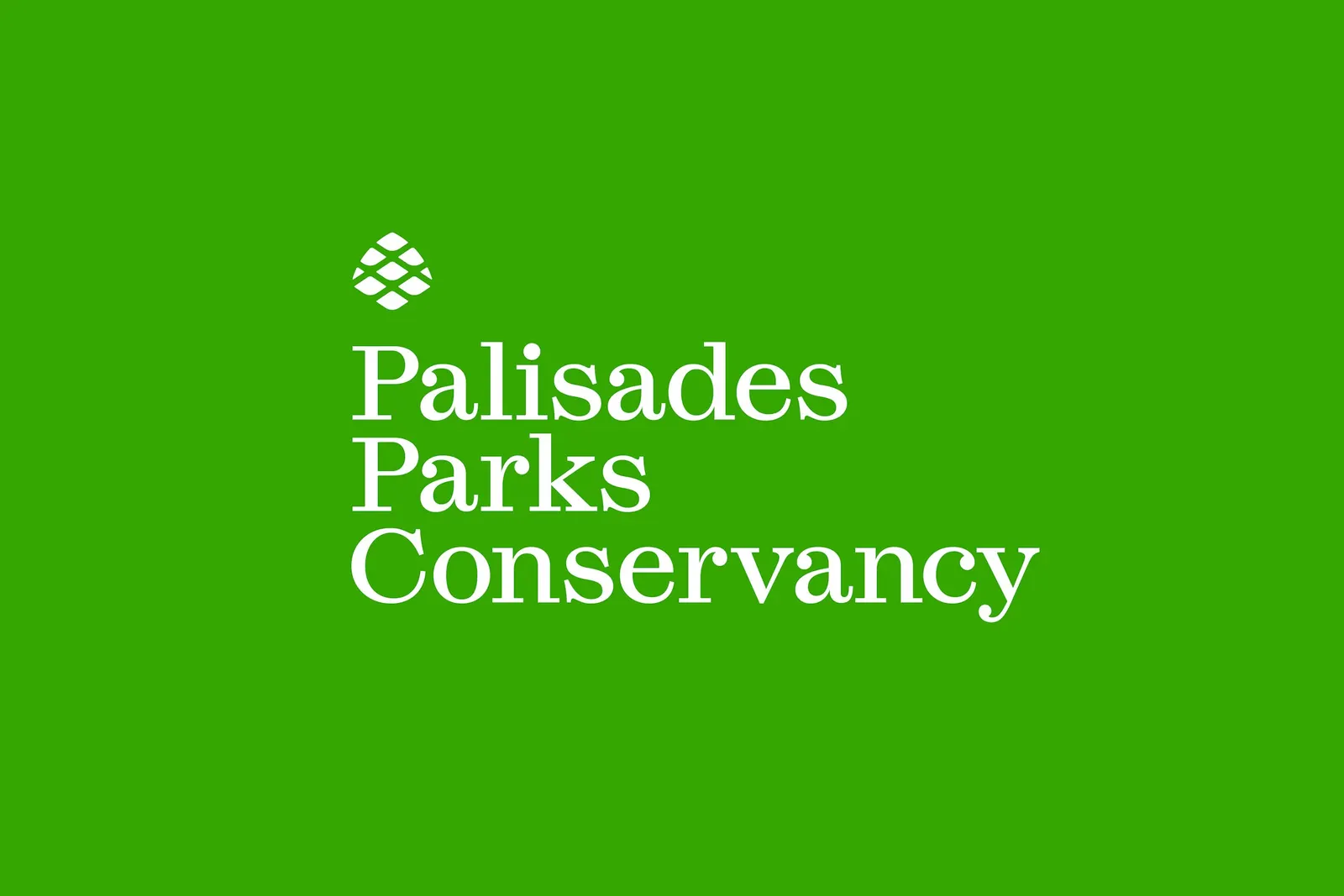
↗Order has given the Palisades Parks Conservancy a single emblem, a pitch pine cone, to represent more than 25 parks and historic sites across New York and New Jersey. The region covers over 130,000 acres of the Hudson River Valley, and the Conservancy has worked alongside the Palisades Interstate Parks Commission to look after it. The brief was to make the identity fit the work the organization does today.
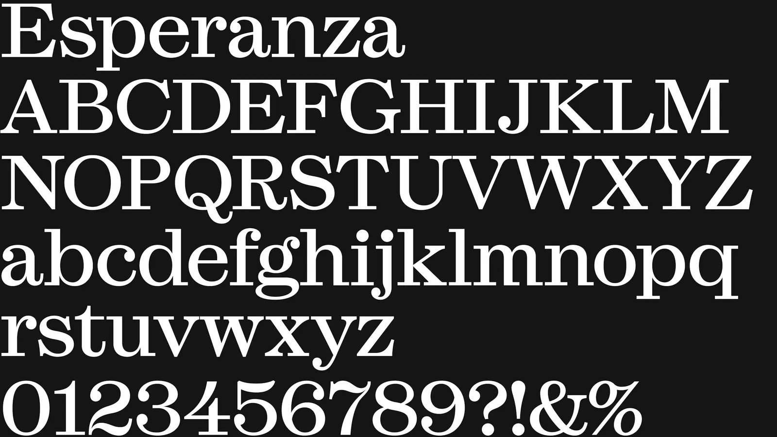
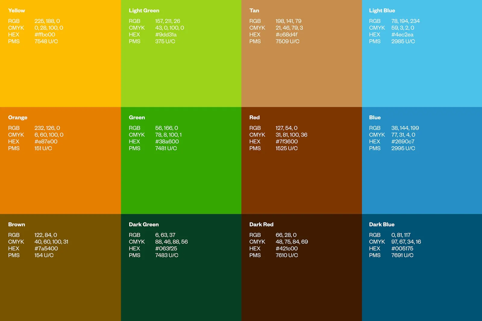
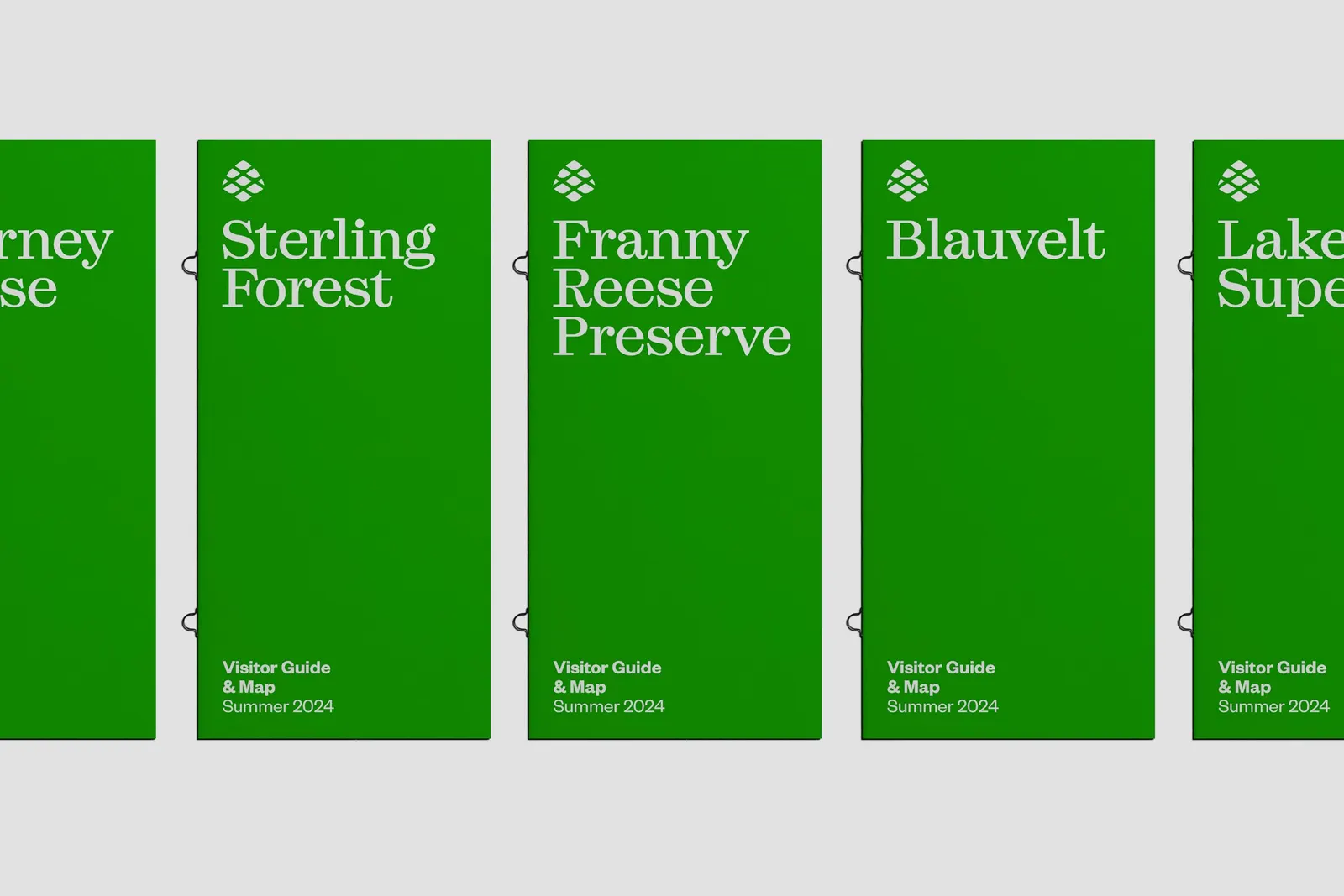
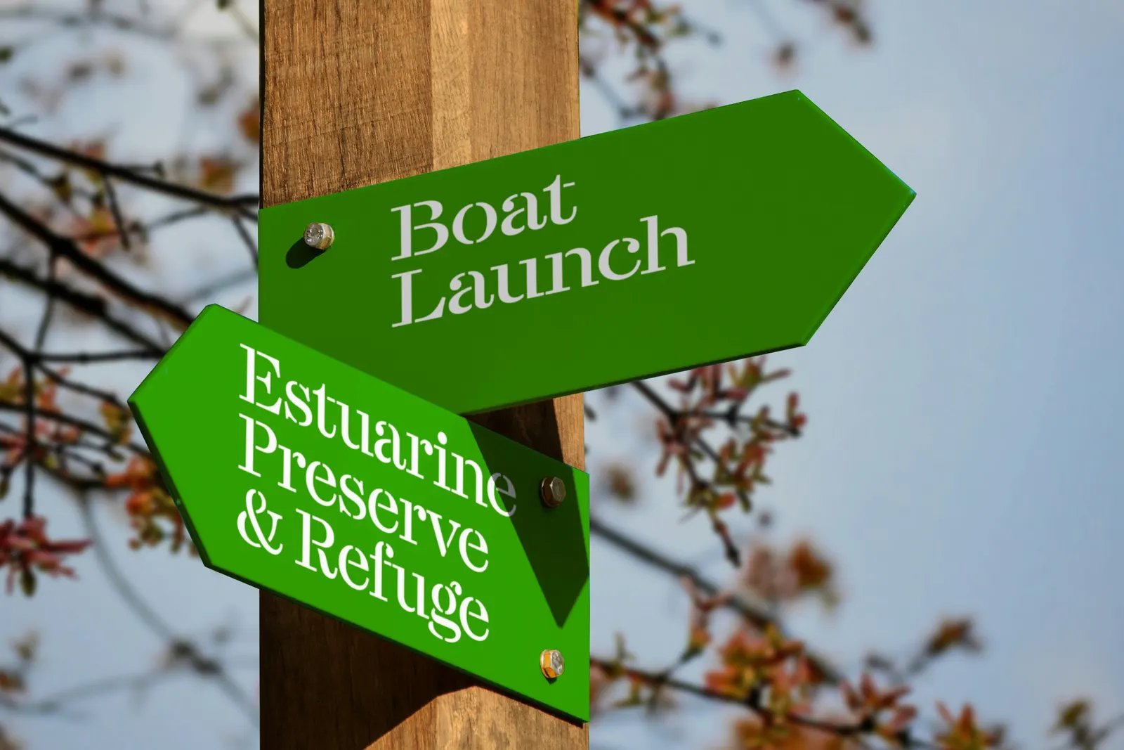
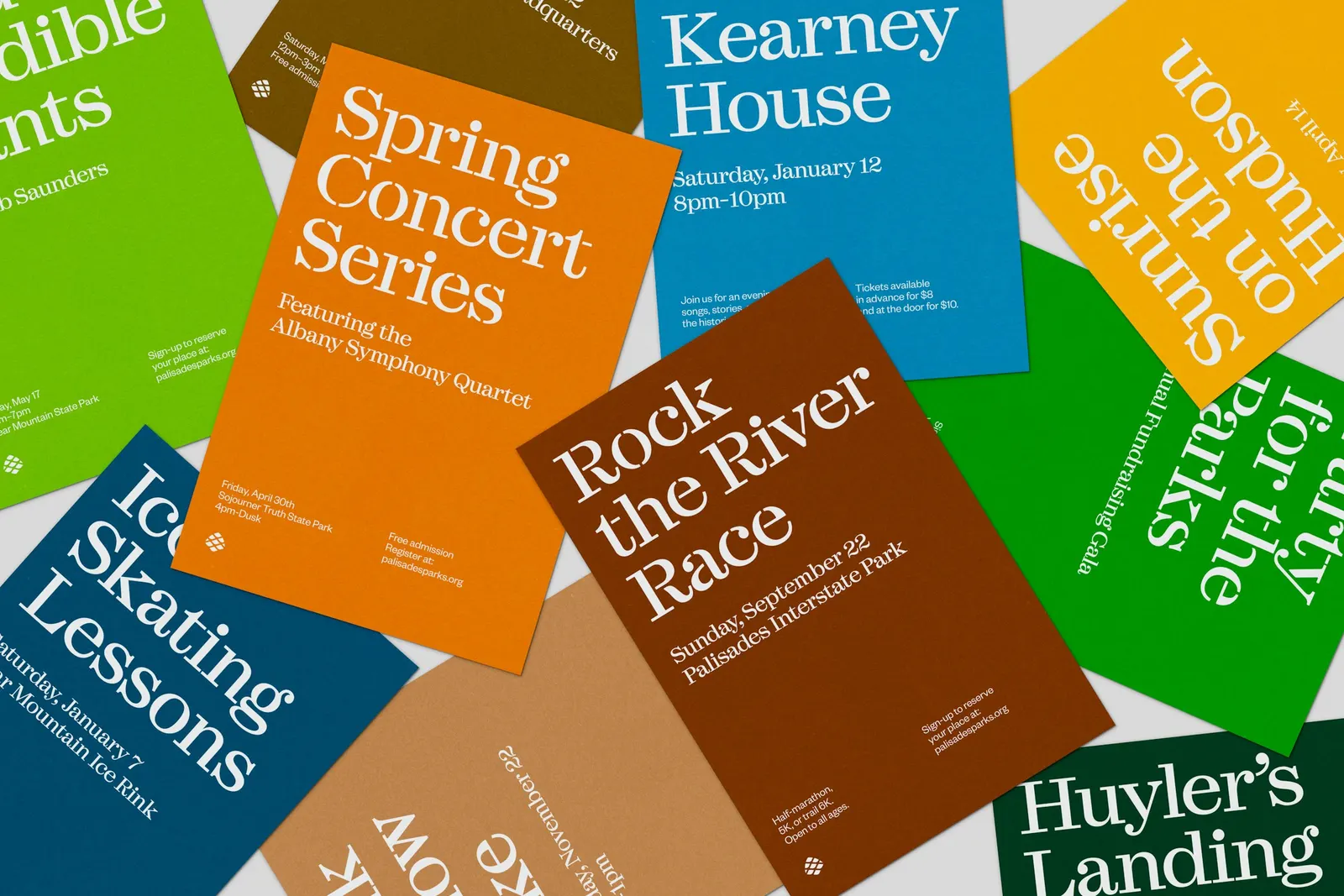
The studio, with designer Laurel Warner, based the mark on a native tree whose cones feed wildlife and help the forest reseed itself. Order then built individual lockups for 21 parks and 9 historic sites. Typography pairs Esperanza from Labor & Wait, in Headline and Stencil cuts, with Founders Grotesk from Klim Type Foundry for smaller text. A palette that follows the seasons covers events and giveaways.
Why it works
Conservation brands tend to default to mountains, leaves, or generic trees. A pitch pine cone is a specific, local object, and it tells a story about giving back to the land, which suits an organization built on stewardship. The lockups let each park keep its own name while clearly belonging to one family. Esperanza's pottery-inspired forms add handmade warmth, the Stencil cut adds a rugged edge, and Founders Grotesk keeps smaller text clear.
Applications
Logo
Typography
Color

Images and video from order.design, by Order.