The Brand Monograph
ICD Beauty brand identity by Pentagram
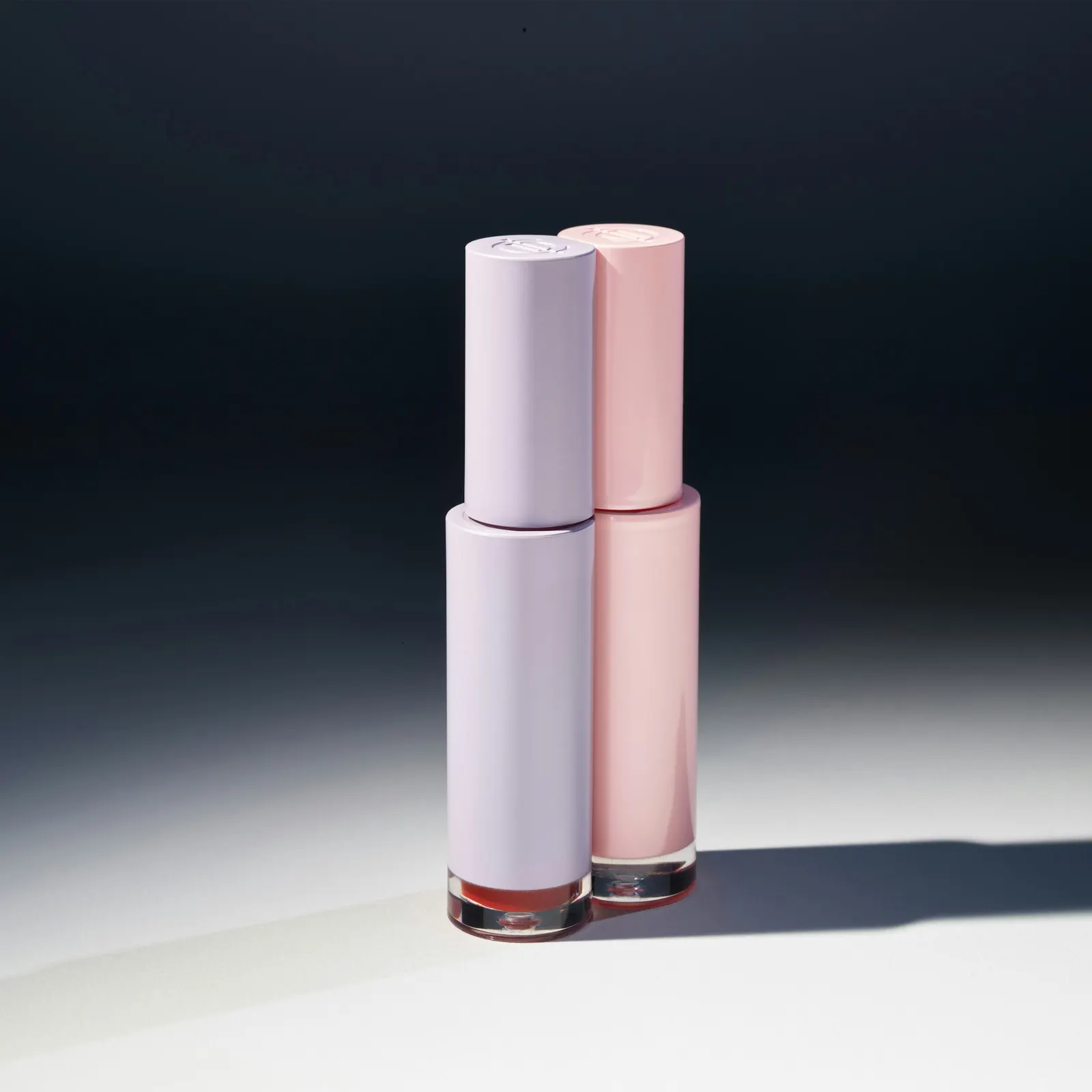
↗Pentagram's identity for ICD, the Seoul beauty brand from Incellderm, stands out for a detail you feel more than see: the products click together. ICD's cellular-science roots had grown into a broader, function-led range, and its look no longer matched that ambition. Pentagram partner Paula Scher and designers Billie Rene, Kirstin Rocke-Huber, Olivia Ray, Piotr Woronkowicz, and Suguru Ogata reworked the brand from mark to package.
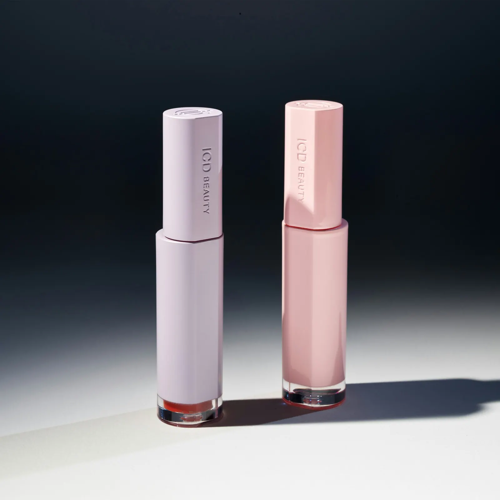
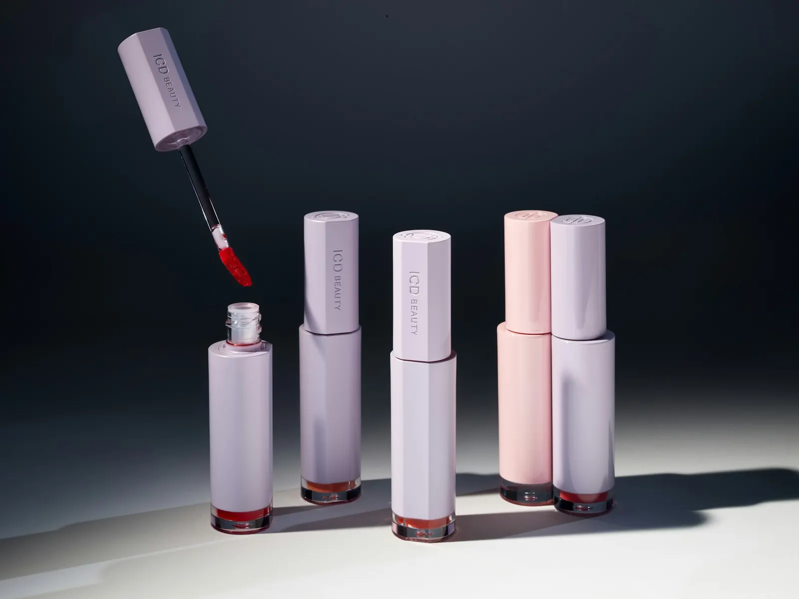
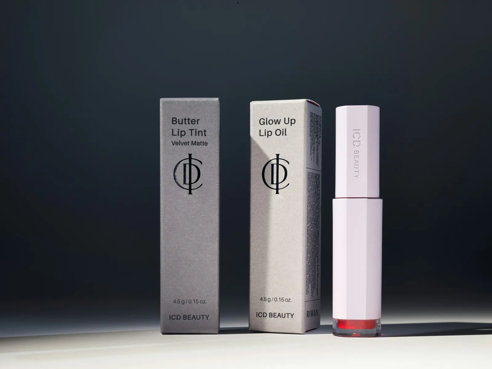
The new monogram links ICD's letters together, with the scale shifting subtly from one character to the next. The packaging starts from a familiar annoyance, digging through a bag for a lip product. Magnets built into the pieces let products find each other and stay together. Grant Cornett's photography shows how the system looks as well as how it behaves.
Why it works
The monogram's gradual change in scale gives a three-letter mark a sense of order and precision, which suits a brand built on science. The magnets do the more important work. They solve a real, small problem, so the idea of ritual comes from using the product rather than from styling. In a category crowded with ingredient claims, a physical behavior is harder to copy than a logo or a color palette. It also needs no translation for a global audience.
Applications
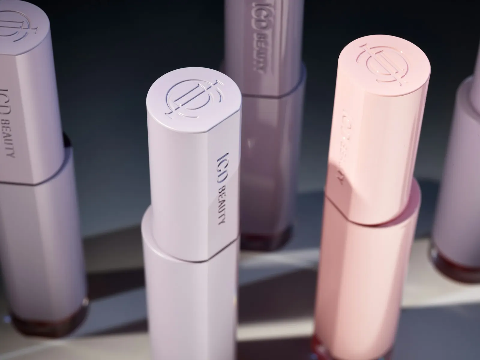
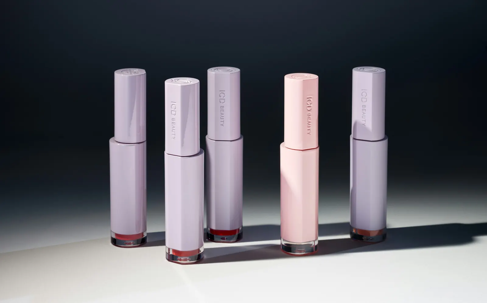
Images and video from pentagram.com, by Pentagram.