The Brand Monograph
The Wall Street Journal brand identity by Order
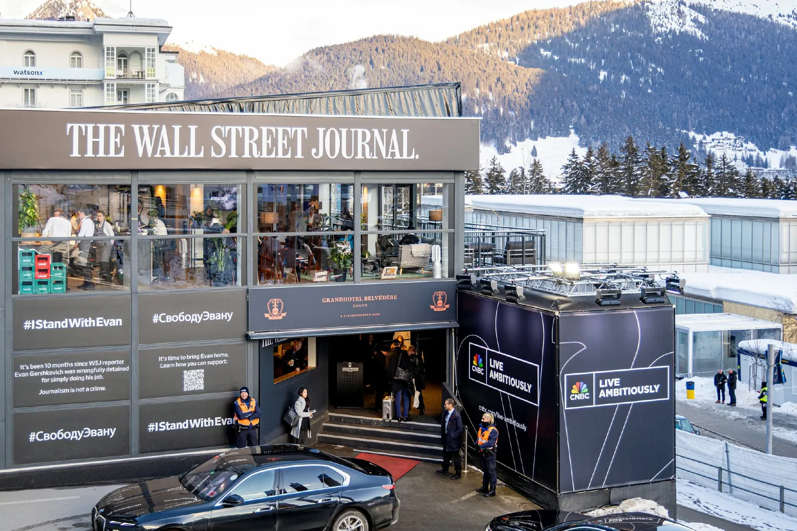
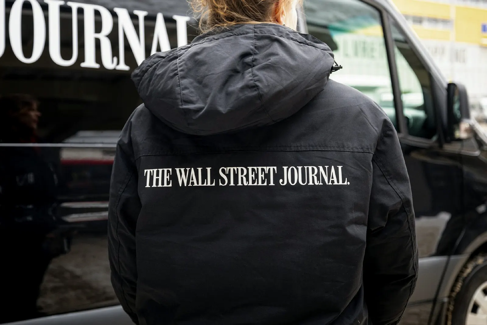
↗Order turned the Wall Street Journal masthead into the raw material for an entire event identity. Journal House is the paper's hospitality space at gatherings such as the World Economic Forum, Cannes Festival for Creativity, and COP 28, and the studio's task was to make it feel unmistakably WSJ without inventing a rival brand.
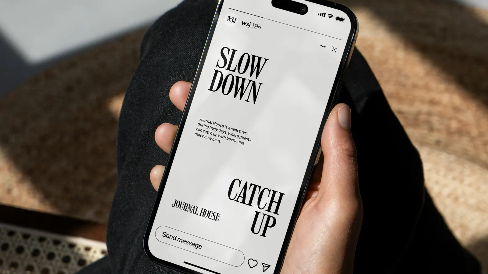
Working with MCKL Type Foundry, Order developed Journal Masthead, a typeface that takes its letterforms and spacing directly from the logo, and set it alongside Retina by Frere-Jones Type, already the brand's supporting face. Garrett Corcoran handled design and Jesse Reed strategy. The palette is mostly black and white, with color held back for small accents. A house-shaped pattern appears only on site, joined by textural photography of each host city and its surroundings. A digital guidelines site holds the files, templates, and usage advice for teams in the field.
Why it works
Most event branding shouts over its neighbors. Here, the restraint is the point. Because the custom alphabet comes from the logo itself, every sign, program, and headline carries the masthead's authority without repeating the logo, which suits an audience of executives and policymakers who already know the name. Holding color back keeps the typography doing the talking, and it looks calm beside louder sponsor activations. Reserving the house pattern for on-site use makes each venue feel like a place you stepped into, not a campaign you were shown.
Applications
Logo


Typography

Color




Images and video from order.design, by Order.