The Brand Monograph
Airbnb brand identity by Further
↗Few rebrands change how a company sees itself as much as Further's work for Airbnb. The studio treated the brief as a question of purpose rather than packaging, and it found the answer in the field, spending time at the San Francisco headquarters and in homes across 18 metro areas and villages. What surfaced was that the business runs on hosts and guests, not properties.
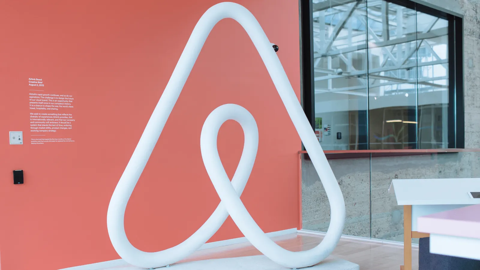
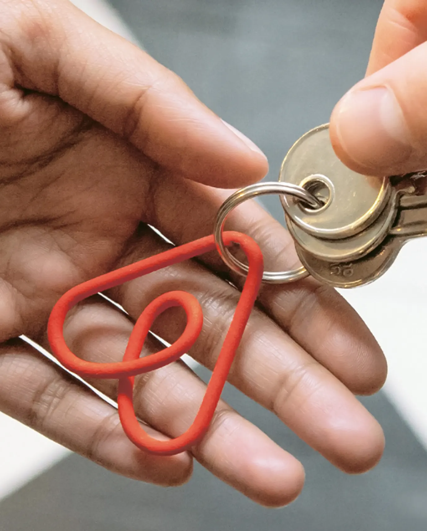
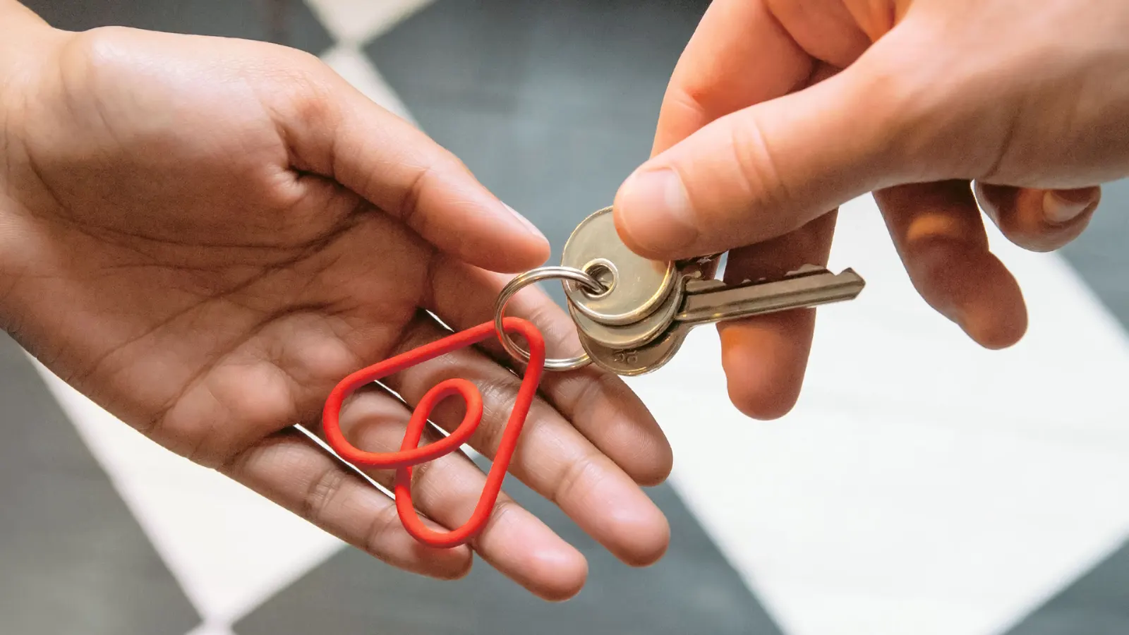
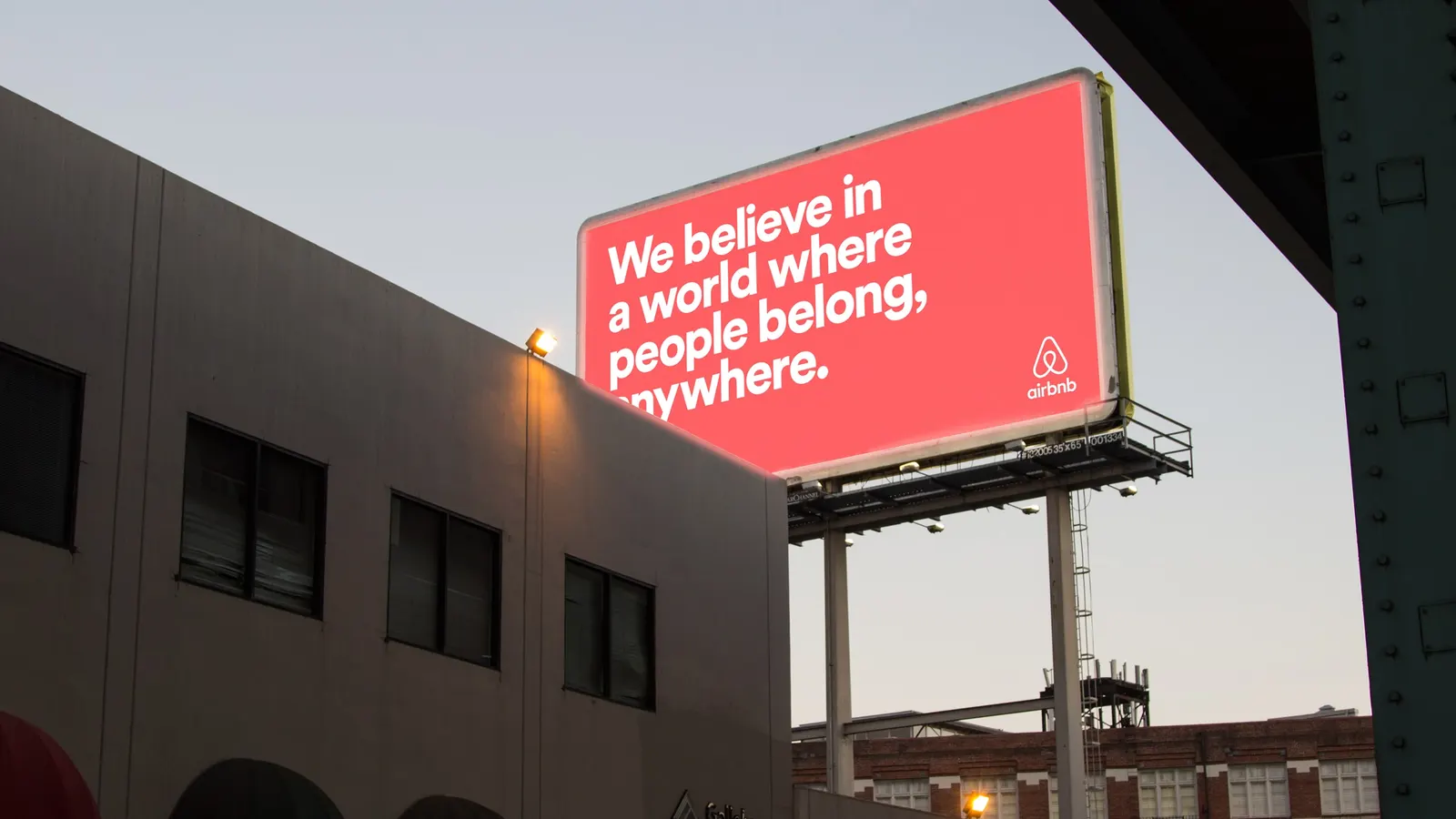
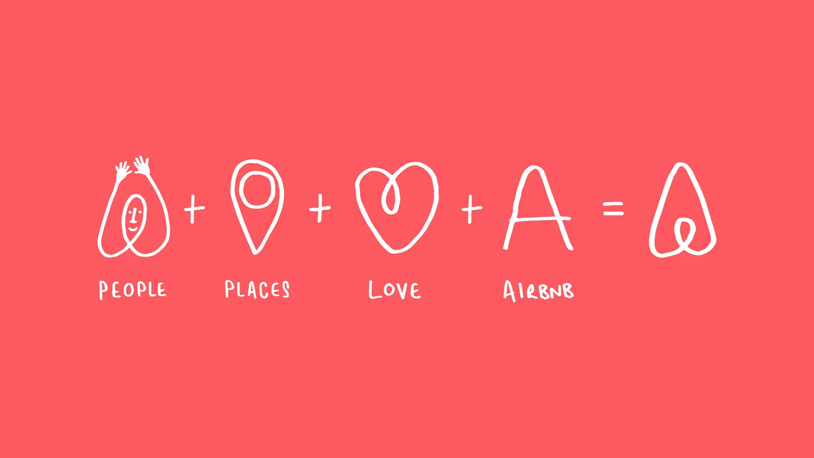
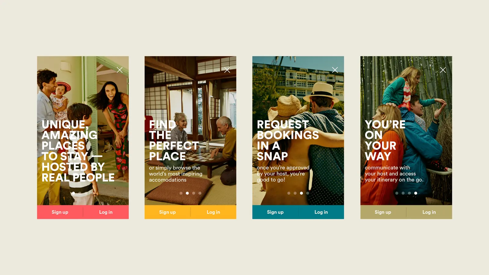
That finding became the mission Belong Anywhere, and the identity grew from it. At the center is the Belo, a symbol simple enough to sketch by hand. Lineto contributed the typography, the copy moved from location and price toward feeling at home somewhere unfamiliar, and photography and film focused on real people. Further then worked from Airbnb's headquarters to rebuild the digital experience so the story held up globally.
Why it works
The Belo works because it invites participation. A mark that anyone can redraw turns the logo into a gesture guests and hosts can make their own, which suits a company built on personal exchange. It also sets Airbnb apart in a category that usually leads with destinations and deals. Because the mission came before the visuals, the mark, the typography, and the tone of the writing all point to the same idea, and that gives the brand room to expand without losing its center.
Applications
Typography
Logo
Images and video from further.group, by Further.