The Brand Monograph
Art House New York brand identity by Pentagram
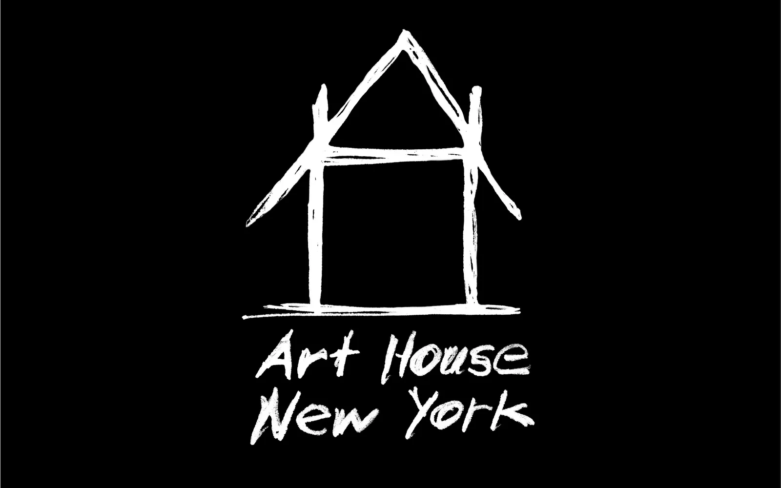
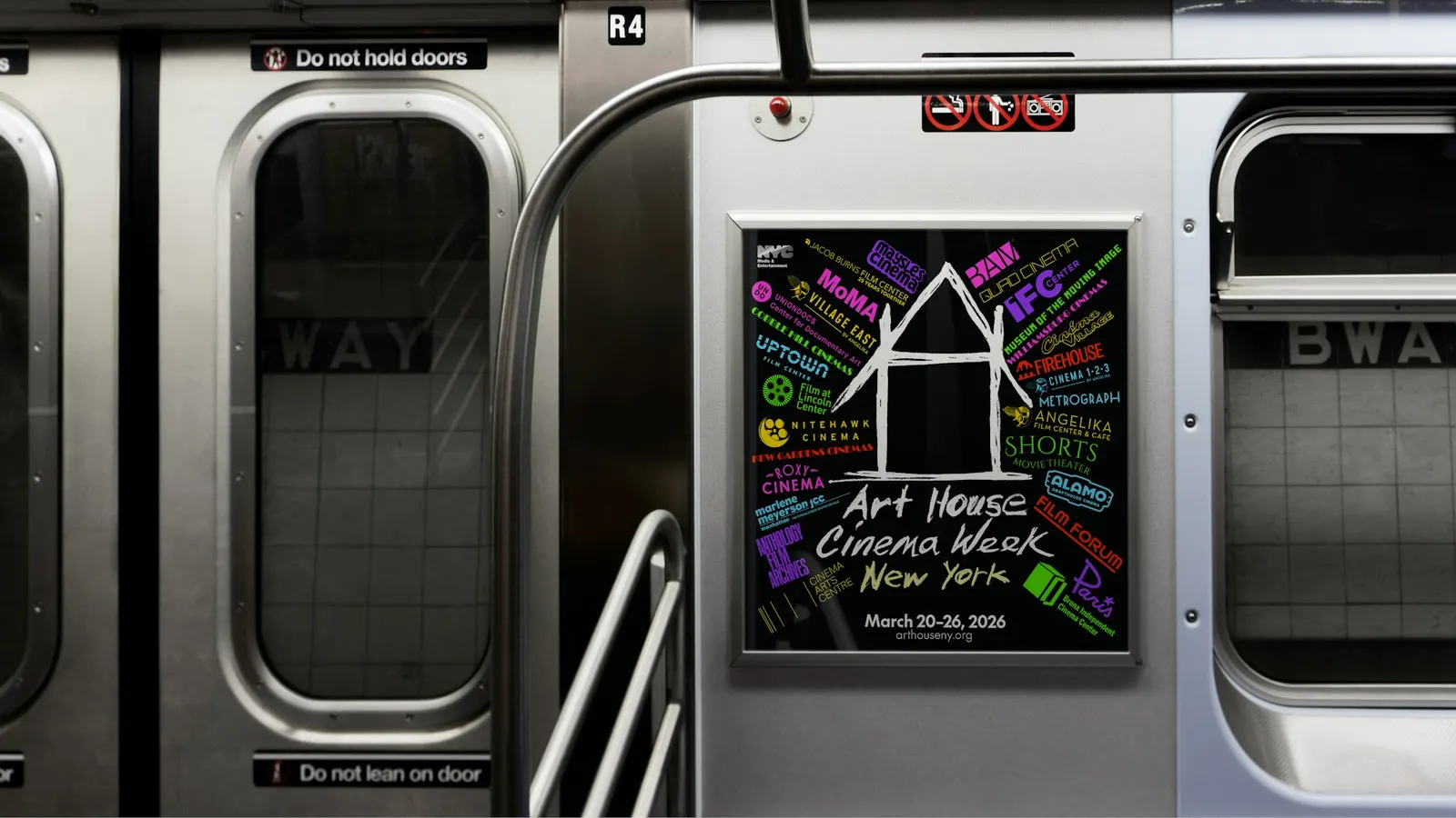
↗Most alliances of cultural venues end up with a neutral mark that offends no one and excites no one. Pentagram's identity for Art House New York is warmer than that. Paula Scher drew the logo by hand, fusing an A and an H into a small house. It reads at a glance and looks like a person made it, not a committee.
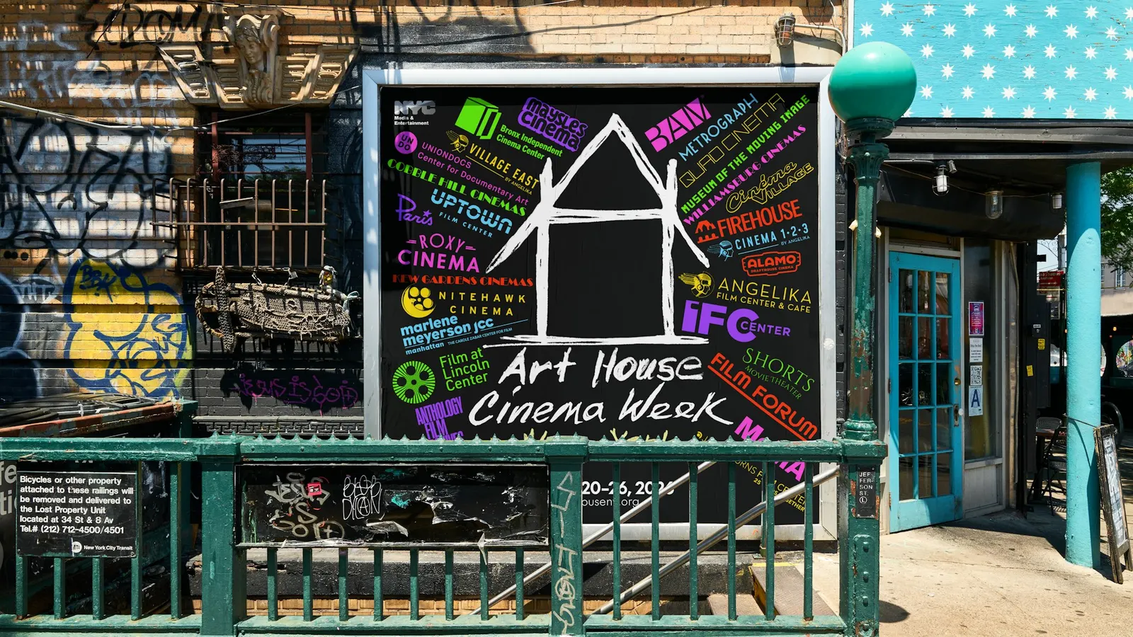
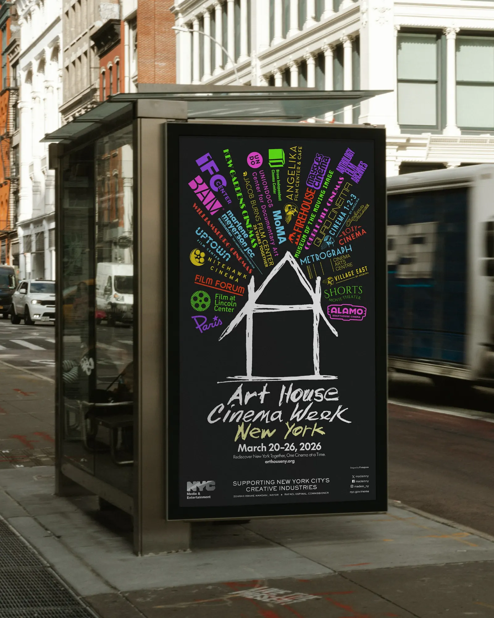
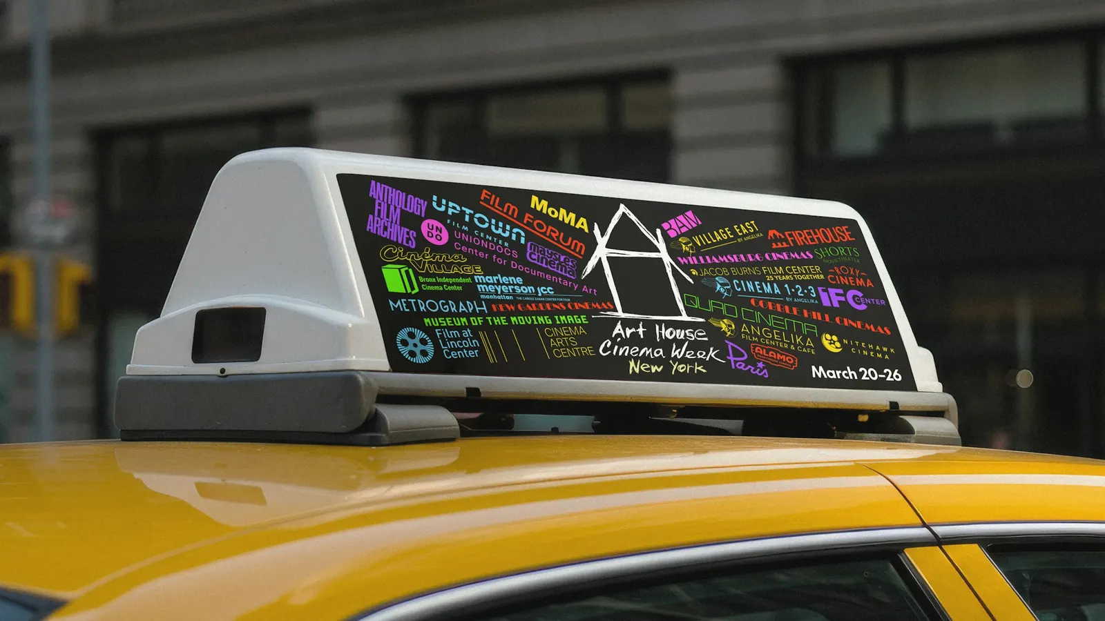
The client is a new alliance of New York's art house cinemas, formed to build audiences, share research, and coordinate strategy. The identity debuted with the first Art House Cinema Week, held March 20–26 with the NYC Mayor's Office of Media and Entertainment. For the campaign, Scher, Bruno Bergallo, and Olivia Ray used the member cinemas' own logos, from Quad and Metrograph to MoMA Film, and set them moving in bright color. Each venue keeps its look, and the system around them does the uniting.
Why it works
A house suits a category built on physical places, where people still walk into a room together to watch something. The drawn line gives the mark some imperfection, which sets it apart from the polished institutional logos around it. Because the mark stays simple, the members' logos can be the loud part. That gives the alliance a way to speak for everyone without asking any venue to give up its identity, and the color and motion make a quiet sector feel like an event.
Applications
Logo
Images and video from pentagram.com, by Pentagram.