The Brand Monograph
Biotic brand identity by Mucho
↗Few identities have to explain something this new. Biotic is the nonprofit behind SpudCell, a synthetic cell built up from basic components and shared openly so researchers can study it, change it, and build on it. Mucho's task was to make that legible to scientists, organizations, and the wider public. The studio began by immersing itself in the science and asking basic questions before it designed anything.
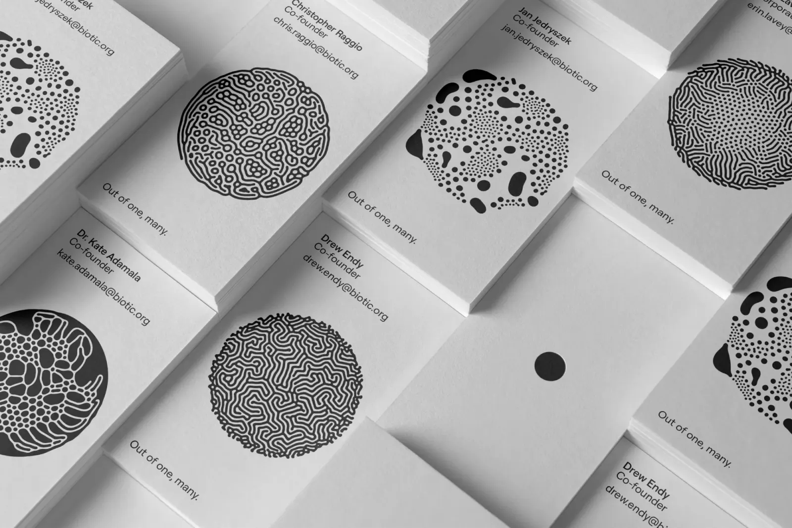
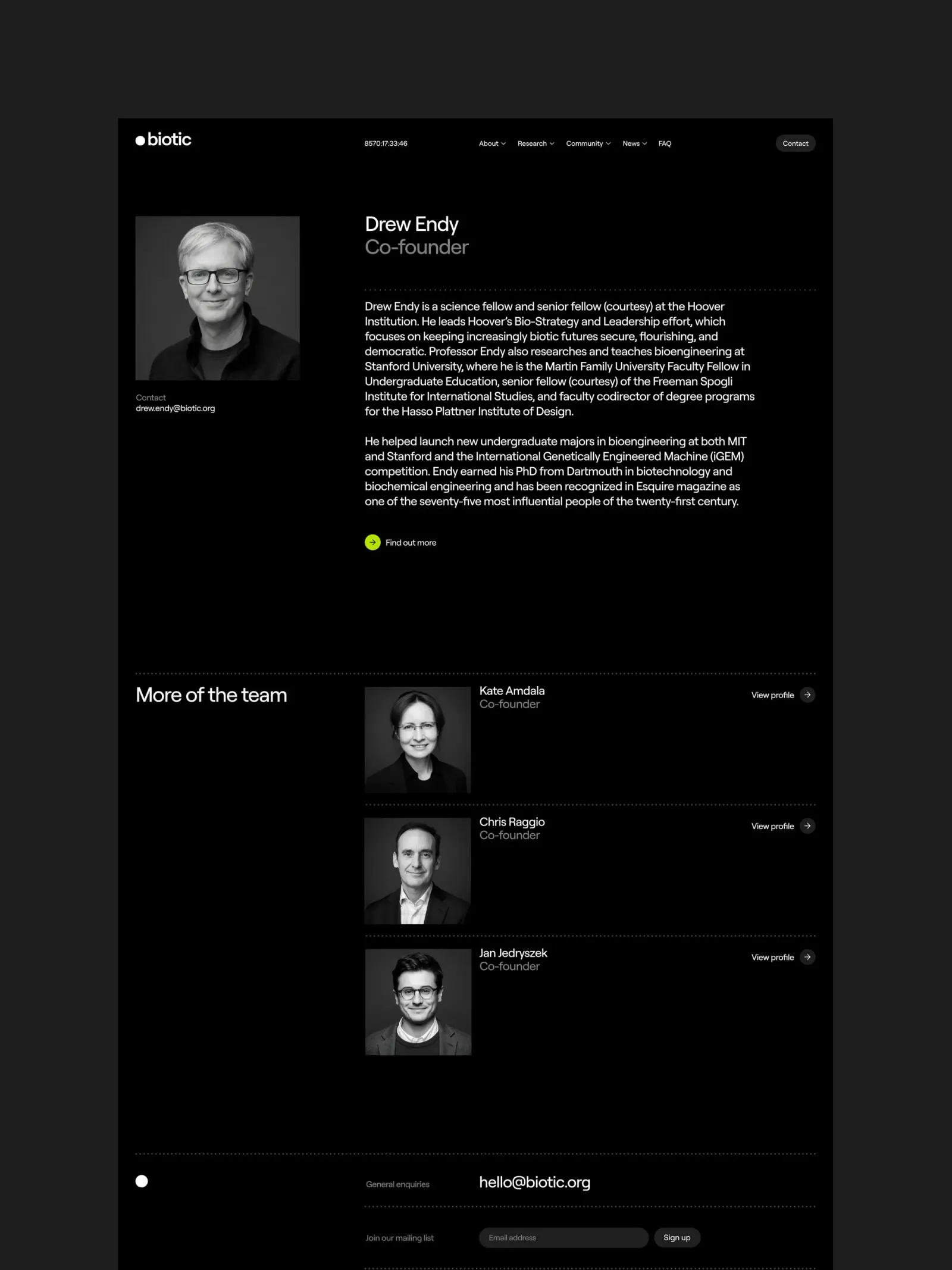
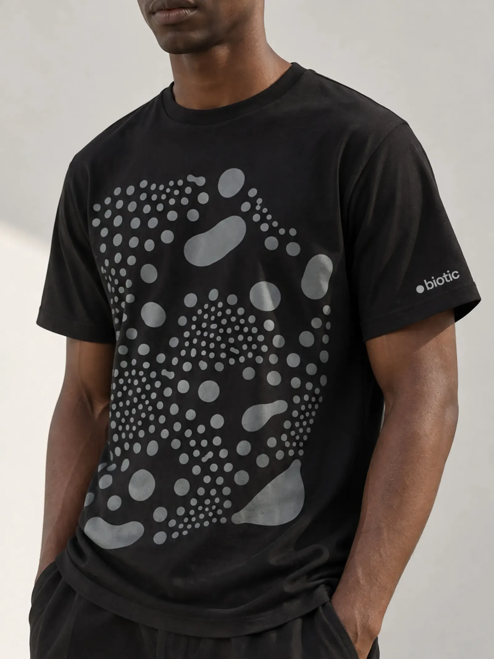
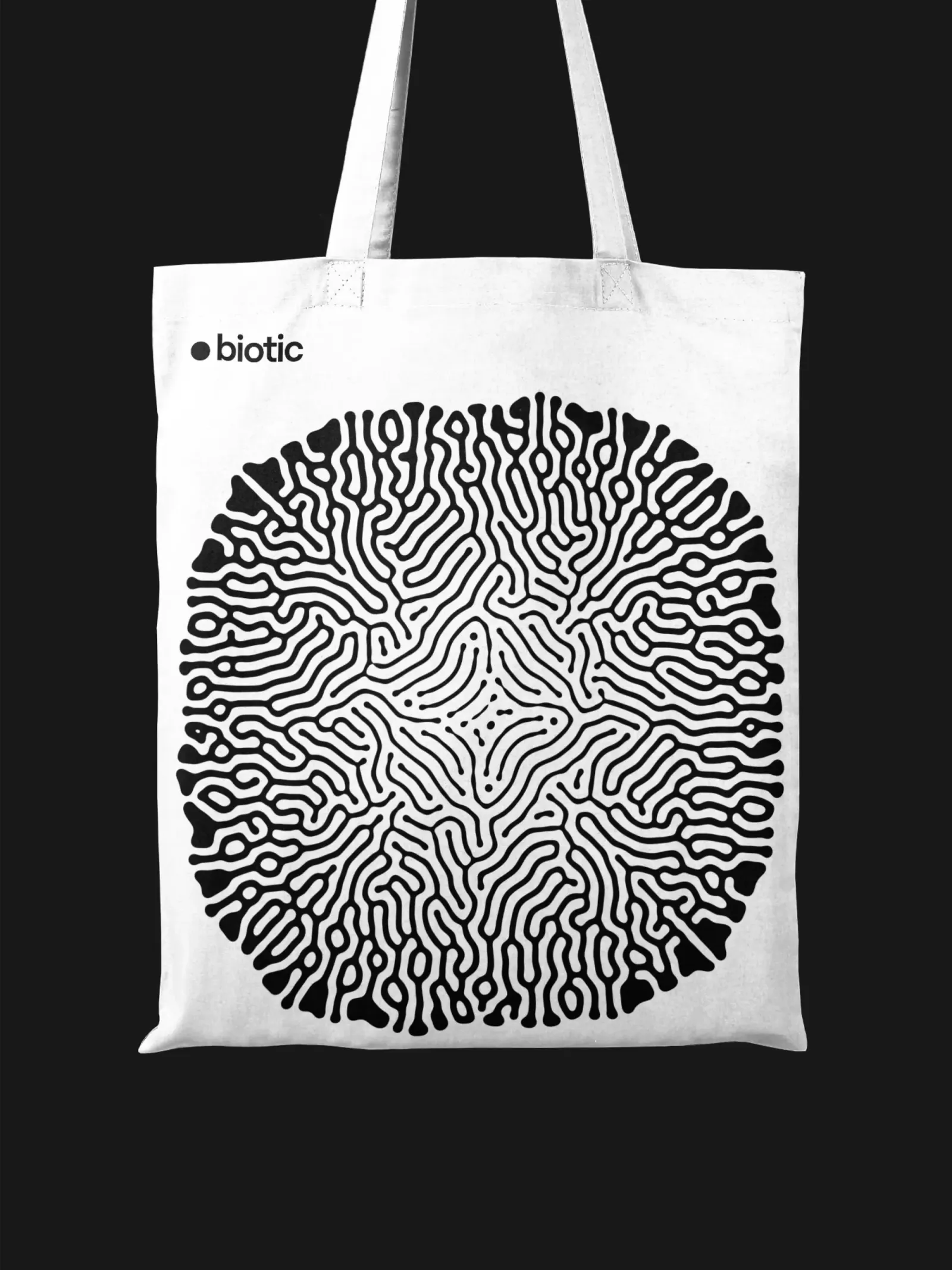
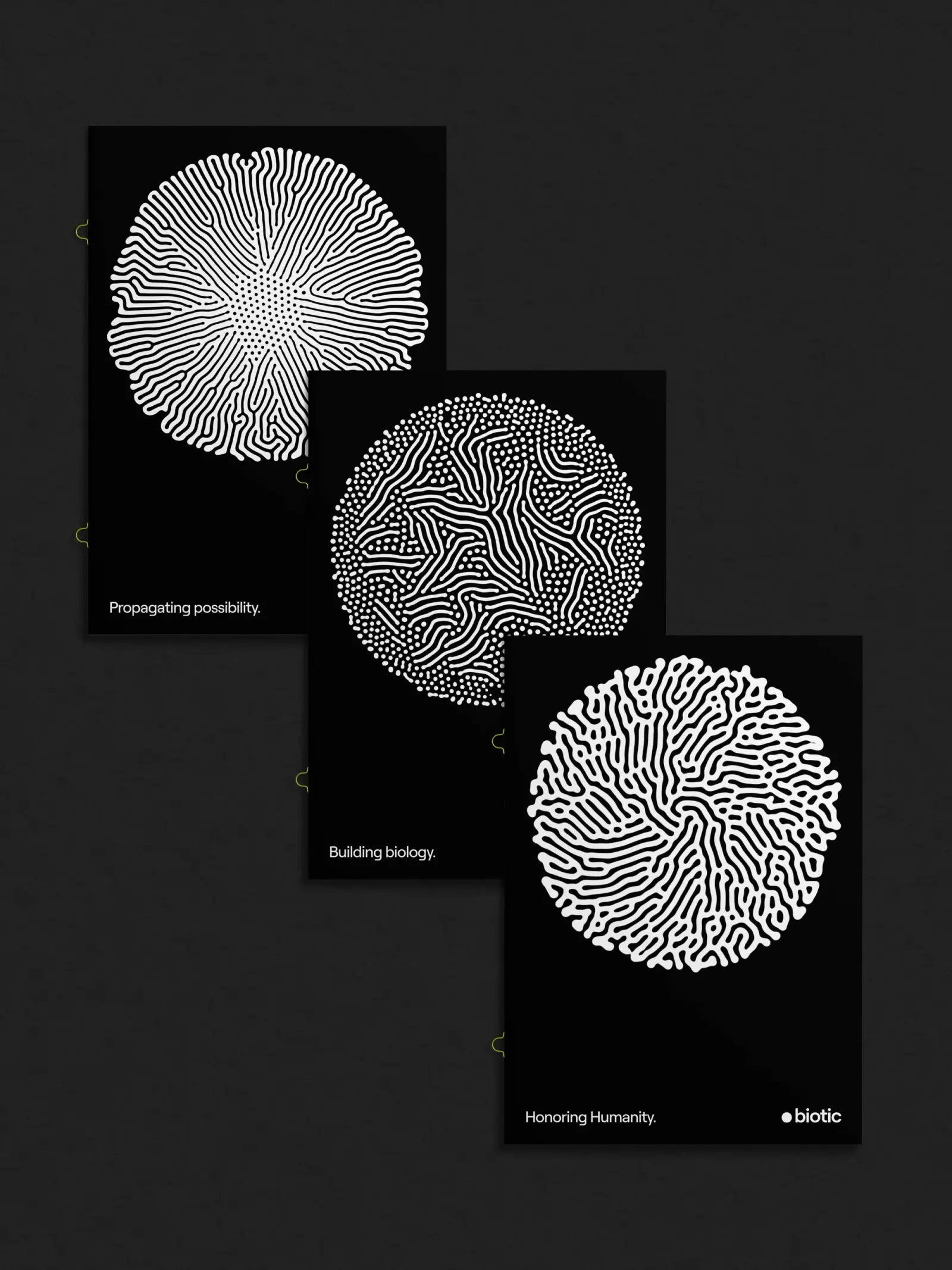
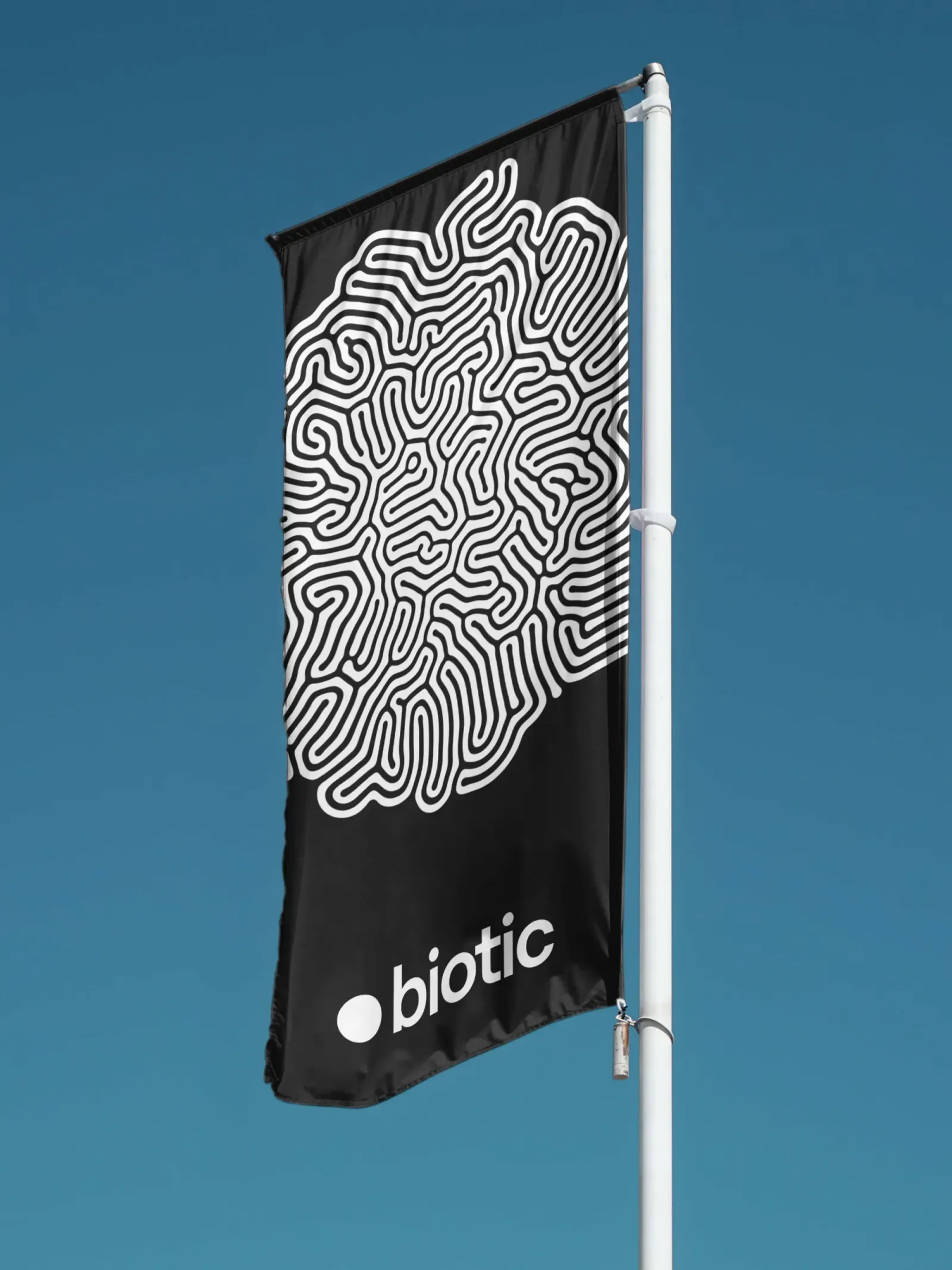
Working with strategist Rob Duncan, Mucho arrived at a Latin tagline that inverts the American national motto, turning unity into multiplication. The logo is a single dot. From it, a system of animations and still images grows using Karl Sims' Reaction-Diffusion software, all in black and white. Kaleido Grafik built the responsive website, where a live clock counts down to 2050 as part of the Bloomsday idea, with copy by David Begler. The palette is held back on purpose, so color can arrive as the science develops.
Why it works
The dot does three jobs at once. It is the logo, a literal picture of one cell, and the seed of the whole visual system, so the generative imagery feels inherited rather than decorated. Biotech and science brands often default to glossy molecules and lab blues, so strict black and white sets Biotic apart and reads as rigorous without feeling clinical. The restraint also leaves the motion as the main event and keeps room for future growth. The countdown gives the brand urgency without alarm, which suits an audience it needs to recruit, not frighten.
Applications
Logo

Images and video from wearemucho.com, by Mucho.