The Brand Monograph
THE LOOM brand identity by Supper Works
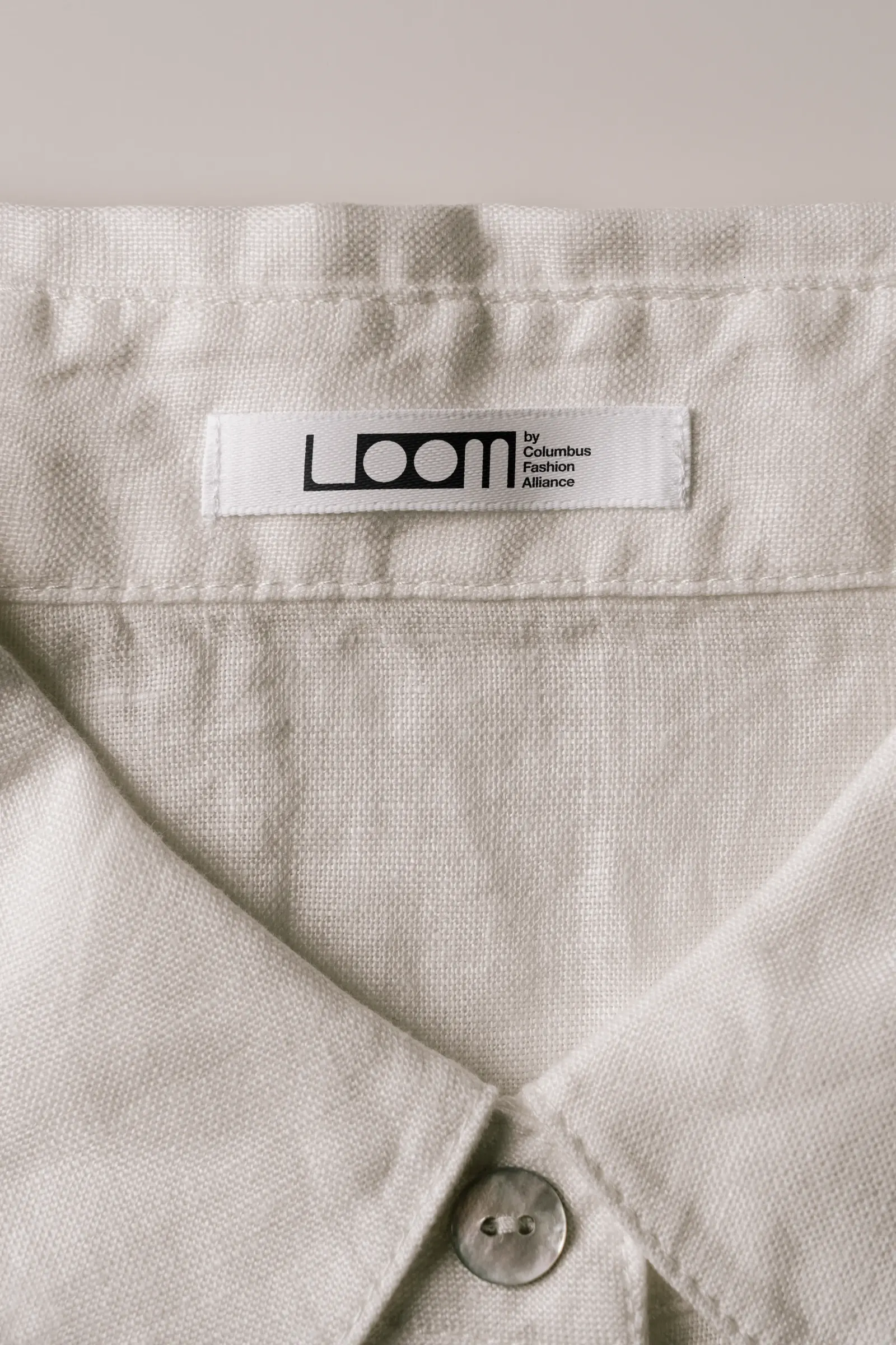
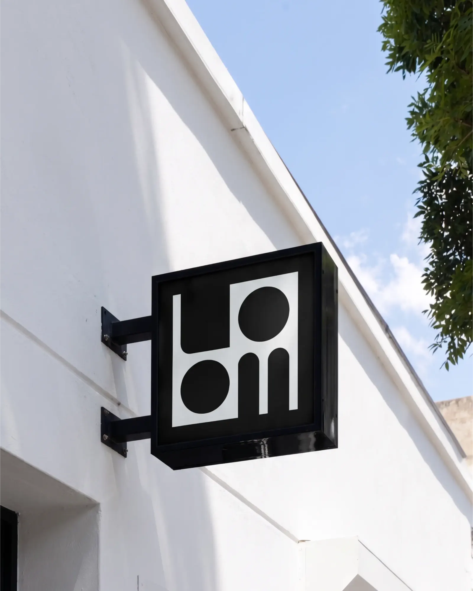
↗Supper Works drew THE LOOM's logo from the geometry of the building itself. A circular silo sits inside a rectilinear structure, and the studio turned that pairing into a circle-in-a-square motif that organizes the whole identity. The client is the Columbus Fashion Alliance, a nonprofit supporting the city's fashion industry. The building is its new headquarters, a former Columbus College of Art and Design warehouse that now holds studios, shared workspaces, equipment, and programming.
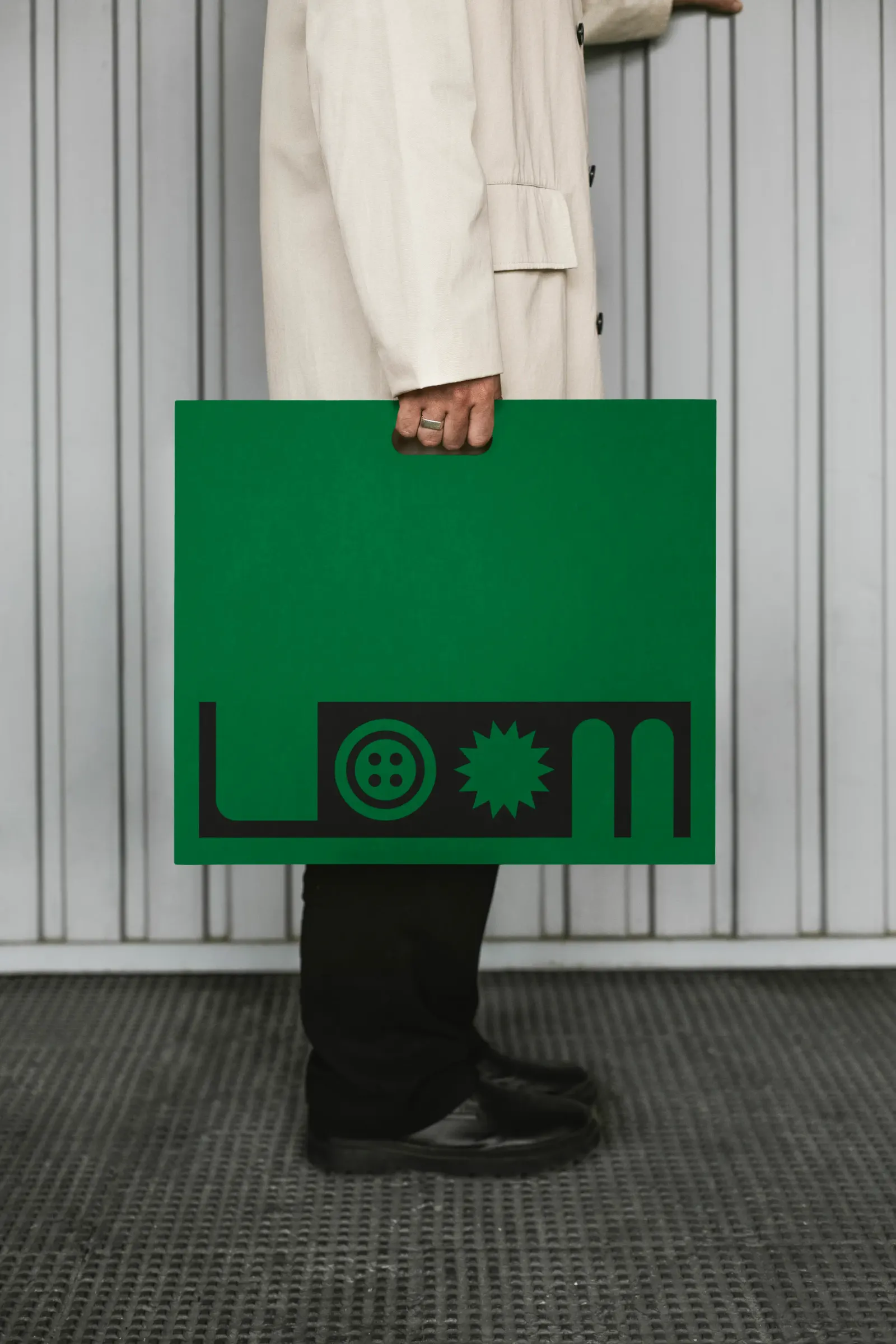
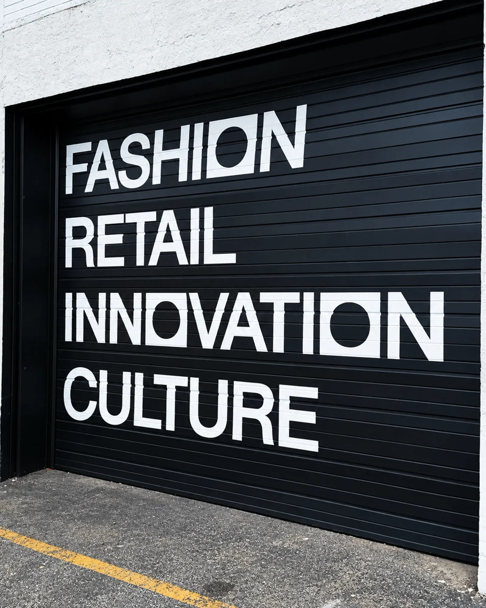
The logo works as a modular kit. Its O counters can stay empty or hold custom icons for the four pillars: fashion, retail, innovation, and culture. Supper Works also gave the system two registers. Empty counters, black and white, and Helvetica Neue read as measured and professional. Filled counters, bright color, and the accent typeface Aether turn it looser and more illustrative.
Why it works
Fashion identities often default to hushed, exclusive minimalism, which is the wrong signal for an organization that wants newcomers to walk in. Here the O does the work: one simple container can hold an icon for whichever discipline is speaking, so the mark never favors one corner of the industry. The two tonal settings suit an audience that ranges from established professionals to first-time makers. Helvetica Neue keeps things credible, while Aether and color invite play. Because the circle and square come straight from the building, the mark feels earned rather than applied.
Applications
Logo

Images and video from supper.works, by Supper Works.