The Brand Monograph
GFI brand identity by Nemesis
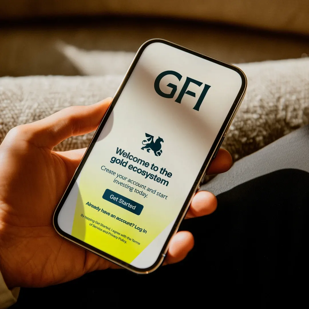
↗Gold investment usually speaks in one of two registers: heavy tradition or fast-money hype. For GFI, Nemesis went for something calmer and more useful. GFI is Belgium's best-known name in the category, with more than twenty years of experience, and it was about to launch an app that ties physical gold to digital access. The identity had to be ready for that shift.
Nemesis was asked to make the brand feel established and current at once. The studio built the refresh around a single visual device about guidance, aimed at people who are curious about gold but unsure how to start. It supports a clear offer: one place to buy, sell, store, and grow tangible assets, whether they are held physically or managed in the app.
Why it works
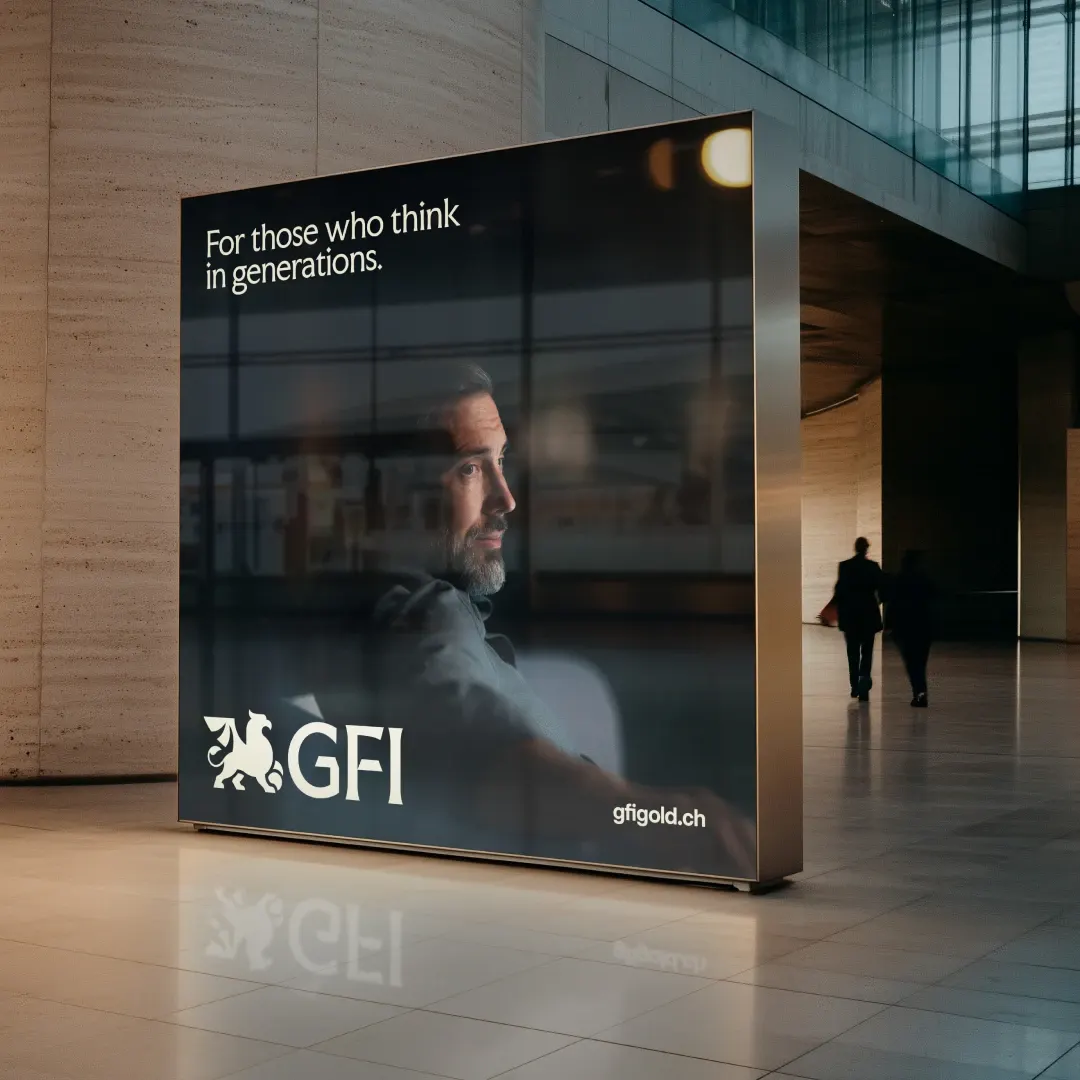
The audience here is the hesitant newcomer, and in a category that often earns credibility by looking weighty, a device built around guidance gives GFI a role rather than just a look. It lets two decades of experience read as reassurance instead of age. It also gives the physical business and the app one idea to share. Committing to that one idea, rather than piling on familiar gold signifiers, is the discipline that makes the brand feel approachable and trustworthy.
Applications
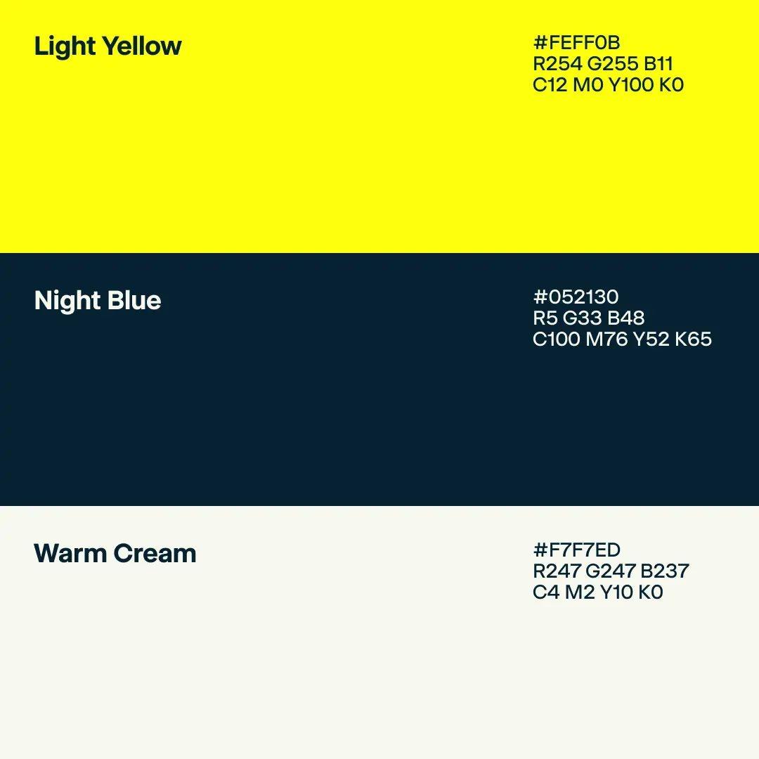
Color
Logo


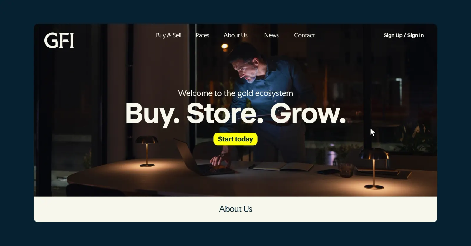
Images and video from nemesis.studio, by Nemesis.