The Brand Monograph
Baret Scholars brand identity by Pentagram
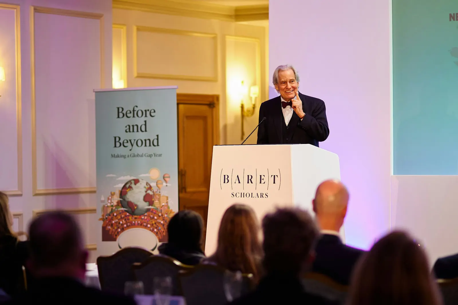
↗Pentagram's identity for Baret Scholars puts its central idea right in the logotype, which is built with lines of longitude that make the name feel like a globe seen up close. Baret is a nine-month gap year program that takes students through seven regions across five continents. It was founded by the team behind Avenues: The World School, and it takes its name from Jeanne Baret, the first woman to sail around the world.
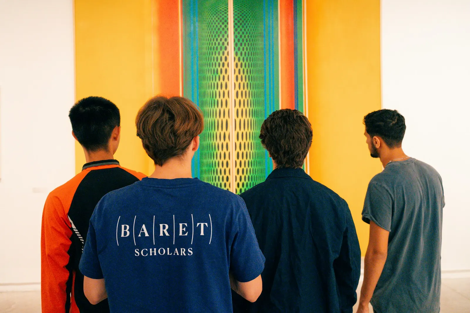
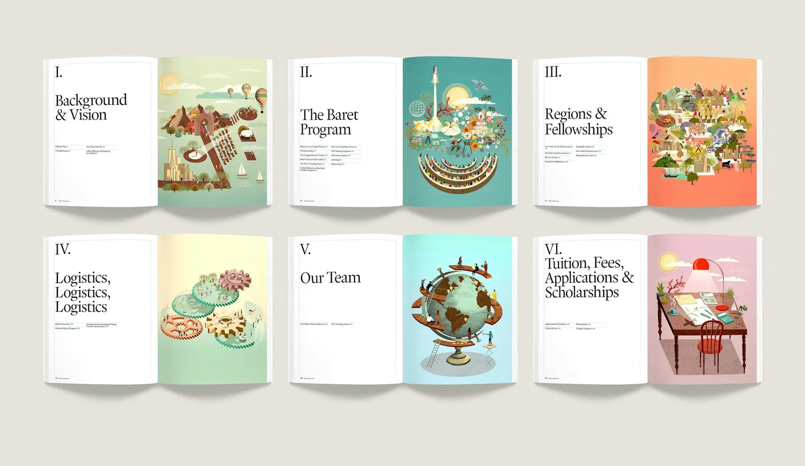
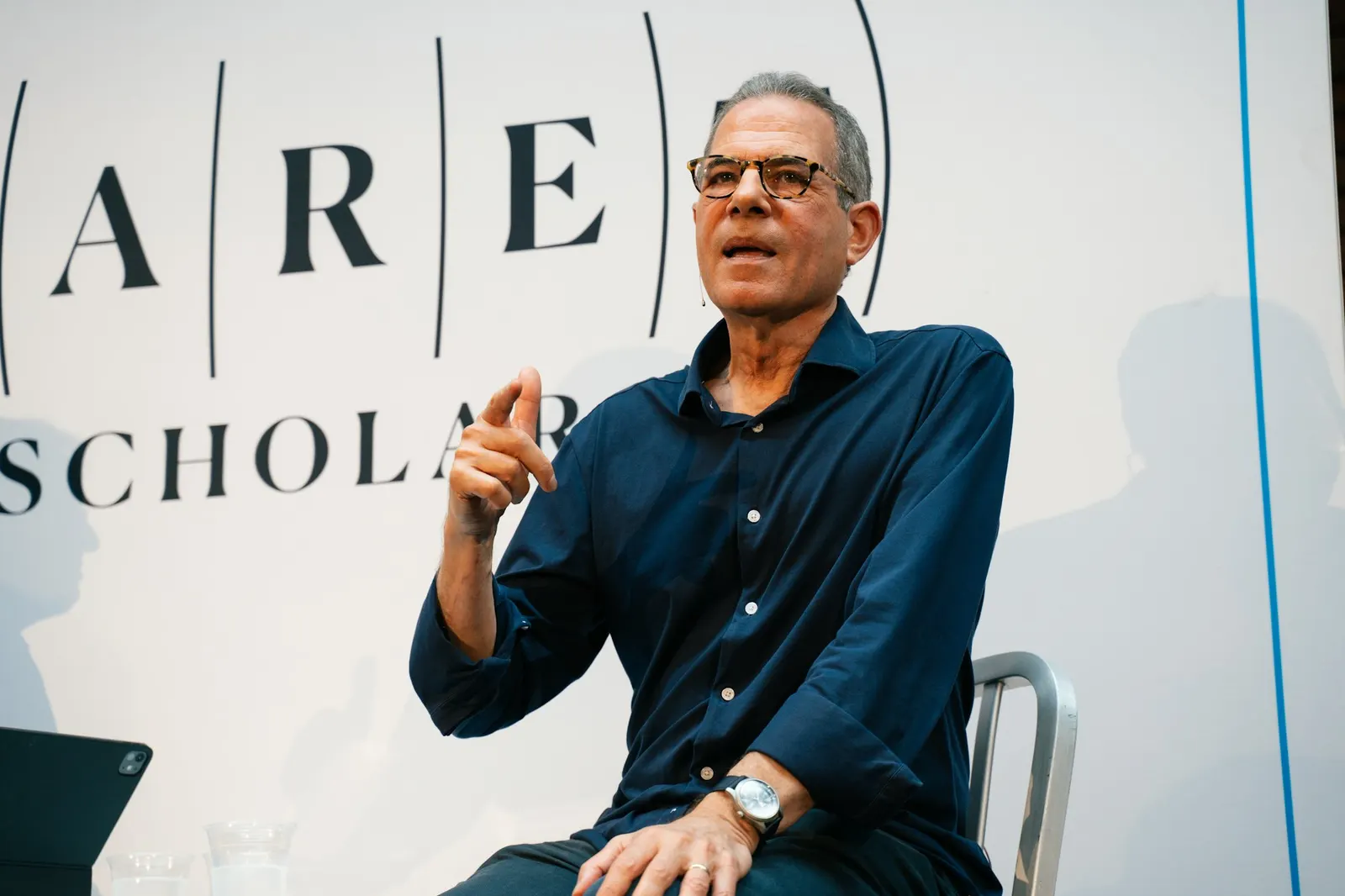
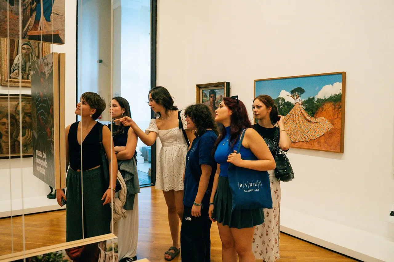
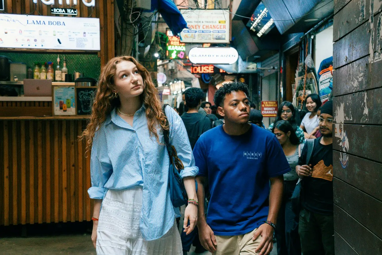
The Pentagram team of Anna LaGrone, Antonio Nogueira, Luke Hayman, and Shigeto Akiyama paired the mark with Guyot, a contemporary serif with a literary tone. The anchor piece is a 172-page book that doubles as viewbook, course catalogue, and travel guide. It carries abstract artwork by Adam Simpson, including a map inspired by early exploration charts, and faculty portraits by Anje Jager. Photography of the inaugural 2024-25 cohort adds a documentary layer, and a social campaign supports each application cycle.
Why it works
Travel brands tend to reach for compass roses, passport stamps, and airplane imagery. Longitude lines signal navigation more quietly, and they keep the mark from looking like tourism. The literary serif speaks to the parents and advisors who must trust a brand-new program, while Simpson's illustration gives students something to imagine. Jager's portraits put real faces on the people who will travel with them. Because the book is built to be read closely, it suits a decision that families make slowly.
Applications
Logo
Typography

Images and video from pentagram.com, by Pentagram.