The Brand Monograph
Bodycare brand identity by Fold7
↗Few rebrands begin with a business that has already collapsed. Fold7 took on Bodycare, a value beauty chain across the Midlands and North that was bought out of administration in 2025, and treated the store itself as the main piece of brand design. The brief was to give shoppers raised on TikTok a reason to visit a physical shop again.
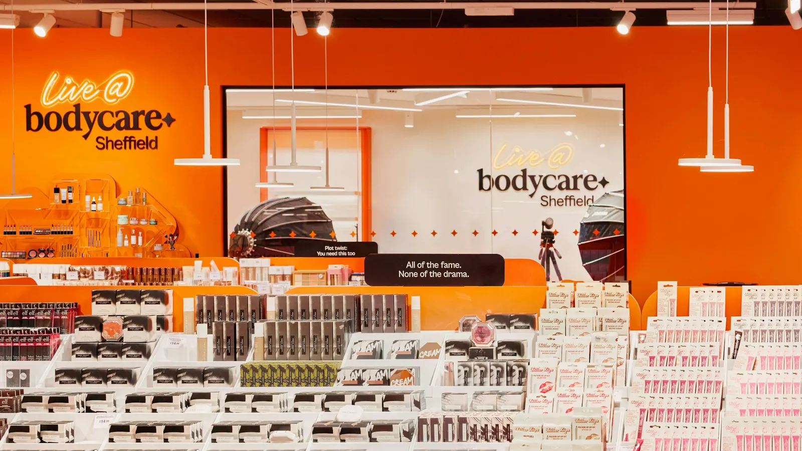
The studio's answer is a store that behaves like a feed. Live broadcast spaces let customers and creators film in real time, layouts reveal something new at every turn, and merchandising responds to local shoppers. The identity carries the idea through a new logo, a flexible set of symbols that moves between abstract shapes and familiar social icons like hearts and speech bubbles, a bright palette, and copy in a warm, older-sister voice. Typography was developed with Dinamo Typefaces and Newglyph.
Why it works
The symbol system does the heavy lifting. Hearts and speech bubbles are the everyday language of the platforms Bodycare's new shoppers already use, so the brand feels native to them before they walk in, while the abstract shapes keep it from reading as pastiche. Because the set is open-ended rather than fixed, it suits a customer base with no single look. The bright palette matters just as much. Value beauty tends toward clinical or shouty promotional cues, and this color choice gives Bodycare a friendlier, more distinctive presence on the shelf and on screen.
Applications
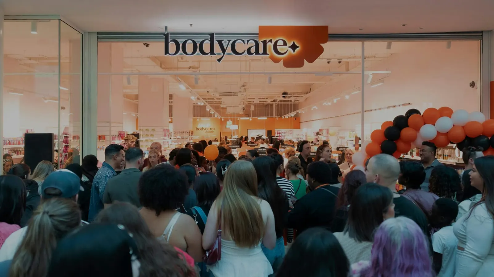
Logo
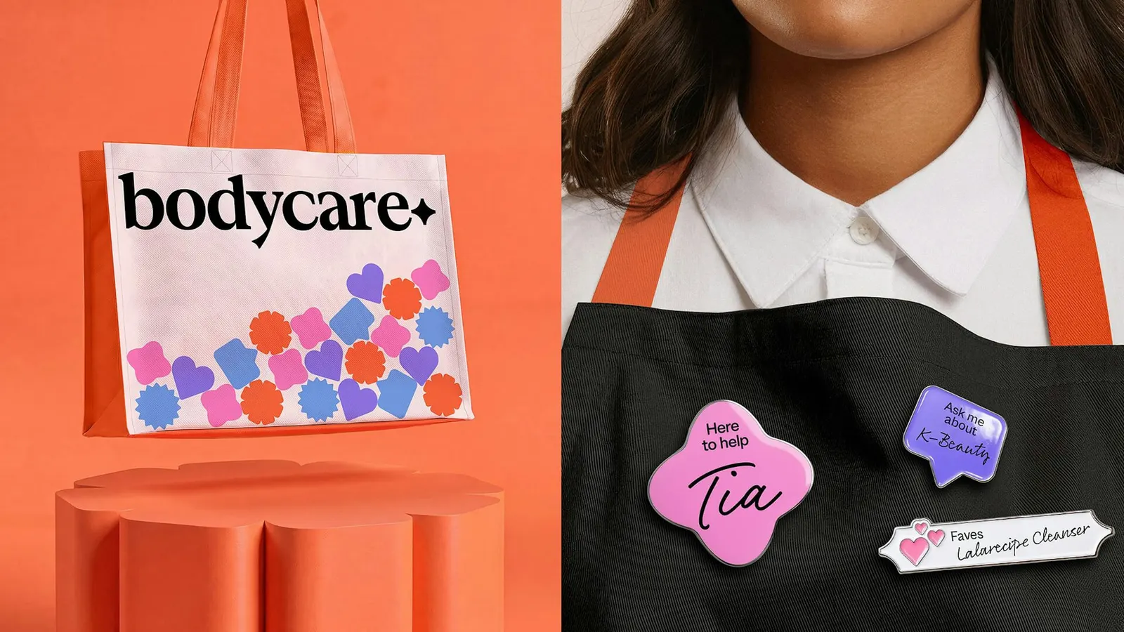
Images and video from fold7.com, by Fold7.