The Brand Monograph
Eclipse Space brand identity by Omoi
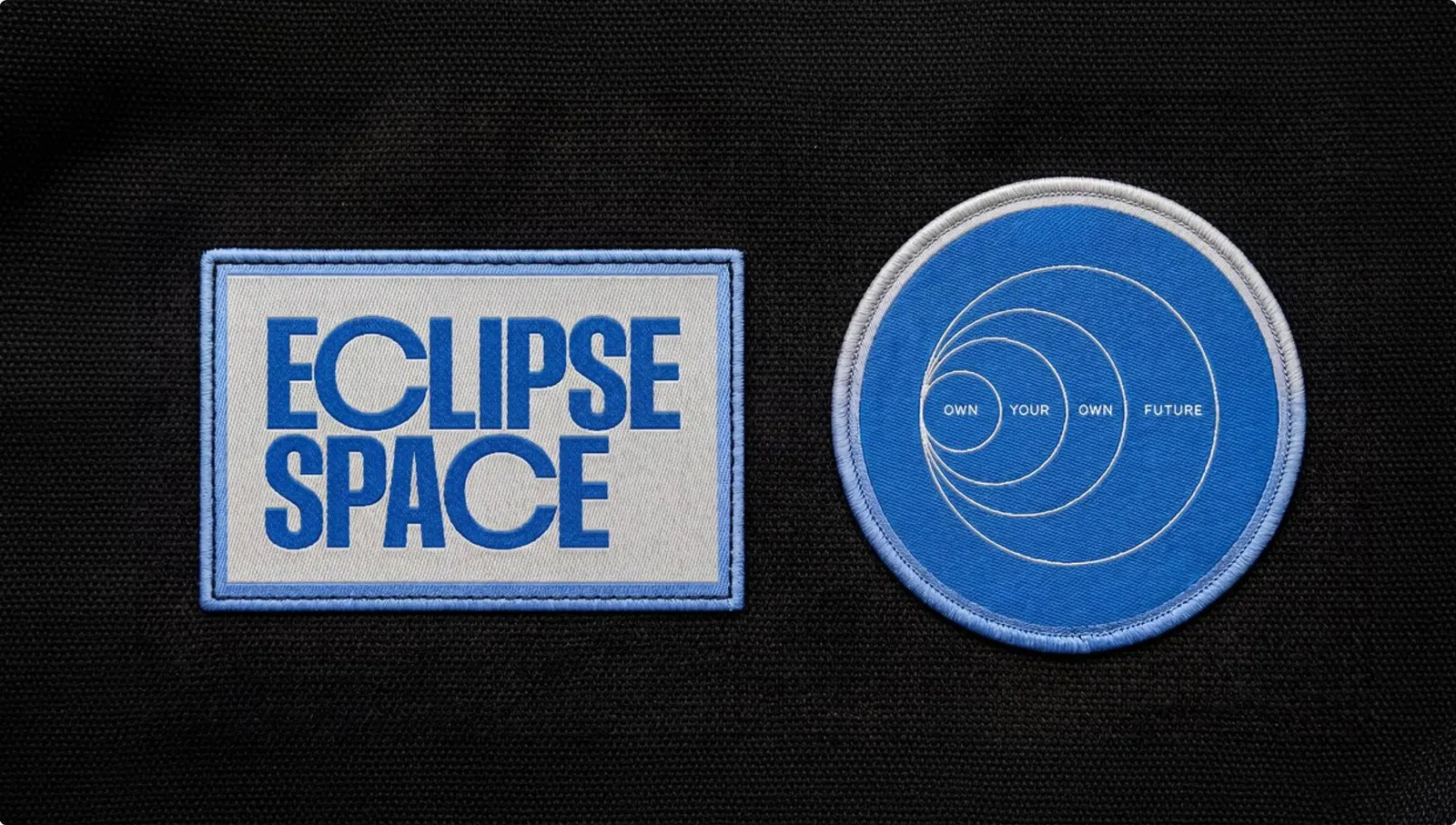
↗Omoi's identity for Eclipse Space is a rare case of the brand arriving last. The company was already building satellite constellations that customers own outright, with a team that had deployed megaconstellations before, but it had little to show publicly. Omoi and strategist Thomas Dawson kept Eclipse's own thesis and swapped the fashionable word "sovereign" for the plainer "own."
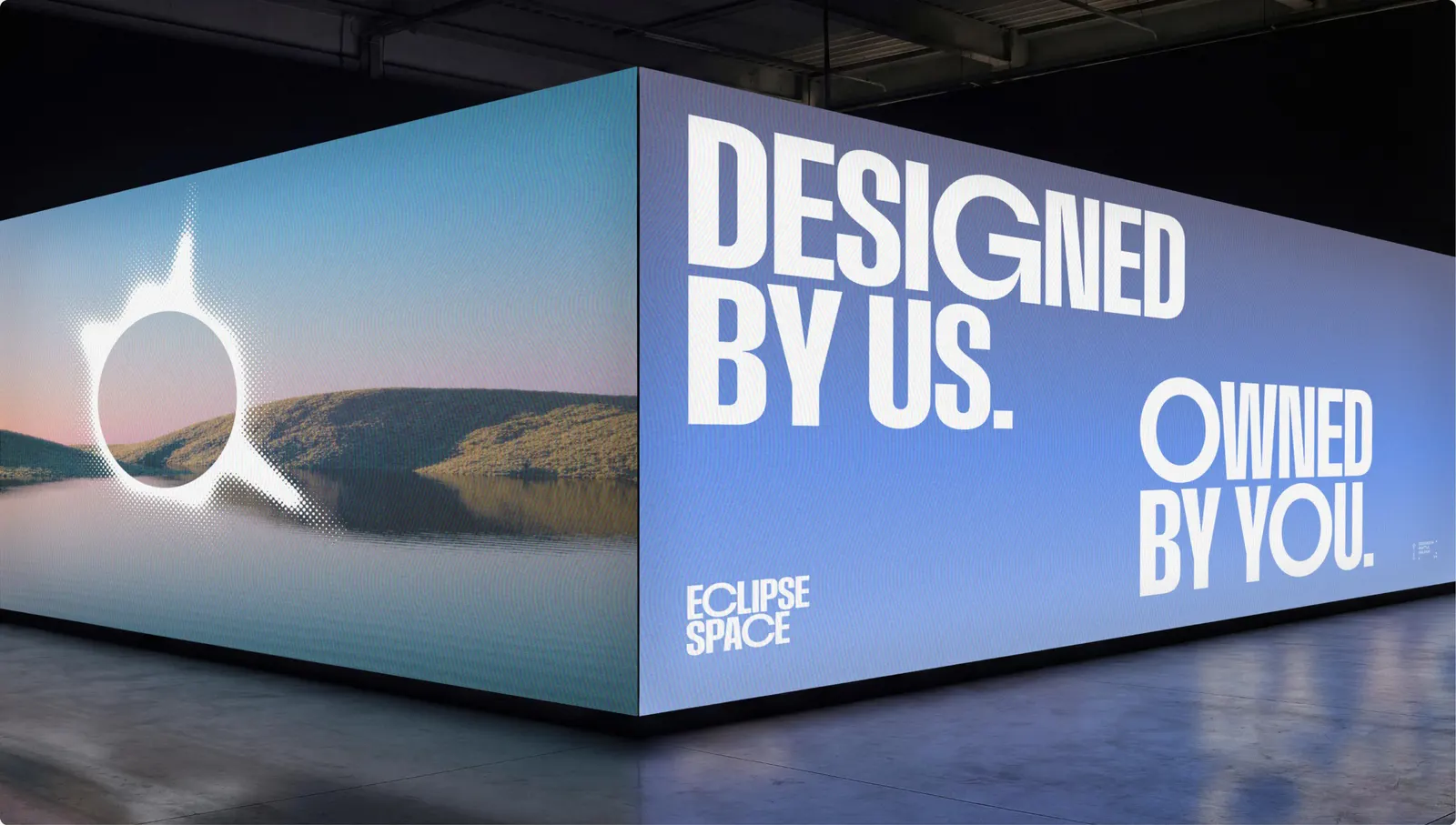
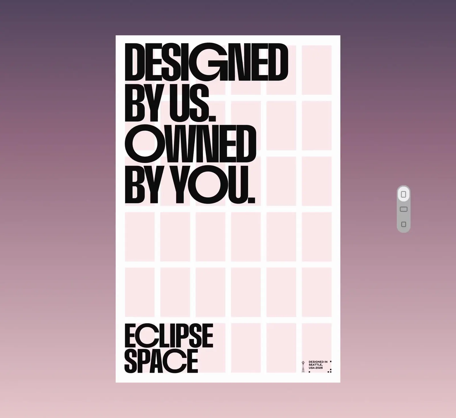
The look borrows from Apollo-era hardware and software. It pairs Marcin Wichary's Gorton Perfected for interface details with Grilli Type's GT Mechanik Poly for text and a custom display face from Blaze Type, all in orange, yellow, and blue. A generator produces the corona symbol in endless variations. Hannah Westander and William Norberg made the 3D satellites, and GRAND st. built the site.
Why it works
Most space brands lean on cold, dark, defense-adjacent styling. Eclipse looks warm and engineered instead, which suits a company asking nations and telcos to trust it with infrastructure. The corona fits the name, and because the generator never repeats itself, the mark echoes the product idea that every customer gets a system of its own. The Gorton and Mechanik pairing reads like real flight hardware, not space-themed decoration, and the keypad-style buttons carry that credibility into the interface.
Logo
Applications

Typography




Images and video from omoi.co, by Omoi.