The Brand Monograph
Pitched brand identity by NDM Branding
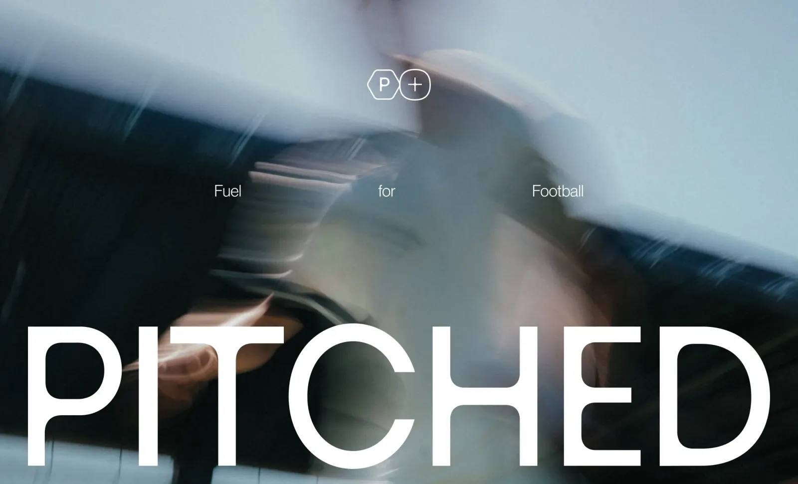
↗Most supplement brands chase the broadest audience they can find. Pitched does the opposite, and NDM Branding built the whole identity around that choice. The brand is a matchday fuelling system made only for football players, covering what they take before, during, and after a game.
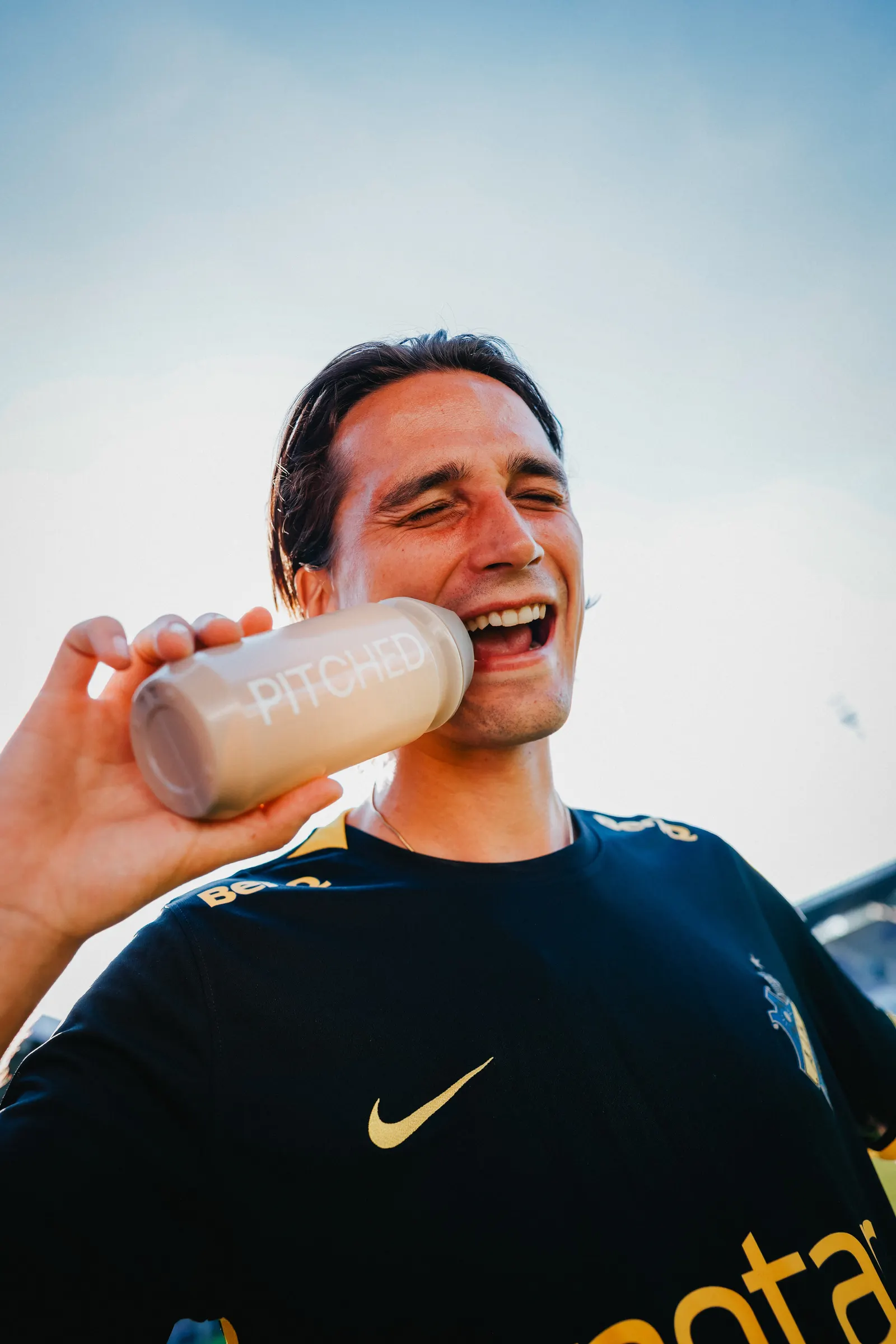
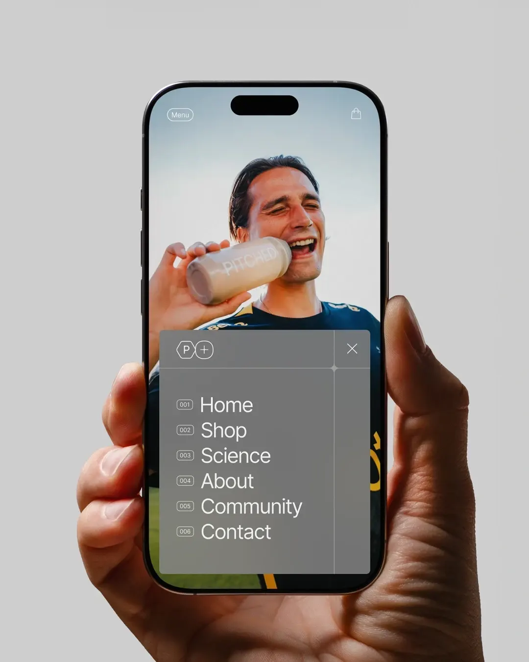
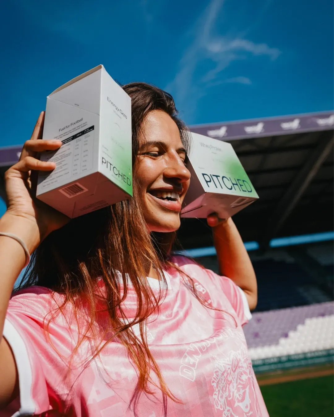
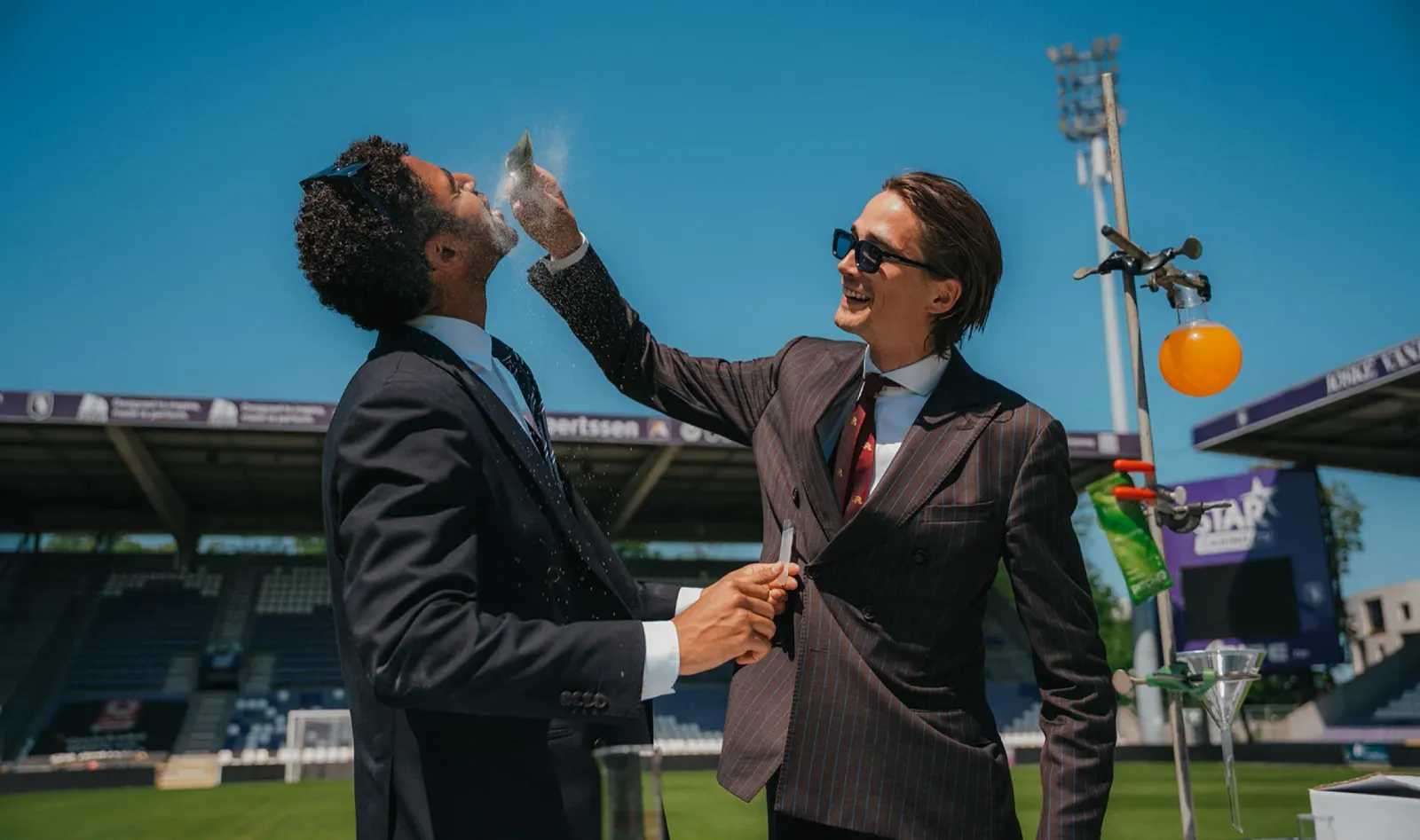
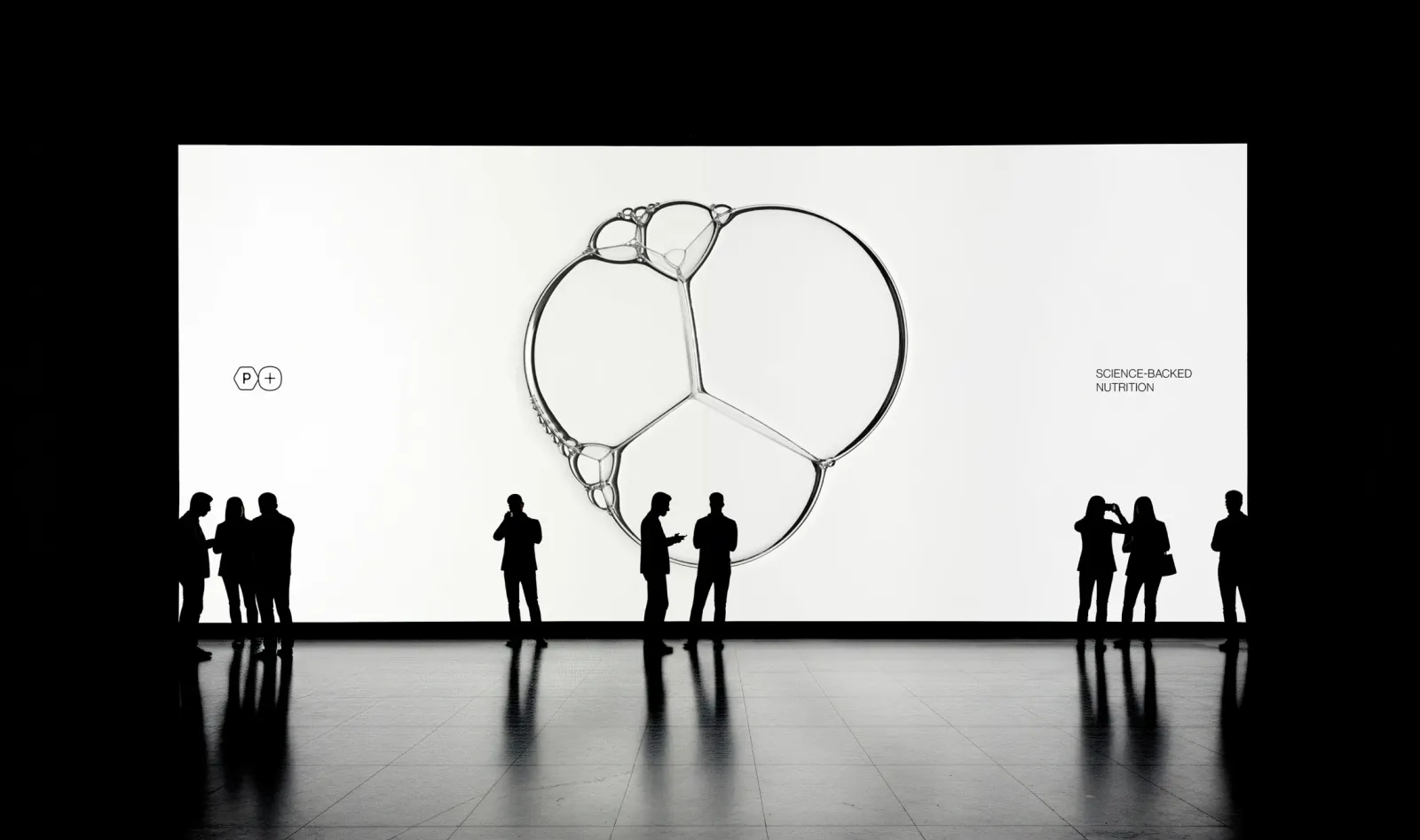
The studio handled strategy and visual identity, and the central tension was clear: football is quick and raw, but the brand needed to look premium. NDM Branding looked to the products' science for an answer. Molecular structures form the logo and then run through the system, from website navigation to email background patterns. The pitch gets a subtler nod through AI-generated motion patterns, softened with gradients and shades of grey. Photography by June rounds out the picture.
Why it works
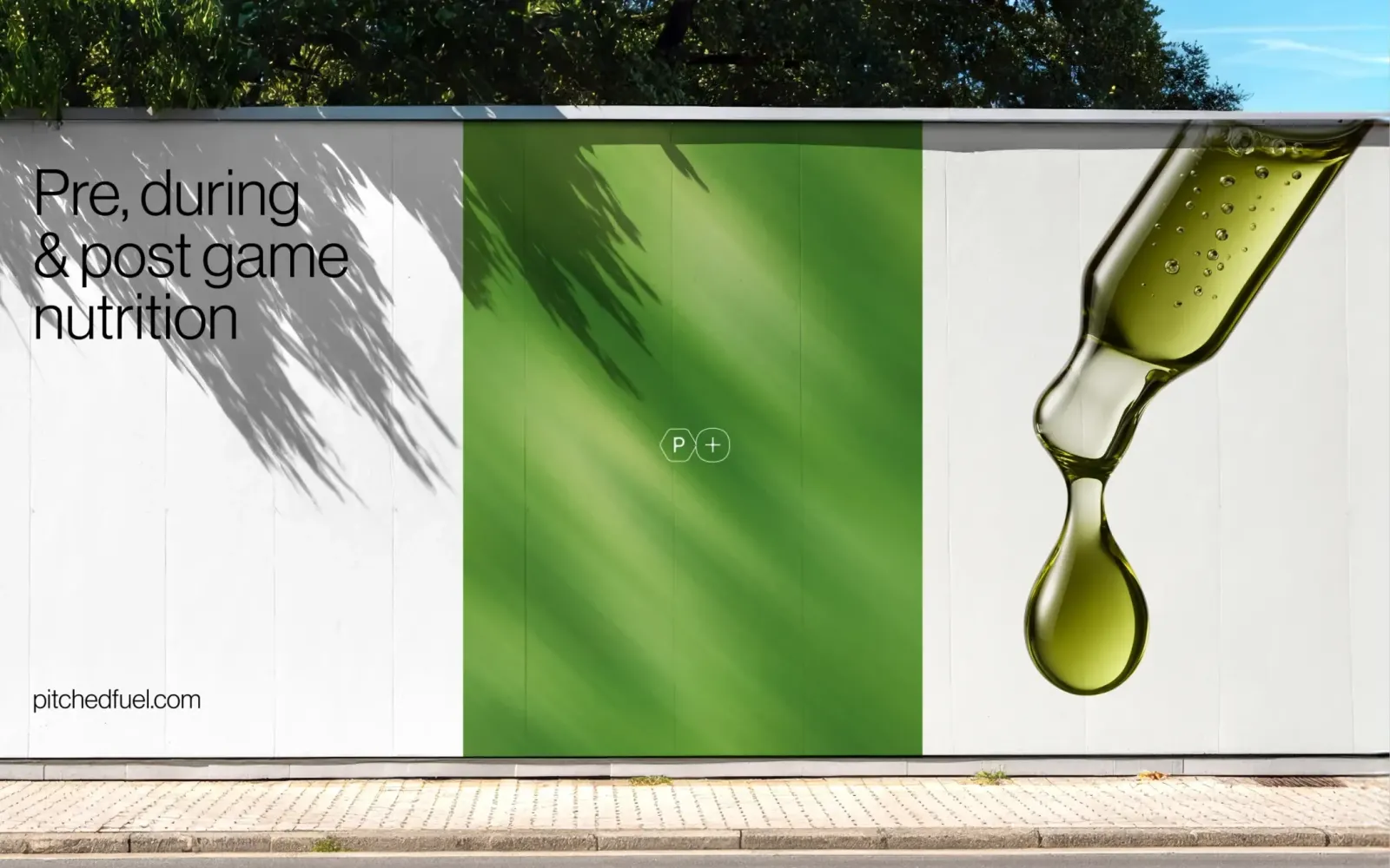
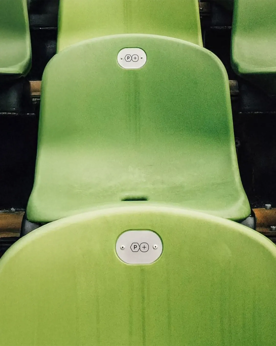
The molecule does two jobs. It gives a dietitian-developed product visible credibility, and it is modular enough to serve as a logo, a navigation element, and an email texture without losing its identity. The grey-led palette with soft gradients keeps Pitched away from the loud, neon look often associated with sports nutrition, so it reads as considered rather than aggressive. The directional patterns suggest pace without resorting to literal turf imagery, which respects an audience that knows the sport and doesn't need it spelled out.
Applications
Images and video from ndmbranding.com, by NDM Branding.