 The Brand Monograph
Henri & Hélène brand identity by Goodside
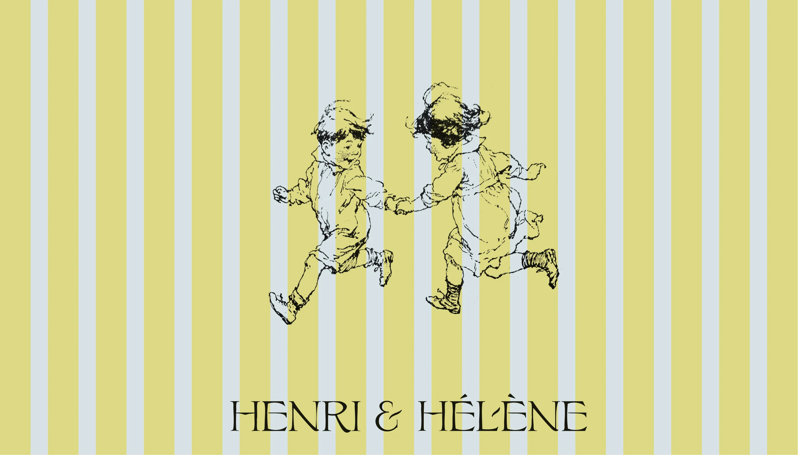
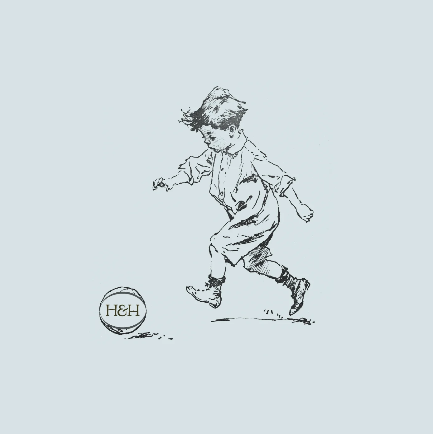
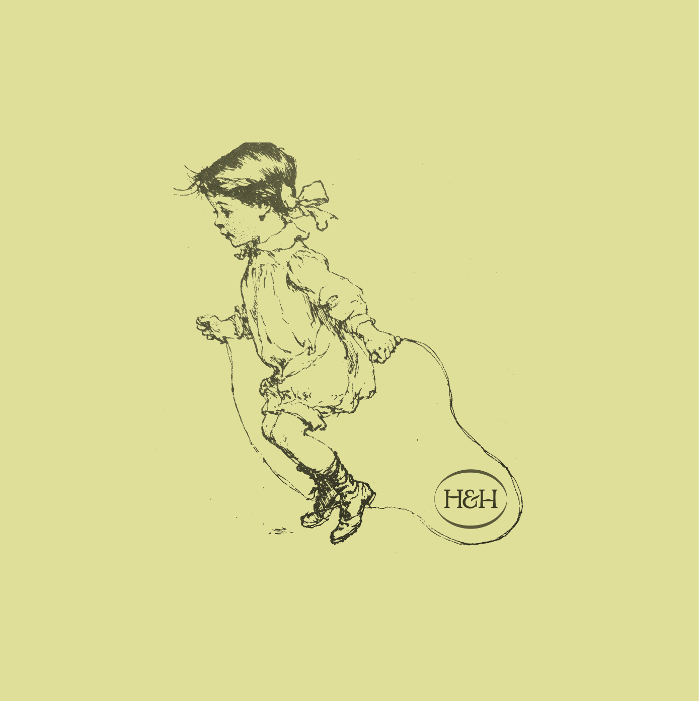
↗Goodside's identity for Henri & Hélène skips the usual Paris-bistro shorthand and feels closer to a well-loved book pulled off a shelf. The restaurant is named for the chef's two children, and the studio made them the center of the brand, drawing them as engraved characters instead of leaving the name to a wordmark alone.
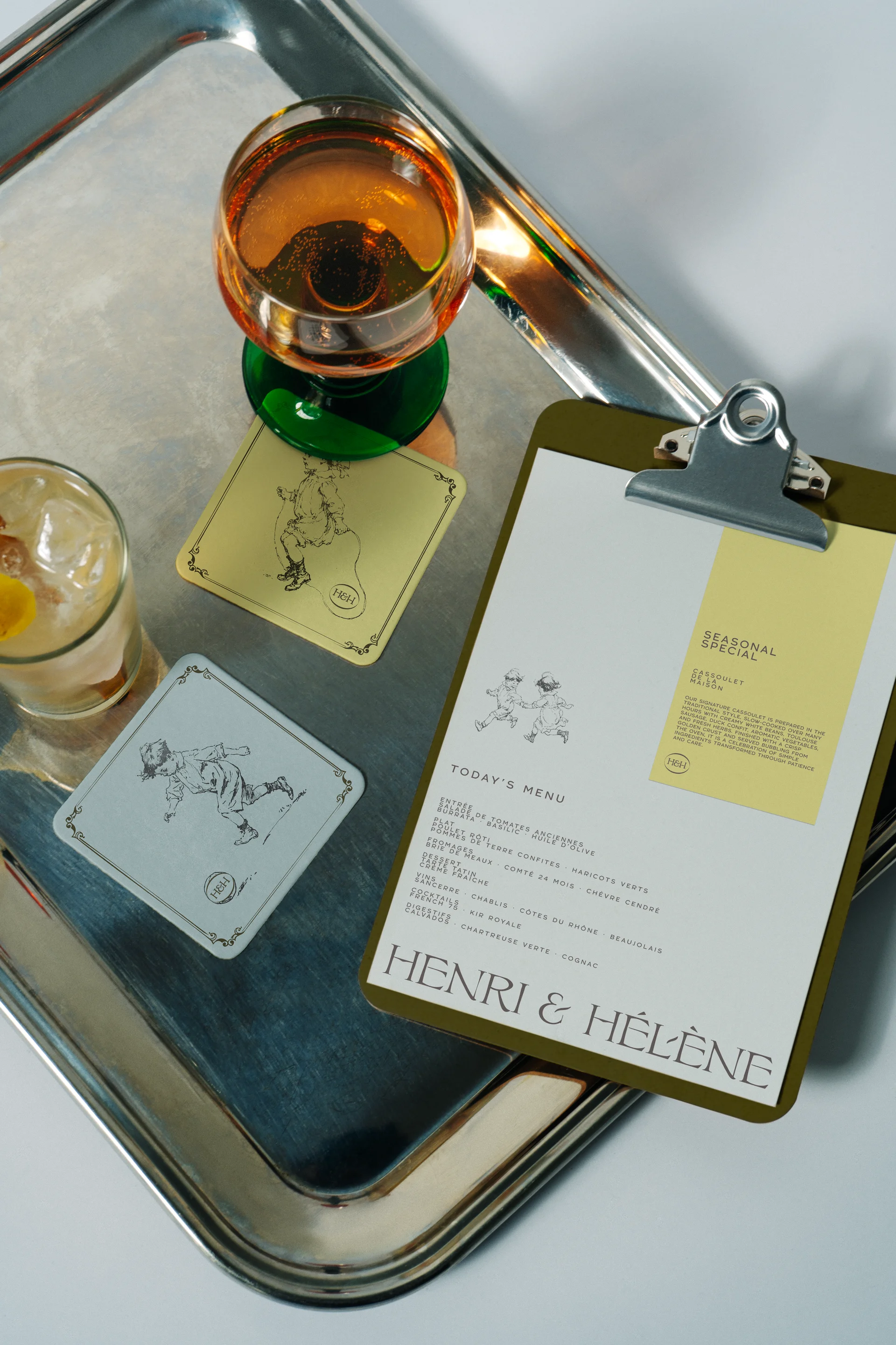
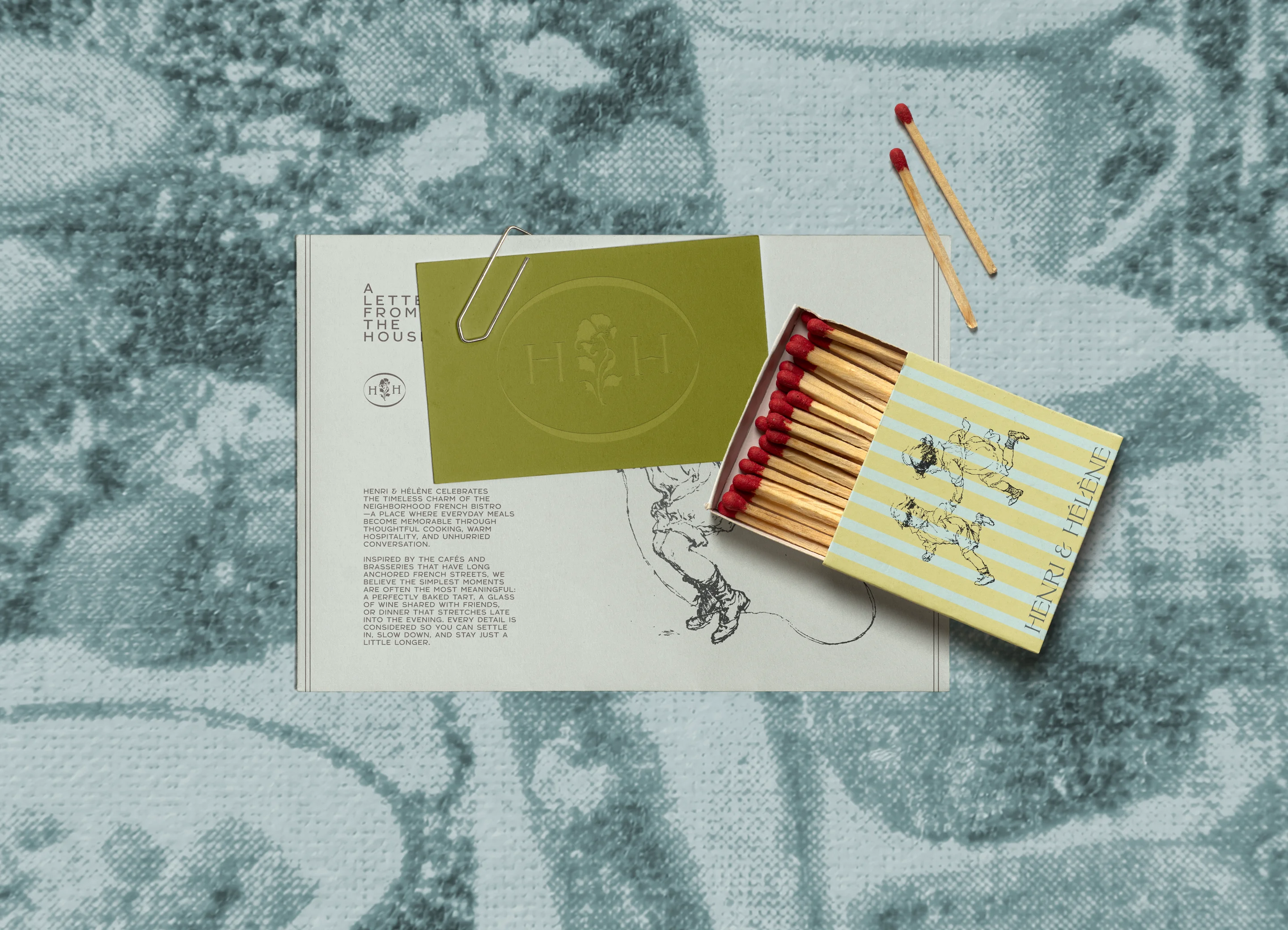
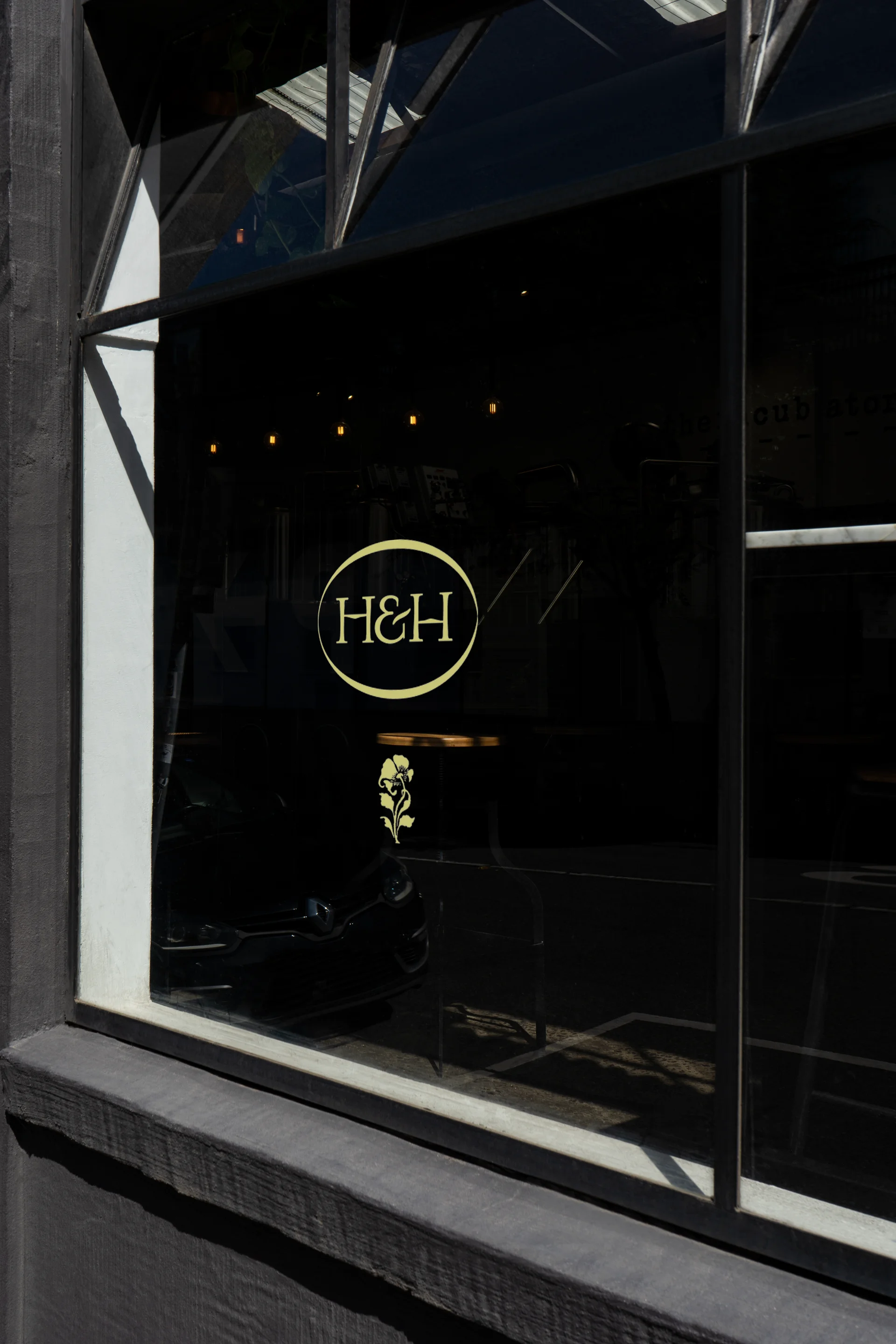
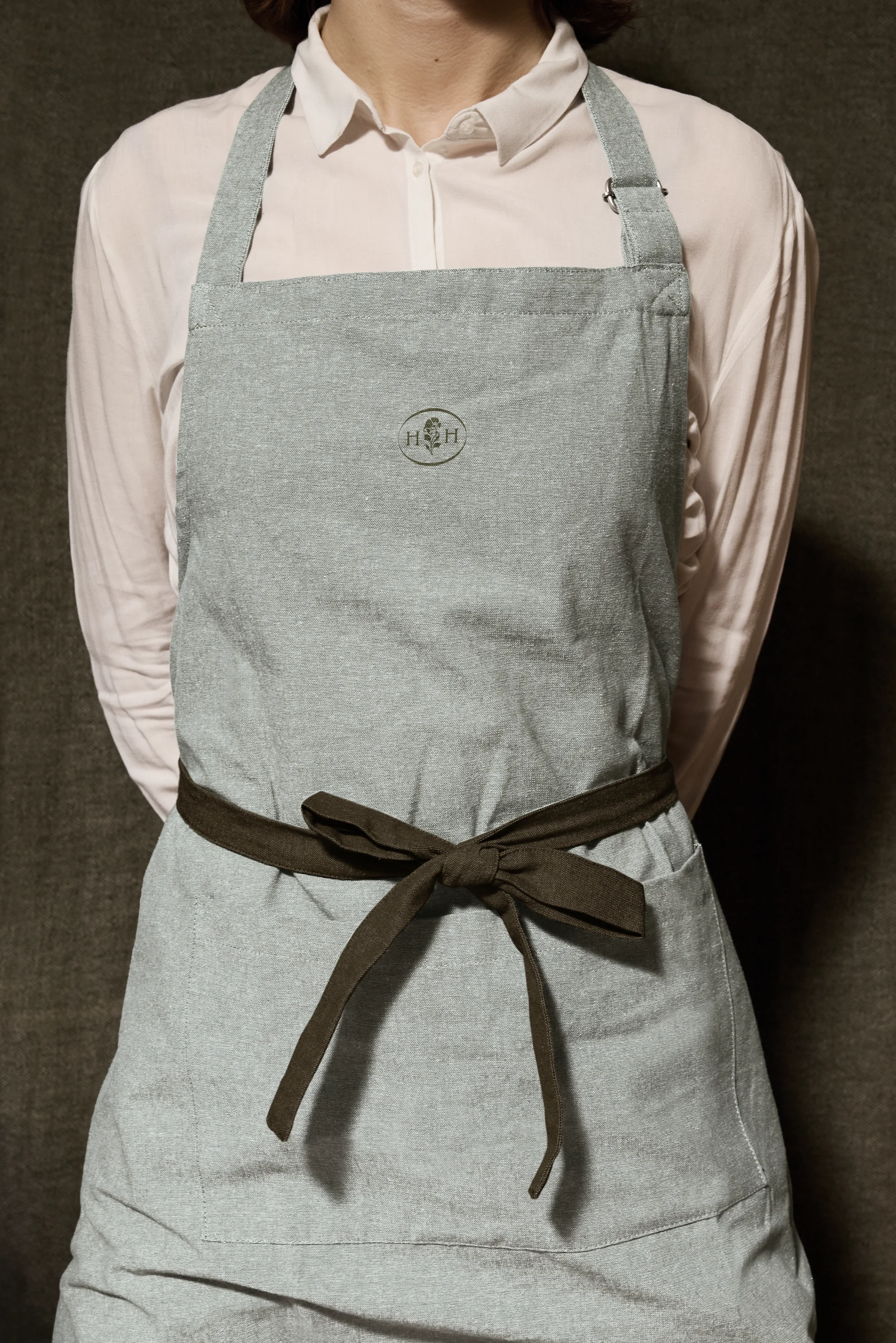
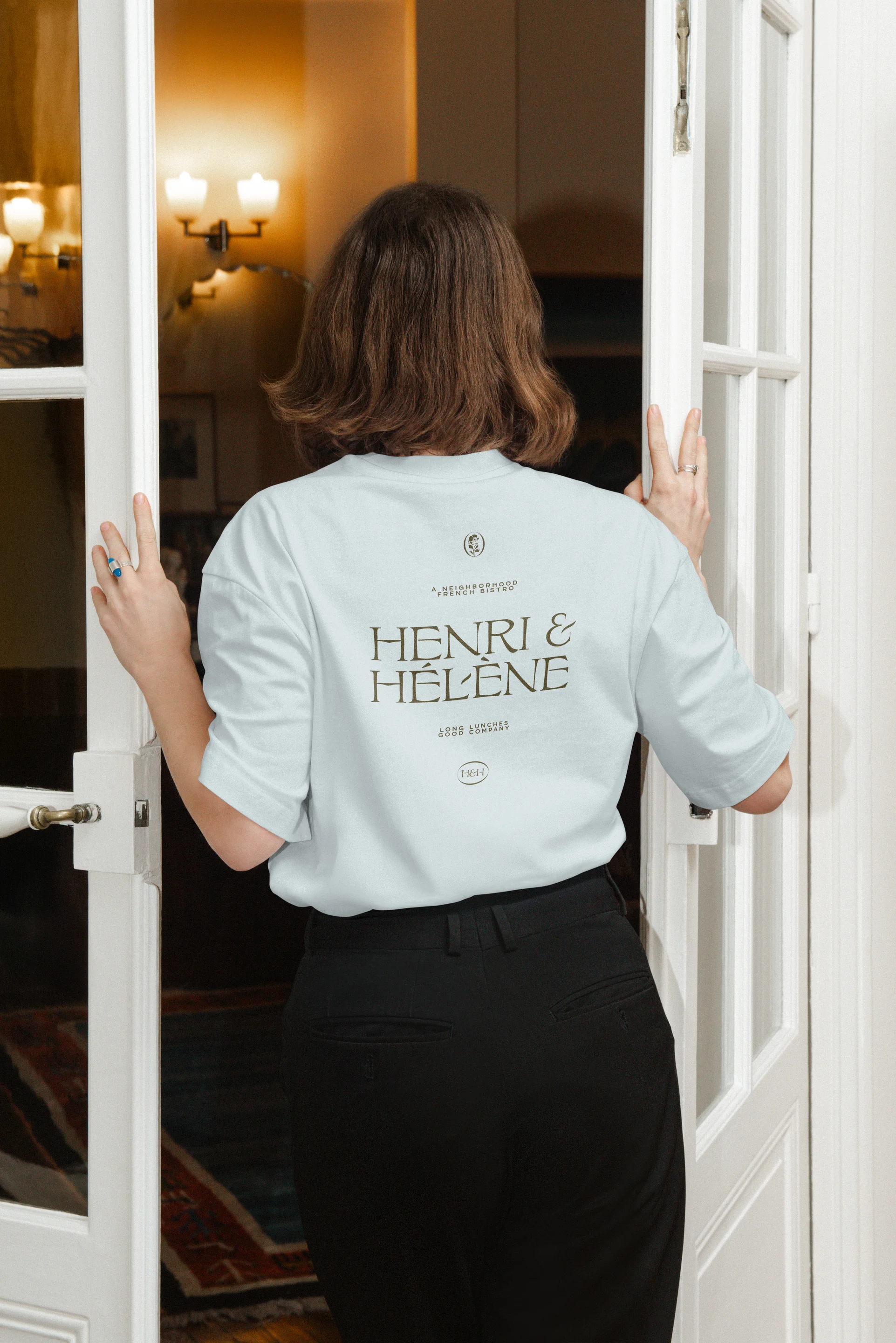
Around those figures, Goodside layered references from vintage French book illustration, Belle Époque lettering, and a muted palette borrowed from the coast. The drawings appear on menus, matchbooks, coasters, and signage, so a guest meets the same cast from the sign out front to the coaster under a glass. The craft shows in how consistent and unforced the system feels.
Why it works
The strongest decision is giving the name a face. Two illustrated characters turn a pair of first names into a small story, and they make the brand easy to recognize and hard to confuse with its competitors. The period typography and engraving style signal French heritage without leaning on clichés, while the soft coastal palette keeps everything light and approachable. Matchbooks and coasters are objects people keep, which lets the identity travel beyond the dining room.
Logo
Applications
Images and video from goodside.studio, by Goodside.