The Brand Monograph
Dally brand identity by Red Antler
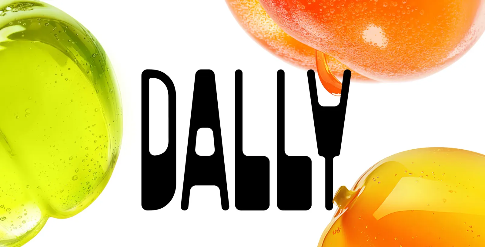
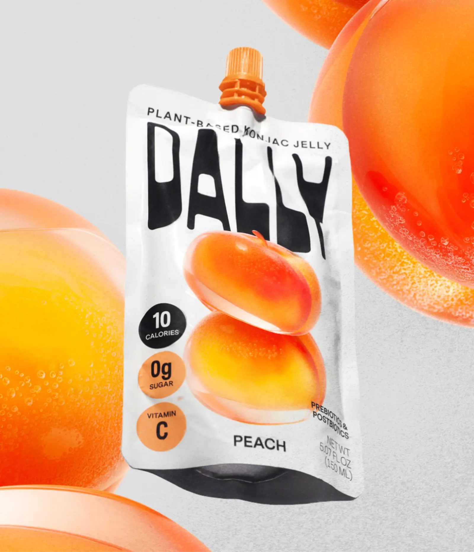
↗Red Antler took a format most people associate with the kids' aisle and made it look like something an adult would reach for. Dally's snack is a low-calorie jelly made from konjac, an ingredient with a strong health story and almost no name recognition in the U.S. The brand had to win people over before it could explain itself.
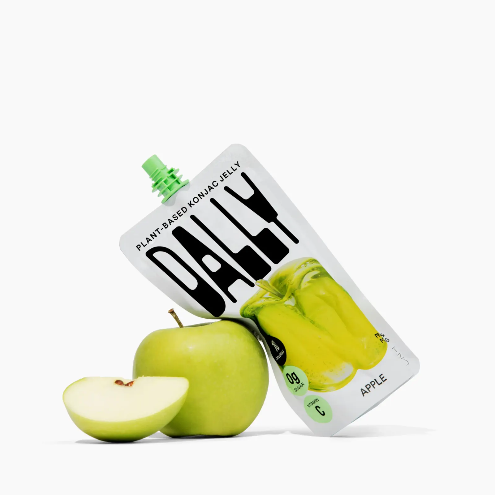
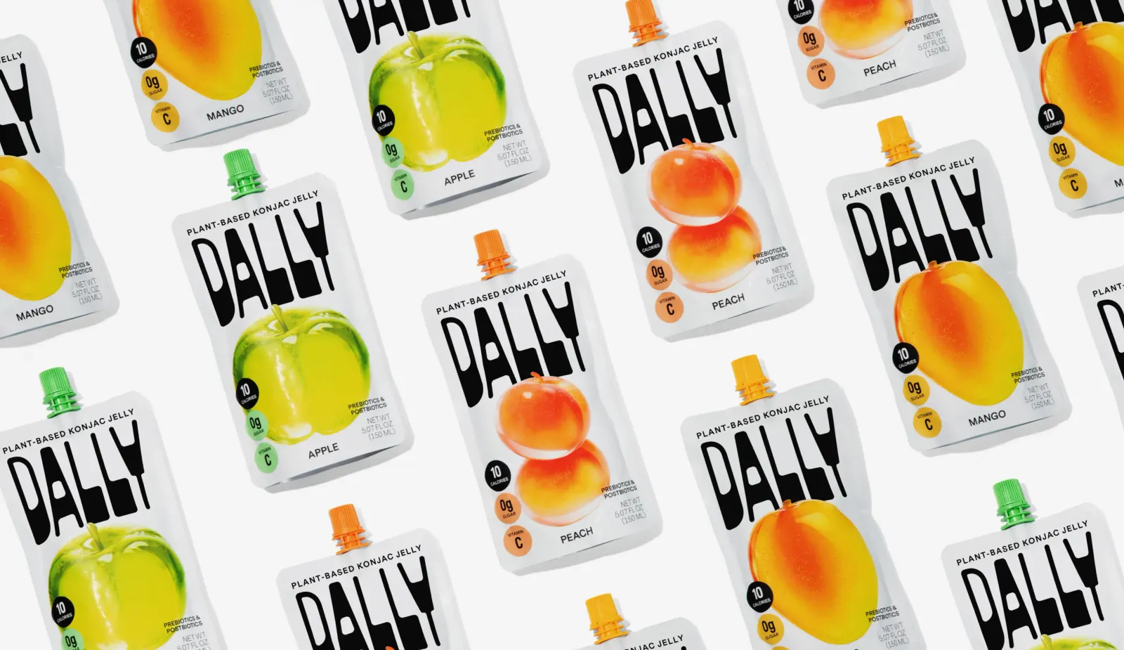
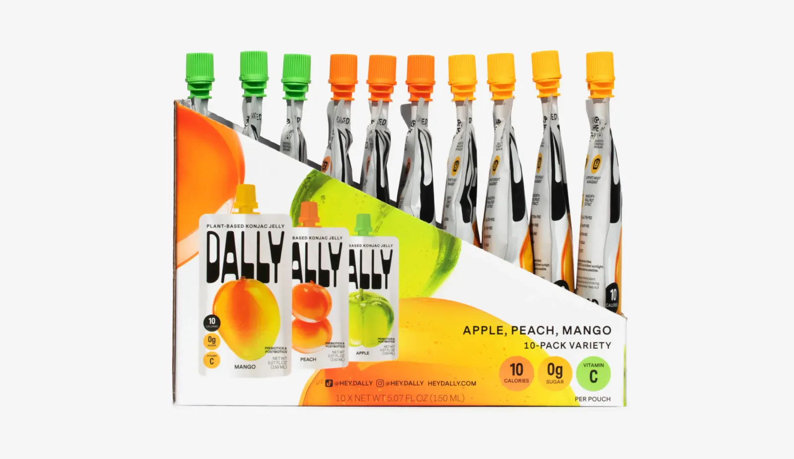
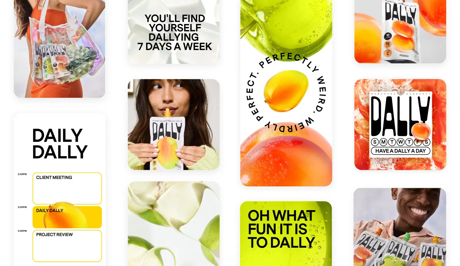
The studio paired a soft, rounded wordmark with stylized fruit illustrations that look slightly otherworldly, so flavors like mango, apple, and peach feel fresh rather than syrupy. Each pouch gets a different spout color, which lets shoppers pick a flavor at a glance. Red Antler carried the system through the website, art direction, and content capture, working with photographer Ashley Batz to keep the look consistent from shelf to screen.
Why it works
The rounded letterforms echo the squeezable pouch, so the mark suggests the product's texture before anyone reads a word. Stylized fruit, instead of literal photography or cartoon mascots, keeps appetite appeal while steering clear of baby-food cues. The spout colors double as a flavor code, which matters for a shopper meeting an unfamiliar ingredient in an unfamiliar format. The identity sells pleasure first and leaves konjac as a pleasant surprise.
Applications
Images and video from redantler.com, by Red Antler.