The Brand Monograph
BRUNCH ELECTRONIK FESTIVAL brand identity by THRU
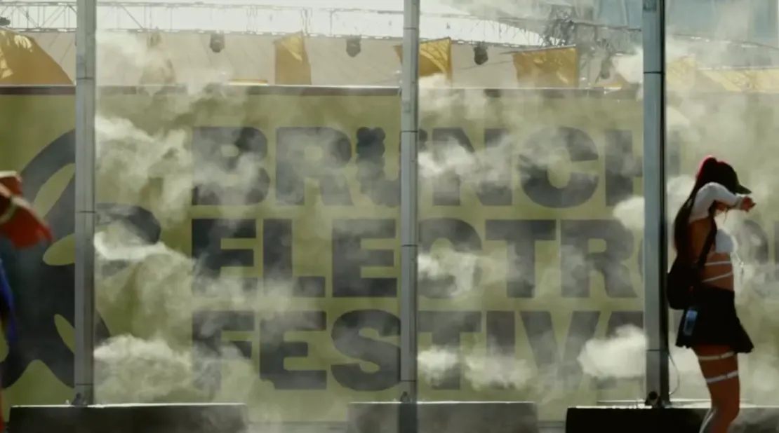
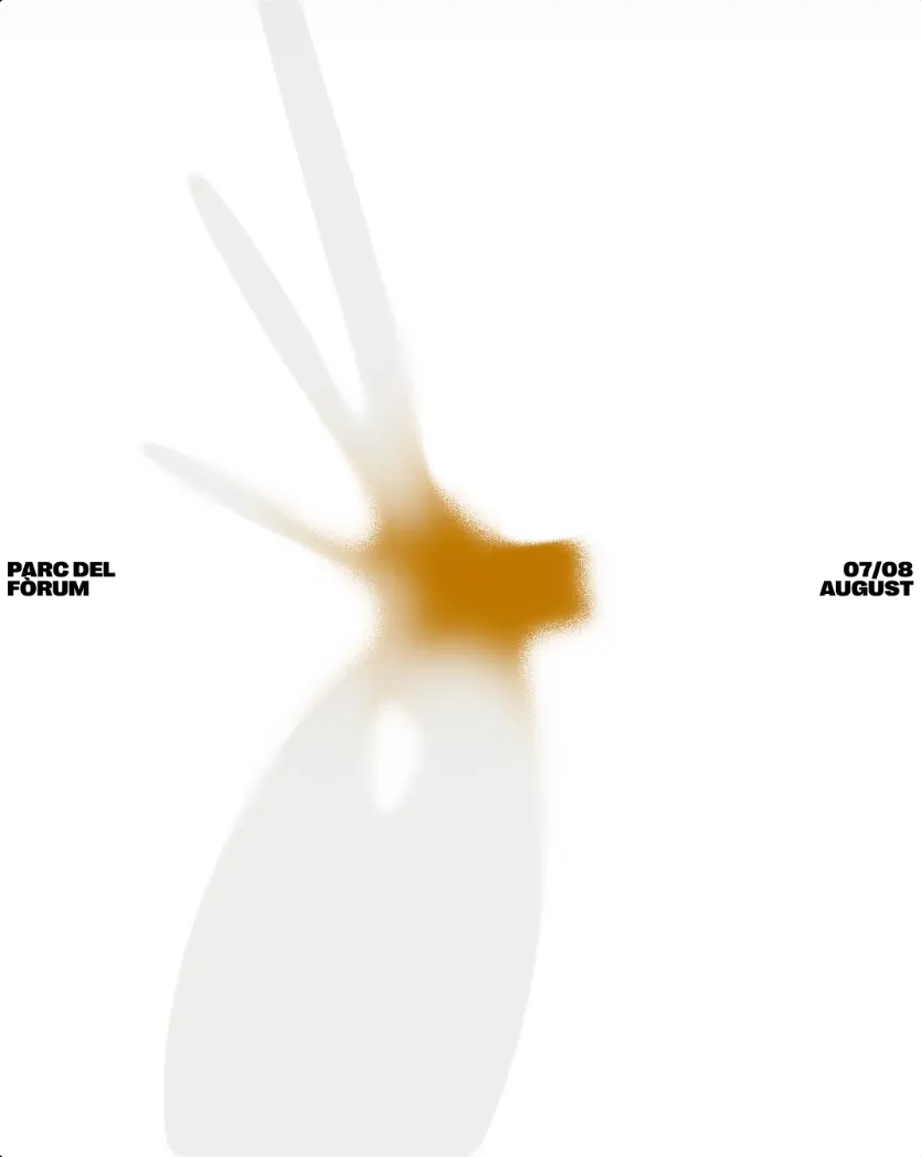
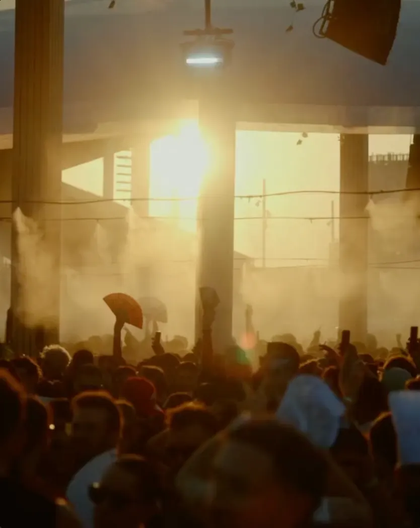
↗THRU's work for Brunch Electronik Festival 2026 turns a familiar flower into something that behaves like a living thing. The studio had worked with the festival and its creative director for several years, and this edition gave it room to go further. Instead of animating a finished identity, THRU shaped the visual language alongside the Brunch team.
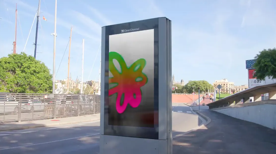
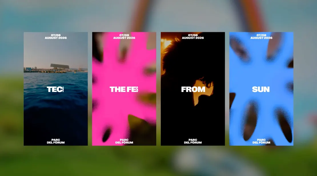
The starting kit was already in place: a palette, typefaces, and the recurring flower. THRU pushed each one into new territory. The flower bends and rebounds like rubber, letters join the compositions rather than sitting beside them, and color carries the warmth of a Barcelona summer. The system is built mainly for artist announcements and wider festival communication. THRU also gave the Brunch team a set of editable motion templates, so the look holds together across formats, channels, and every stage of the festival calendar.
Why it works
The smartest decision here is what stayed put. Because the flower, palette, and type are untouched, regulars recognize Brunch instantly, and all the novelty goes into movement. That movement gives the identity a playful, physical personality. It stands apart in a category that often leans on dark, hard-edged visuals, and it suits a festival about leisure and sunshine. Since announcements are the content people see most, giving them one distinct behavior makes every lineup post feel like part of the same family.
Applications
Logo

Images and video from thrumotion.com, by THRU.