The Brand Monograph
Center Square brand identity by JKR
↗Data infrastructure rarely gets this much visual attention, which is what makes Centersquare worth a close look. JKR named and designed the identity for the company created when Evoque and Cyxtera merged, so the studio had to build one confident brand out of two existing ones, starting with what to call it.
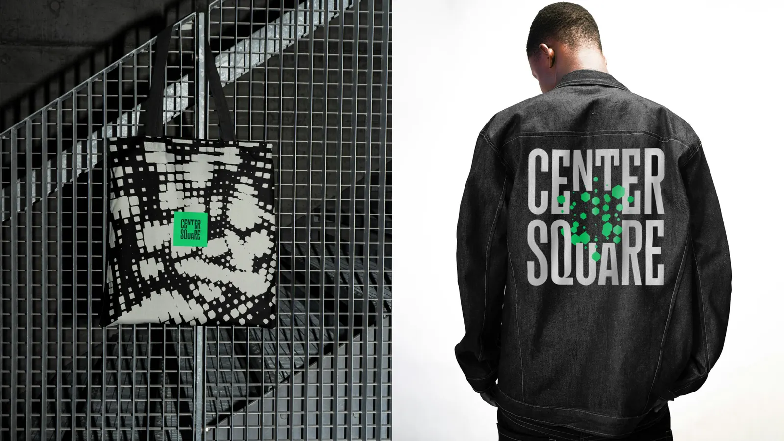
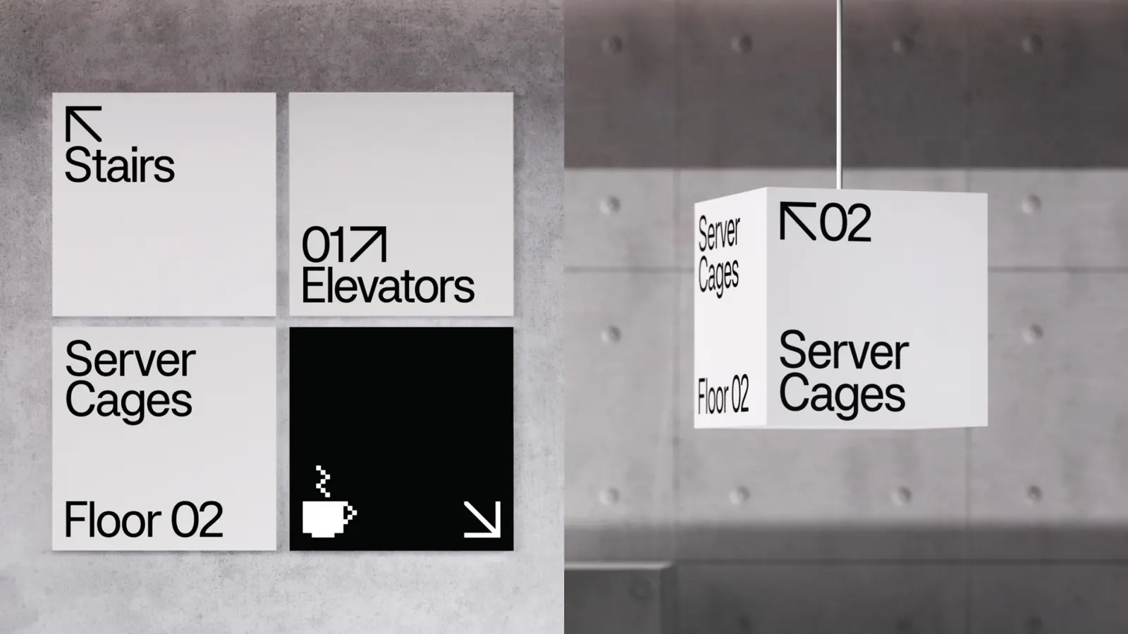
The answer is a name and a logo drawn from the physical idea of a data center, which then anchors a design system driven by live data rather than fixed decoration. Peregrin Studio and Simon Walker contributed the typography, and Variable handled development, the kind of partnership a system built on moving information depends on.
Why it works
This category usually defaults to abstract networks and generic tech imagery, and Centersquare avoids all of it. The name is plain, sturdy, and easy to say, and it sounds like a place you could rely on, which is what an IT buyer wants to hear. A mark based on the data center itself reads as architecture, not metaphor. Letting data become the visual material means the brand demonstrates its subject instead of describing it, and that feels more credible to a skeptical, technical audience.
Logo
Applications
Typography
Images and video from jkrglobal.com, by JKR.