The Brand Monograph
Chiba Tech brand identity by Pentagram
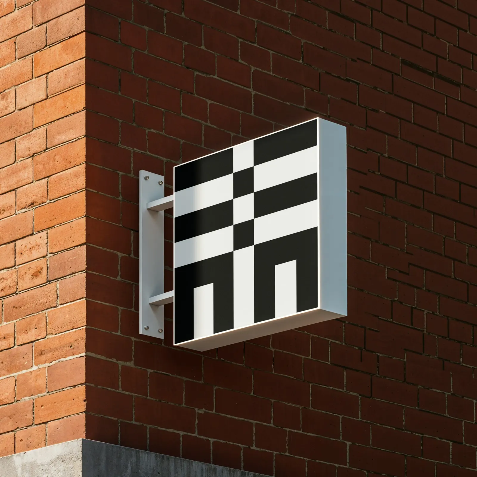
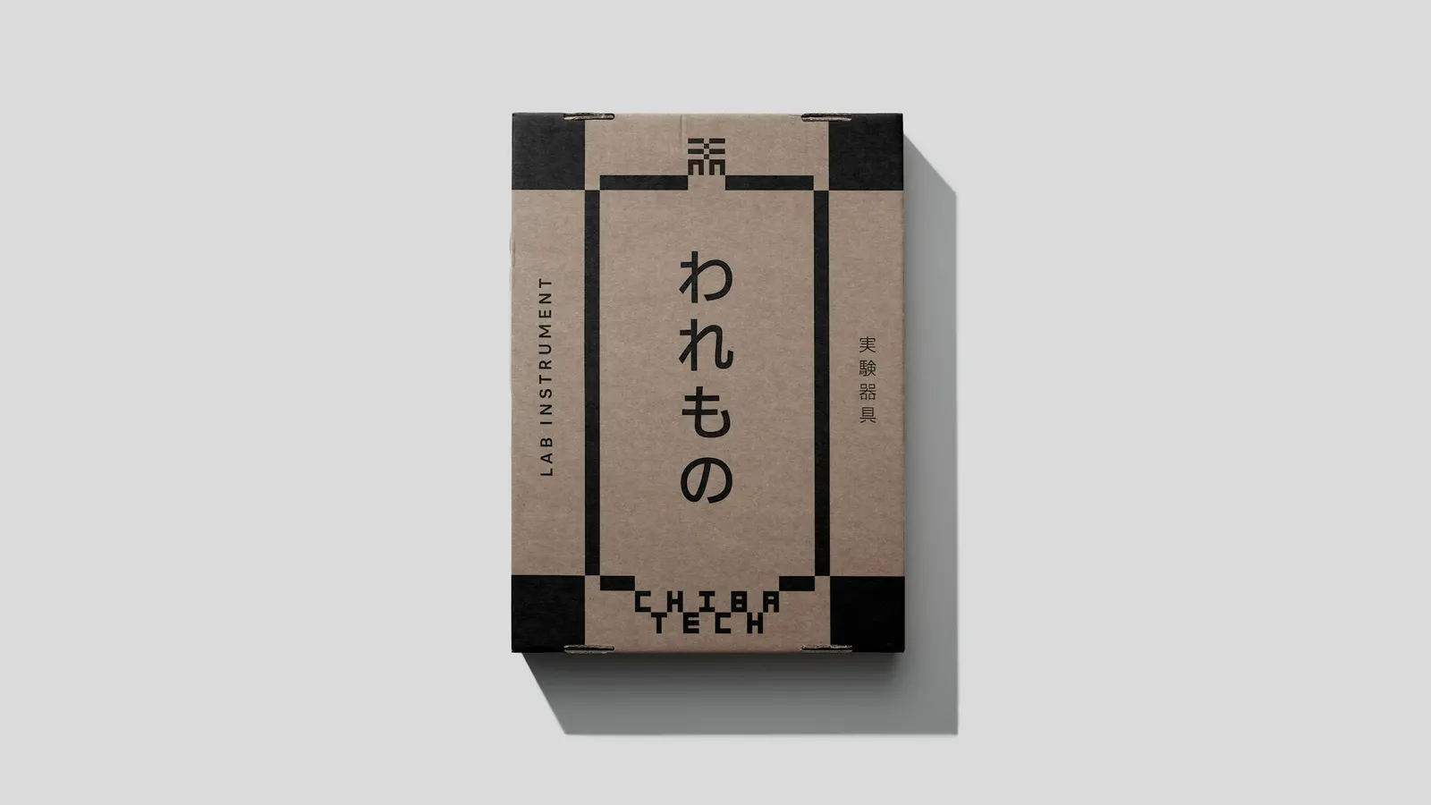
↗Pentagram's identity for Chiba Tech makes one character do nearly all the work. Japan's oldest private technology institute wanted to reach international students without losing its roots, so Giorgia Lupi and her team started from the character used at its 1942 founding. They rebuilt it from geometric squares drawn from the ichimatsu checker pattern. That single form becomes the logo, the typographic starting point, the layout grid, and the mascot.
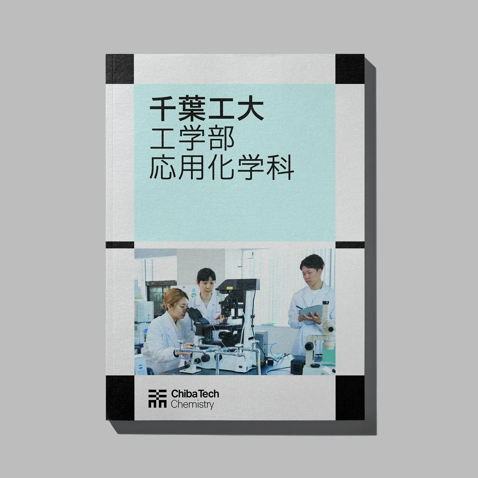
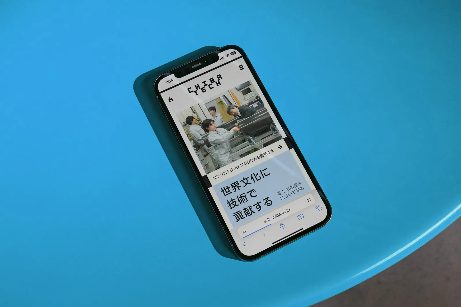
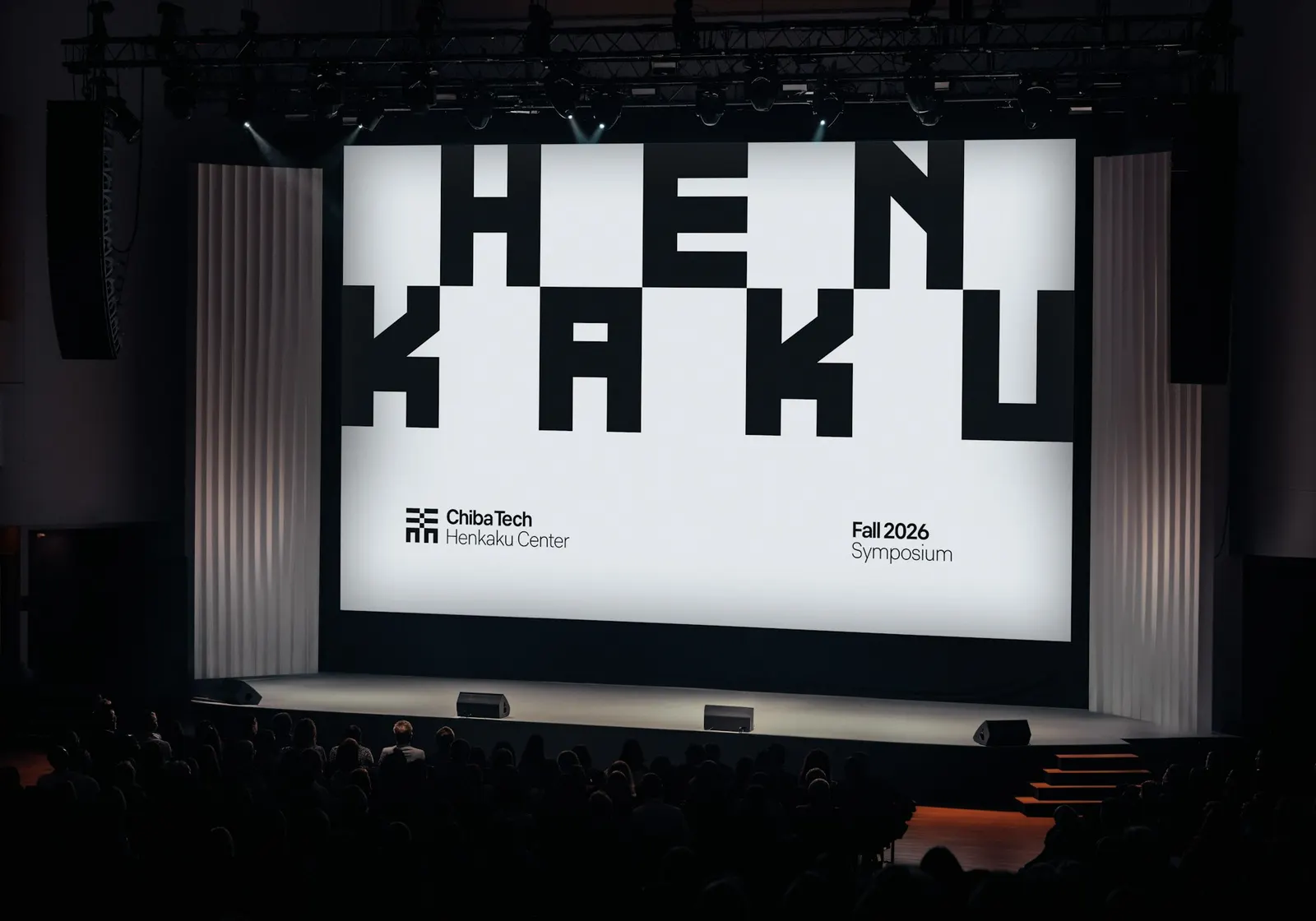
The studio also shortened the name to Chiba Tech and drew two custom typefaces: one that borrows the checker logic, and a monospace built on the character's square footprint. Layouts anchor to the character's four corners, then stretch and shift with content and scale. Chibuggy, the mascot, draws on Japanese folklore about objects that come to life. Lupi and Senior Designer Yoshi Torralva grounded the work in campus visits and conversations with students and faculty, with Britt Cobb, Phillip Cox, and Ryan Yan on the design team.
Why it works
University identities often default to a crest or a wordmark that could belong to any campus. Here the mark is specific: a historical character, simplified until it behaves like a module. That keeps the system flexible without losing recognition, because every layout, headline, and crop traces back to the same four corners. The checker pattern reads as traditional to a Japanese audience and as digital to an international one, which suits a school courting both. Chibuggy gives prospective students a friendly face that a strict grid alone couldn't.
Applications
Logo
Color
Images and video from pentagram.com, by Pentagram.