The Brand Monograph
Common Goal brand identity by Barkas
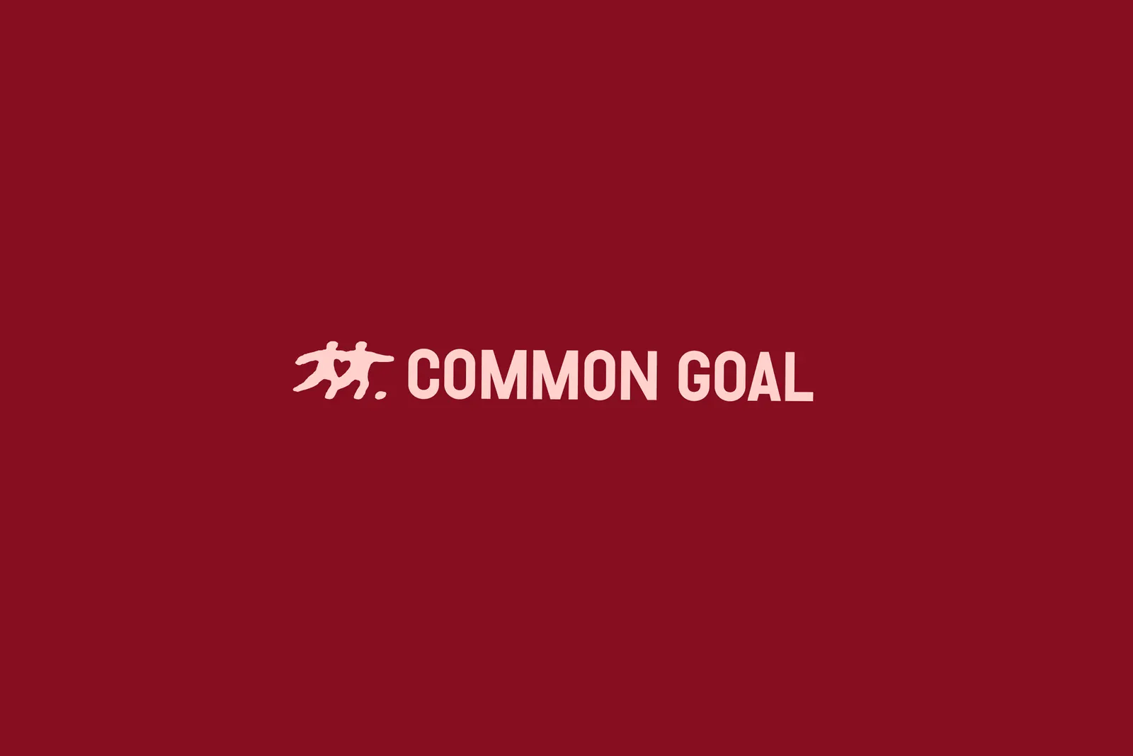
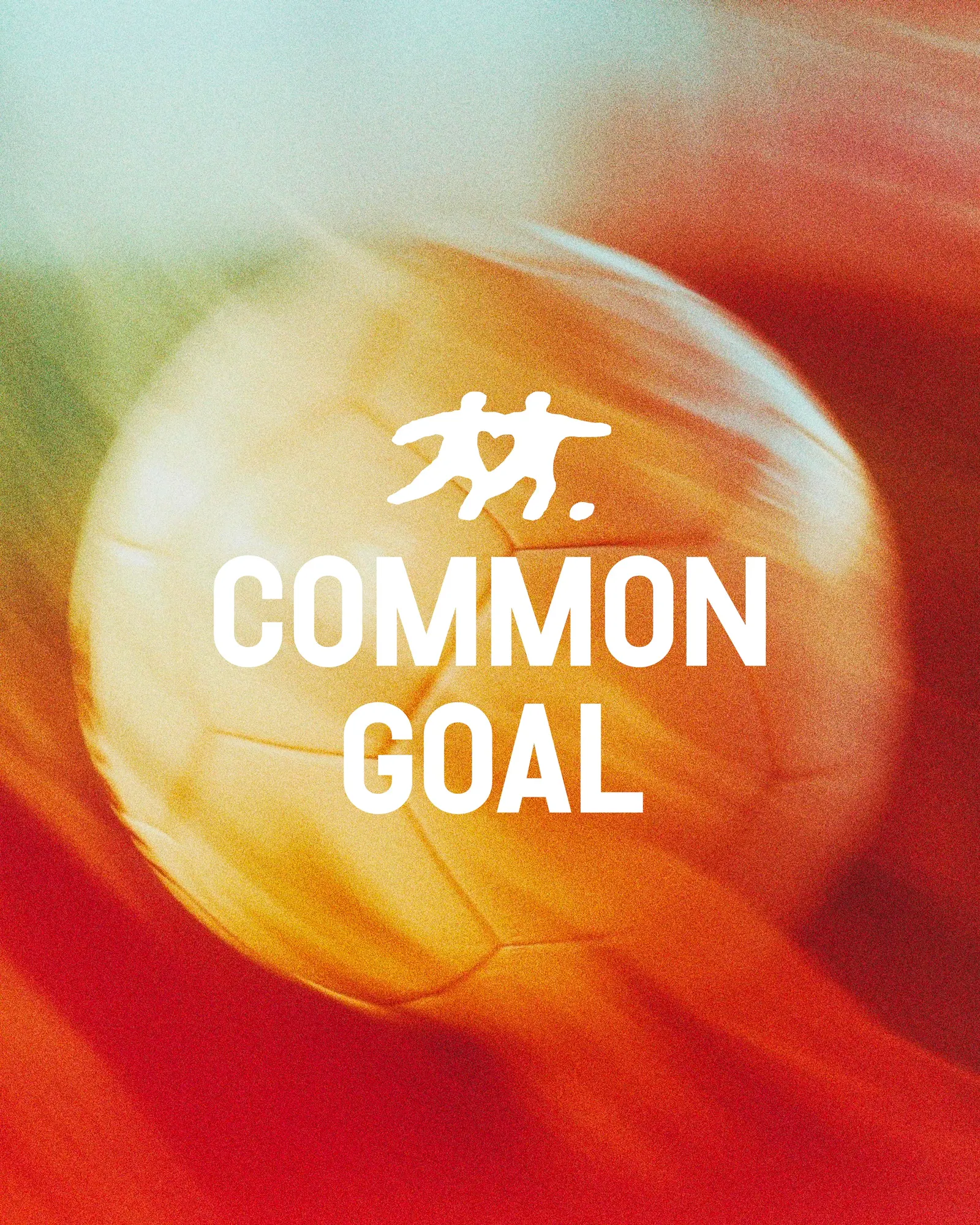
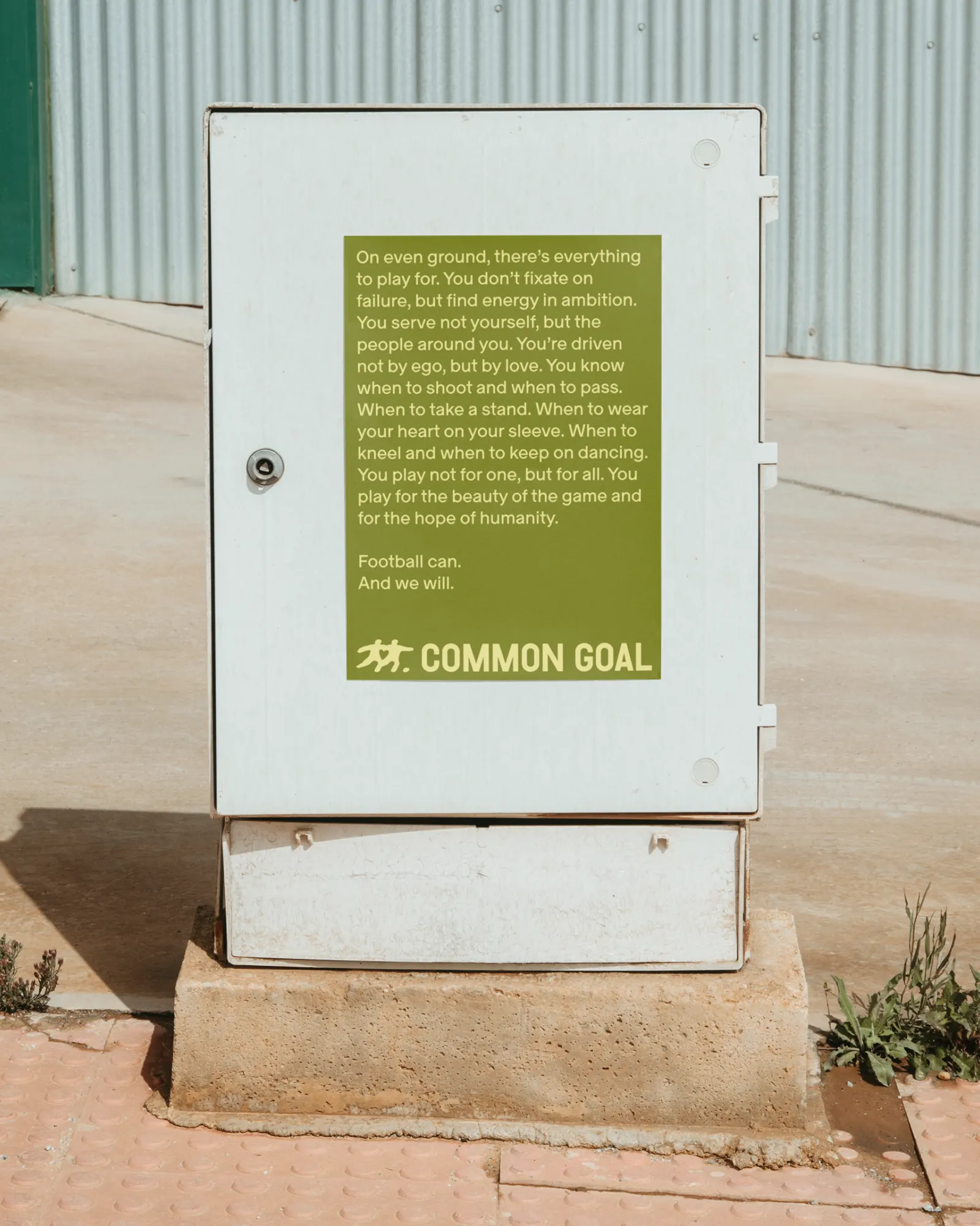
↗Few sports charities look like they belong on a terrace, but Common Goal's new identity from Barkas does. The studio was brought in to give the world's leading football-focused NGO a fresh brand narrative and visual identity, something that could pull a growing global community together and carry it into its next phase.
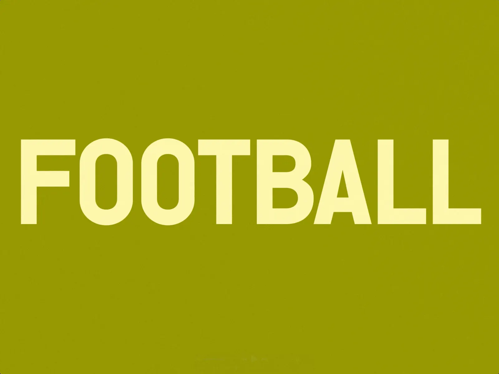
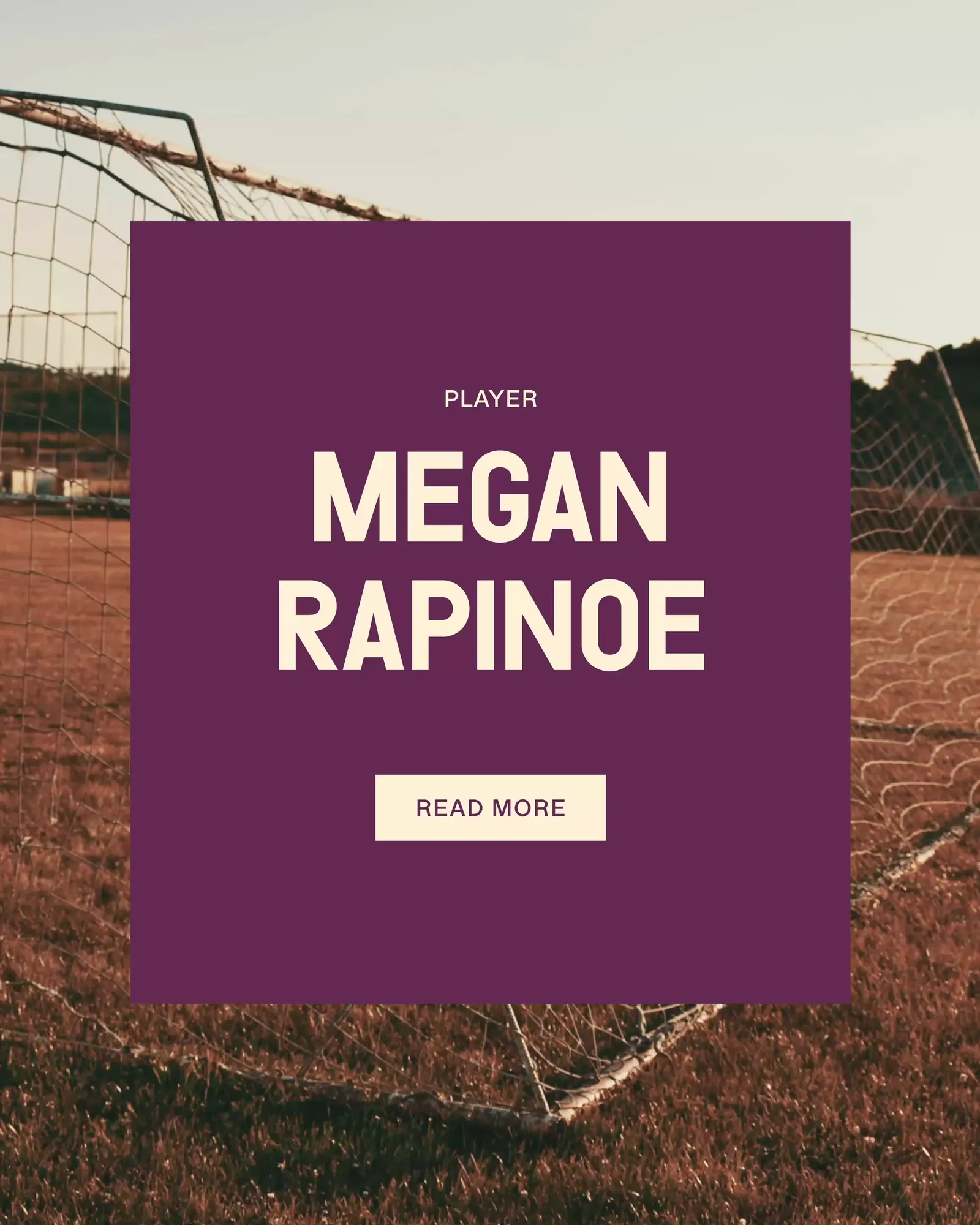
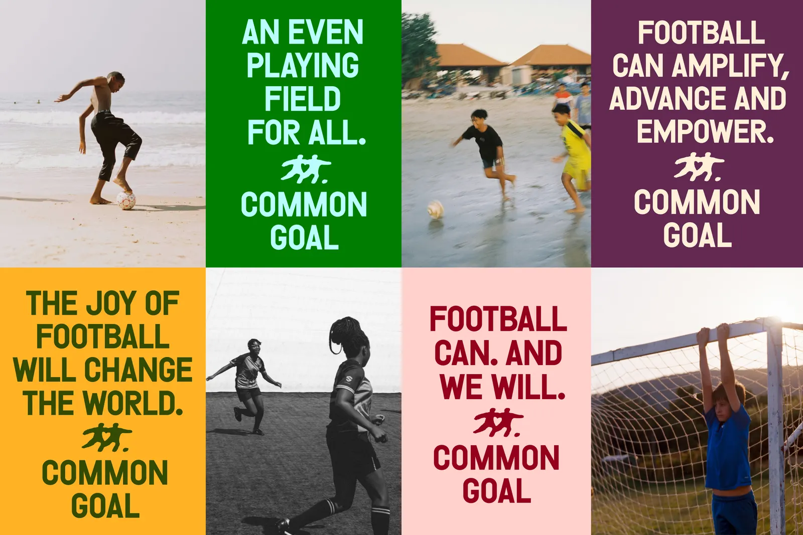
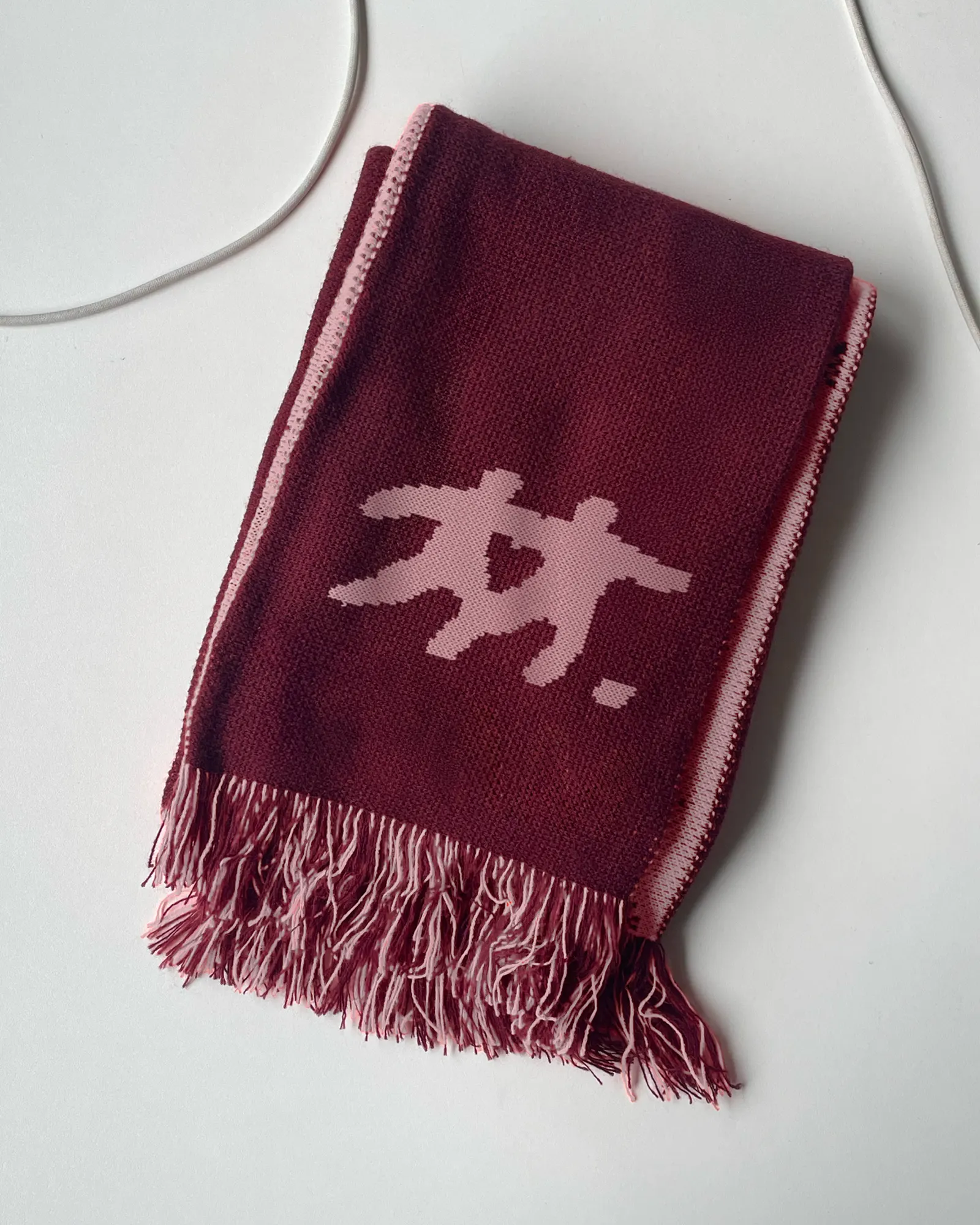
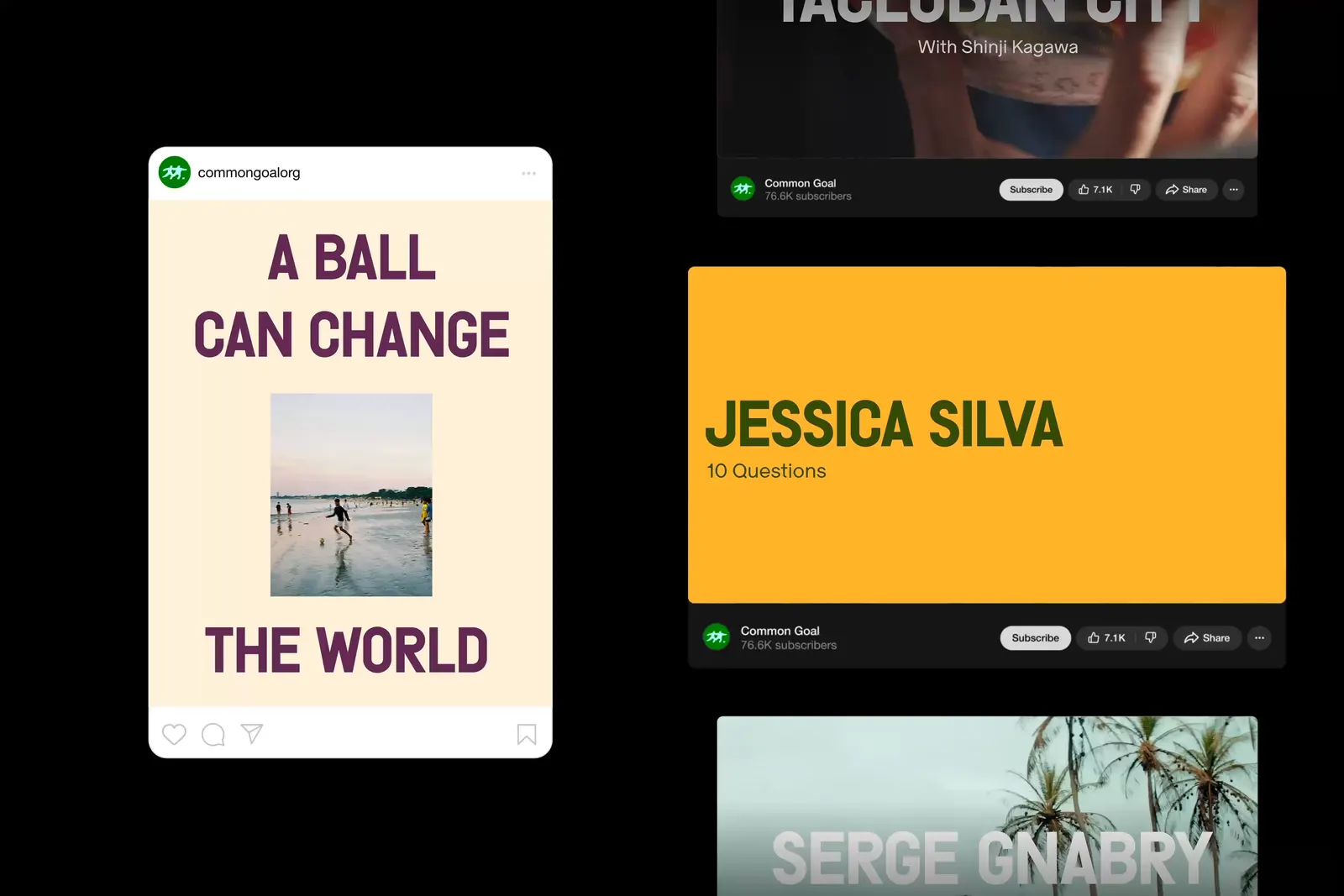
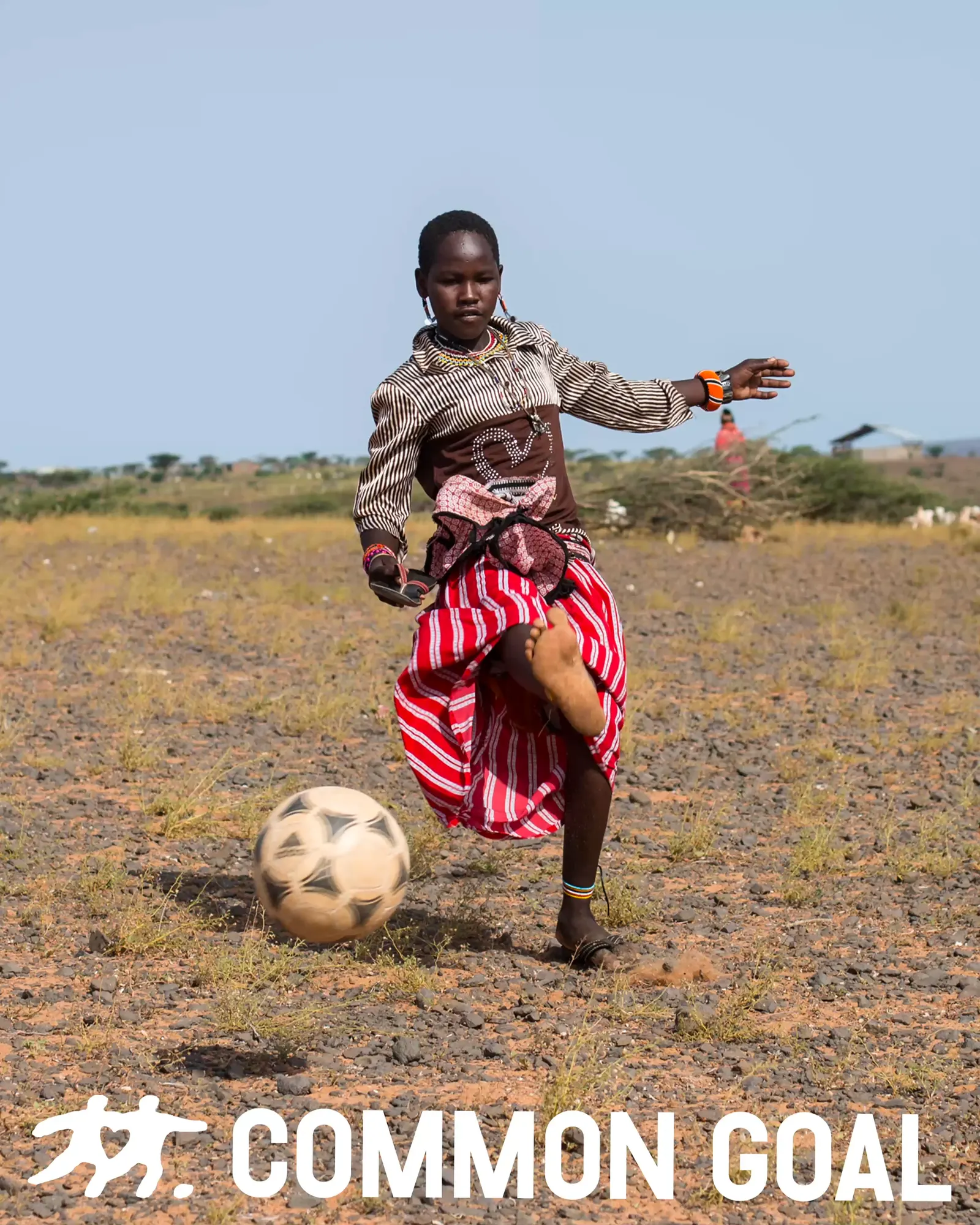
The answer pairs a loud, characterful typeface drawn from protest posters with a bright, upbeat palette. A hand-drawn logo sits at the center, and its loose, human lines also shape the supporting icons. Typography was developed with Out of the Dark and Tüpokompanii, and strategist Sarah Trounce worked with Barkas on the narrative. The system is meant to be shared and used by the whole network, not just admired from a distance.
Why it works
The hand-drawn mark is the smartest move here. Football branding often leans on polish, with crests and slick sportswear gloss, so a drawn logo feels refreshingly made by people, which suits a network built on local organizations. The protest-inspired type gives the cause some bite, keeping the warmth from drifting into generic charity sweetness, while the bright color keeps that edge from turning angry. Together they sit between sports marketing and the nonprofit world, and should read as familiar to fans and credible to partners.
Images and video from barkas.com, by Barkas.