The Brand Monograph
Design Doha Biennial brand identity by Pentagram
↗Pentagram's identity for Design Doha Biennial treats Arabic and English as one piece of typography rather than a translated pair. Samar Maakaroun led the project, working with designers Caroline Fay Fright, Giulia Saporito, Jacob Chung, Jess Yanzio, and Jonathan Nielsen.
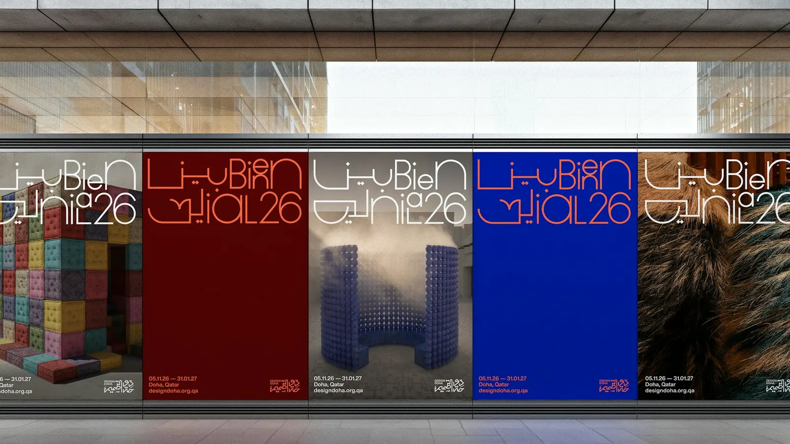
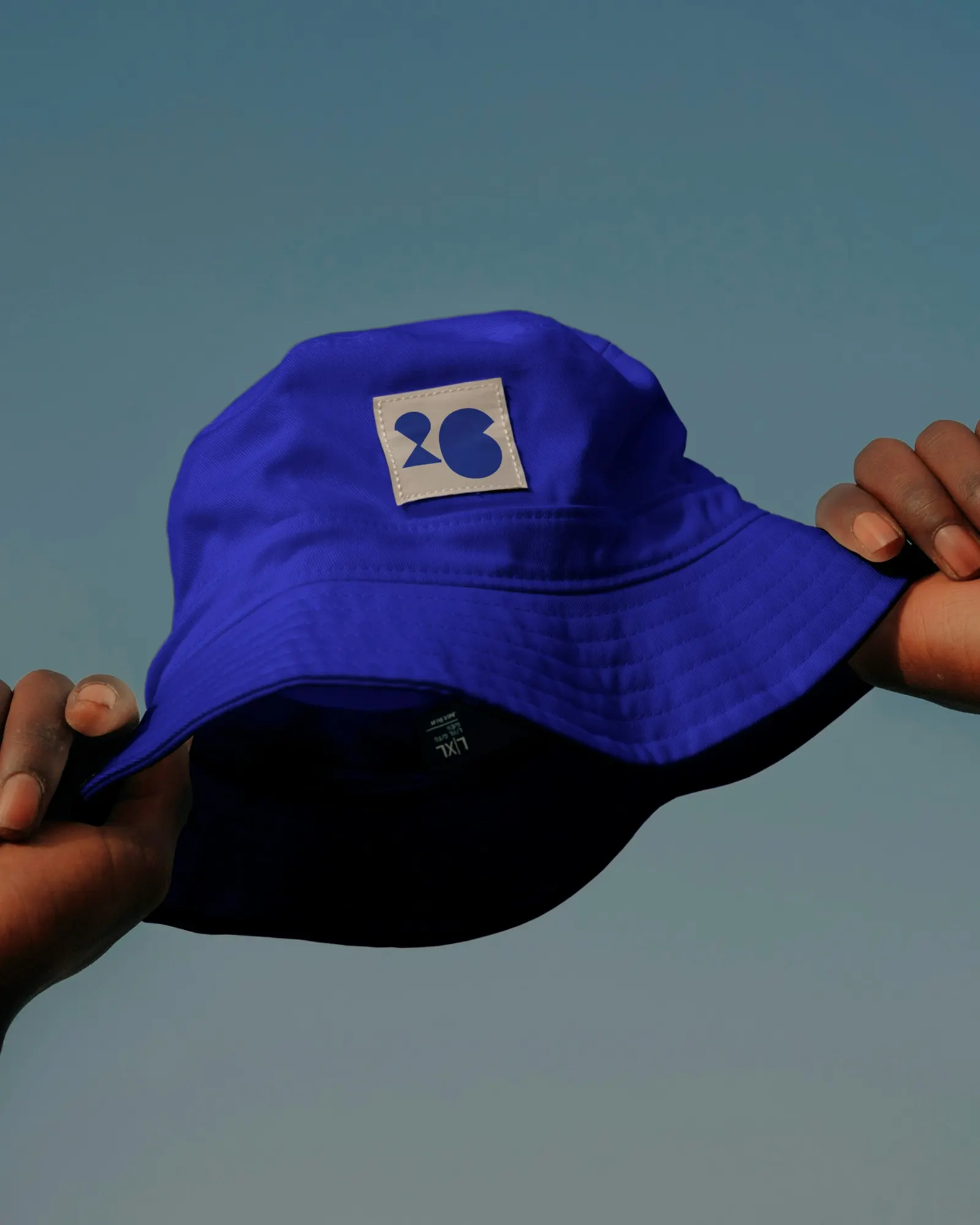
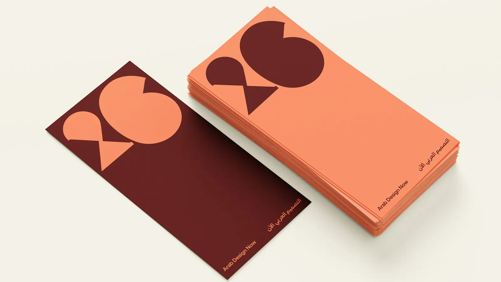
The brief came from the largest design event in the Arab region, whose 2026 edition spreads across many sites in Doha and needs a single face for dozens of exhibitions and public programs. Instead of a logo, the studio drew a system in which long letter strokes reach out and join neighboring elements, so layouts read like a map of linked points and shift from one application to the next. Beige and maroon nod to local stone and architecture, orange adds heat, and the blue from the previous edition keeps the thread. Arab Design Now, the headline show, gets a louder version built on the same rules. The biennial opens on 5 November 2026.
Why it works
Most bilingual identities leave one script as the guest. Here the two share a composition, so bilingualism becomes the visual idea rather than a localization step, which matters to an audience of designers who will notice how Arabic is handled. The stretching strokes also solve a practical problem: a multi-venue event usually ends up with a logo stamped on everything, whereas this system produces layouts that feel related without being identical. Keeping the blue while adding warmer colors makes the change feel like growth, not a reset.
Applications
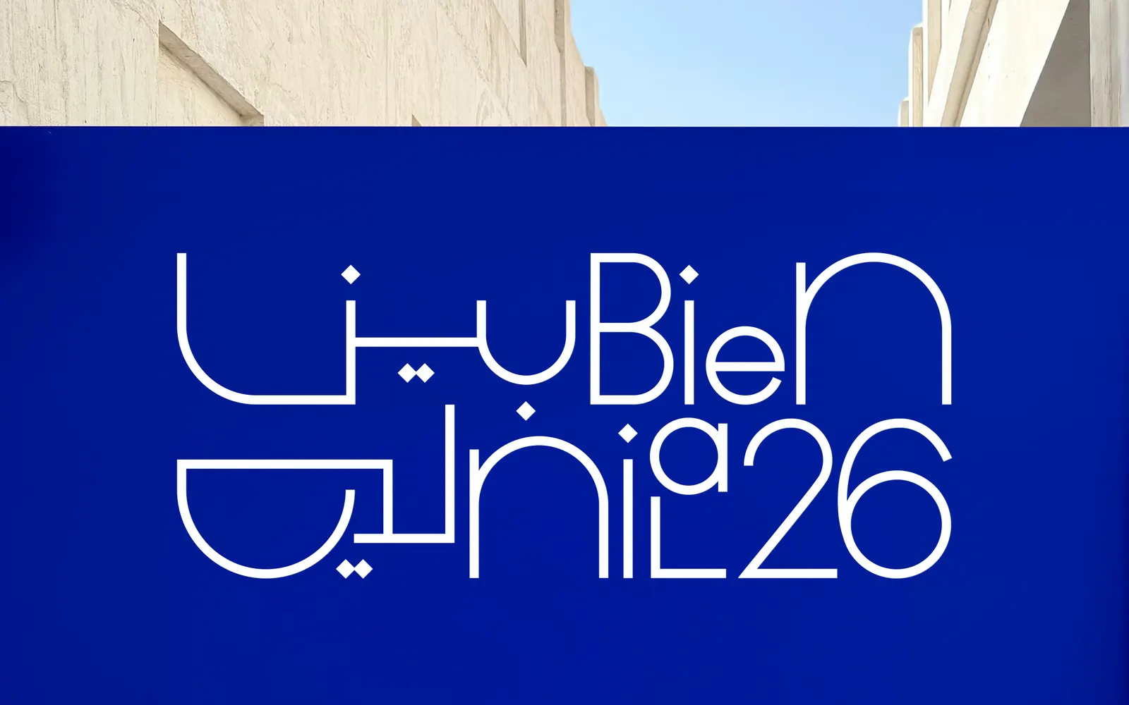
Logo
Images and video from pentagram.com, by Pentagram.