The Brand Monograph
Equinox Hotels brand identity by Collins
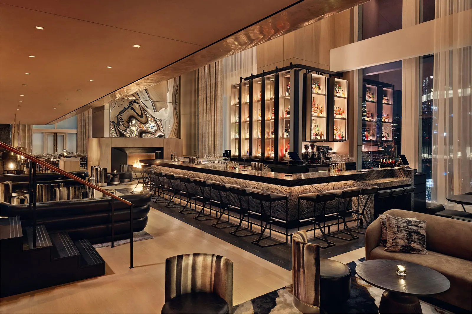
↗Few brand extensions ask a gym to become a place people sleep. Collins took on that leap for Equinox, building the Equinox Hotels identity around a tension its guests already live with: the urge to push harder and the need to switch off completely. Rather than blending the two into a single mood, the studio lets them sit side by side as light and dark, warm and cool, hard and soft.
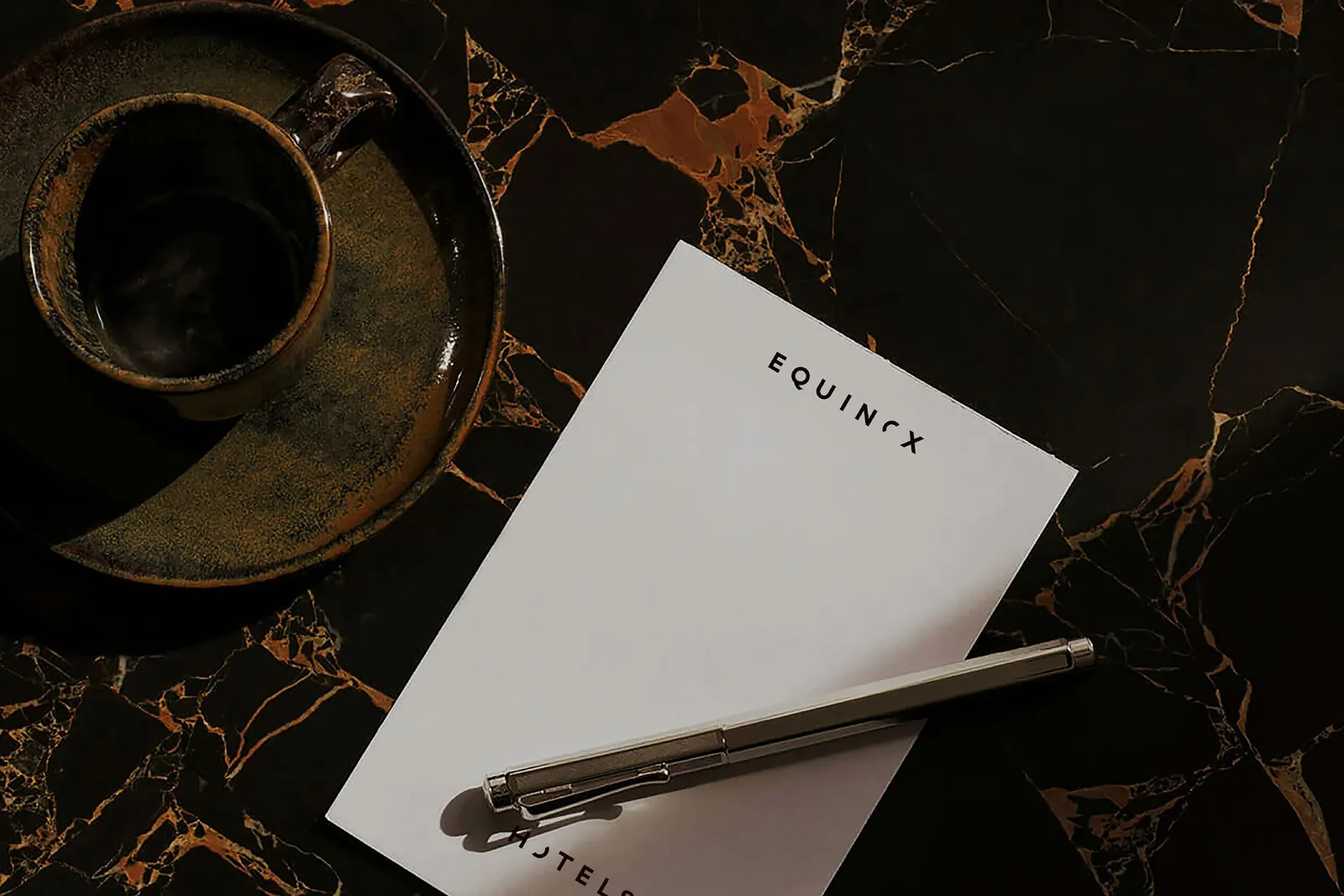
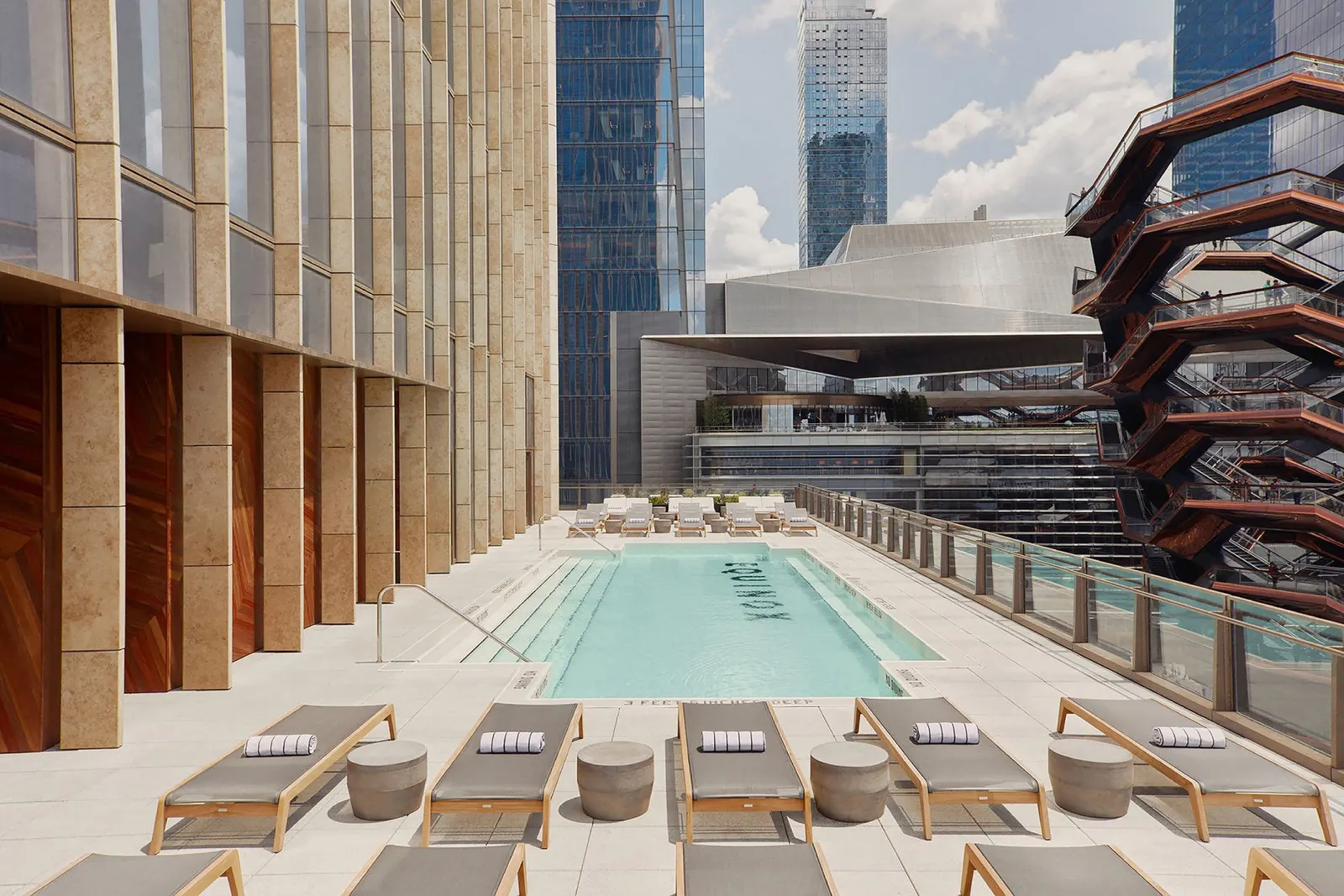
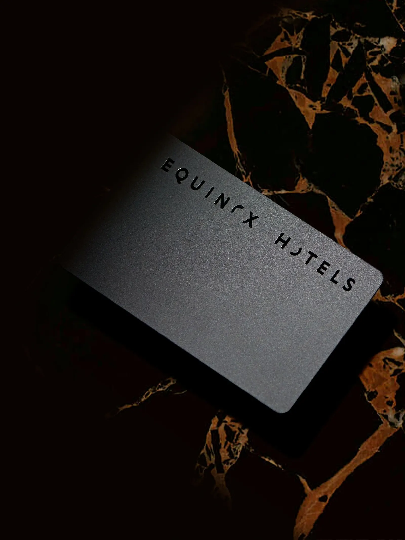
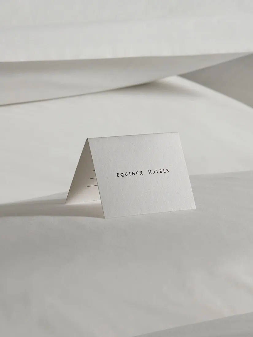
The brief was to define, design, and launch a hospitality brand for a company known for luxury fitness. Working with Hugo & Marie on design, Collins reworked a recognizable graphic element from the original Equinox wordmark so it tells a new story. That links the hotel to the clubs while giving it its own footing. The identity is built as a framework that can absorb the character of each city, starting with Hudson Yards in New York, where the hotel has since earned a place on the World's 50 Best Hotels list.
Why it works
Reusing a piece of the existing wordmark is the smartest move here. Members get something familiar to recognize, and the evolved meaning signals a deeper relationship rather than a bolted-on sideline. The system of opposites also works as a practical design rule. Pairing hard with soft and light with dark builds contrast into the brand, which suits an audience that wants intensity and calm in the same weekend. It also helps the hotel avoid the interchangeable hush of much luxury hospitality. And a framework instead of a fixed look is what lets a hotel brand travel from city to city.
Applications
Logo

Images and video from wearecollins.com, by Collins.