The Brand Monograph
Sustana brand identity by Collins
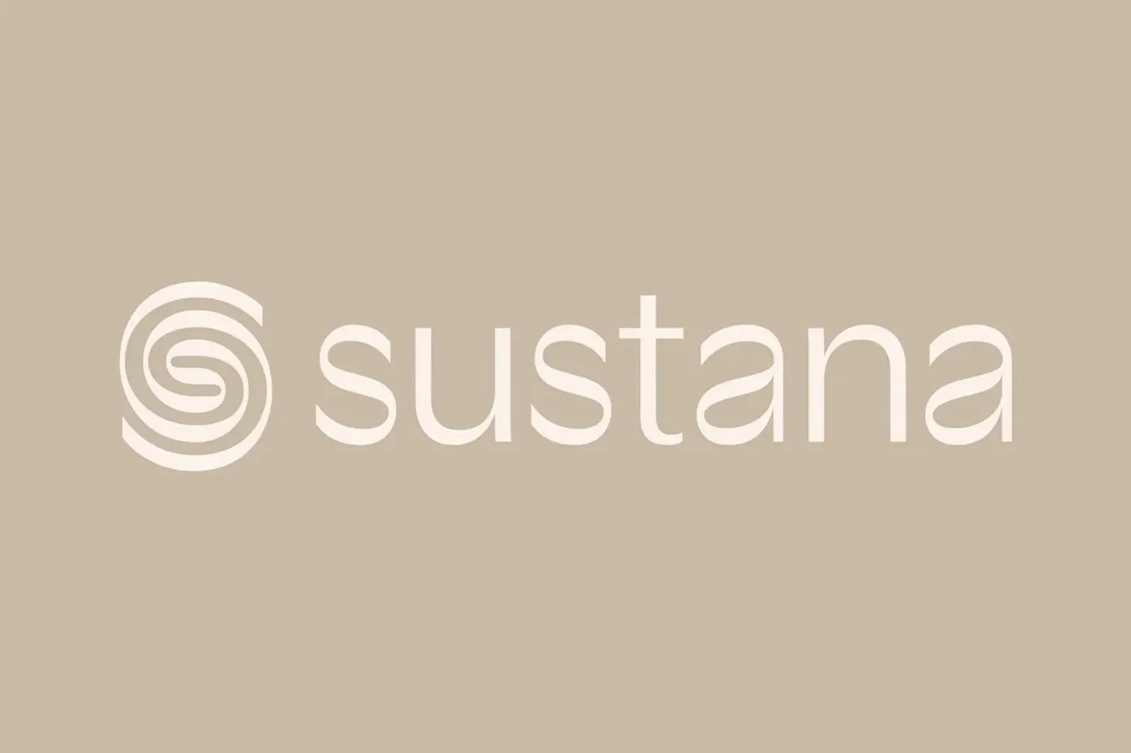
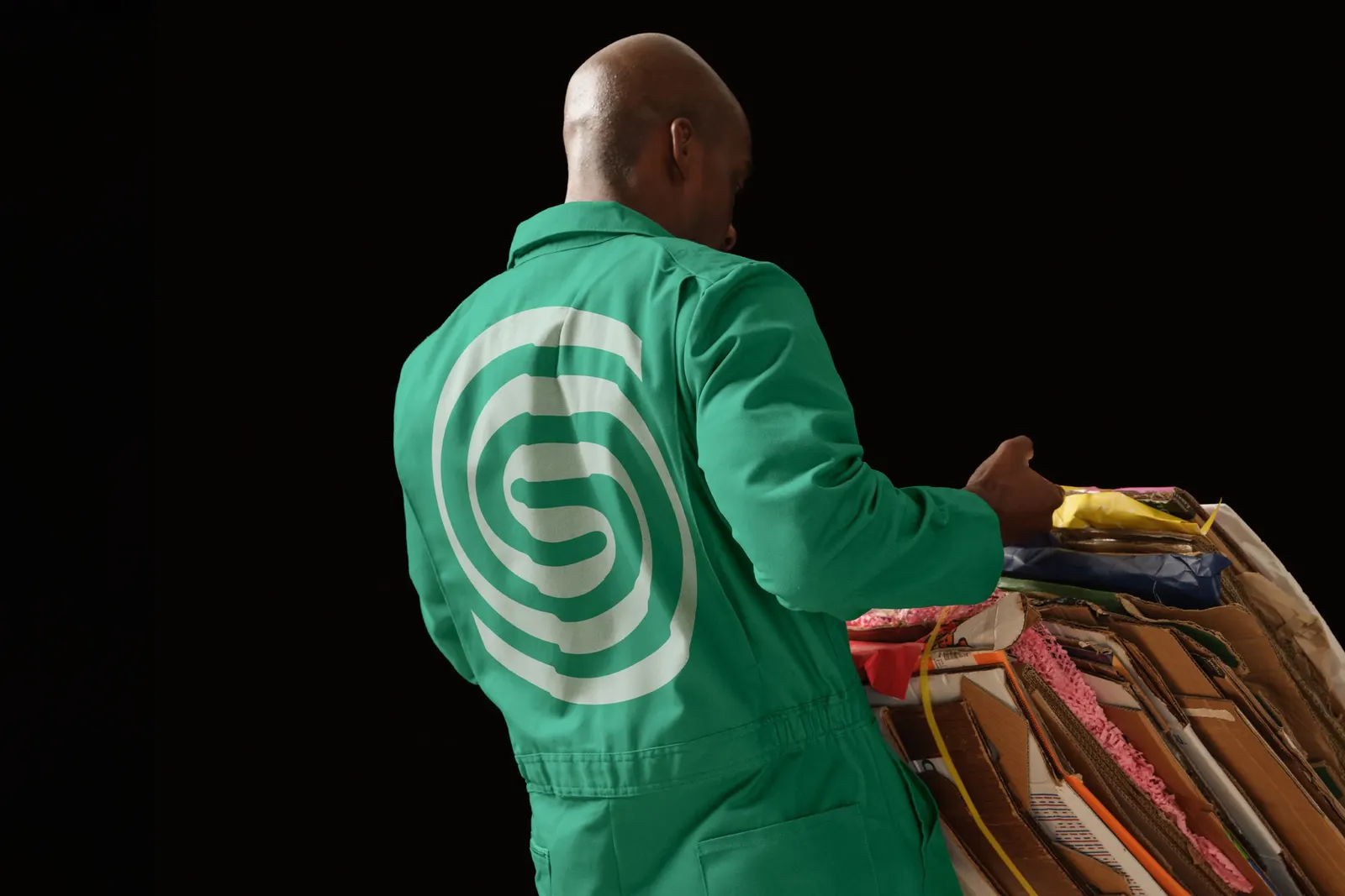
↗COLLINS took a 140-year-old Canadian paper mill in a shrinking industry and changed the question being asked about it. Rolland made paper, but its operation looked more like a materials producer's: it runs on recycled waste, draws most of its energy from biogas, and reuses all of its water. The studio renamed the company Sustana and positioned it for a field far larger than paper.
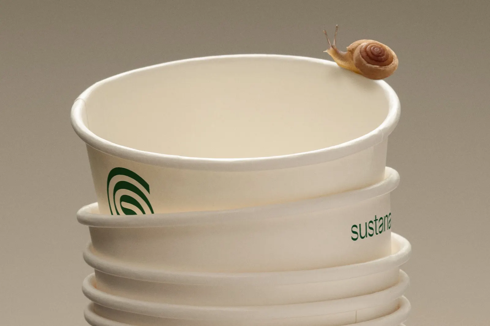
The brief was as strategic as it was visual. COLLINS built the positioning around the idea of an ingredient, so Sustana could approach global brands as a partner rather than a supplier. That clarity also gave the company a story to support acquisitions, including Hanna, a major North American paper recycler. Sharp Type handled design and typography, Mari Juliano photography, and Pedro Veneziano 3D, with Nicole Louie also contributing.
Why it works
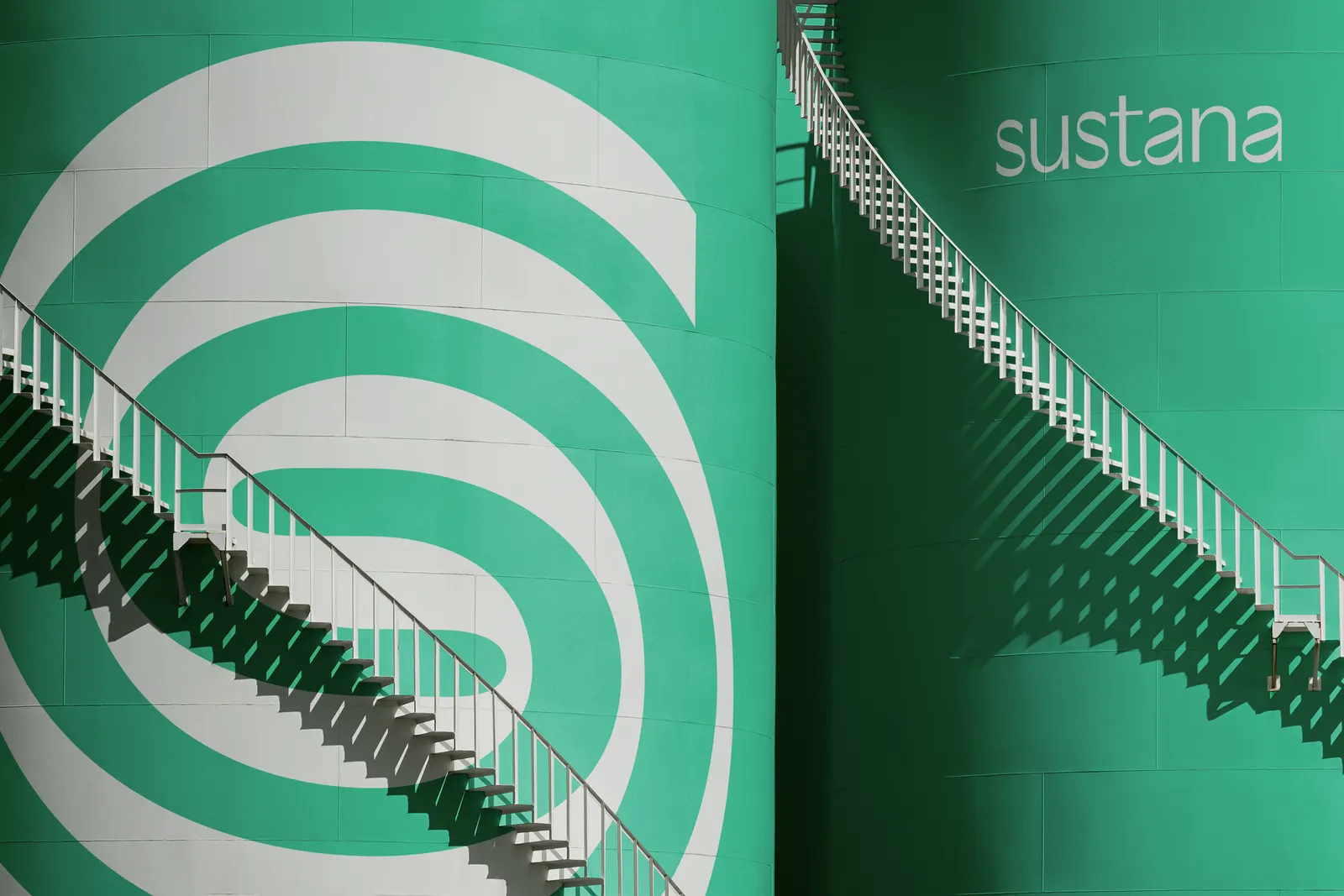
The name does a lot of the heavy lifting. Rolland read as a single mill. Sustana is a coined word that hints at sustaining and never mentions paper, so it can follow the company into any category it acquires its way into. The mission is plain enough that a packaging or consumer goods buyer gets it in one read. We also like the pairing of photography and 3D in the credits. Real imagery keeps the brand tied to physical industry, while 3D can show a material inside an everyday product, which is exactly where an ingredient brand needs to be seen.
Applications
Logo
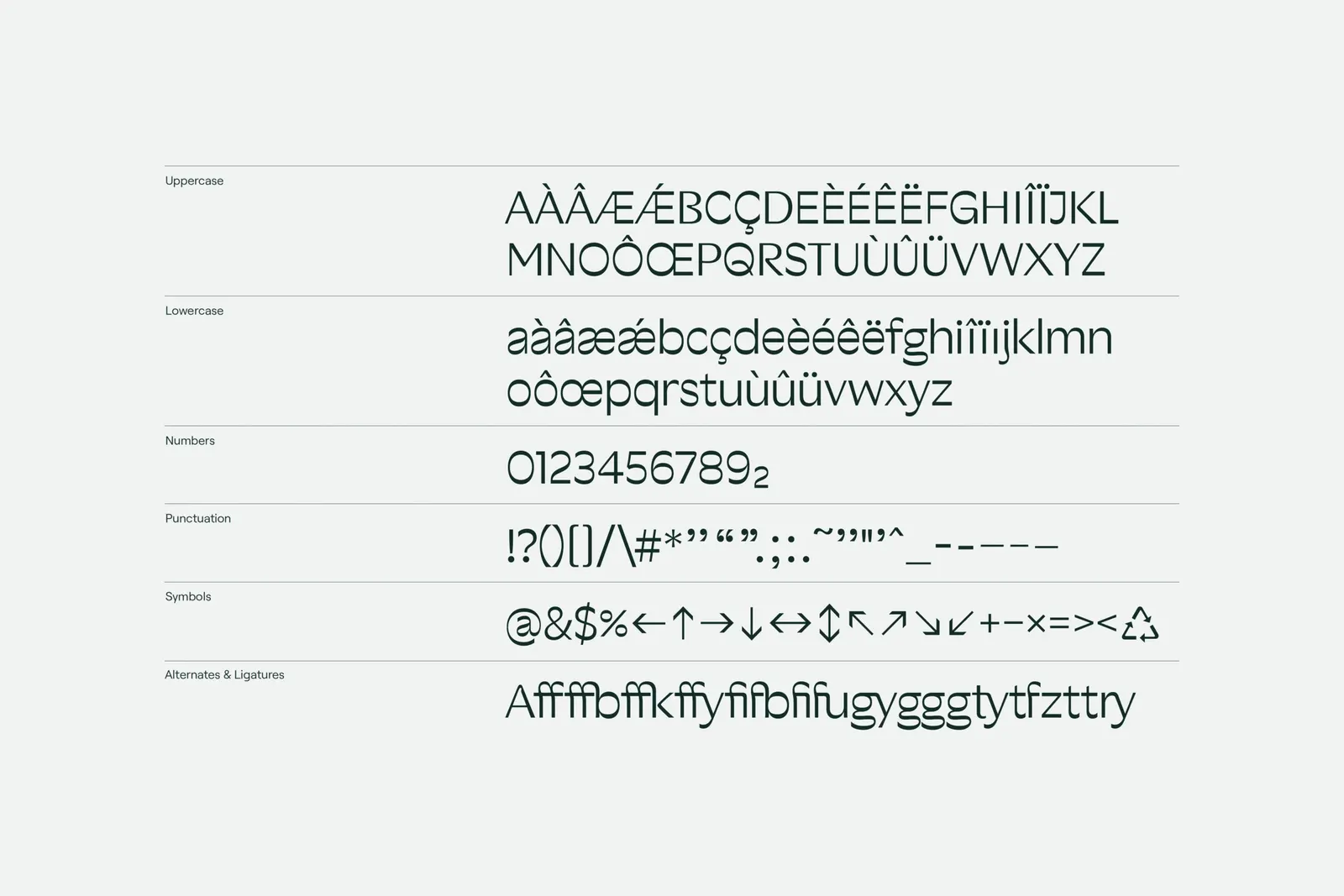
Typography
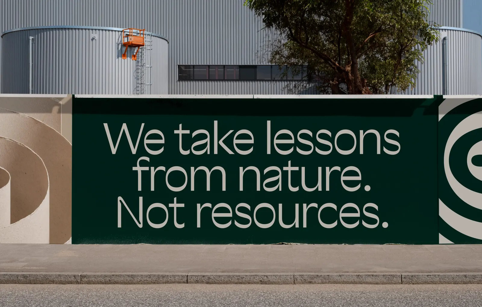
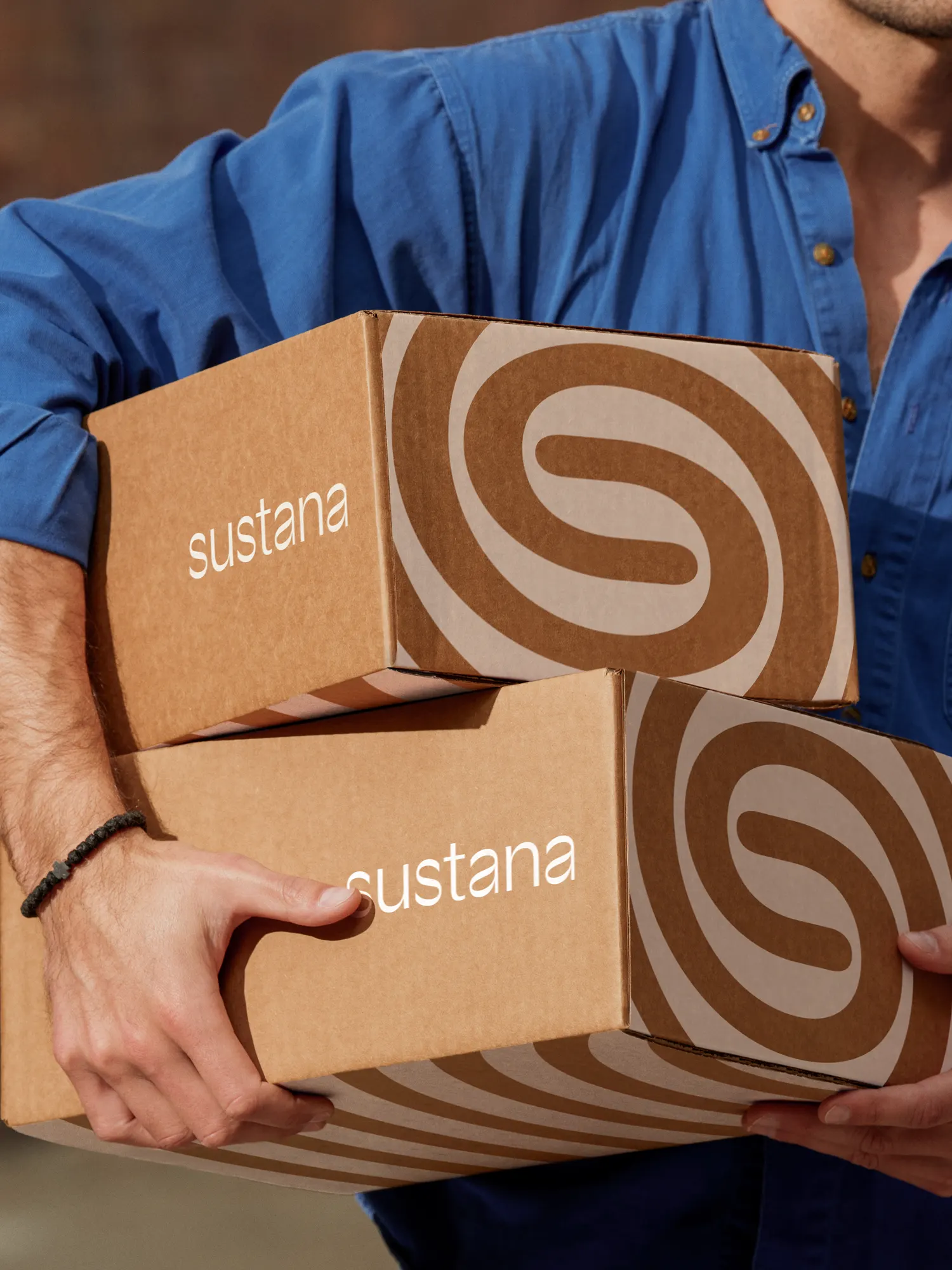
Images and video from wearecollins.com, by Collins.