The Brand Monograph
Farmer Gracy brand identity by Tobias Hall
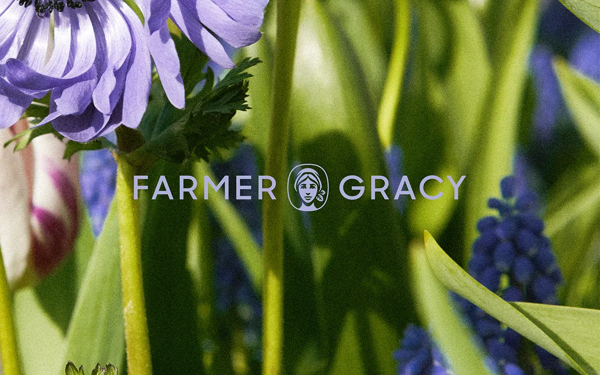
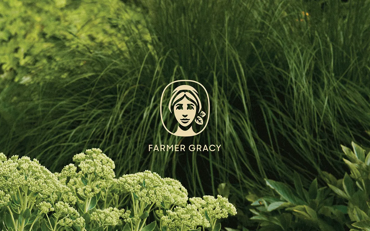
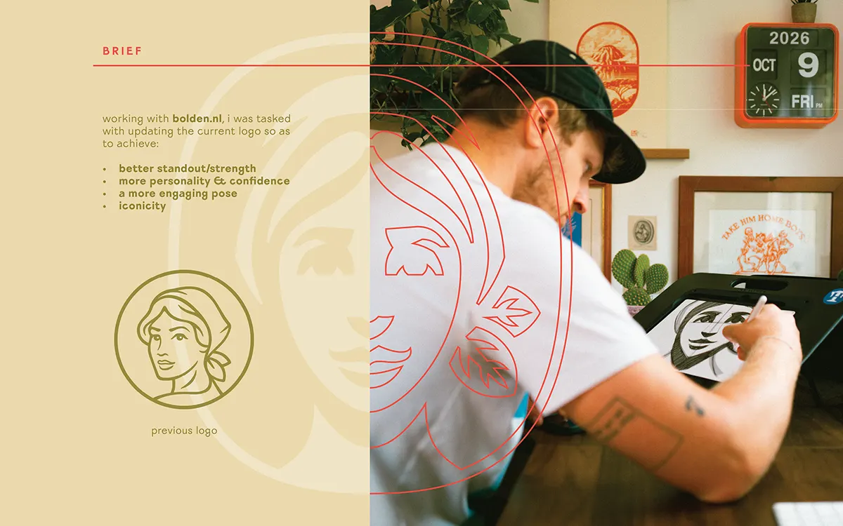
↗Tobias Hall's mark for Farmer Gracy shows what an illustrator's hand can bring to a logo. The studio drew the identity for the garden brand, which is known for bulbs and plants, and worked with Bolden, who handled design on the project.
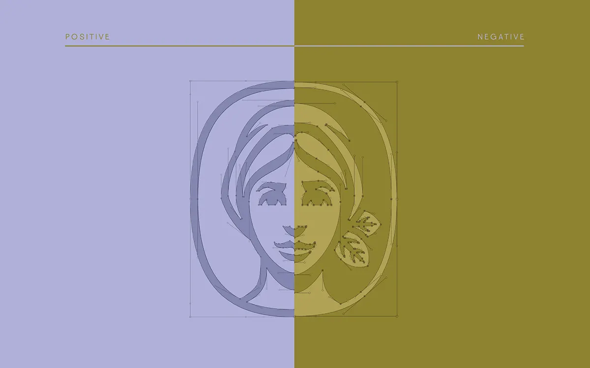
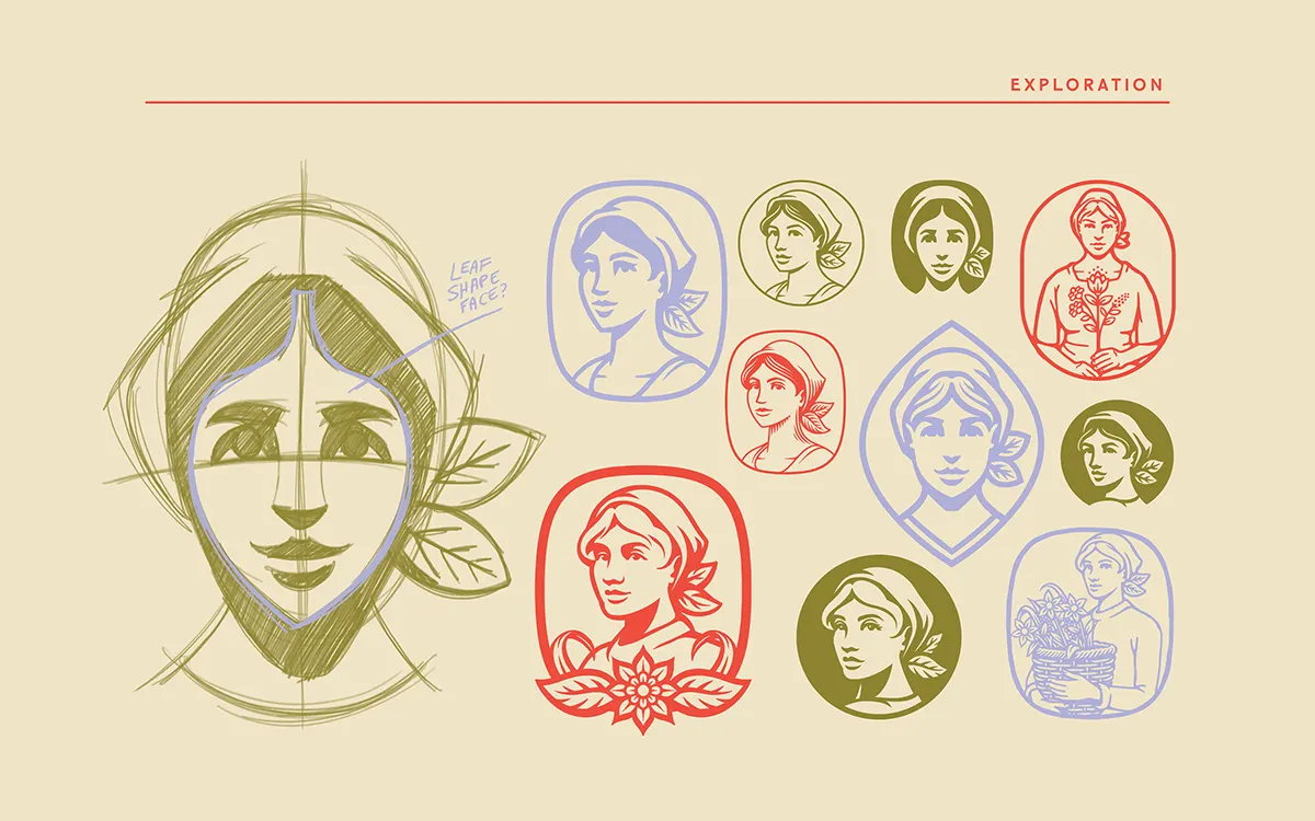
The work sits where Hall's illustration and logo practices overlap. Instead of building a mark from clean geometry, the studio keeps the character of drawing, so the brand reads as having a point of view rather than a template. The split of roles is also worth noting: Bolden shaped the design side while Hall supplied the mark that anchors it, a reminder that a good identity often depends on the right specialist drawing the one piece everything else leans on.
Why it works
Garden retail can fall back on generic botanical clip art and safe green palettes, so a mark with a visible human hand stands out quickly. It suits the subject, too: plants and bulbs are grown and tended, and drawn lines carry that sense of care better than a polished, mechanical symbol. An illustrated logo also gives the brand a personality it can wear on its own, which helps a business that wants to feel approachable to home gardeners rather than institutional.
Applications

Logo
Images and video from tobias-hall.co.uk, by Tobias Hall.