The Brand Monograph
FC Como Women brand identity by Kind Studio
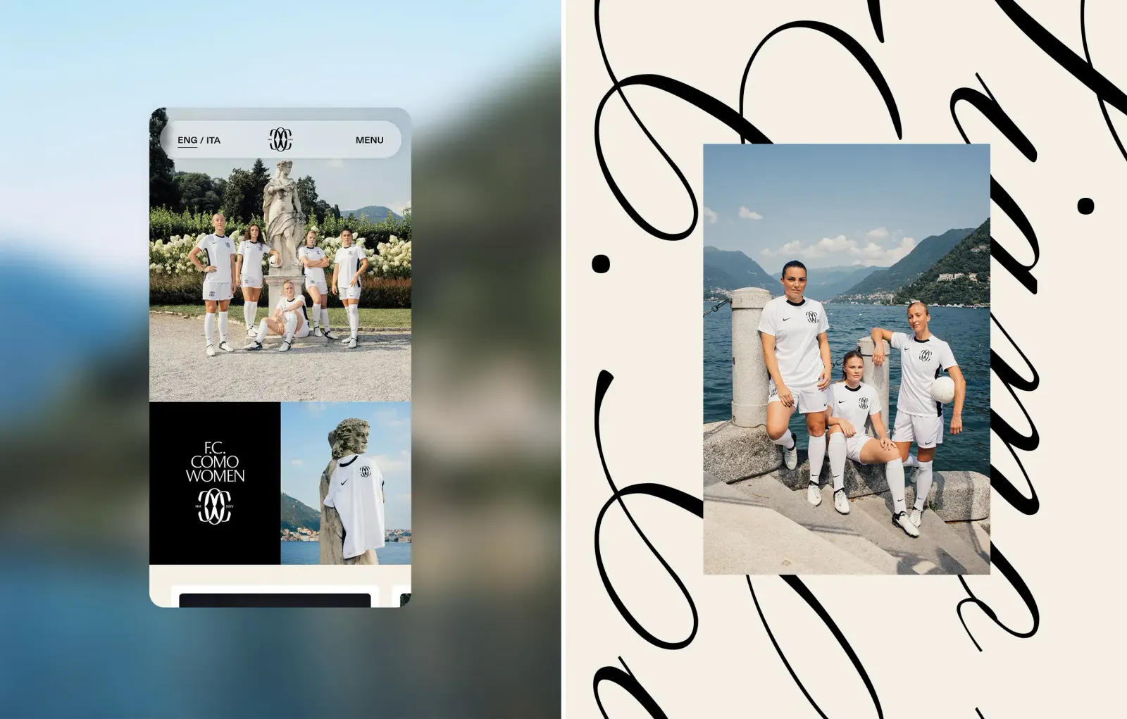
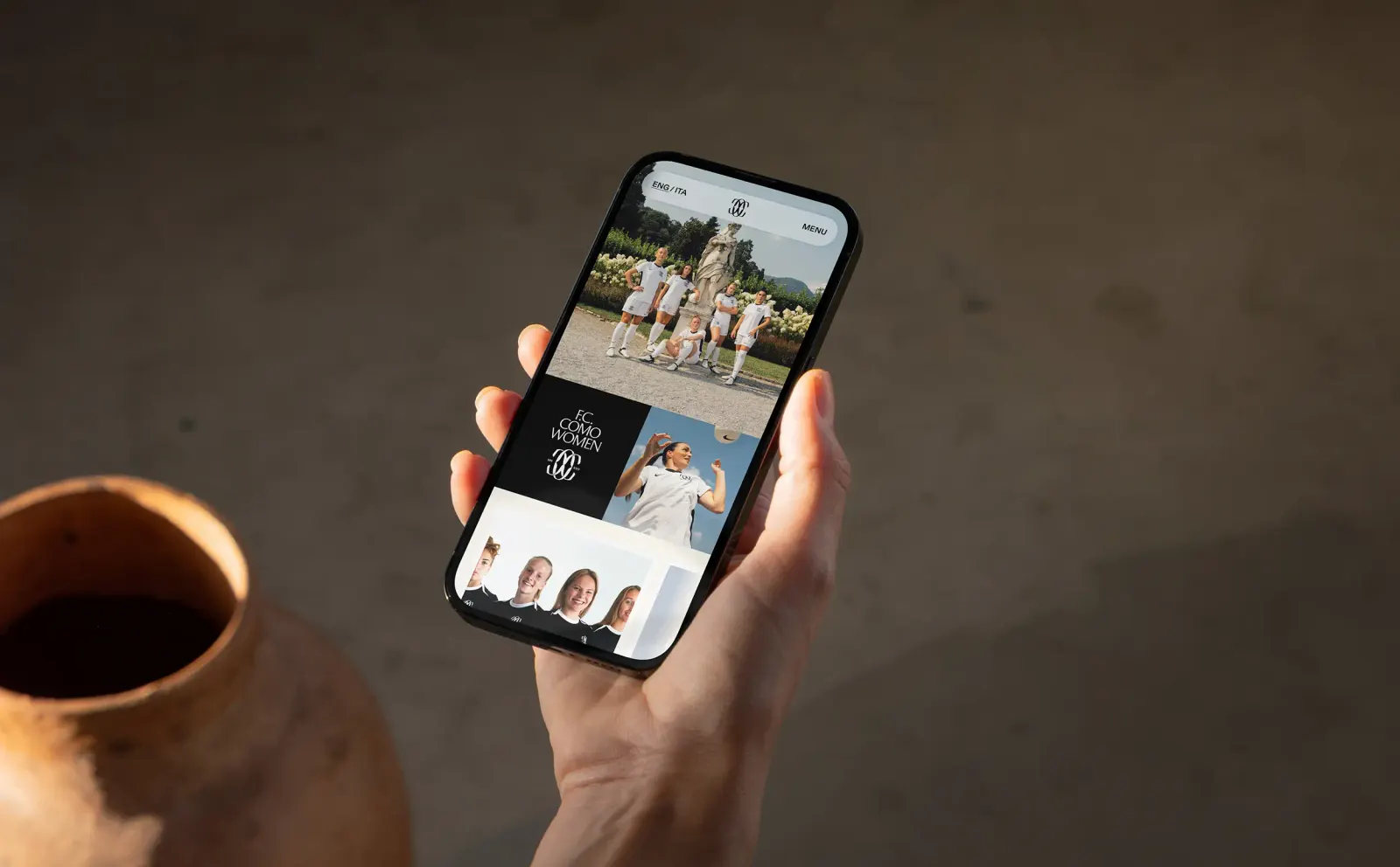
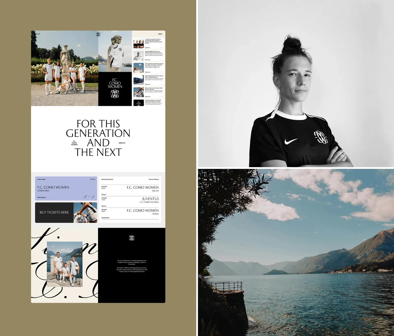
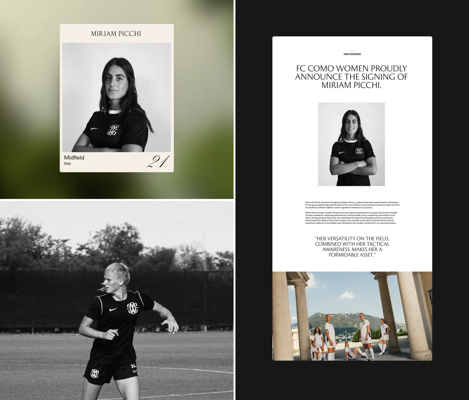
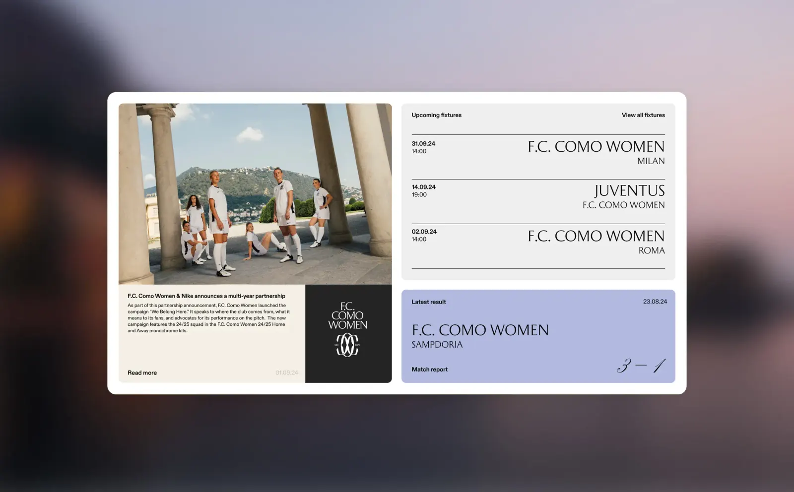
↗Most football club websites lead with fixtures, tickets, and merchandise. Kind Studio's site for F.C. Como Women leads with a point of view instead. Gender equality is the substance of the club's public face, not a campaign running alongside it.
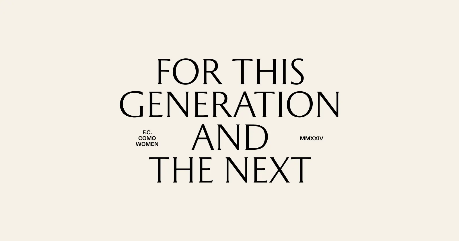
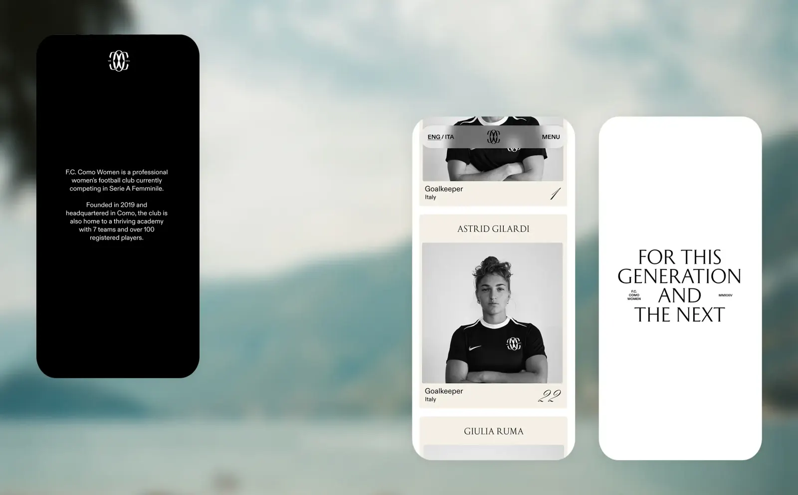
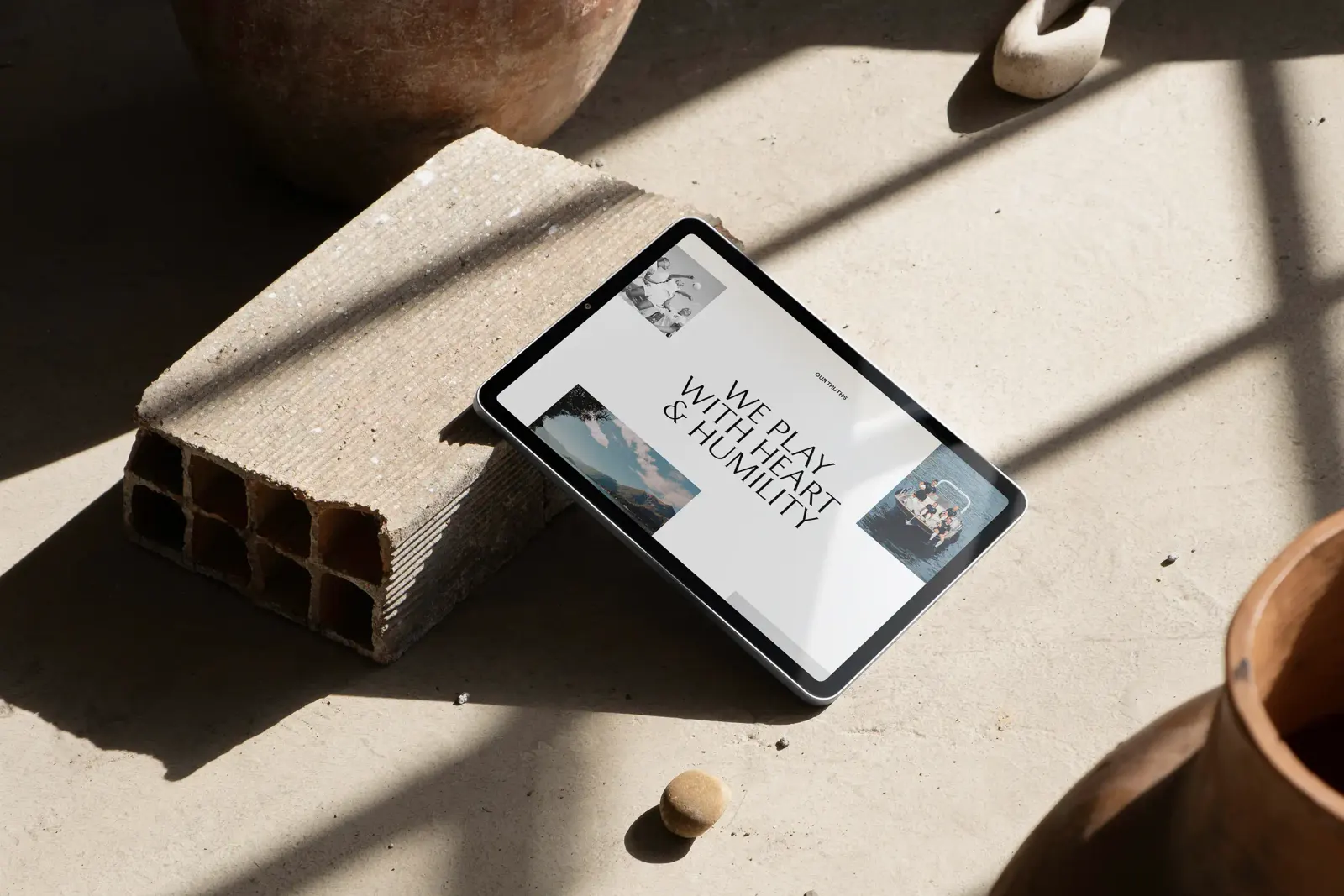
The brief called for a site that shows the club's ambitions reaching well beyond the pitch. Kind Studio built it like a publication: editorially led, bilingual, and driven by large type, strong photography, and a confident, direct voice. The result gives the club room to tell stories and make its case to supporters and to the wider sport, and it reads more like a magazine than a team page.
Why it works
An editorial structure suits a club that wants to persuade as much as win. It lets the message unfold through stories rather than slogans, and it lets the content set the pace instead of a template. Bold type does the loud work, so the copy can stay direct without turning strident. Offering the site in two languages widens the audience beyond a local fan base and frames the argument as one for the whole sport. Few clubs in this category look or sound like this, and that distance is the point.
Applications
Logo
Images and video from kindstudio.co.uk, by Kind Studio.