The Brand Monograph
Global Switch brand identity by Pentagram
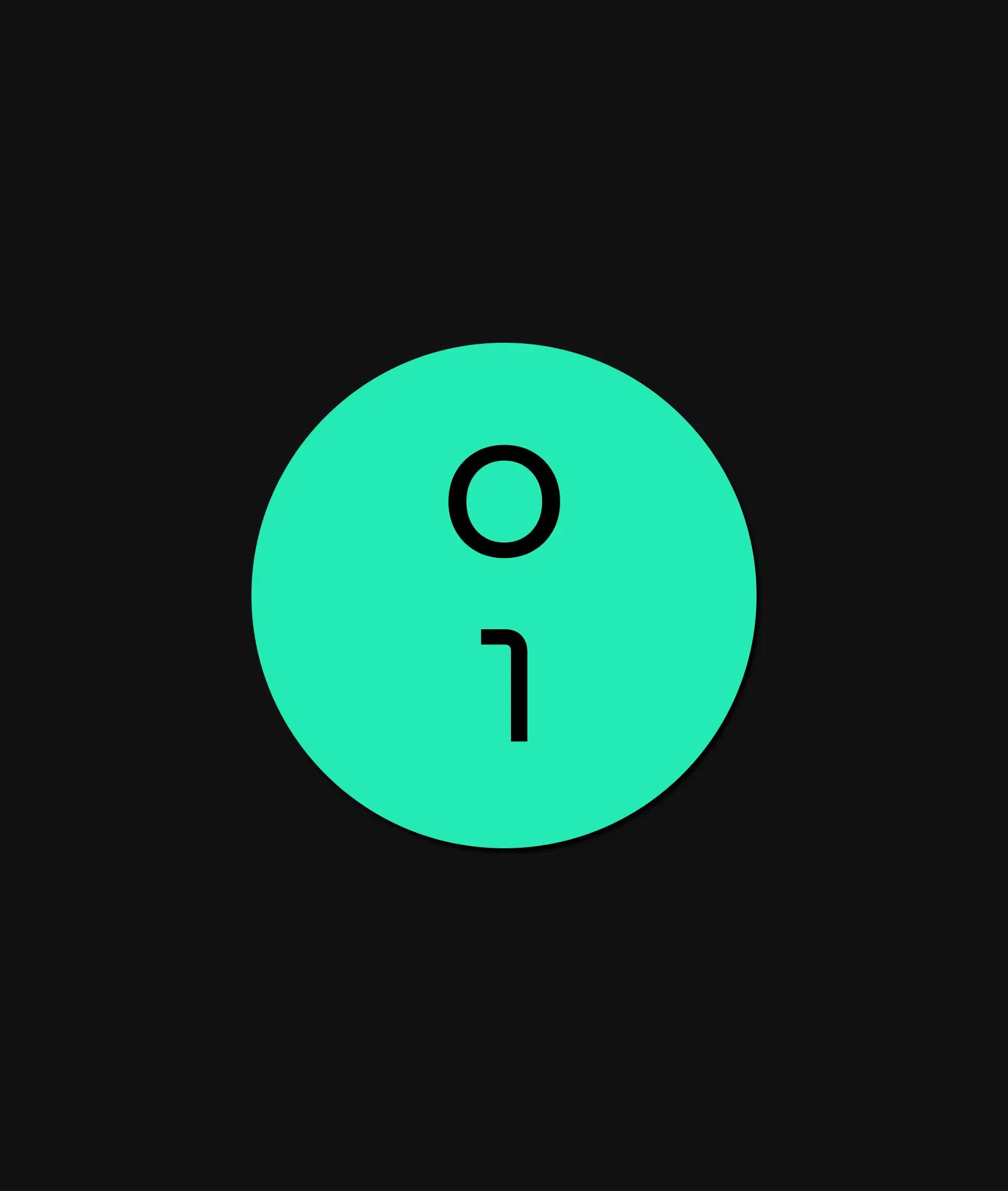
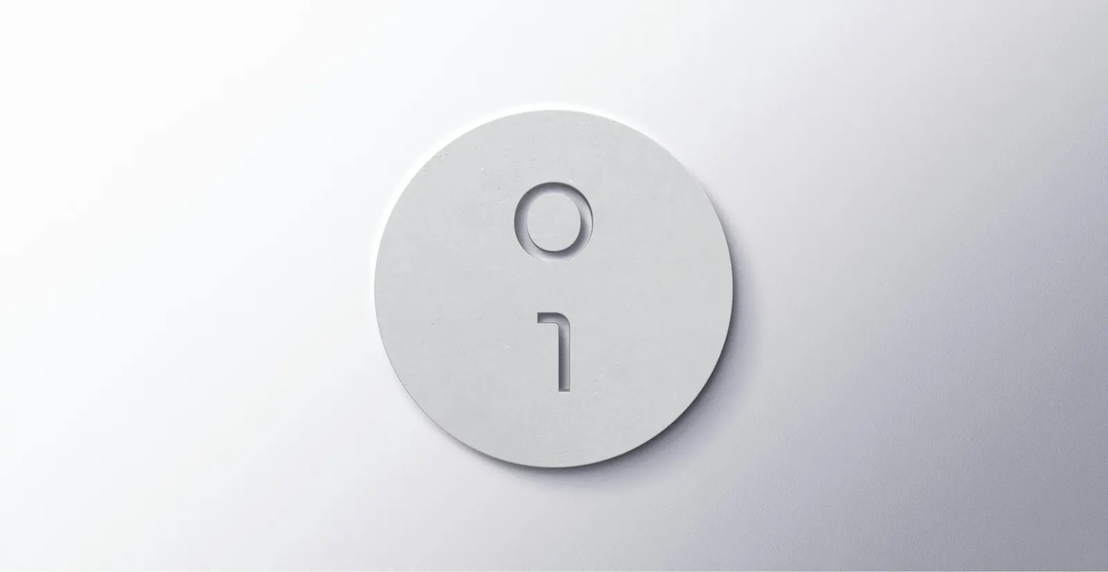
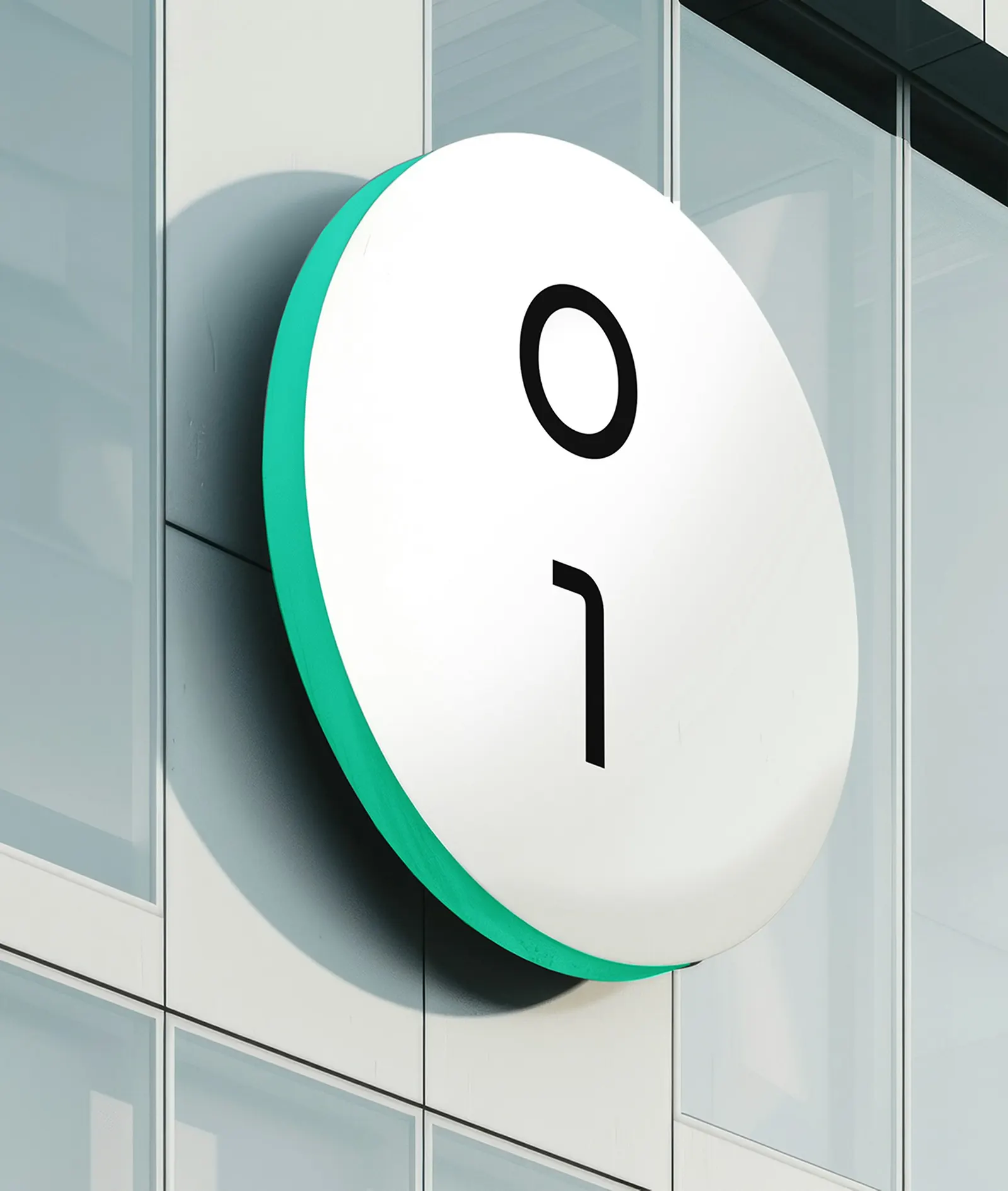
↗Most data centre brands lean on glowing server racks and circuit-board graphics. Pentagram took Global Switch somewhere quieter, with a wordmark in which the I and O double as a binary 1 and 0. The client operates 12 facilities across Europe and Asia and wants to grow without losing its boutique, high-security positioning, so the identity needed to look precise rather than flashy.
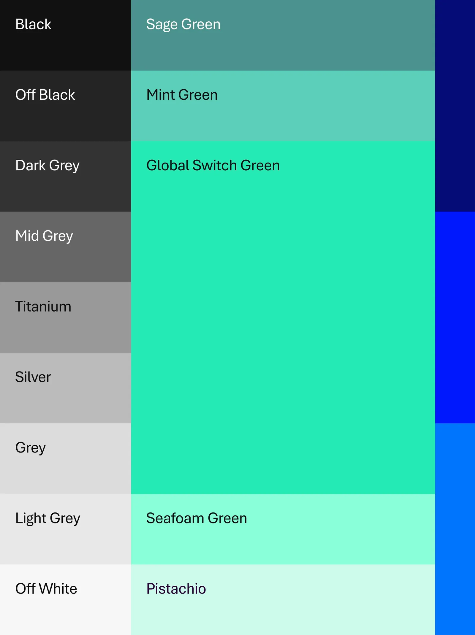
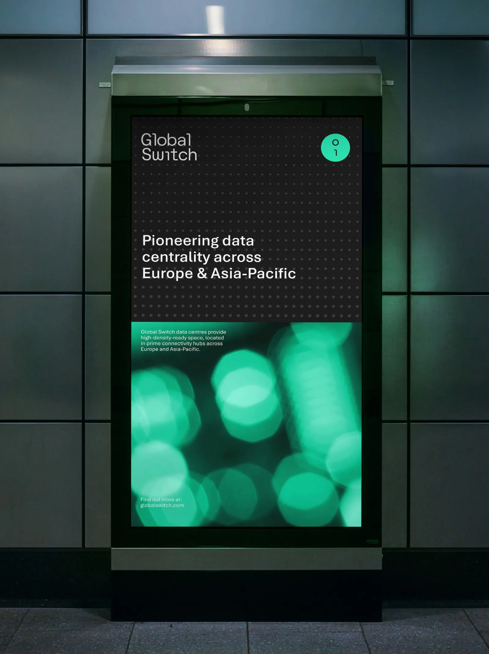
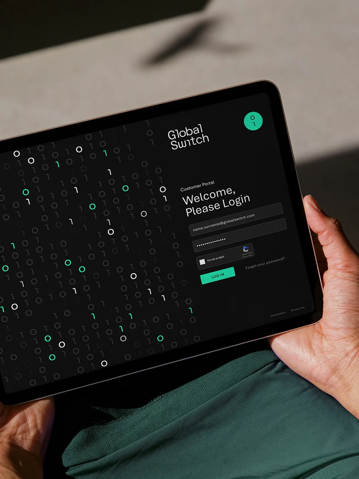
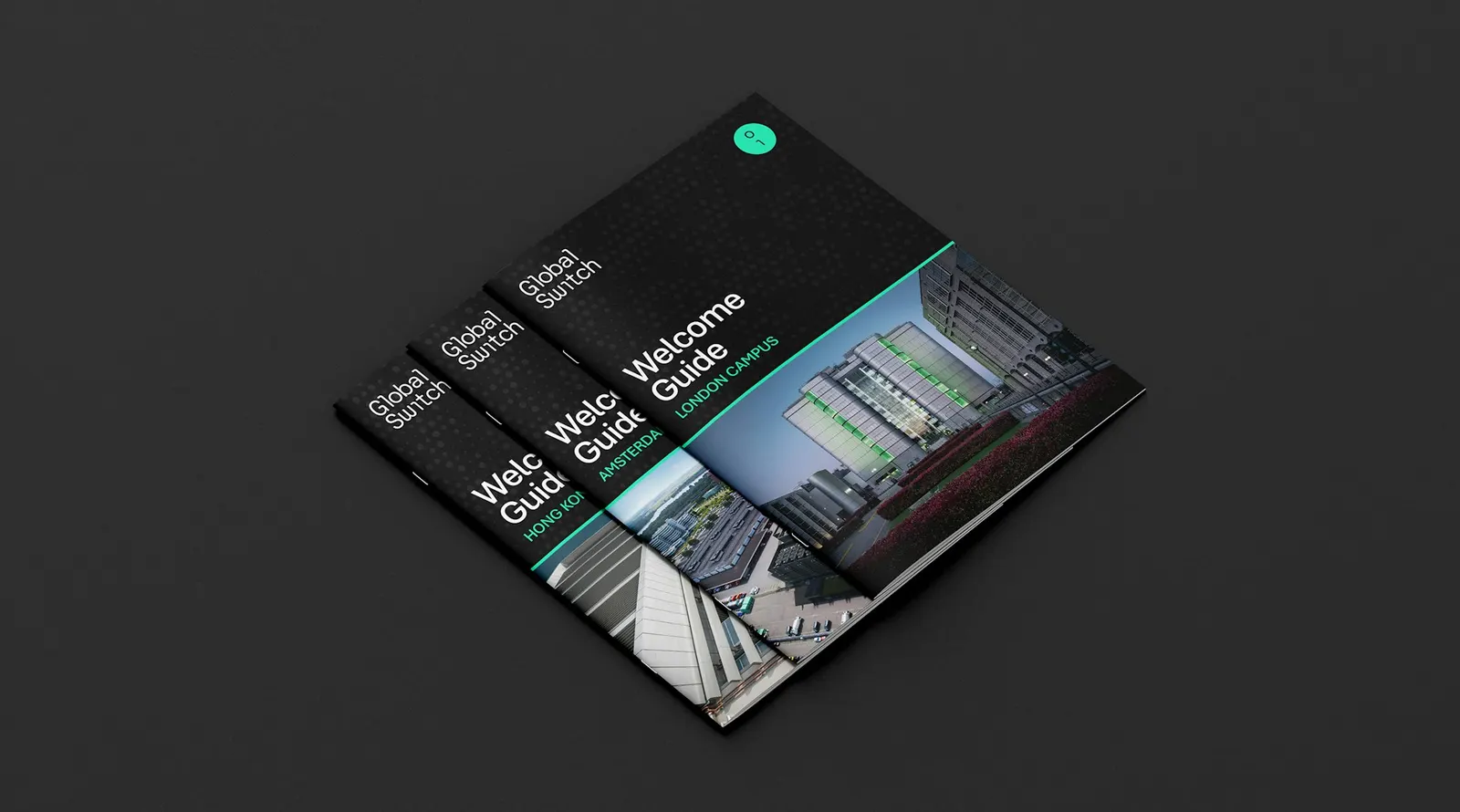
The design team included Alex Wright, Angus Hyland, Charlotte Selby, Daniela Perez, Daren Howells, Eoghan McMahon, and Jack Brown. They drew a custom monospaced wordmark, then derived a symbol from its characters that generates a library of patterns and abstract textures. An expanded color palette, iconography, guidelines, and templates support rollout to more than 500 staff in seven countries, set in Aptos for everyday use.
Why it works
The monospaced wordmark reads as code before anyone notices the binary detail, which suits buyers who judge infrastructure on rigor. The 1 and 0 joke is discreet enough to feel earned rather than gimmicky. Because the patterns grow from the logo's own characters, the brand gets texture and ownable visuals in a category that usually borrows stock imagery. Using Aptos for everyday text is a smart trade: the custom wordmark carries the personality, so the workhorse type can stay neutral and easy for teams to apply.
Applications

Logo
Color
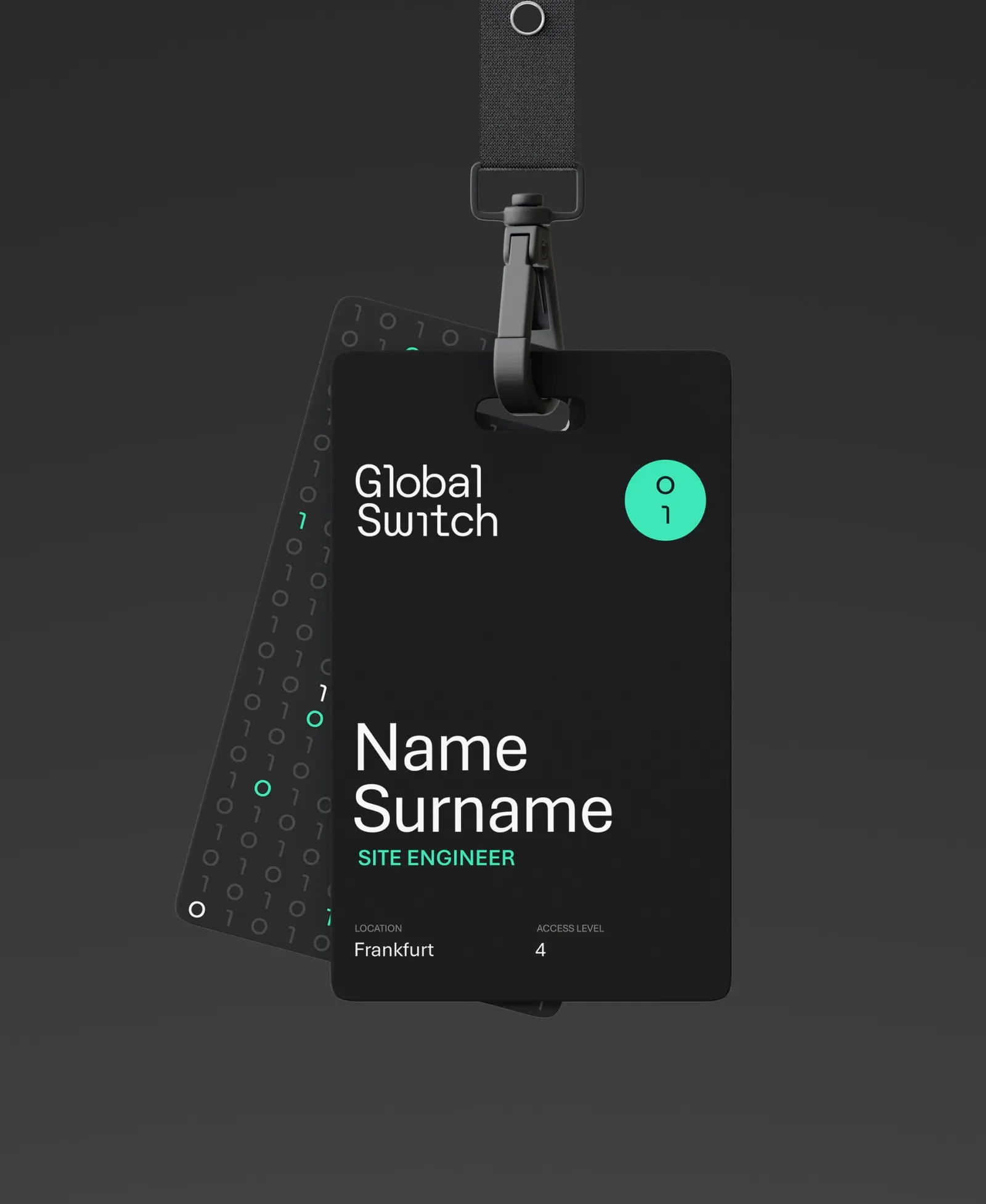
Images and video from pentagram.com, by Pentagram.