The Brand Monograph
Graziano brand identity by Barkas
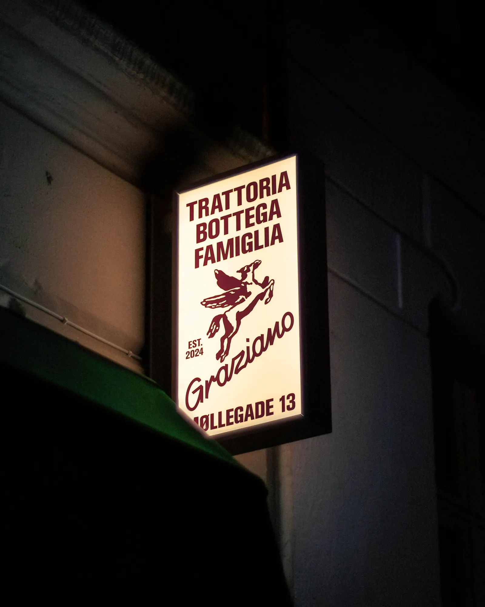
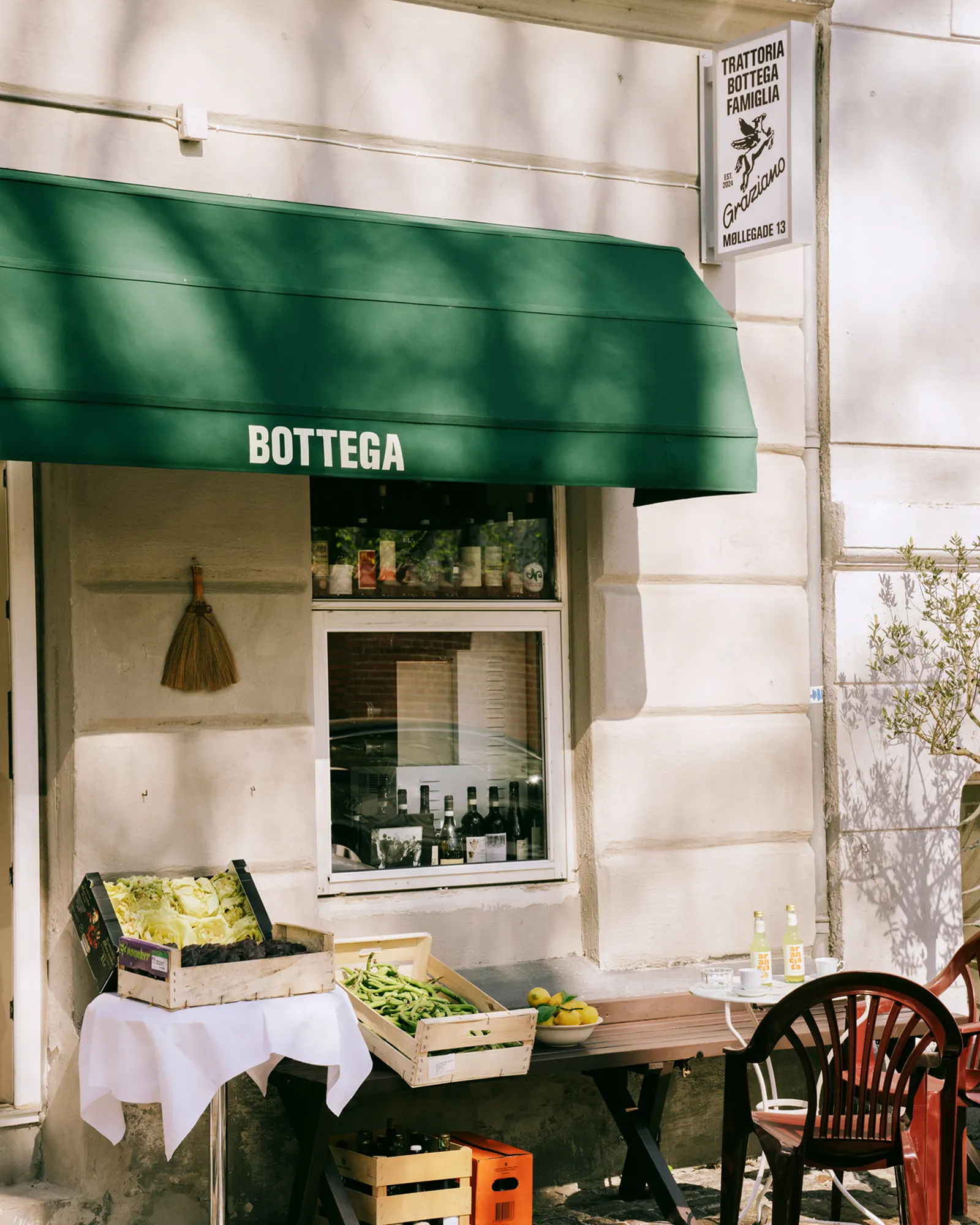
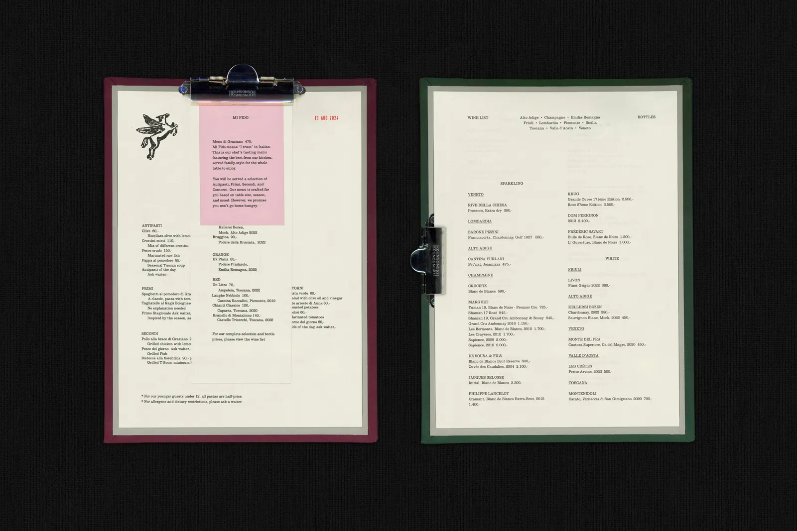
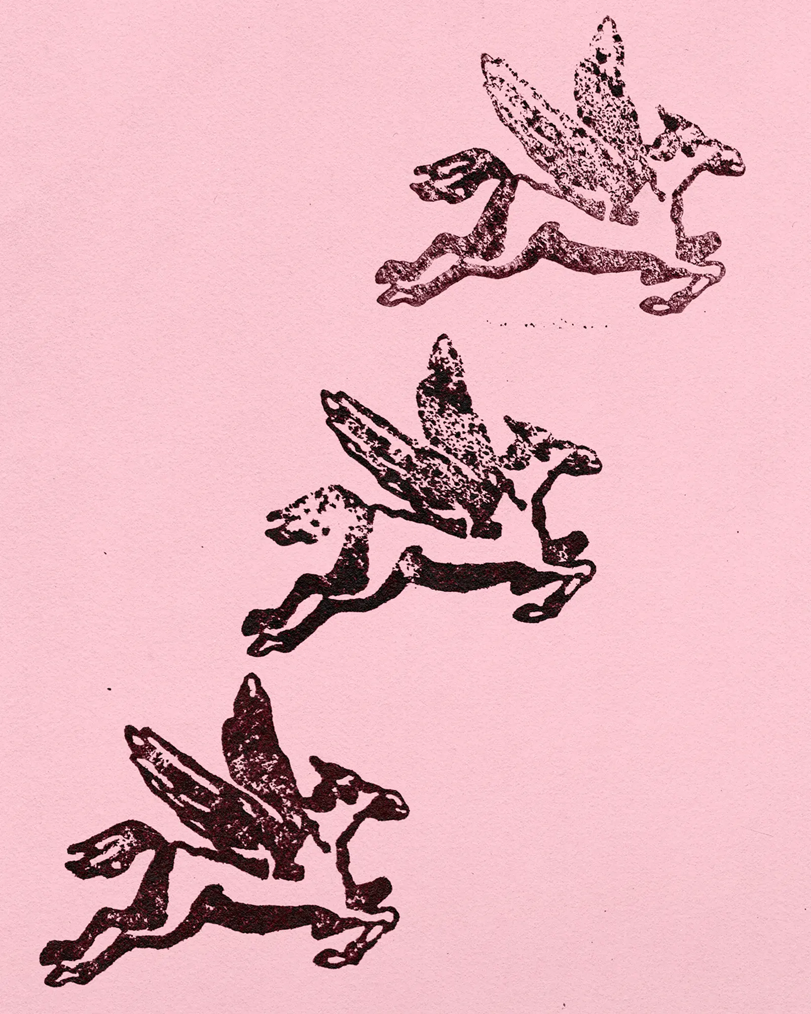
↗Barkas gave Graziano, a small Tuscan restaurant in Copenhagen N, an identity that feels personal rather than themed. The studio built it around a hand-drawn Pegasus, the emblem of Tuscany. The choice is rooted in the story of co-founder and chef Jonathan, who grew up on an olive grove in Montecatini.
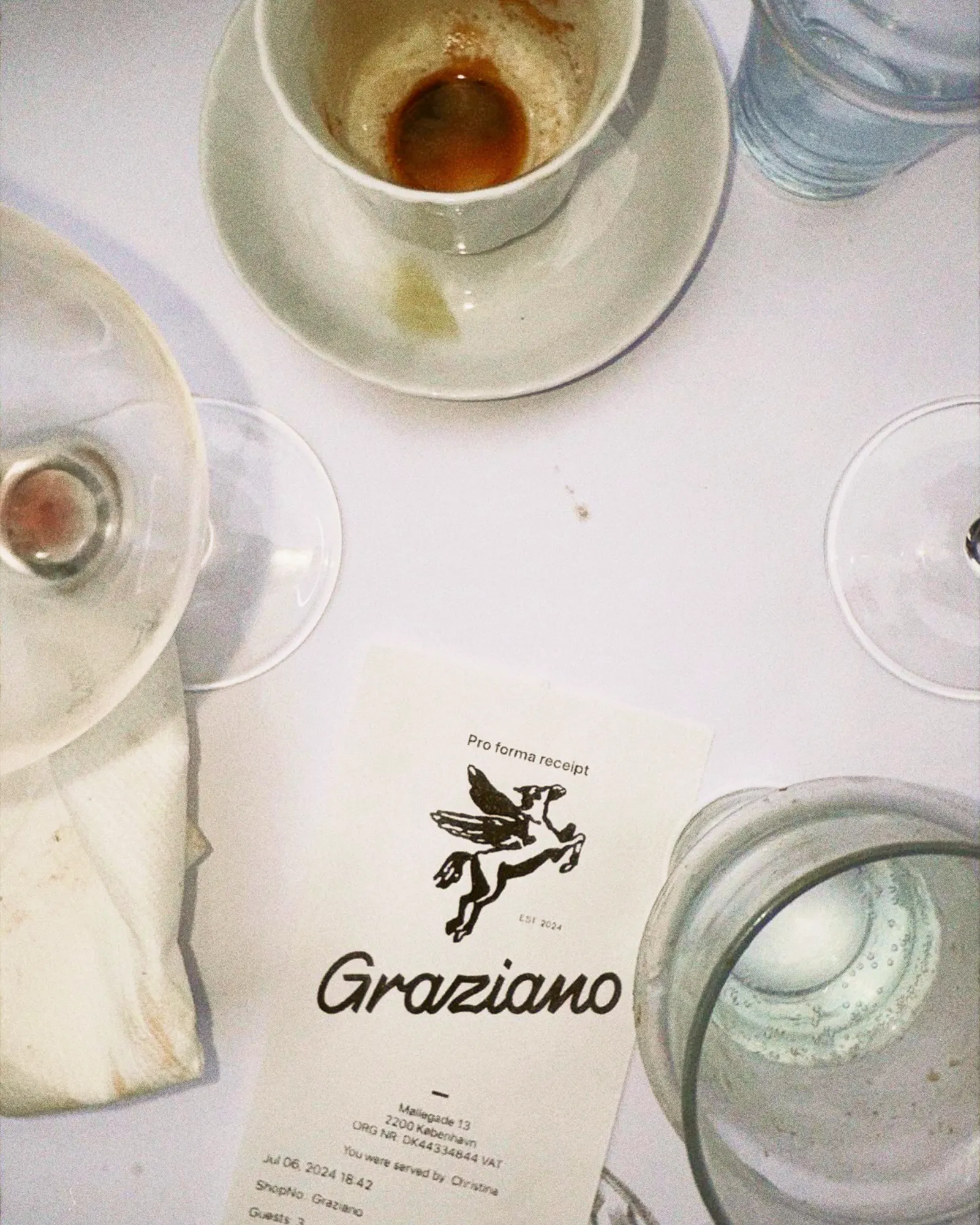
Founders Jonathan and Kaave wanted a look that could hold up for years without chasing a moment. Barkas answered with custom lettering for the logotype, modeled on the looping, handmade signs found on Italian streets, and let the drawn mark carry the rest. Jakub Dohnalek and Kasper Kristoffersen handled photography, and Klara K handled production.
Why it works
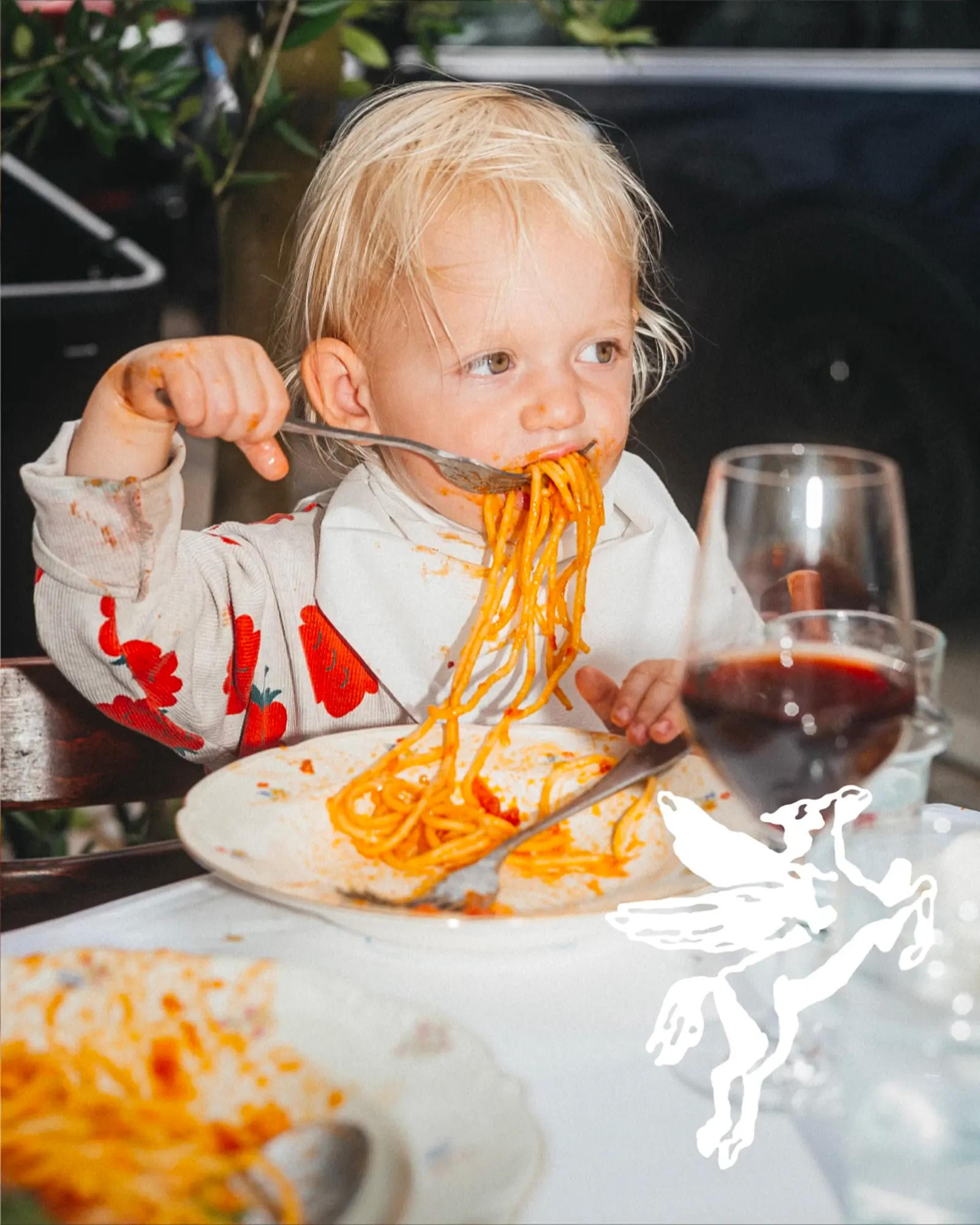
Italian restaurant branding often leans on the same familiar props, so a Pegasus is a braver and more specific choice. Because the mark is drawn by hand, it carries the warmth of a place run by people, which suits a restaurant this size. The lettering borrows from street signage rather than from the kitchen, linking the Italian references to the city where the restaurant actually sits. Together, the two feel like a neighborhood regular, not a concept.
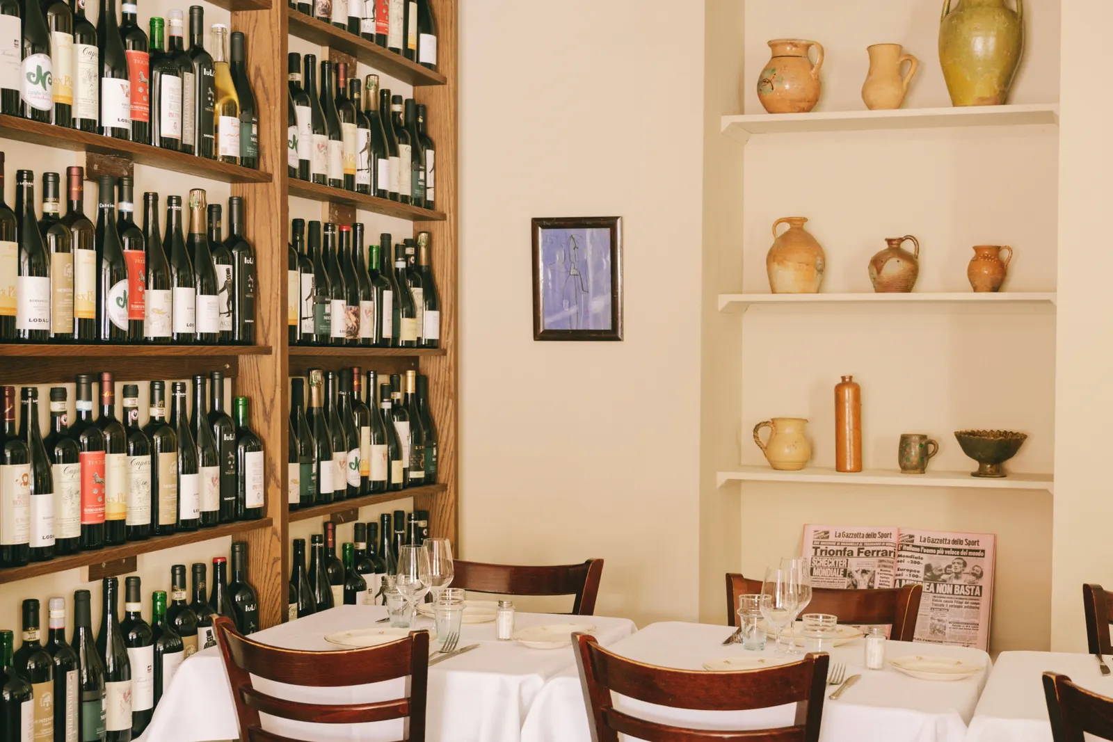
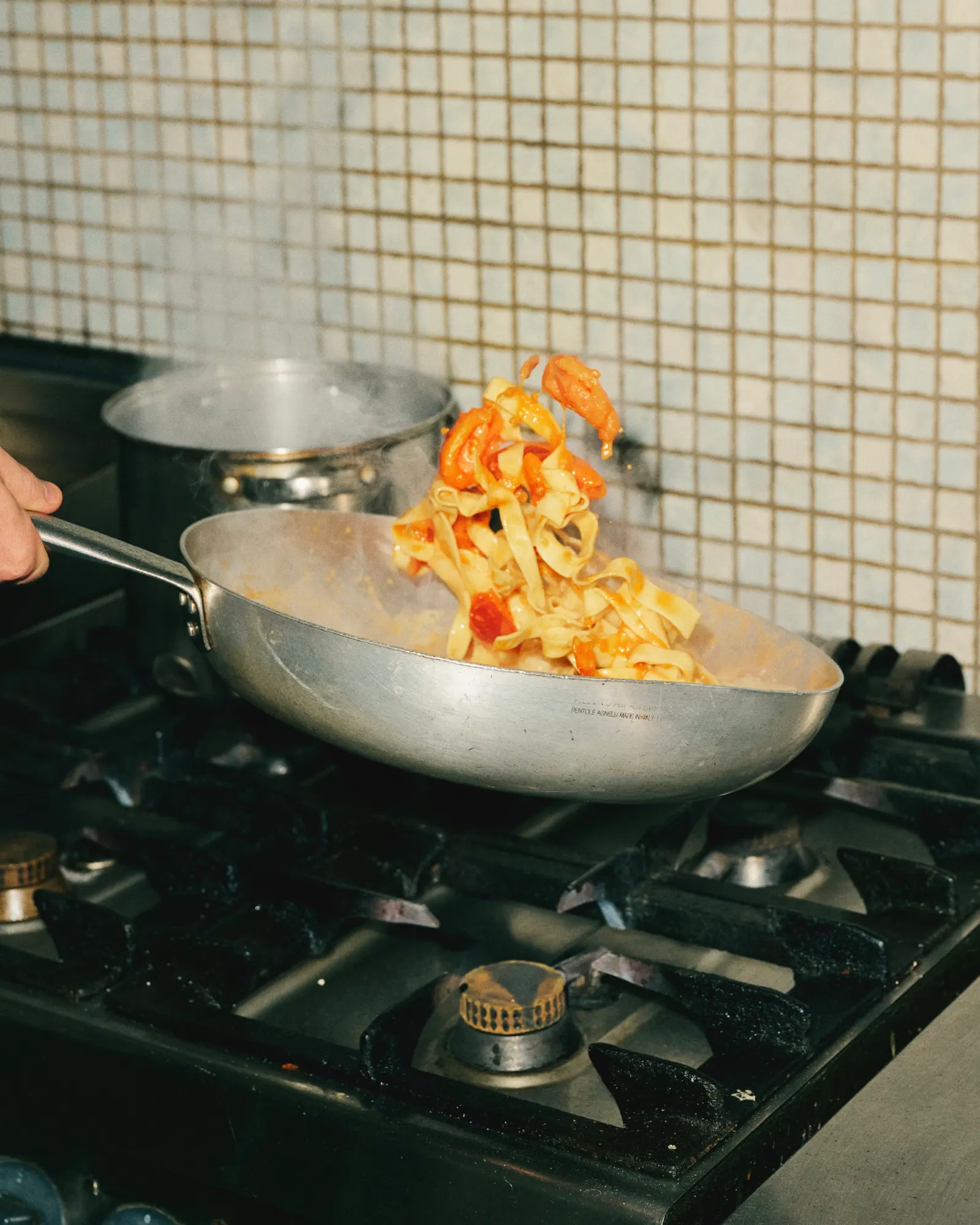
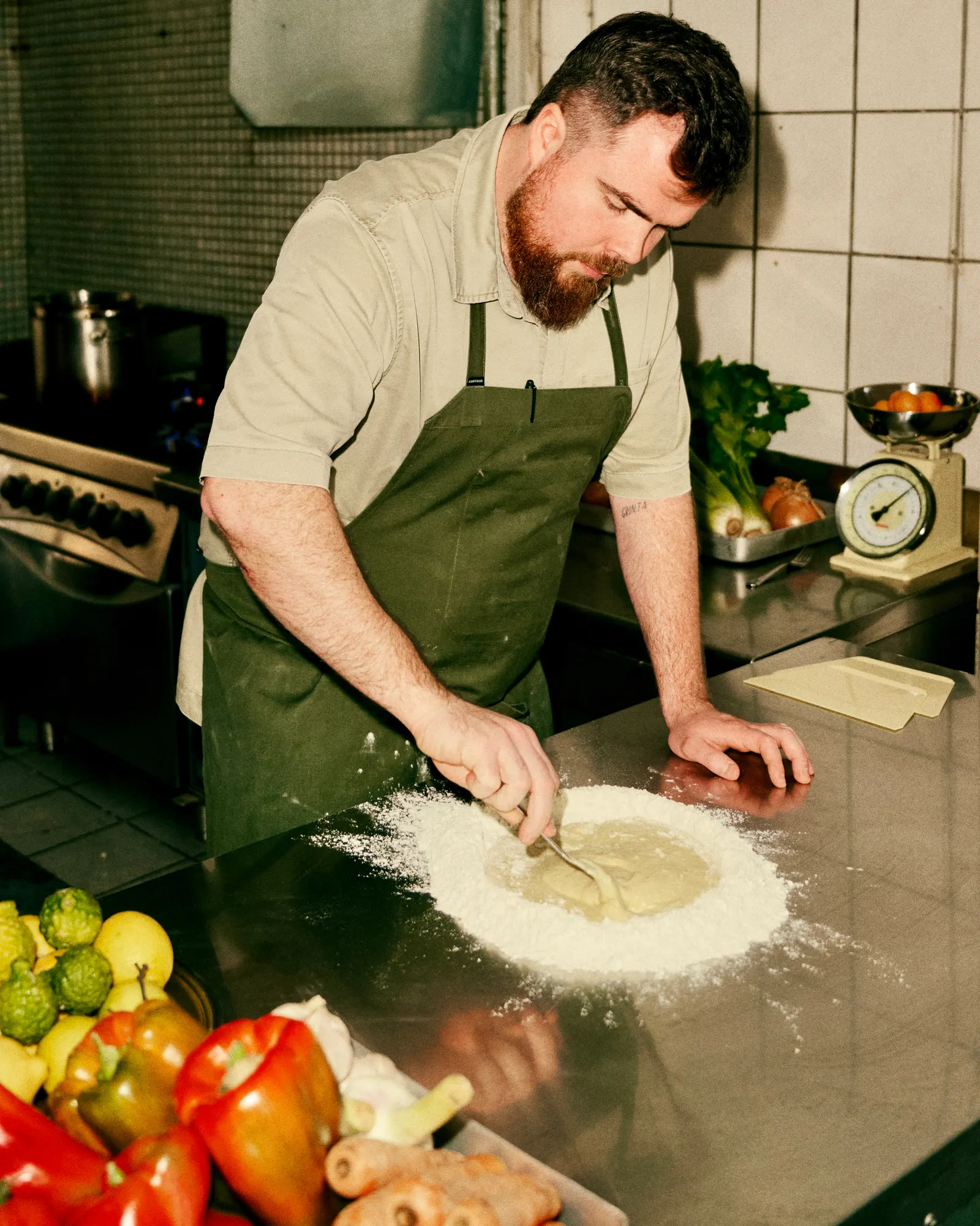
Images and video from barkas.com, by Barkas.