The Brand Monograph
Guggenheim Fellowship brand identity by Pentagram
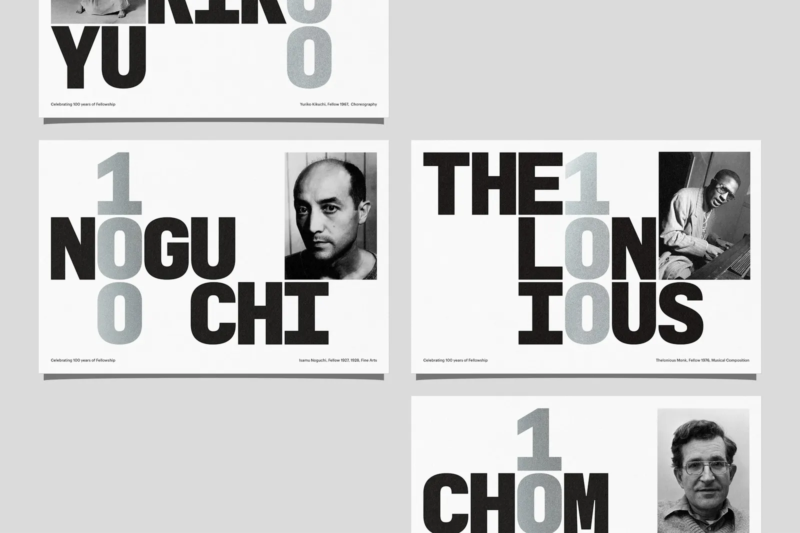
↗Most foundations introduce themselves with a crest and a hushed tone. For its 100th anniversary, the Guggenheim Foundation went another way with Pentagram, which put the grant itself, the Fellowship, at the center of the identity and let the institution step back.
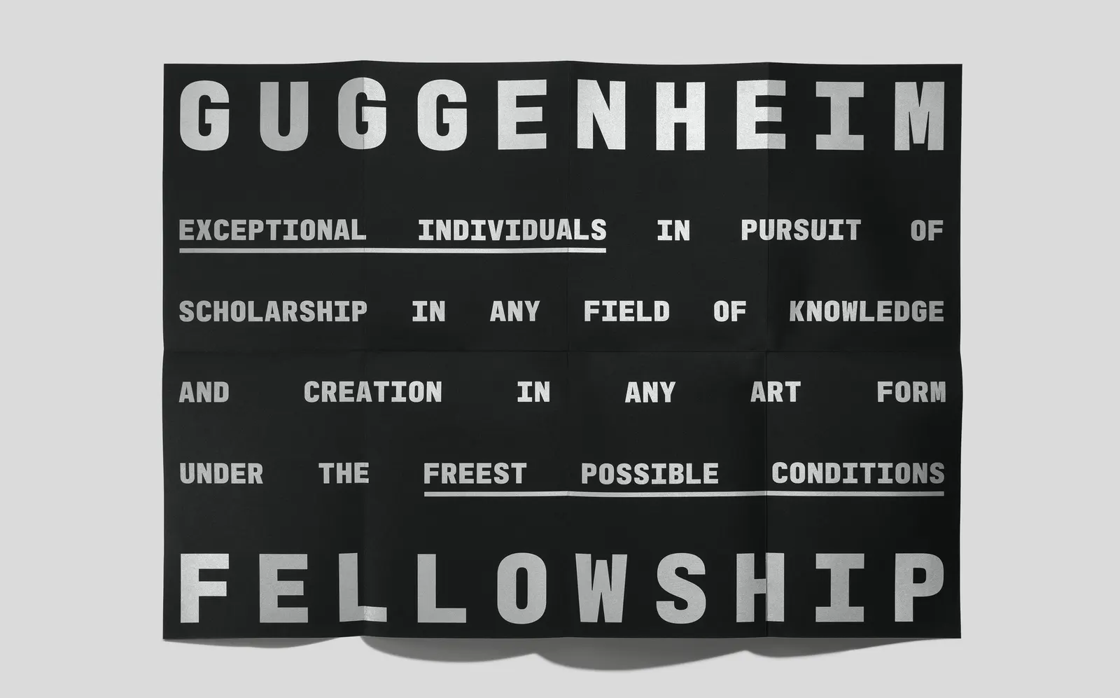
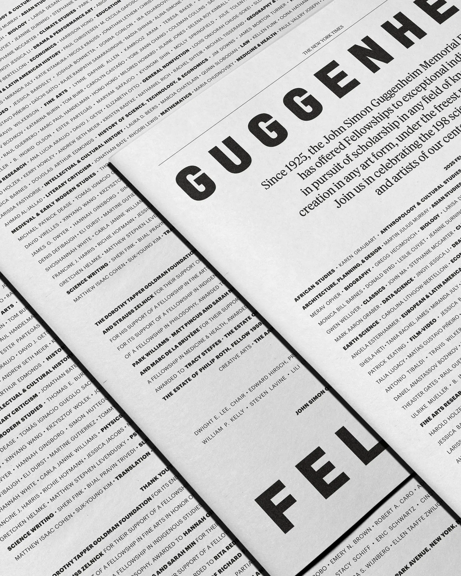
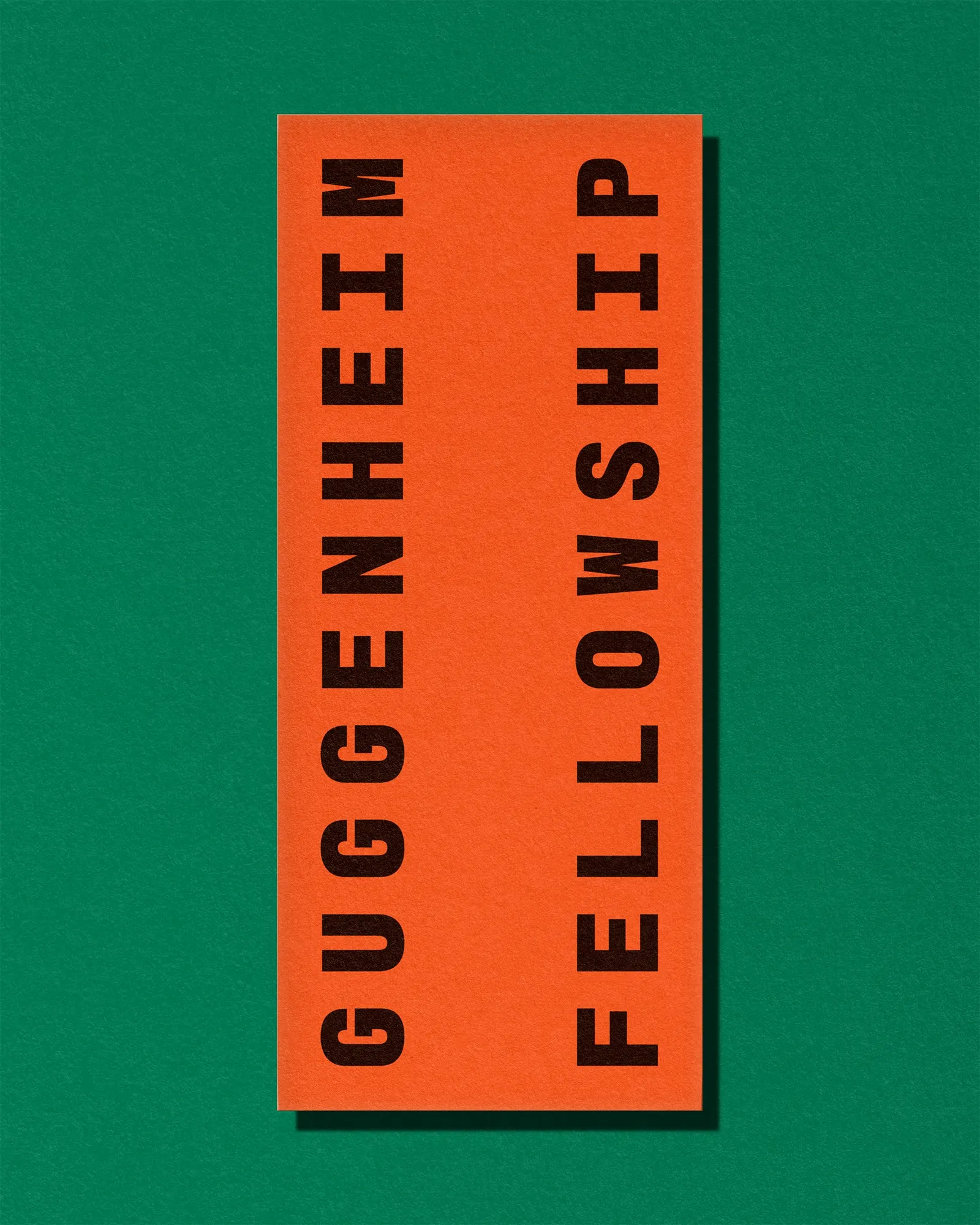
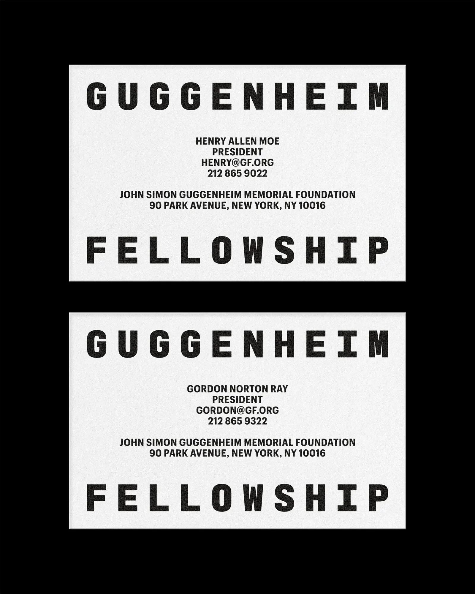
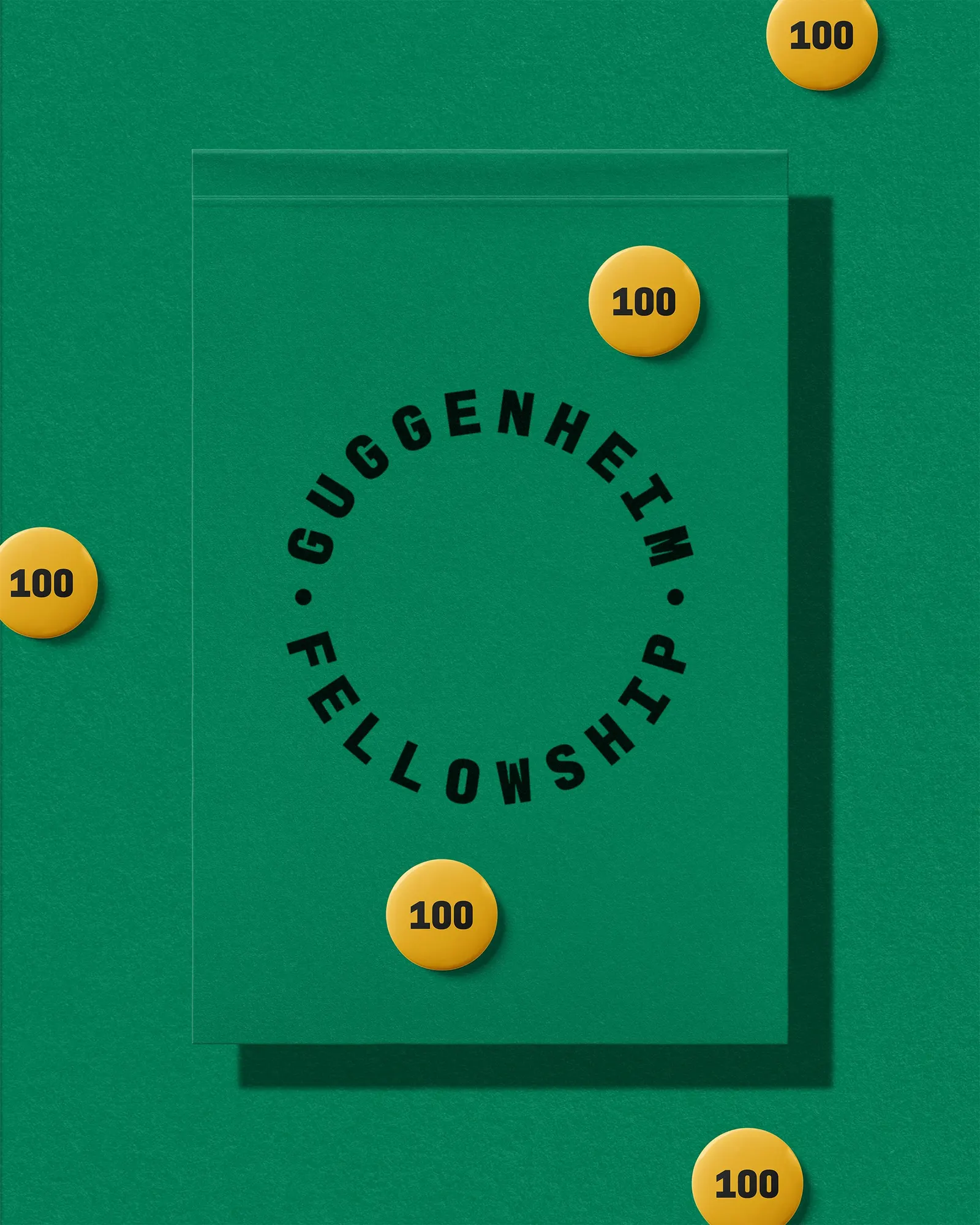
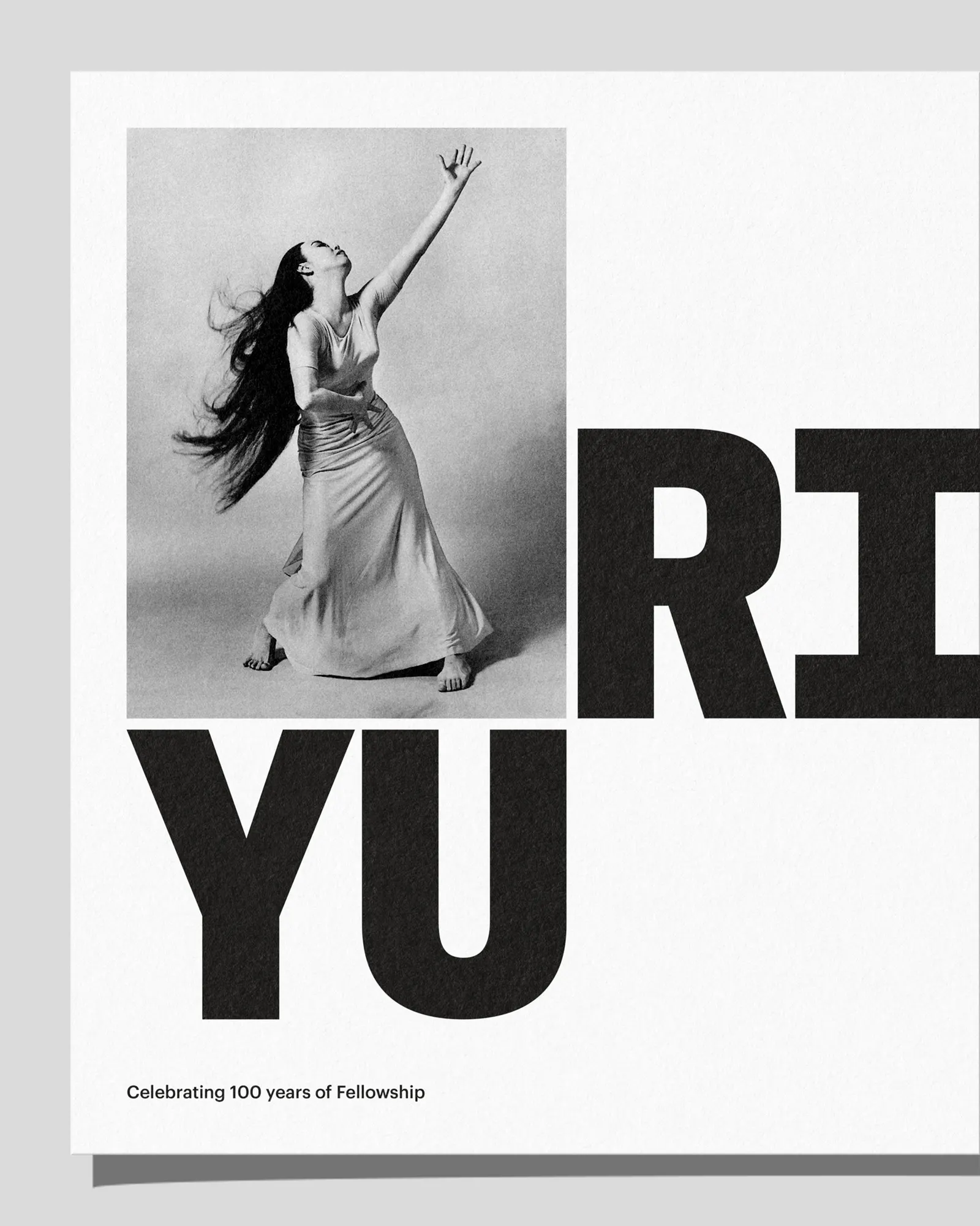
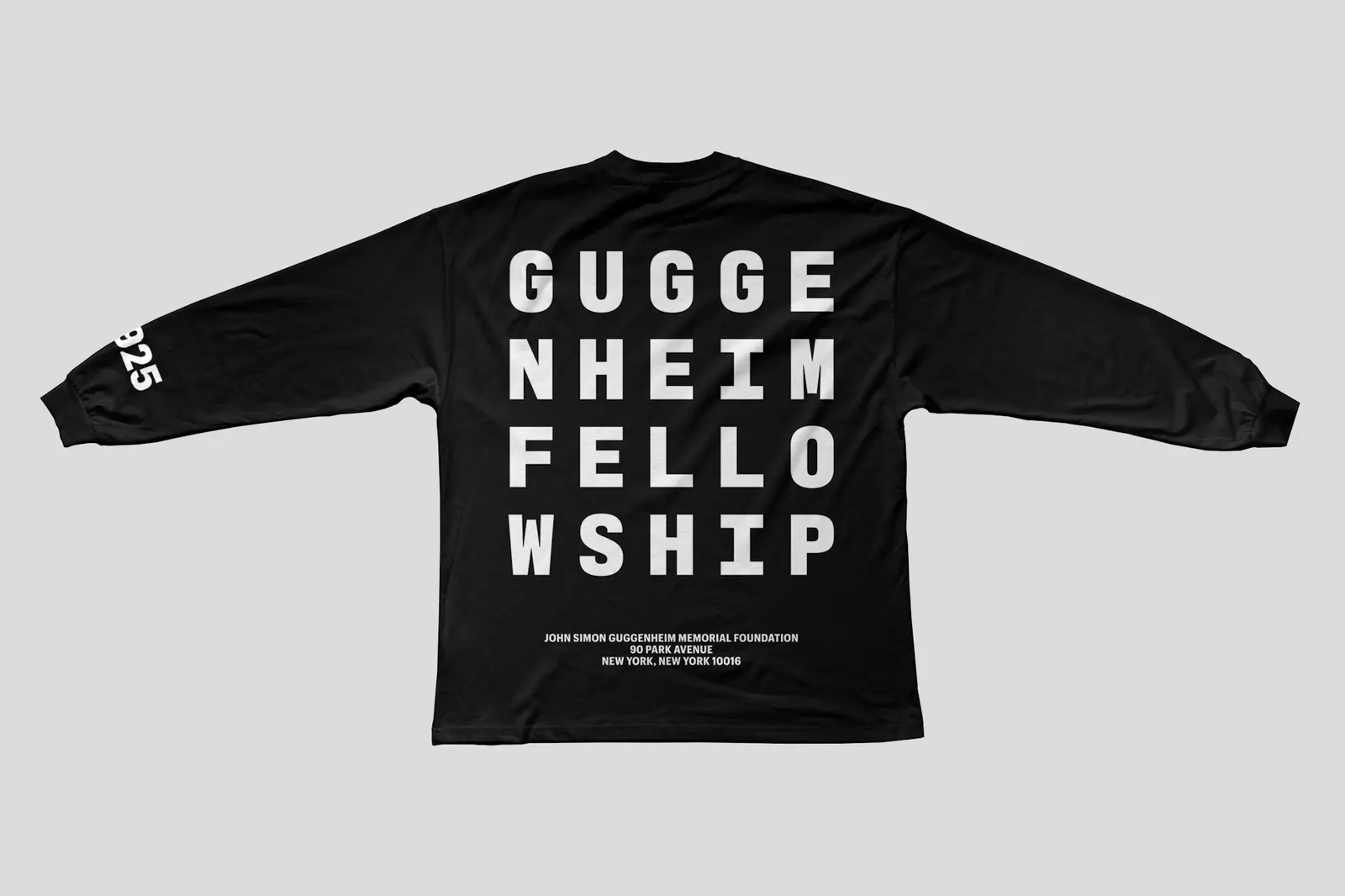
The system starts with a monospaced wordmark that behaves like a set of building blocks: it stacks, packs into a square, shrinks to a GF monogram, or turns into a circular seal for official correspondence. Commercial Type developed the custom Graphik Mono logotype into a full typeface, and bright colors join black and white to move the tone from sober to festive. Michael Bierut led strategy, with August Dine, Jonny Sikov, and Matt Willey designing. The rollout began with a New York Times announcement of the centennial class, and AREA 17 built the website as a database of past Fellows.
Why it works
Monospacing gives every letter the same weight, so the name reads like a stamp or a label rather than a letterhead flourish, which suits an award whose value is the endorsement. The square and the GF monogram fit anywhere, from a newspaper page to a social avatar, while the seal keeps formality for the moments that need it. The bright palette is the smartest move. It puts the Foundation closer in spirit to the artists and scientists it backs than to the banks and trusts it might otherwise resemble.
Applications
Logo
Images and video from pentagram.com, by Pentagram.