The Brand Monograph
Harry Ransom Center brand identity by Pentagram
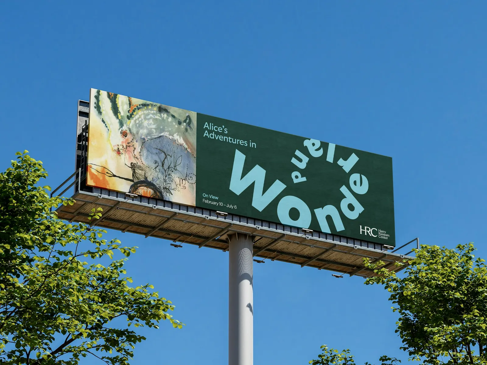
↗Most institutions turning 50 start a rebrand by retiring the old mark. Pentagram's Austin office did the opposite for the Harry Ransom Center, the University of Texas library, archive, and museum whose holdings include a Gutenberg Bible and Frida Kahlo's self-portrait. The fall 2023 brief was to make a place revered by scholars legible to the students and newcomers who pass it every day without going in.
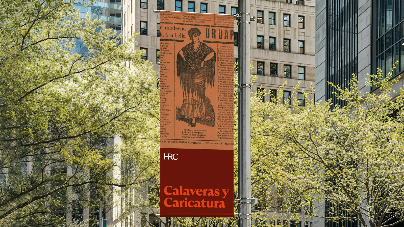
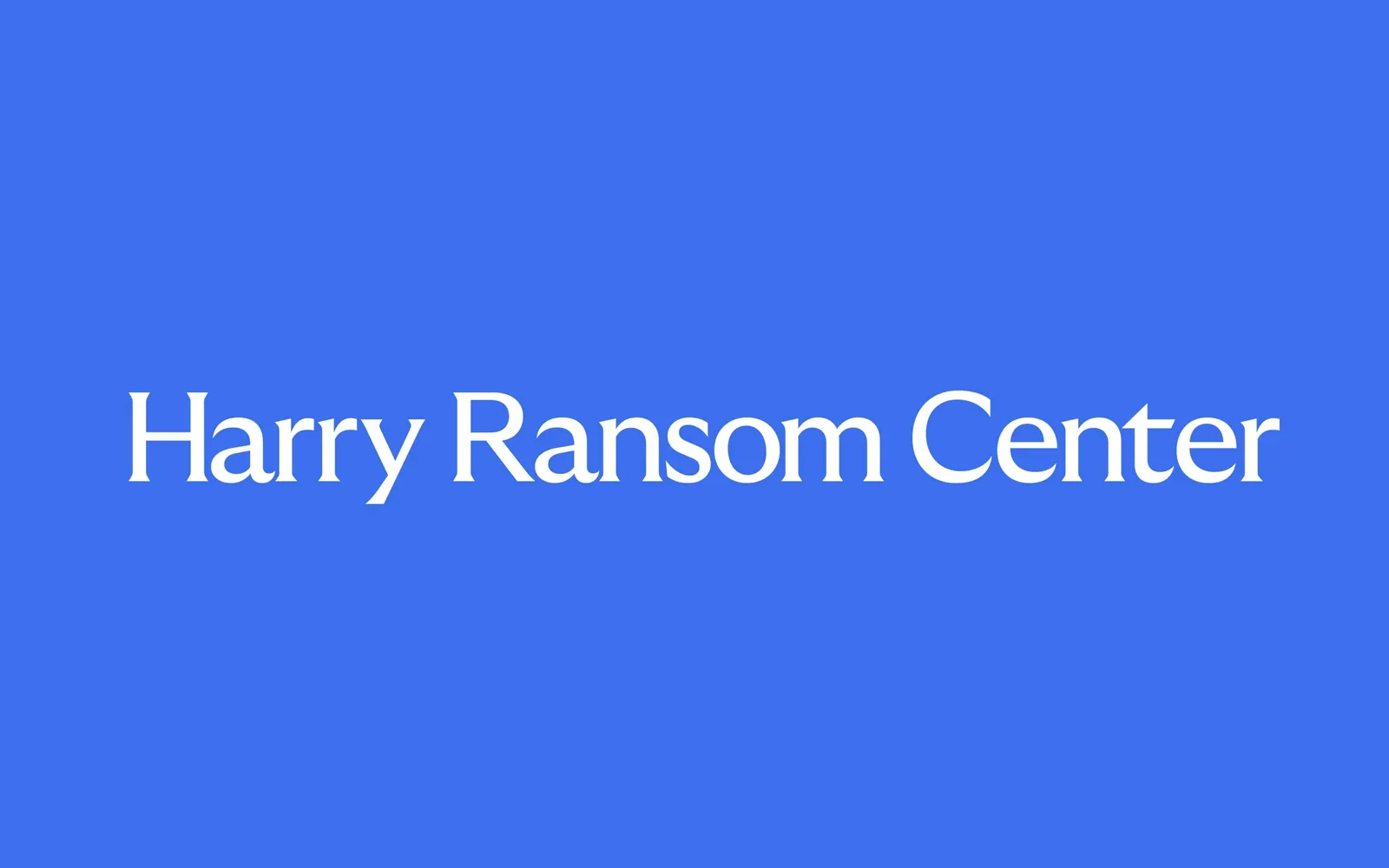
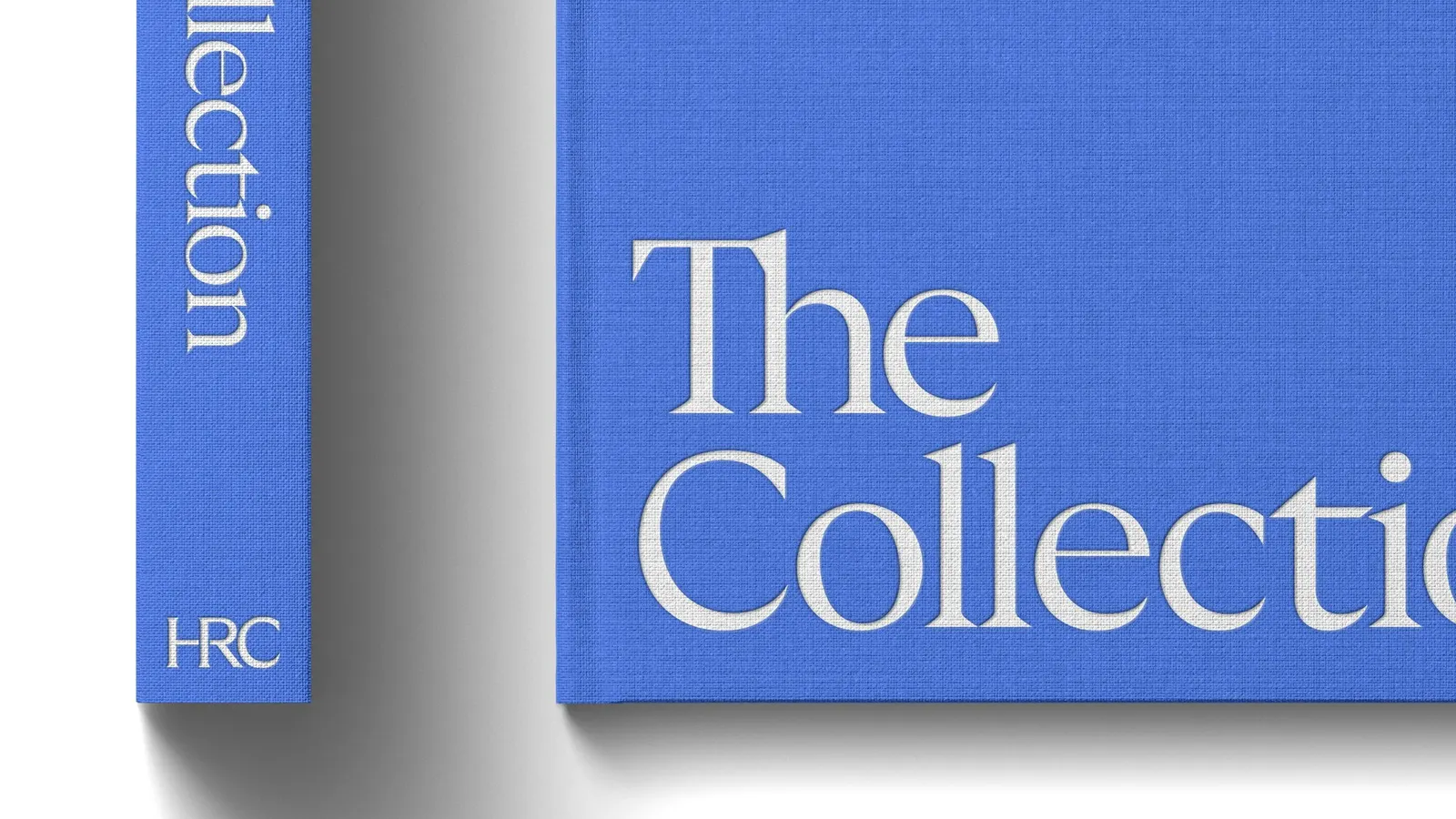
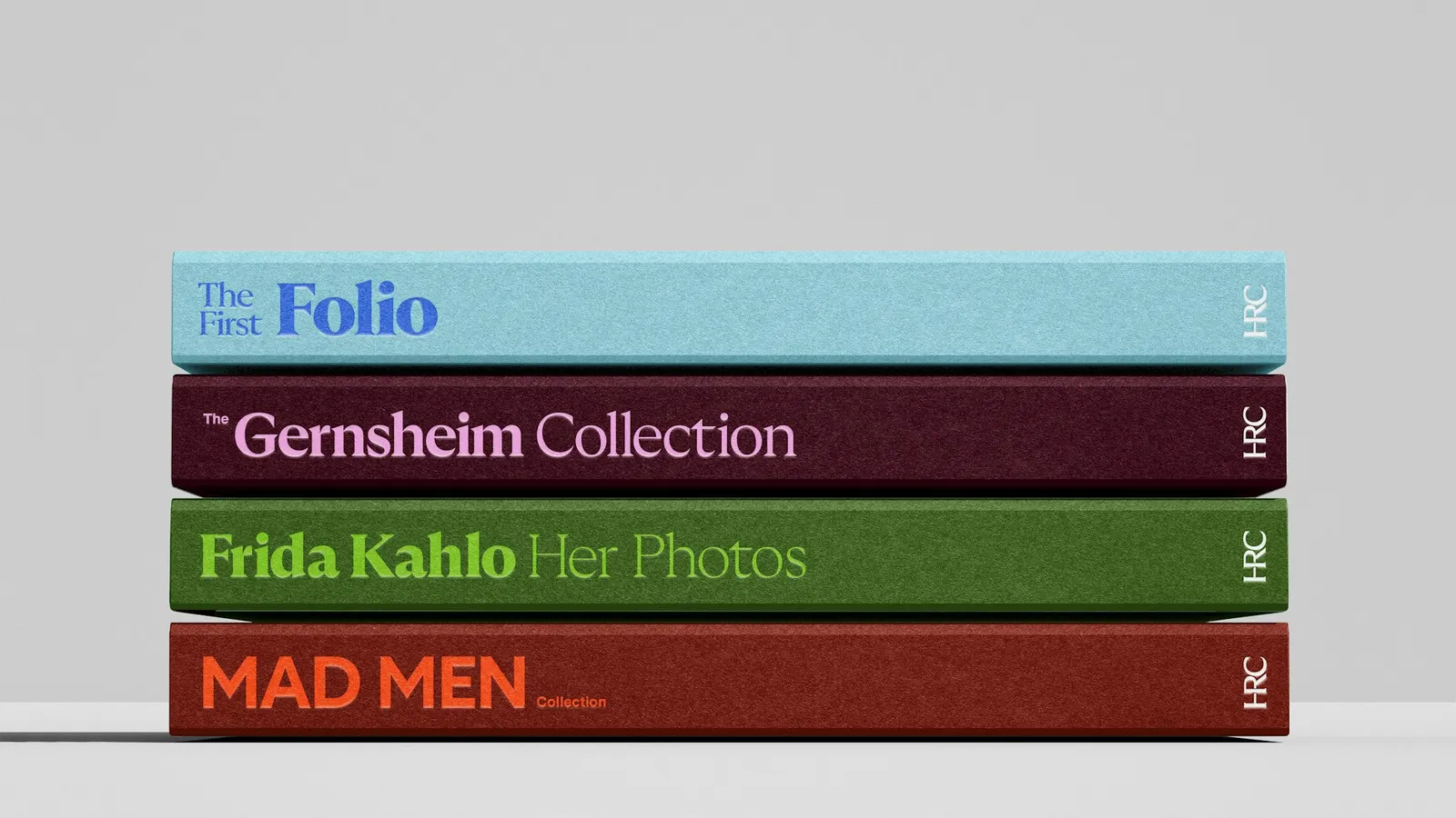
Working with designers Connor O'Neill, DJ Stout, Davian-Lynn Hopkins, and Delta Murphy, the studio kept the three-letter acronym but redrew it in Grilli Type's GT Ultra, so the H and R lock together more cleanly. The full name drops into sentence case, the building's windows become a framing device, and saturated color pairings sit beside vintage images from the collection. The initials now lead, the way MoMA does for its museum.
Why it works
The smartest move is restraint. Keeping the acronym preserves decades of recognition, while GT Ultra's sturdy blend of sans and serif gives it the weight to hold up on a phone screen and still feel literary. Bright color is the real break from category habits, since archives usually default to muted, reverent palettes. Set against old photographs and documents, it makes the collection feel alive rather than preserved. Leading with "HRC" also gives students a name short enough to say out loud.
Applications
Logo
Color
Images and video from pentagram.com, by Pentagram.