The Brand Monograph
Herman Miller brand identity
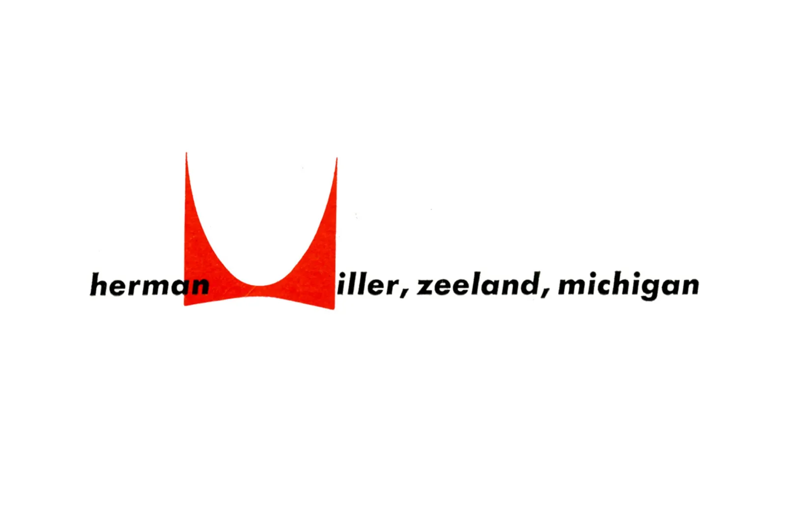
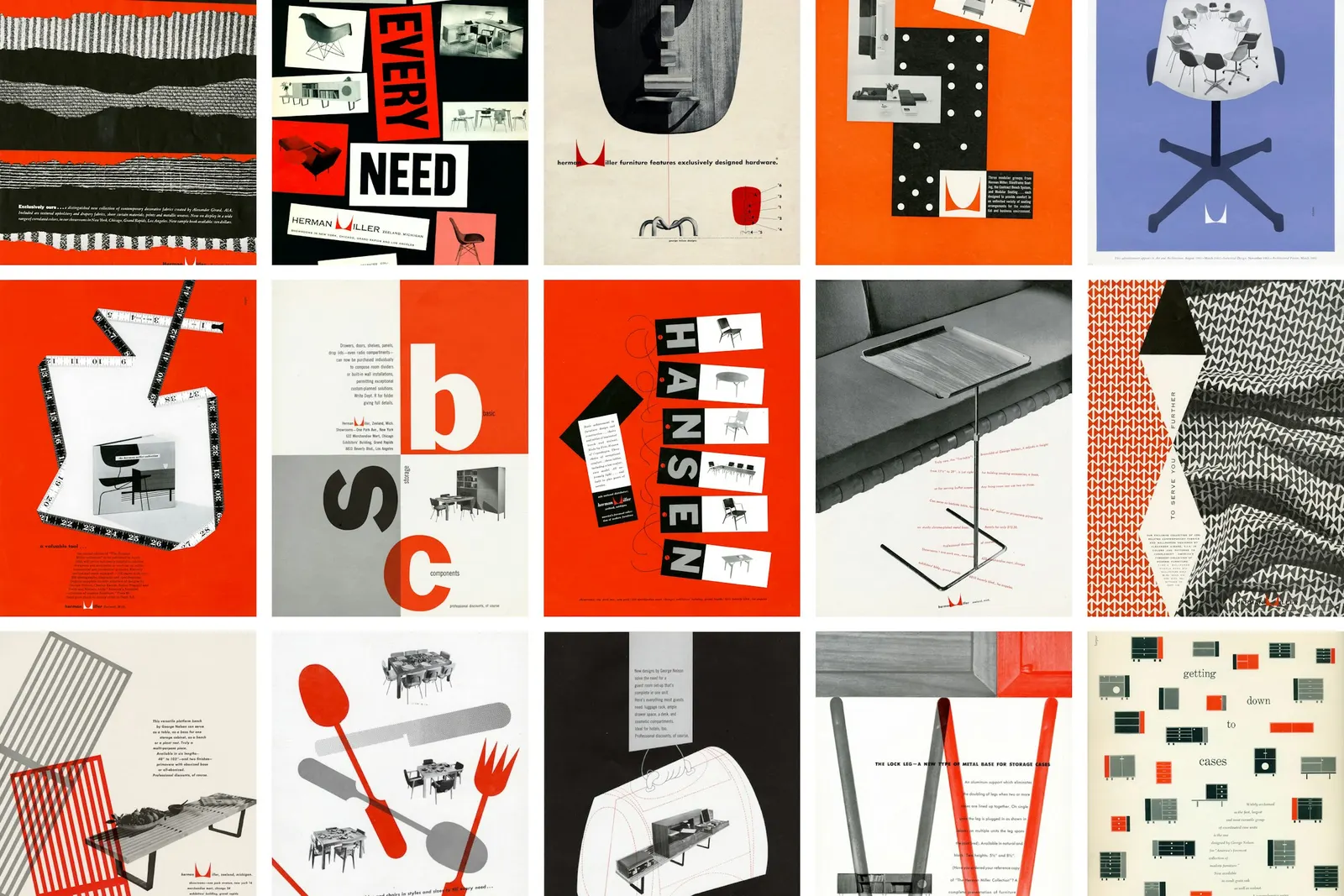
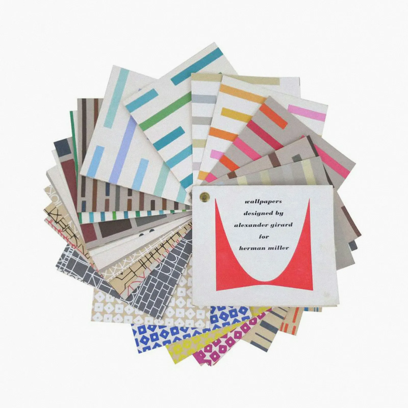
↗Order's identity for Herman Miller shows what a studio can do when it knows what to leave alone. The Brooklyn team started in the company's archive, studying the marks and graphic work of Irving Harper, John Massey, and Steve Frykholm. It came out with a clear position: Harper's original "M" drawing stays exactly as drawn, freed from the containers that once boxed it in.
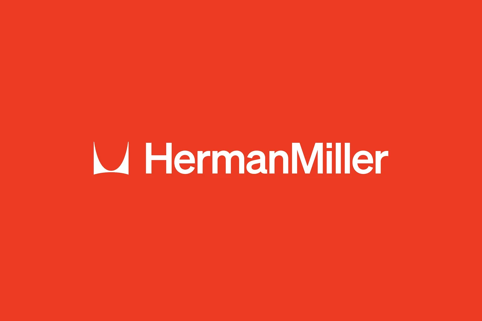
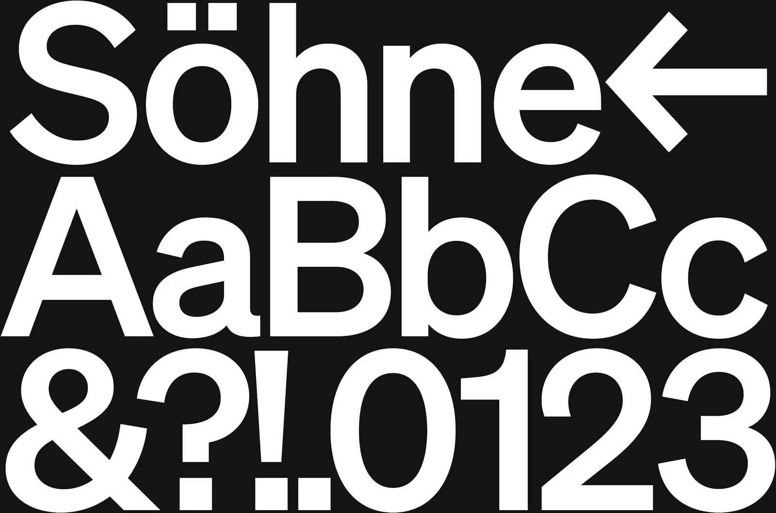
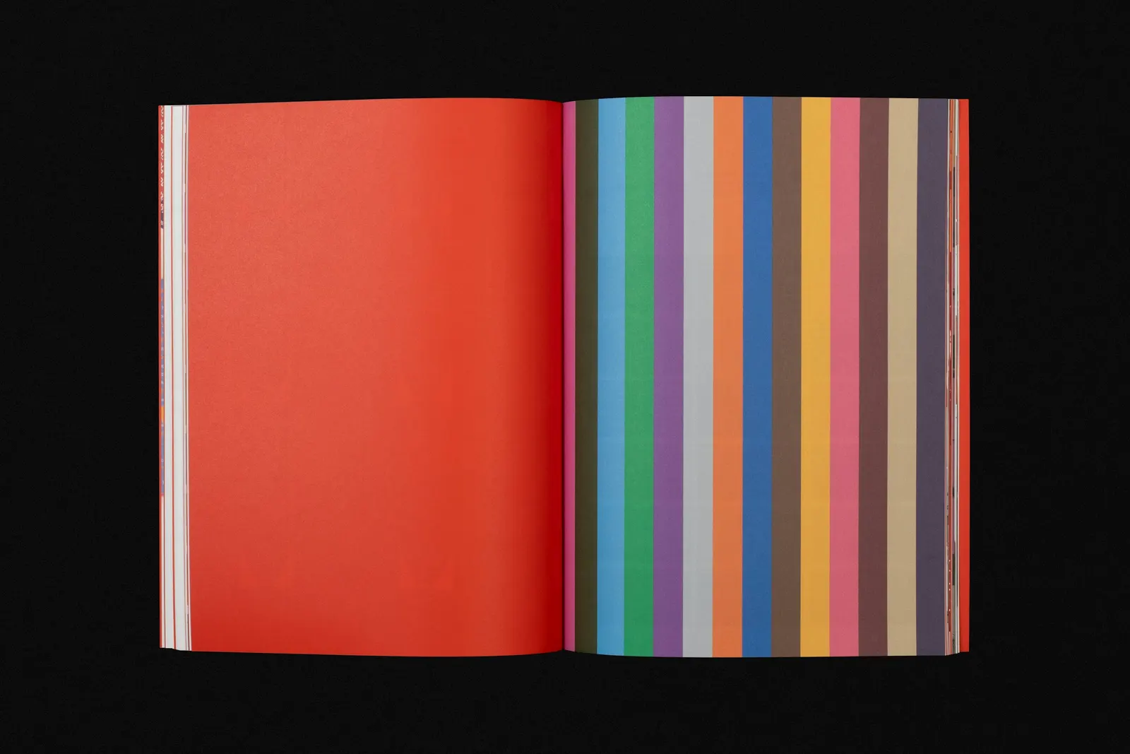
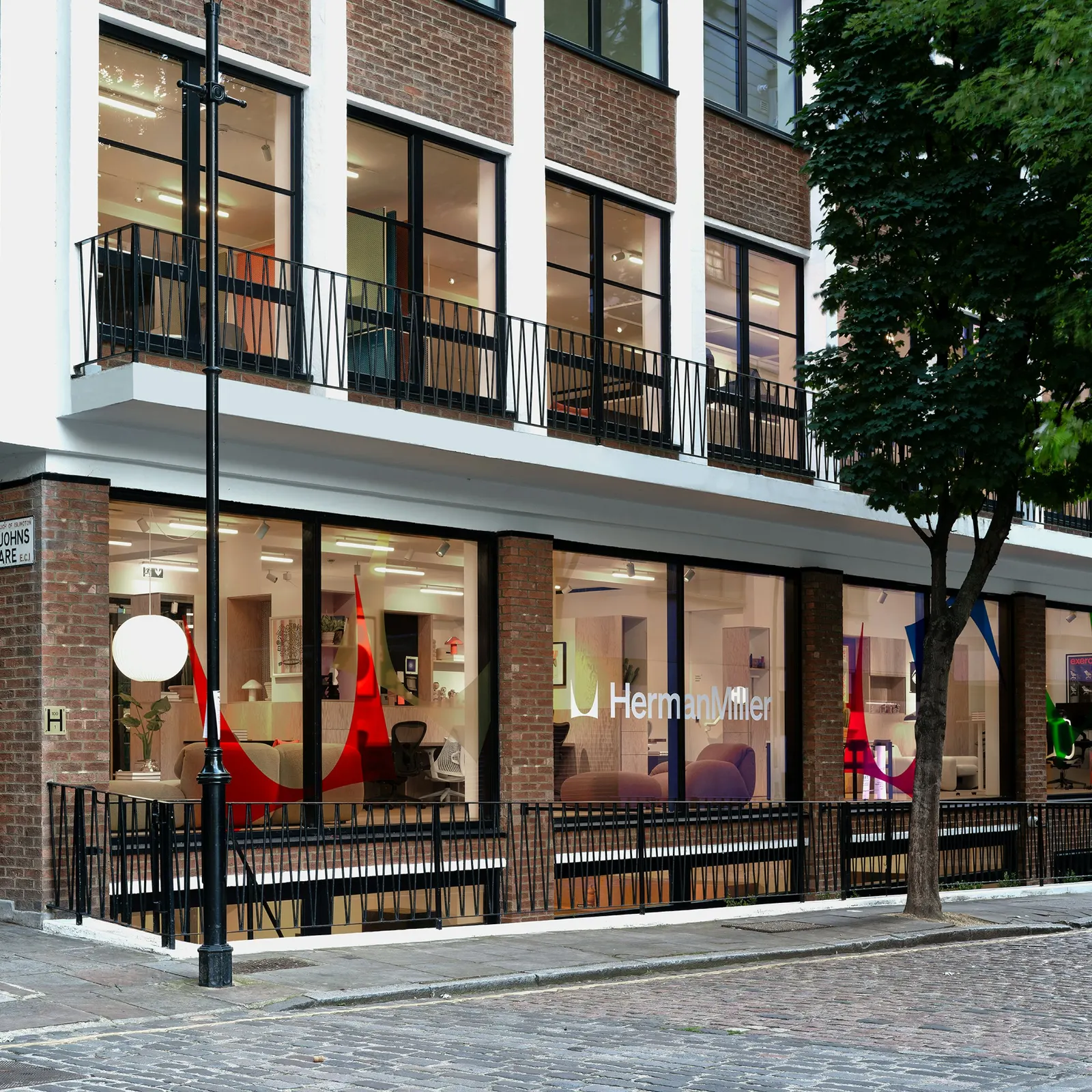
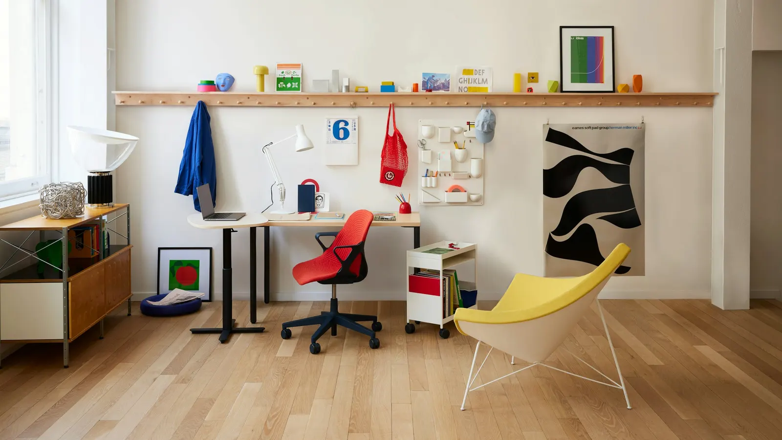
Led by partner Jesse Reed, with designer Garrett Corcoran and operations lead Megan Nardini, the studio built a suite of symbol, wordmark, and logo that can each stand alone or work together. Herman Miller Red anchors a wider color palette, Klim Type Foundry's Söhne handles typography, and motion and guidelines extend the system across a company that spans workplace, home, healthcare, and technology.
Why it works
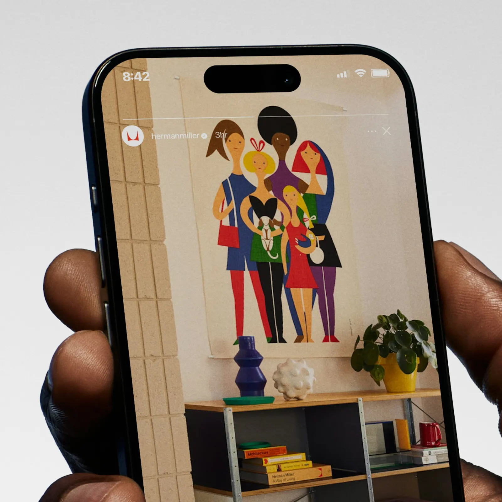
The strongest move is the simplest one. Without its container, the "M" becomes a graphic device that can be cropped, scaled up, or used as a quiet signature. The wordmark handles naming plainly, so neither element has to do everything. In a category crowded with trend-chasing furniture brands, that restraint reads as confidence. Söhne is neutral enough to let the products lead but has enough character to avoid generic corporate sans-serif territory. Because red stays the anchor, the added colors feel like range rather than a rebrand.
Applications

Logo
Typography
Color
Images and video from order.design.