The Brand Monograph
Bite Back brand identity by Wolff Olins
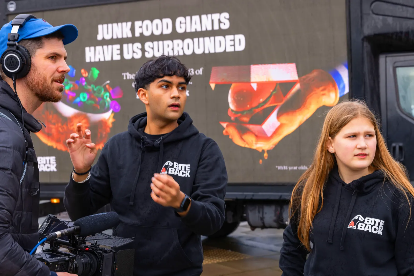
↗Health messaging often talks down to young people, and Bite Back's identity does the opposite. The youth-led movement began in 2019, when 12 activists started petitioning the UK government and schools over junk food promotion. Wolff Olins was asked to shift the conversation away from blaming children and families and toward the companies marketing to them.
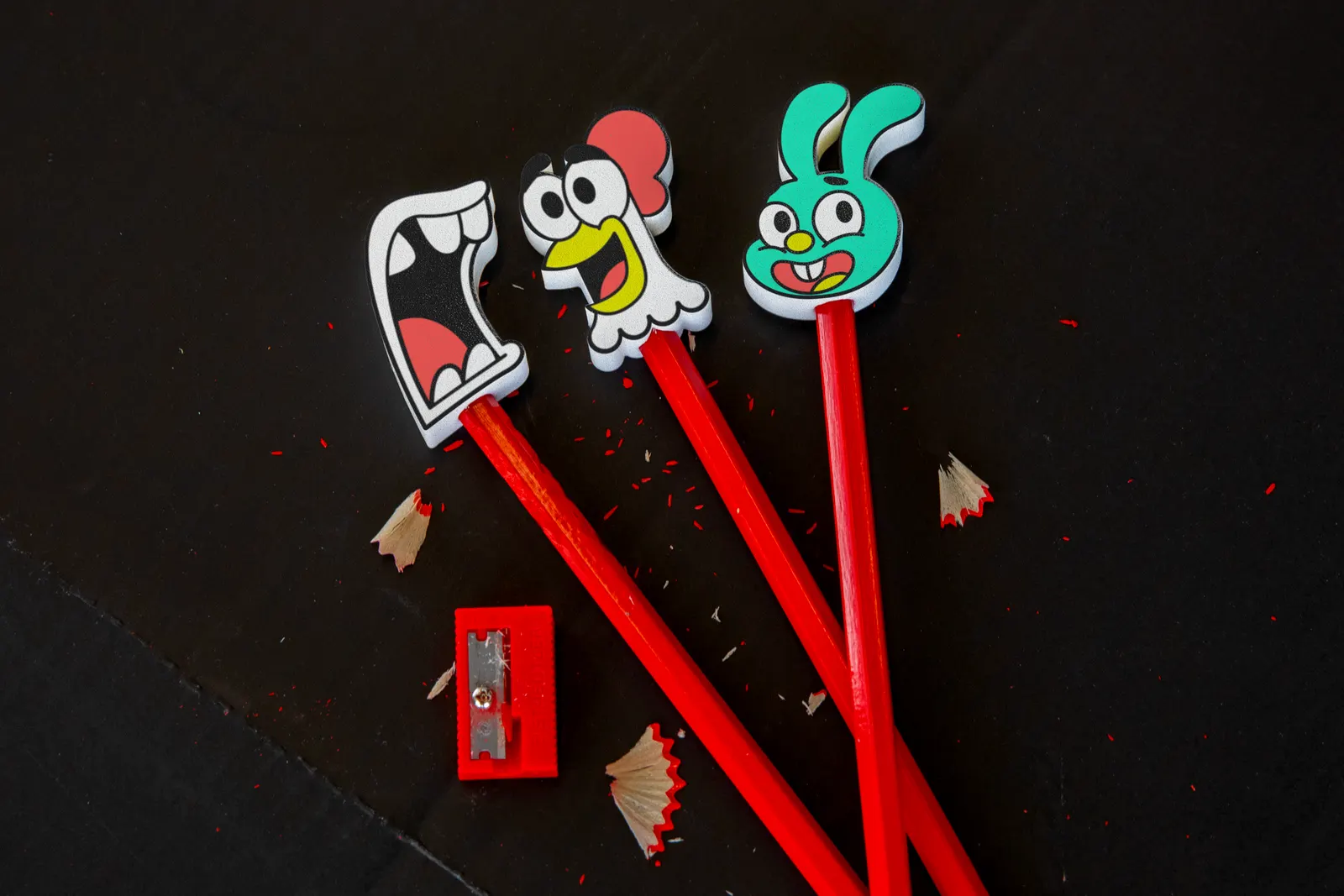
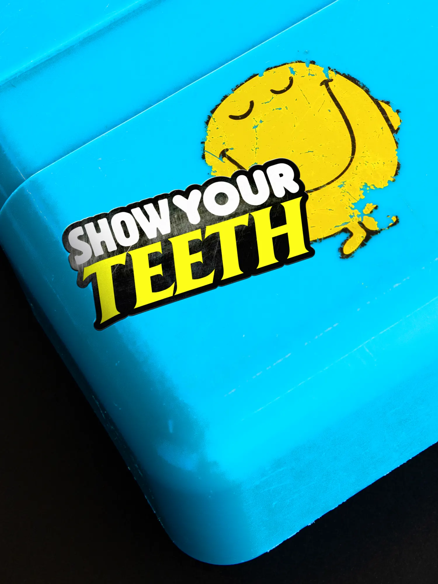
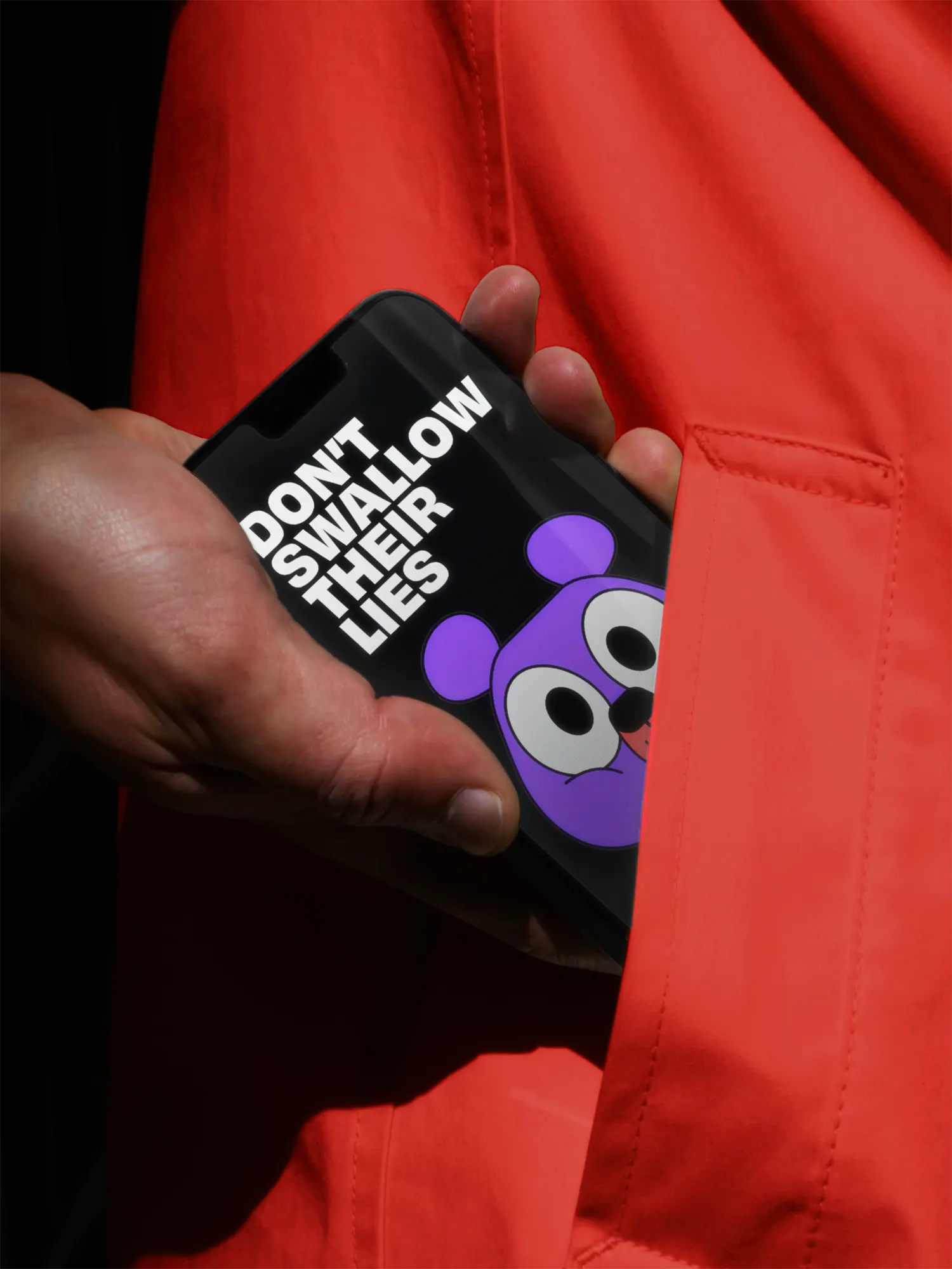
The studio built the identity from those companies' own materials: fast food reds and yellows, glossy oversaturated photography, and typefaces named Fried Serif, Sugar Rush Round, and Cereal Script. Colors have names like Chicken Shop Red and Unlicensed Mauve, and the copy puns on the language of food. Animade handled motion, Ejatu Shaw photography, and Fakery 3D. Since the September 2023 launch, social engagement has risen 250%, and 14,000 students have seen the brand in youth-led assemblies.
Why it works
The palette and type are deliberately a little sickening, and that's the point. They read as fast food at a glance, so the critique lands before anyone reads a word. Because the system is assembled from ordinary marketing parts, teenagers can pick it up and use it without a design team, which suits a movement run by young people. It also separates Bite Back from the earnest greens and clinical blues of most health charities, and the humor keeps the anger from turning into a lecture.
Applications
Logo
Typography
Images and video from wolffolins.com, by Wolff Olins.